Adding 4 nominees to an FD without making it feel like a bank form
Designing FD nominations for India’s new multi-nominee banking regulations
Timeline: ~2 weeks, 2 iterations My role: Sole designer, end-to-end — from regulatory requirement interpretation to final handoff Collaboration: Product Manager, Engineering, Compliance/Legal, Product Owners of 3 other teams Tools: Figma — also used AI tools (Claude, ChatGPT) for rapid prototyping to get early stakeholder buy-in and for iterating on UX copy for allocation descriptions Platform: Mobile (Android & iOS)
I’m Shreya, a Product Designer at Axis Bank, working on their Mobile Banking app — the bank’s primary digital channel serving 25M+ active users every month. I lead end-to-end design for security, authentication, and user-control experiences across Mobile Banking, Internet Banking, and WhatsApp Banking.
This case study is about a nomination flow I designed for Fixed Deposits in response to India’s 2025 banking regulation overhaul — a pattern that was later adopted across 4 product teams at Axis Bank.
1. Context
In November 2025, the Banking Laws (Amendment) Act, 2025 and the updated RBI nomination directions came into effect. The key changes:
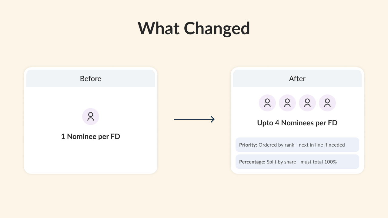
- Depositors can now appoint up to 4 nominees for deposit accounts, including Fixed Deposits
- Two allocation methods are now supported: Simultaneous — percentage-based split across nominees, totalling 100% Successive — priority-ordered nominees, where the next becomes eligible only if a higher-priority nominee is unavailable
- The goal: reduce post-death disputes, speed up claim settlement, give customers finer control over how their deposits are distributed
This regulatory change applied across multiple Axis Bank products simultaneously — Retail Mobile Banking (50M+ users), Corporate Banking, Branch of the Future (BOTF), and other deposit journeys.
2. The Design Challenge
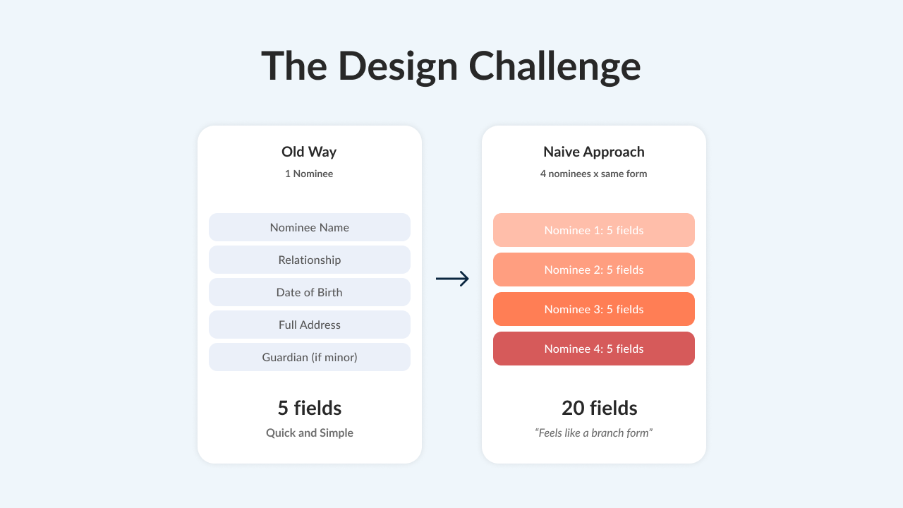
The regulation was the trigger. The design challenge was: how do you collect 3–4x more nominee data without creating 3–4x more friction?
The existing FD nominee flow was straightforward — one nominee per FD. The user entered a name, relationship, DOB, address, and (if the nominee was a minor) guardian details. Simple, linear, done.
Now the flow needed to support up to 4 nominees, each with their own details and address, plus an allocation method selection. A naive implementation would mean repeating the same long form up to 4 times — and for most Indian families, the nominees are from the same household, sharing the same address.
3. What Existed Before
The existing FD creation flow:
- Select funding source (Axis Bank account or other bank)
- Enter deposit amount
- Set tenure
- Choose interest payout method
- Nominee details — if the user’s bank account already had a nominee, that name was pre-filled. Options: keep existing nominee, enter a new nominee, or opt for no nominee.
For a new nominee: Name, Relationship, Address, DOB. If the nominee was a minor: guardian’s name and guardian’s address.
No concept of multiple nominees. No allocation. No centralized nominee management.
4. First Iteration — and What Broke
V1 approach: After clicking “Add Nominee,” the user saw a single long-form page collecting all nominee details — name, relationship, DOB, and full address — in one scroll. After completing one nominee, the CTA offered “Save & Allocate Funds” or “Add Another Nominee.” The percentage allocation screen didn’t show how each percentage translated to an actual amount. Address reuse was handled with an inline checkbox: “Address same as [nominee name].”
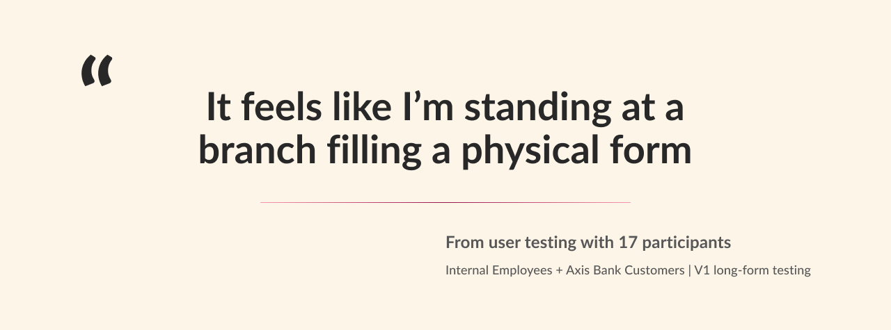
What I tested: 17 users — a mix of internal Axis Bank employees and actual customers.
What I found:
- No one abandoned the flow. Nominee addition isn’t optional — people complete it because they have to. But the experience left them frustrated.
- The breaking point was the second nominee’s address. By the time users reached the third nominee and were asked to enter an address again — for someone who lives in the same house — they were visibly irritated. Multiple users compared it to standing at a branch counter filling a physical form.
- The repetition was the problem, not the length. Users didn’t mind the number of fields for one nominee. They minded entering identical information multiple times.
- The inline checkbox for address reuse (“Same as [nominee]”) was easy to miss and felt like an afterthought.
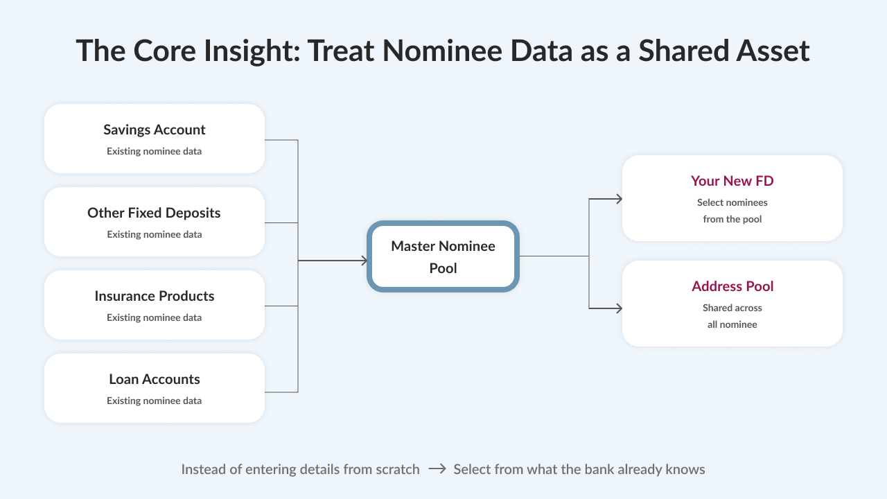
The insight: The friction wasn’t in the amount of data collected — it was in the amount of redundant data collected. Most nominees in Indian families share the same household. The system already had this data across the customer’s banking relationship. The design needed to treat nominee and address information as shared assets, not per-nominee inputs.
5. The Solution — V2
I restructured the entire flow around three principles:
- Don’t ask for data the bank already has — pull nominee and address details from across the customer’s banking relationship
- Separate concerns — who are the nominees, where do they live, how should funds be split
- Make the complex parts feel optional — progressive disclosure, smart defaults, convenience shortcuts
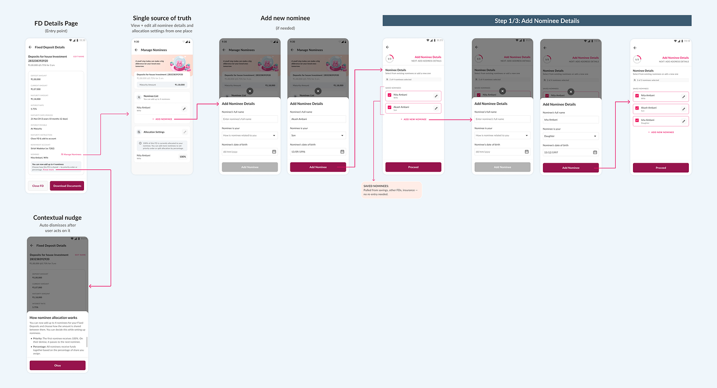
The Manage Nominees hub + selecting nominees
I introduced a dedicated Manage Nominees page — this didn’t exist before. It gives users a single place to view and manage all nominee details and allocation settings for any FD. It’s both the entry point for setting up nominees and the page they return to when they need to change anything.
On the FD Details page, a contextual nudge informs users about the new multi-nominee option. Clicking “Know more” opens an educational bottom sheet explaining Priority and Percentage allocation in plain language. The nudge auto-dismisses once the user acts on it.
From the hub, when the user taps “Add Nominee,” they land on a master list of all nominees across their Axis Bank relationship — savings accounts, other FDs, insurance, any linked product. Instead of filling a blank form, they just select. If someone isn’t in the list, a lightweight bottom sheet collects only the essentials — name, relationship, DOB. No address yet. For most returning users, this step is selecting, not filling.
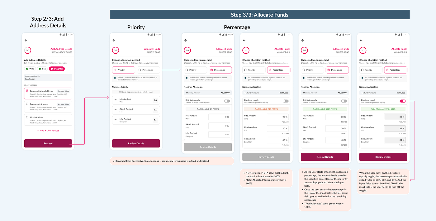
Assigning addresses
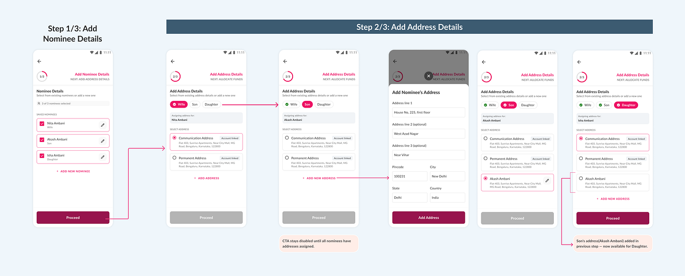
Nominees appear as tabs at the top. The user taps each tab to assign an address from a shared pool of existing addresses — communication address, permanent address, and any address already assigned to another nominee in this flow.
The key interaction: once a user adds a new address for one nominee, it immediately appears in the pool for the others. For a family living in the same house, this means entering the address once instead of three or four times. A tick appears on each tab once that nominee’s address is assigned, and the CTA stays disabled until all nominees have addresses.
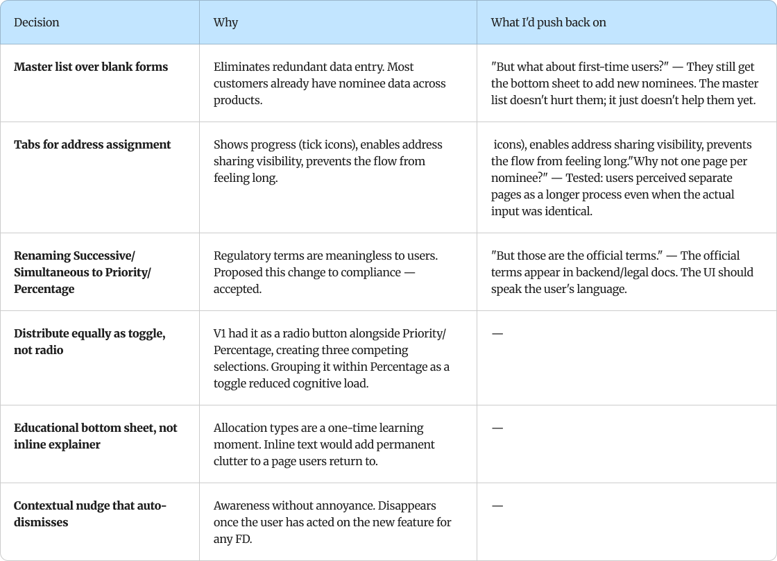
Tabs instead of separate pages — because switching between nominees should feel instant, and the user should see the address pool growing as they go.
Allocating funds
The user chooses how the FD is distributed between nominees. I renamed the regulatory terms — “Successive” became Priority, “Simultaneous” became Percentage — because users shouldn’t need a legal glossary to manage their money. I proposed this change to compliance, and it was accepted.
Under Priority, nominees appear in a drag-and-drop list — hold and drag to set the order. Under Percentage, the maturity amount is shown upfront so users know what they’re splitting. Each nominee gets a percentage input with the calculated rupee amount shown below it in real time. A “Distribute equally” toggle auto-splits evenly — I changed this from a radio button in V1 to a toggle in V2, because having three competing selection states (Priority vs. Percentage vs. Distribute Equally) created unnecessary cognitive load. The running total updates live and turns orange when it doesn’t add up to 100%. Once the user fills in percentages for all but the last nominee, the final field auto-fills with the remaining percentage.
Review, confirm, and the updated state
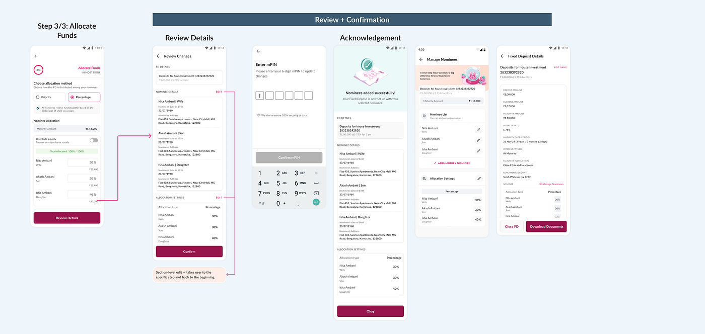
A Review page shows everything — FD details, nominee details, allocation settings — each with a section-level Edit button that takes the user back to the specific step, not the beginning of the flow. After mPIN authentication, the success screen confirms the setup, and both the Manage Nominees hub and the FD Details page reflect the updated state.
7. Cross-Product Adoption
The regulatory change applied across multiple Axis Bank products simultaneously. After designing the pattern for Retail Mobile Banking, I proactively reached out to product owners of other teams — Corporate Banking, Branch of the Future (BOTF), and other deposit journeys — and presented the pattern as a shared solution.
The pattern was adopted as-is across 3 additional product teams beyond Retail. This wasn’t mandated by a design system team — I initiated the alignment. The result:
- Reduced duplicated design and engineering effort — teams didn’t need to solve the same problem independently
- Consistent nominee experience across Axis Bank products — a customer managing nominees on Mobile Banking and BOTF encounters the same flow
- Faster implementation — teams could reuse the validated pattern instead of designing from scratch
The core reusable elements: the master list pattern, the 3-step structure, the address pool, and the allocation UI with Priority/Percentage naming.
8. What’s Next
- Run a comparative test between V1 and V2 — specifically measuring task completion time and error rate across both versions. V2 was designed as a direct response to specific pain points from V1 testing, but I’d want to quantify the improvement: how much faster is the address step with the shared pool vs. manual entry? That data would strengthen the case for the pattern across teams.
- Post-launch instrumentation — I’ve recommended to the product team that we measure time-per-step, drop-off points, and how often users select from the master list vs. adding new nominees. This data will validate whether the shared-asset model is working as intended or if specific steps need refinement.
9. Status
Currently in development. Expected to go live across Retail Mobile Banking for 25M+ users, with parallel implementation in Corporate Banking, Branch of the Future (BOTF), and other deposit journeys.
메타데이터
- post_id
- b7ef71fdf7ea
- slug
- adding-4-nominees-to-an-fd-without-making-it-feel-like-a-bank-form-b7ef71fdf7ea
- url
- https://medium.com/@shreyasama001/adding-4-nominees-to-an-fd-without-making-it-feel-like-a-bank-form-b7ef71fdf7ea
- canonical_url
- https://medium.com/@shreyasama001/adding-4-nominees-to-an-fd-without-making-it-feel-like-a-bank-form-b7ef71fdf7ea
- author_url
- https://medium.com/@shreyasama001
- status
- ok
- fetched_at
- 2026-06-09 15:37:30