6 Color Palettes With Hex Codes You Can Steal for Your Next Design (Free Generator Included)
Every good design decision starts in the same annoying place: staring at a blank canvas, trying to figure out which colors actually go…
6 Color Palettes With Hex Codes You Can Steal for Your Next Design (Free Generator Included)
Every good design decision starts in the same annoying place: staring at a blank canvas, trying to figure out which colors actually go together. You can eyeball it, you can guess, or you can start from palettes that have already been tested for contrast, mood, and balance — then tweak them until they’re yours.
That’s the idea behind this post. Below are six ready-to-use color palettes, each with full hex codes, a breakdown of the mood they create, and where they work best — in branding, web design, apps, or illustration. At the end, I’ll show you how to generate palettes like these yourself, pull colors straight out of any image, and build gradients, all for free with ColorPalGen.
Why a good color palette matters more than people think
A logo can be redrawn. Copy can be rewritten. But color is the first thing a visitor’s brain processes — often before they’ve consciously read a single word. Studies on visual perception consistently point to color as one of the fastest signals for mood, trust, and brand recognition. A mismatched palette doesn’t just look “off”; it actively works against whatever message you’re trying to send.
The good news: you don’t need a design degree to pick great colors. You need a system — and a decent starting point. That’s exactly what a color palette generator is for: it takes the guesswork out of the equation and gives you a tested set of hex codes you can drop straight into CSS, Figma, or a paint chip.
1. Soft Cream — warm, editorial, and easy to read
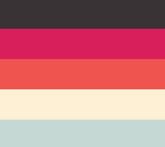
Hex codes: #3A3335 #D81E5B #F0544F #FDF0D5 #C6D8D3
This palette pairs a warm off-white background with a near-black plum for text, then layers in a punchy raspberry and coral for accents. It reads as warm and editorial — think lifestyle blogs, boutique product pages, or a portfolio that wants to feel approachable rather than corporate. The soft sage green keeps the brighter tones from feeling too loud.
Best for: blogs, boutique e-commerce, personal brand sites, editorial layouts.
See the full Soft Cream palette →
2. Retro Pop — bold, playful, unapologetically loud
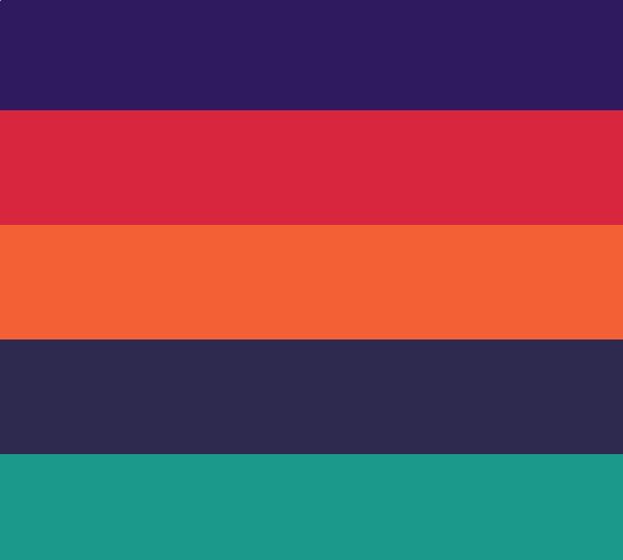
Hex codes: #2F195F #D7263D #F46036 #2E294E #1B998B
Deep purple and near-black navy anchor this one, while a fiery red-orange combo and a teal green do all the talking. It has an unmistakable late-70s/early-80s energy — the kind of palette that works when you want a brand to feel confident, fun, and a little rebellious. Music, events, streetwear, and youth-oriented products all lean into palettes like this.
Best for: event branding, music/entertainment, youth brands, bold posters.
See the full Retro Pop palette →
3. Cobalt Ember — tech-forward with a warm counterpoint
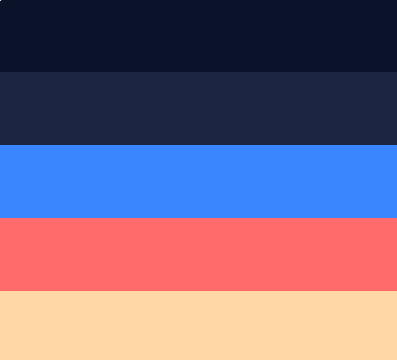
Hex codes: #0B132B #1C2541 #3A86FF #FF6B6B #FFD6A5
Two dark navy shades create a premium, screen-friendly base, then a bright cobalt blue does the heavy lifting for CTAs and links. The coral and peach accents stop it from feeling cold or sterile — a common trap with all-blue tech palettes. This is a strong pick for SaaS dashboards, app UIs, and dark-mode-first products.
Best for: SaaS, dashboards, fintech apps, dark-mode interfaces.
See the full Cobalt Ember palette →
4. Denim Rust — grounded and masculine without being flat
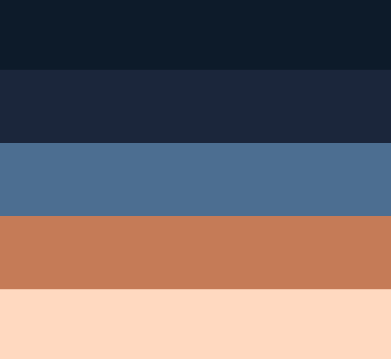
Hex codes: #0D1B2A #1B263B #4C6E91 #C57B57 #FFD9C0
Layered navy-to-slate blues sit next to a warm rust and a soft peach highlight. It’s a palette that reads as sturdy and grounded — denim, leather, workwear, outdoor gear — but the peach tone keeps it from feeling heavy. Works equally well as a UI palette for a product that wants to feel dependable rather than flashy.
Best for: menswear, outdoor/adventure brands, workwear, rustic product photography.
See the full Denim Rust palette →
5. Twilight Ink — quiet, moody, minimal
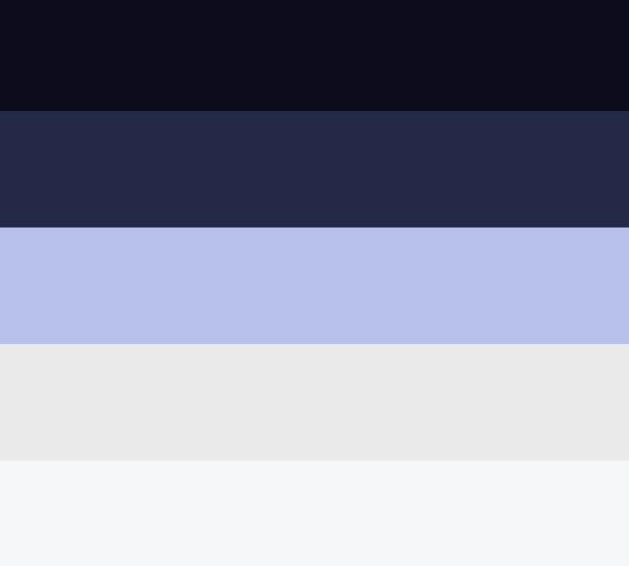
Hex codes: #0D0C1D #232946 #B8C1EC #EAEAEA #F6F7F8
Almost-black ink and deep indigo pair with a dusty periwinkle and two near-white neutrals. This is a restrained, low-saturation palette suited to interfaces and brands that want to feel calm, premium, and a little introspective — think journaling apps, sleep and wellness products, or a portfolio for photography and design work where the images should do the talking, not the background.
Best for: wellness apps, journaling/writing tools, portfolios, minimalist UI.
See the full Twilight Ink palette →
6. Minimal Stone — a clean neutral base with one loud accent
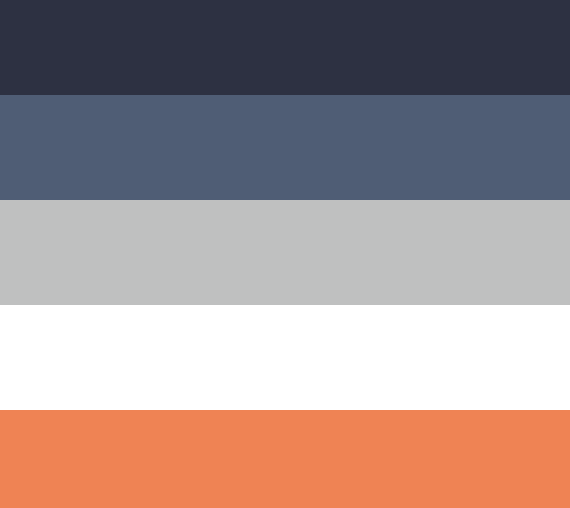
Hex codes: #2D3142 #4F5D75 #BFC0C0 #FFFFFF #EF8354
Charcoal, slate, and stone-grey form a quiet, almost architectural base, then a single burnt-orange accent gets to do all the emotional work. This “mostly neutral, one loud accent” formula is one of the most reliable structures in design — it scales cleanly across a whole website or product because there’s only ever one decision to make about where the accent goes.
Best for: architecture/interior design sites, agency portfolios, editorial dashboards, minimalist product UIs.
See the full Minimal Stone palette →
What actually makes these palettes “work”
Looking across all six, the same underlying pattern shows up every time:
- One or two dark anchors (near-black or deep navy) that text and structure can sit on top of.
- One or two neutral or muted tones that give the eye somewhere to rest.
- One accent color that gets used sparingly — for buttons, links, or a single highlight — so it stays powerful instead of overwhelming.
Once you notice this pattern, you can start building your own palettes with the same logic instead of picking five colors that “feel right” and hoping they cooperate.
Already have a color in mind? Start from a hex code instead
Sometimes you’re not starting from scratch — you already have a brand color, a logo, or a hex code someone handed you, and you need a full palette built around it. That’s the most common way people actually use a color palette generator: paste in one hex code (or a color name), and get a full five-color set with contrast and harmony already worked out, instead of manually testing combinations in a design tool.
This matters more than it sounds like it should. A huge amount of the search traffic around “color palette” tools comes from people looking for exactly this — a hex code color palette, a color palette from hex, or a way to turn one color into a usable brand palette. If you’re doing this by hand in Figma or Photoshop, you’re solving a problem that a generator solves in seconds.
Don’t know the hex code? Pull it straight from a photo
Not every project starts with a hex code — sometimes it starts with an image. A photo from a shoot, a product photo, a screenshot of a UI you like, a picture of a sunset that has the exact mood you’re chasing. In those cases, manually eyeballing “what shade of blue is that, exactly” wastes time and rarely gets you an accurate hex value.
ColorPalGen’s image color picker and visualizer solves this directly: upload any image, click on the areas you want, and get exact hex and RGB values pulled straight from the pixels. It’s the fastest way to turn “I like the colors in this photo” into an actual usable palette — no more guessing whether that ocean blue is #3A86FF or #2E6FCC.
This is especially useful for:
- Matching a website’s color scheme to a product photo
- Building a brand palette around an existing logo or asset
- Extracting UI colors from a screenshot or reference design
- Color-matching print or packaging to a physical sample
Building gradients, not just flat colors
Flat five-color palettes cover a lot of ground, but modern web and app design leans heavily on gradients — hero backgrounds, buttons, cards, loading states. A palette that looks great as solid blocks doesn’t always translate cleanly into a smooth gradient; colors that are harmonious side-by-side can look muddy or banded once you try to blend between them.
That’s why ColorPalGen has a dedicated gradient palette generator — it’s built specifically to create smooth, usable CSS gradients rather than treating gradients as an afterthought bolted onto a flat palette tool. If you’re designing anything with modern UI trends in mind — soft mesh gradients, subtle background washes, glassmorphism-style cards — this is the faster path than manually tweaking linear-gradient() values in dev tools until something looks right.
How to actually use these palettes in a real project
A palette is only useful once it’s applied consistently. A simple system that works for almost any project:
- Pick your dark anchor — this becomes your primary text color and, often, your header/footer background.
- Pick your neutral or light base — this is your main background color, the thing everything else sits on top of.
- Pick one accent — reserved almost exclusively for buttons, links, and the occasional highlight. Resist using it for large blocks of color; its power comes from scarcity.
- Use the remaining 1–2 colors as secondary accents — tags, icons, subtle dividers, hover states.
This is roughly the same structure used across all six palettes above, and it’s a large part of why they don’t feel chaotic despite using five distinct colors each.
Try it yourself
If any of the six palettes above are close but not quite right, you don’t have to start over — you can open any of them directly in ColorPalGen, tweak individual colors, lock the ones you like, and regenerate the rest until it fits your project exactly. Or start completely fresh: type in a hex code, a color name, or upload an image, and get a full palette back in seconds.
A few starting points depending on what you’re working on:
- Building a brand from a single logo color → start with a hex code palette generator
- Matching colors to an existing photo or screenshot → try the visualizer / image color picker
- Designing UI backgrounds, buttons, or hero sections → check out gradient palettes
Good color choices don’t have to be a mystery or a two-hour rabbit hole in a design tool. Start from a palette that already works, understand why it works, and adjust from there.
This is the first in a series of posts on color theory, palette building, and practical design workflows. More on how to build brand palettes, accessible color contrast, and gradient design are coming next — I’ll link them here as they go live.
메타데이터
- post_id
- b8a93aabc8bc
- slug
- 6-color-palettes-with-hex-codes-you-can-steal-for-your-next-design-free-generator-included-b8a93aabc8bc
- url
- https://medium.com/@colorpalgen/6-color-palettes-with-hex-codes-you-can-steal-for-your-next-design-free-generator-included-b8a93aabc8bc
- canonical_url
- https://medium.com/@colorpalgen/6-color-palettes-with-hex-codes-you-can-steal-for-your-next-design-free-generator-included-b8a93aabc8bc
- author_url
- https://medium.com/@colorpalgen
- status
- ok
- fetched_at
- 2026-07-08 18:29:56




