Building a Scalable Icon Management Service: A Developer’s Guide to Better UX | Icon DropdownList|…
The Problem: Icon Anarchy
Building a Scalable Icon Management Service: A Developer’s Guide to Better UX | Icon DropdownList| Angular
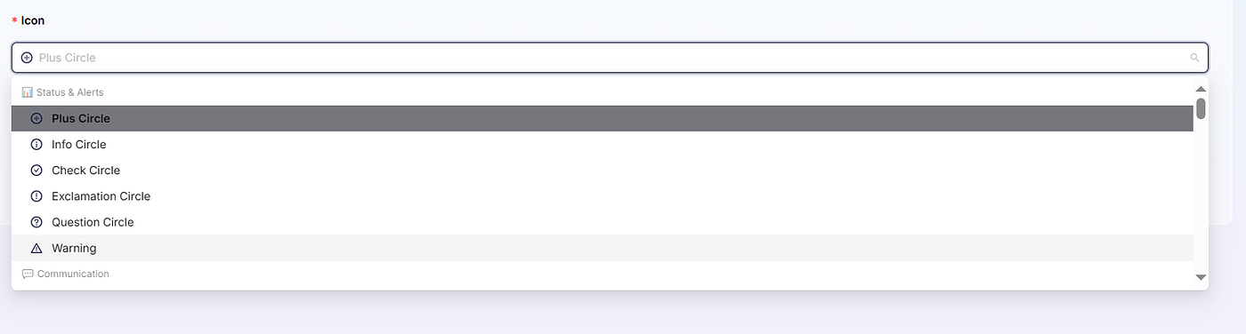
Icon Dropdown List
The Problem: Icon Anarchy
Picture this: You’re building a feature-rich application, and suddenly you realize your team has been using icons inconsistently across the platform. Some developers hard-code icon names, others guess at what’s available, and users end up with a confusing mix of visual elements that don’t tell a coherent story.
Sound familiar?
This was exactly the challenge we faced when building our announcement system. We needed users to select icons that would make their announcements visually distinctive and meaningful, but managing hundreds of icons manually was becoming a nightmare.
The Solution: A Centralized Icon Service
We decided to build a comprehensive icon management service that would:
- Organize icons by logical categories
- Provide a clean, searchable interface
- Ensure consistency across the application
- Make it easy for developers to add new icons
Here’s how we did it.
Why Ng-Zorro Icons?
Before diving into the implementation, it’s worth noting that our icon system is built around Ng-Zorro Ant Design icons. Ng-Zorro provides a comprehensive, well-designed icon library that integrates seamlessly with Angular applications. All the value properties in our service correspond directly to Ng-Zorro icon names (like 'check-circle', 'user-add', 'calendar').
This means if you’re using a different icon library (FontAwesome, Material Icons, etc.), you’ll need to adjust the icon values to match your library’s naming conventions. The service structure and logic remain the same — only the actual icon names change.
Building the Foundation: The Icon Service
Step 1: Define the Icon Structure
First, we created a clear structure for our icons:
export interface IconOption {
  value: string;      // Ng-Zorro icon name (e.g., 'user-add')
  label: string;      // Human-readable label (e.g., 'Add User')
  category: string;   // Logical grouping (e.g., 'people')
  keywords?: string[]; // Search terms for better discoverability
}
This interface gives us everything we need: the technical value (based on Ng-Zorro icon names), user-friendly display, logical grouping, and enhanced searchability.
Step 2: Create the Service
@Injectable({
  providedIn: 'root'
})
export class IconService {
  // Icon values are based on Ng-Zorro Ant Design icon names
  private icons: IconOption[] = [
    // Status & Alerts
    { value: 'check-circle', label: 'Success', category: 'status', keywords: ['success', 'complete', 'done'] },
    { value: 'exclamation-circle', label: 'Warning', category: 'status', keywords: ['alert', 'caution'] },
    { value: 'info-circle', label: 'Information', category: 'status', keywords: ['info', 'details'] },
    { value: 'close-circle', label: 'Error', category: 'status', keywords: ['error', 'failed', 'wrong'] },

    // Communication
    { value: 'mail', label: 'Email', category: 'communication', keywords: ['message', 'contact'] },
    { value: 'phone', label: 'Phone', category: 'communication', keywords: ['call', 'contact'] },
    { value: 'message', label: 'Message', category: 'communication', keywords: ['chat', 'talk'] },
    { value: 'notification', label: 'Notification', category: 'communication', keywords: ['alert', 'bell'] },

    // Actions & Events
    { value: 'plus-circle', label: 'Add/New', category: 'actions', keywords: ['create', 'new', 'add'] },
    { value: 'edit', label: 'Edit', category: 'actions', keywords: ['modify', 'change'] },
    { value: 'delete', label: 'Delete', category: 'actions', keywords: ['remove', 'trash'] },
    { value: 'fire', label: 'Important', category: 'actions', keywords: ['urgent', 'priority', 'hot'] },

    // Time & Calendar
    { value: 'calendar', label: 'Calendar', category: 'time', keywords: ['date', 'schedule'] },
    { value: 'clock-circle', label: 'Time', category: 'time', keywords: ['clock', 'deadline'] },
    { value: 'schedule', label: 'Schedule', category: 'time', keywords: ['plan', 'agenda'] },

    // People & Team
    { value: 'user', label: 'User', category: 'people', keywords: ['person', 'profile'] },
    { value: 'team', label: 'Team', category: 'people', keywords: ['group', 'people'] },
    { value: 'user-add', label: 'Add User', category: 'people', keywords: ['invite', 'new member'] },

    // ... add more icons based on Ng-Zorro's available icons
  ];
getAllIcons(): IconOption[] {
return this.icons;
} getCategories(): string[] {
const categories = new Set(
this.icons
.map(icon => icon.category)
.filter((category): category is string => category !== undefined)
);
return Array.from(categories);
} getGroupedIcons(): { [category: string]: IconOption[] } {
return this.icons.reduce((grouped, icon) => {
if (!grouped[icon.category]) {
grouped[icon.category] = [];
}
grouped[icon.category].push(icon);
return grouped;
}, {} as { [category: string]: IconOption[] });
} searchIcons(searchTerm: string): IconOption[] {
const term = searchTerm.toLowerCase();
return this.icons.filter(icon =>
icon.label.toLowerCase().includes(term) ||
icon.value.toLowerCase().includes(term) ||
icon.keywords?.some(keyword => keyword.toLowerCase().includes(term))
);
}
}Creating the User Interface: Grouped Dropdowns
The real magic happens in the UI. Instead of overwhelming users with a massive list of icons, we created a grouped dropdown that organizes icons logically:
<nz-select
    formControlName="icon"
    nzPlaceHolder="Select an icon"
    style="width: 100%"
    nzShowSearch
    [nzCustomTemplate]="selectedIconTemplate">

    <nz-option-group
        *ngFor="let category of getGroupedCategories()"
        [nzLabel]="getCategoryDisplayName(category)">
        <nz-option
            *ngFor="let icon of getIconsByCategory(category)"
            [nzValue]="icon.value"
            [nzLabel]="icon.label"
            [nzCustomContent]="true">
            <span nz-icon [nzType]="icon.value" nzTheme="outline" class="mr-2 text-primary"></span>
            {{icon.label}}
        </nz-option>
    </nz-option-group>
</nz-select>
<!-- Template for selected value display -->
<ng-template #selectedIconTemplate let-selected>
    <span nz-icon [nzType]="selected.nzValue" nzTheme="outline" class="mr-2 text-primary"></span>
    {{selected.nzLabel}}
</ng-template>
The Component Logic
export class AnnouncementComponent {
  iconList: IconOption[] = [];
  groupedIcons: { [category: string]: IconOption[] } = {};
  constructor(private iconService: IconService) {
    this.iconList = this.iconService.getAllIcons();
    this.groupedIcons = this.iconService.getGroupedIcons();
  }
  getGroupedCategories(): string[] {
    return Object.keys(this.groupedIcons);
  }
  getIconsByCategory(category: string): IconOption[] {
    return this.groupedIcons[category] || [];
  }
  getCategoryDisplayName(category: string): string {
    const categoryNames: { [key: string]: string } = {
      'status': '📊 Status & Alerts',
      'communication': '💬 Communication',
      'actions': '⚡ Actions & Events',
      'objects': '🎯 Objects & Items',
      'time': '⏰ Time & Calendar',
      'people': '👥 People & Team',
      'places': '🏢 Places & Navigation',
      'technology': '💻 Technology',
      'business': '💼 Business & Finance',
      'health': '🏥 Health & Safety',
      'education': '📚 Education & Learning'
    };

    return categoryNames[category] || category.charAt(0).toUpperCase() + category.slice(1);
  }
}
The Results: A Better User Experience
Before: The Icon Nightmare
- Developers guessing icon names
- Inconsistent icon usage across features
- Users confused by similar-looking icons
- Hard to maintain and scale
After: Organized Icon Paradise
- Logical Grouping: Icons organized by purpose (📊 Status, 💬 Communication, ⚡ Actions)
- Visual Preview: Users see exactly what they’re selecting
- Searchable: Built-in search across names and keywords
- Consistent: Centralized source of truth for all icons
- Scalable: Easy to add new icons and categories
Key Benefits Discovered
1. Improved Developer Experience
Developers no longer need to memorize icon names or hunt through documentation. The service provides IntelliSense support and clear categorization.
2. Better User Interface Consistency
By centralizing icon management, we ensure consistent visual language across the entire application.
3. Enhanced Searchability
Users can search by icon name, label, or keywords, making it easy to find the perfect icon quickly.
4. Future-Proof Architecture
Adding new icons or reorganizing categories is now a simple service update rather than a complex refactoring task.
5. Reduced Cognitive Load
Instead of scrolling through hundreds of icons, users navigate logical categories to find what they need.
Advanced Features: Taking It Further
Dynamic Icon Loading
For larger applications, consider lazy-loading icon sets:
async loadIconCategory(category: string): Promise<IconOption[]> {
  const iconModule = await import(`./icon-sets/${category}-icons`);
  return iconModule.icons;
}
Icon Usage Analytics
Track which icons are most popular to inform design decisions:
logIconUsage(iconValue: string): void {
  // Analytics tracking
  this.analytics.track('icon_selected', { icon: iconValue });
}
Custom Icon Uploads
Allow advanced users to upload custom icons:
uploadCustomIcon(file: File, metadata: Partial<IconOption>): Observable<IconOption> {
  // Handle custom icon upload and registration
}
Best Practices We Learned
- Start with User Mental Models: Group icons the way users think about them, not how they’re technically organized.
- Use Descriptive Labels: “Add User” is better than “user-plus” for user-facing text.
- Include Keywords: Add searchable keywords that match how users might describe the icon’s purpose.
- Consistent Naming: Use Ng-Zorro’s naming conventions directly — don’t try to abstract them unless necessary.
- Icon Documentation: Reference the Ng-Zorro Icons documentation to discover available icons and their exact names.
- Regular Audits: Periodically review icon usage and remove unused ones to prevent bloat.
- Accessibility First: Always include proper ARIA labels and ensure sufficient color contrast.
Conclusion: Small Service, Big Impact
Building this icon management service took just a few hours, but the impact on our development workflow and user experience has been tremendous. Users now create more visually appealing announcements, developers work more efficiently, and our application maintains consistent visual language.
The key insight? Good developer experience leads to good user experience. By making it easy for developers to implement consistent, meaningful icons, we enabled them to create better interfaces for our users.
Adapting to Other Icon Libraries
While this example uses Ng-Zorro icons, the same pattern works with any icon library:
- Material Icons: Replace values with Material icon names (
'add_circle','person_add') - FontAwesome: Use FontAwesome class names (
'fa-plus-circle','fa-user-plus') - Custom SVGs: Use your own naming convention (
'icon-add-circle','icon-user-add')
The service structure remains identical — only the value properties change to match your chosen library.
메타데이터
- post_id
- b8dca4c04c5b
- slug
- building-a-scalable-icon-management-service-in-angular-a-developers-guide-to-better-ux-b8dca4c04c5b
- url
- https://medium.com/@assiljanbeih/building-a-scalable-icon-management-service-in-angular-a-developers-guide-to-better-ux-b8dca4c04c5b
- canonical_url
- https://medium.com/@assiljanbeih/building-a-scalable-icon-management-service-in-angular-a-developers-guide-to-better-ux-b8dca4c04c5b
- author_url
- https://medium.com/@assiljanbeih
- status
- ok
- fetched_at
- 2026-07-26 04:48:36