The Digital Pulse: How We Are Wiring the Planet to Survive the Climate Crisis
A deep dive into the convergence of GIS, AI, and Digital Twins in 2026 and beyond.
The Digital Pulse: How We Are Wiring the Planet to Survive the Climate Crisis
A deep dive into the convergence of GIS, AI, and Digital Twins in 2026 and beyond.
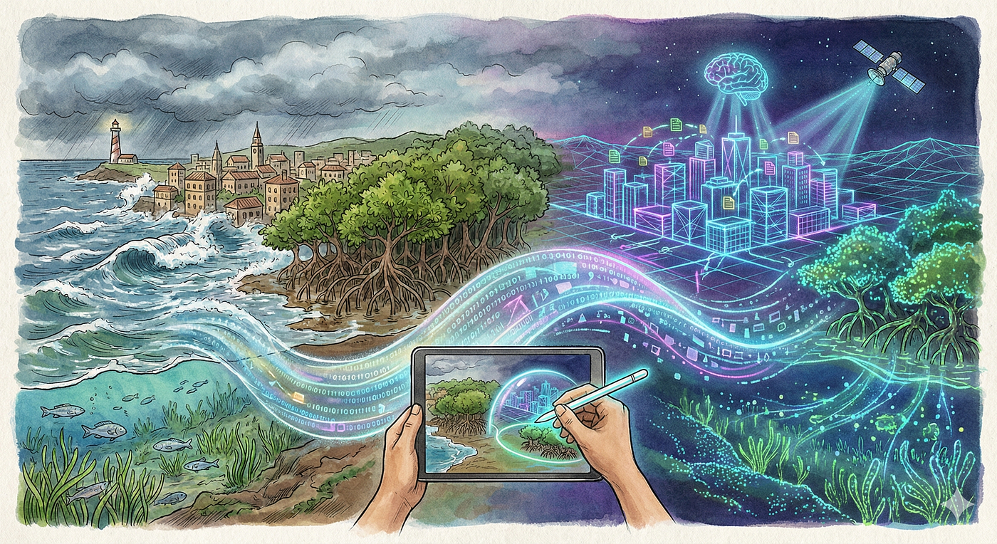
For centuries, the map was a fixed object. It was a snapshot of the world frozen in time, drawn on paper or parchment, meant to endure for decades. A mountain stood where it stood; a coastline was a definitive line separating land from sea. But we no longer live in a world of static geography. We live in the Anthropocene, an era defined by rapid, human-induced change. Coastlines are retreating due to rising sea levels. Forests are shifting their ranges as temperatures climb. Cities are expanding and contracting in a chaotic rhythm. In this volatile environment, a static map is not just obsolete; it is dangerous. To navigate the climate crisis, humanity is building a new kind of map. It is not a drawing, but a nervous system. It is a dynamic, living digital infrastructure that combines the spatial precision of Geographic Information Systems (GIS) with the predictive power of Artificial Intelligence (AI) and the real-time sensory input of the Internet of Things (IoT). This convergence is creating a “Digital Pulse” of the planet — a continuous stream of data that allows us to monitor the breath of a rainforest, the heat signature of a megacity, and the carbon stored in a seagrass meadow, all in near real-time. This transformation is not merely technical; it is existential. As extreme weather events become more frequent and unpredictable, the ability to simulate the future has become a survival skill. Urban planners are no longer just designing roads; they are building “Digital Twins” to test how those roads will hold up against a 100-year flood. Conservationists are no longer just counting trees; they are using satellite algorithms to monetize the carbon stored in mud, creating economic lifelines for coastal communities.
This blog post explores the frontier of these technologies as they stand in 2026. It delves into the mechanics of how we measure the planet, from the microscopic spectral bands of satellites to the social dynamics of participatory mapping. It examines the shift from reactive disaster management to proactive resilience planning. And it tells the stories of the people — from the data centers of the Global North to the mangrove swamps of the Global South — who are using these tools to secure a future for their communities. This is the story of how we are learning to see the world in motion.
The Era of the Urban Digital Twin
2.1 Defining the Concept: More Than a 3D Model
The term “Digital Twin” has become a buzzword in the technology sector, often applied loosely to any three-dimensional visualization of a city. However, in the academic and professional domains of climate resilience, the definition is far more rigorous. A true Urban Digital Twin (UDT) is a bi-directional, multi-layered digital representation of a city that enables visualization, simulation, and evaluation based on dynamic data flows. It is not a static archive; it is a mirror world that evolves in sync with the physical world [1, 2].
The distinction between a standard 3D GIS model and a Digital Twin lies in the flow of information. A traditional GIS model is static: it contains data on building heights, road networks, and drainage systems as they existed at the time of the survey. A Digital Twin, however, is connected to the physical infrastructure through a network of sensors — the Internet of Things (IoT). These sensors provide real-time updates on water levels in storm drains, traffic density on highways, energy consumption in buildings, and even air quality on street corners.
Scholars currently debate the precise taxonomy of these systems. Some experts argue that many existing platforms are effectively “Digital Shadows” — systems that receive a one-way flow of data from the city to the model — rather than full twins, which implies a two-way loop where the model can also automatically control city systems (e.g., changing traffic lights or opening floodgates). However, for the purposes of climate resilience, even the “Digital Shadow” represents a revolutionary leap forward. It moves the discipline of urban planning from a reliance on historical averages to an engagement with real-time reality [2].
The architecture of a UDT is built on layers. At the base is the geometric layer: the physical 3D shape of the city, often derived from LiDAR scans or photogrammetry. Above this sits the semantic layer, which contains information about what the objects are (e.g., “this 3D box is a hospital,” “this line is a high-voltage cable”). Finally, there is the dynamic layer, where the live data streams are integrated. This integration allows for a “system of systems” approach, where the city is understood not as a collection of separate objects, but as a complex, interconnected web of dependencies [1, 3].

2.2 Simulating Climate Chaos: The Power of “What If”
The primary driver for the adoption of UDTs in 2026 is the urgent need for disaster risk management. Climate change has broken the reliability of historical weather data. Planners can no longer look at flood records from 1950 to predict the risks of 2030. The rules have changed. UDTs provide a sandbox where planners can simulate the unprecedented.
One of the most critical applications is the simulation of flooding and sea-level rise. Traditional flood maps are often “bathtub models” — they simply raise the water level on a topographic map and mark everything below that line as flooded. UDTs allow for hydrodynamic modeling. They simulate the physics of how water moves through a city. They calculate how floodwaters will flow down specific streets, how they will pool in underpasses, how they will be diverted by buildings, and how fast they will rise.

- Sea-Level Rise Evaluation: By modeling different emission scenarios (low, medium, high), UDTs can show the hyper-local effects of sea-level rise over the coming decades. They can identify which specific electrical substations will be corroded by salt water, or which emergency escape routes will be cut off during high tide [3].
- Infrastructure Dependencies: Perhaps the most valuable insight provided by UDTs is the visibility of “cascading failures.” A city is a knot of dependencies. A flood in one district might not just damage homes there; it might submerge a critical server room that manages traffic signals for the entire city. Or it might flood a power station that supplies electricity to sewage pumps in a completely different neighborhood, causing a sewage backup miles away from the flood zone. UDTs use “knowledge graphs” to map these connections, allowing planners to see how a localized event can trigger a systemic collapse. This supports “intelligent design,” enabling engineers to harden critical nodes that create the biggest ripple effects [3, 4].

Table 1: This table illustrates the functional differences between traditional GIS approaches and the emerging Digital Twin methodology in the context of disaster management.
2.3 The Human-Centered Approach: Immersive Planning
A significant criticism of early “Smart City” initiatives was their technocratic nature. They often treated the city as a machine to be optimized, ignoring the messy, subjective reality of the humans living within it. The current wave of research in 2025 emphasizes “human-centered” resilience.
This shift is enabled by technologies like “networked immersion” and “virtual human teleportation.” These fanciful terms describe a practical capability: the ability for stakeholders to virtually inhabit the Digital Twin. Instead of showing a community group a complex 2D graph of flood risk probabilities, planners can use the UDT to create an immersive visualization. A resident can “stand” on their own street corner in the virtual model and see what a 0.5-meter sea-level rise would actually look like. They can see the water lapping at their doorstep.
This visceral communication is crucial for bridging the “knowledge-action gap.” Scientific risk assessments often fail to motivate change because they are abstract. A UDT makes the risk concrete. It helps residents understand why disruptive adaptation measures — such as building a sea wall that blocks a view, or relocating a neighborhood — are necessary. It fosters a collective understanding of the threat [1,3].
Furthermore, advanced UDTs are beginning to integrate “multi-agent systems” (MAS). This involves using AI to simulate the behavior of the population during a disaster. If a flood warning is issued, how do people react? Do they follow the evacuation signs? Do they drive to schools to pick up children? Do they panic and clog the highways? By simulating thousands of individual “agents” (virtual people) with different priorities and behaviors, planners can test the effectiveness of their emergency plans against the chaotic reality of human psychology [3].
2.4 Barriers to Implementation: The Global South Context
While the promise of UDTs is immense, their deployment is uneven. Much of the literature and development is focused on wealthy cities in the Global North. However, the cities most vulnerable to climate change are often in the Global South, where resources and data are scarce.
A major barrier is the “Data Silo” problem. A functioning UDT requires data from dozens of different agencies — water, power, transport, private telecommunications, and housing authorities. In many cities, these agencies do not share data, or they store it in incompatible formats. There is a lack of universal standards for how this data should be structured, leading to significant interoperability issues.
Moreover, a model built for a planned European city cannot simply be copy-pasted to a rapidly growing metropolis in Africa or Asia. The “CityTime” model, introduced by researchers at Politecnico di Milano, advocates for “context-sensitive” planning. It argues that UDTs must be adapted to the specific morphological and socio-economic fabric of the city. In a city with large informal settlements, for example, there may be no official data on building footprints or population density. Here, the UDT might need to rely on different data sources, such as satellite imagery analysis or community-collected data, rather than official municipal records [1, 4].
3. The Blue Carbon Frontier
While urban centers arm themselves with digital shields, a different kind of battle is being waged in the quiet, muddy fringes of the coast. This is the frontier of “Blue Carbon.”
3.1 The Hidden Carbon Sinks
Blue Carbon refers to the carbon dioxide sequestered from the atmosphere by the world’s coastal ocean ecosystems: mainly mangroves, tidal marshes, and seagrass meadows. For decades, these ecosystems were viewed primarily as habitats for fish or barriers against storms. Their role in the global carbon cycle was underestimated.

Recent science has revealed that these ecosystems are disproportionately powerful carbon sinks. Although they cover a tiny fraction of the Earth’s surface compared to terrestrial forests, they can sequester carbon at a rate up to five times higher per hectare. The secret lies in the soil. In a terrestrial rainforest, much of the carbon is stored in the biomass of the trees — the trunks, branches, and leaves. When these trees die and decompose, or when they burn, that carbon is released back into the atmosphere. In a mangrove forest or seagrass meadow, however, the soil is waterlogged and anaerobic (lacking oxygen). This prevents the bacteria that break down organic matter from functioning effectively. As a result, leaves, roots, and other organic debris that fall into the mud do not decompose. They accumulate, layer by layer, for centuries or even millennia. The soil beneath a mangrove forest is a carbon vault [5, 6, 7].
Interest in Blue Carbon has exploded. Bibliometric analysis shows that research publications on the topic have grown at an annual rate of 16.9% between 1990 and 2022. While mangroves have historically received the most attention due to their visibility, there is a growing urgency to map and protect seagrasses and salt marshes, which are harder to see but equally vital [8].
3.2 The Measurement Challenge (MRV)
The central problem with Blue Carbon is accounting. You cannot manage what you cannot measure. Furthermore, you cannot sell what you cannot measure. The rise of the voluntary carbon market offers a potential financial lifeline for these ecosystems. Companies like Apple or Microsoft are willing to pay for “carbon credits” to offset their emissions. But to sell a credit, a project must prove — with scientific rigor — exactly how much carbon it is sequestering.
This process is known as Monitoring, Reporting, and Verification (MRV). Traditionally, MRV required “ground truthing”: teams of scientists trudging through waist-deep mud to measure the girth of trees and take soil core samples. This method is accurate, but it is slow, expensive, and physically exhausting. It is impossible to scale this manual approach to cover the millions of hectares of coastline that need protection.
This is where GIS and remote sensing have become the economic engines of conservation. The goal is to develop methods to estimate carbon stocks from the sky, using satellites and aircraft to measure the forest without touching it. This requires establishing a correlation between what the satellite “sees” (light reflected from the canopy) and what is actually there (the biomass of the trees and the carbon in the soil) [6, 9].
3.3 The Remote Sensing Toolkit
To solve the MRV puzzle, scientists employ a variety of sensors, each providing a different “layer” of information.
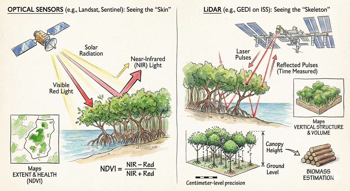
Optical Sensors (Satellite Imagery): These are the most common tools. Satellites like Landsat and Sentinel measure the solar radiation reflected by the Earth’s surface. Healthy vegetation absorbs visible red light (for photosynthesis) and reflects near-infrared (NIR) light. By comparing these two bands, scientists calculate indices like the Normalized Difference Vegetation Index (NDVI), which serves as a proxy for plant health and density. Optical sensors are excellent for mapping the extent of an ecosystem — drawing the boundaries of where the mangroves start and end [10, 11].
LiDAR (Light Detection and Ranging): While optical sensors see the “skin” of the forest, LiDAR sees its “skeleton.” LiDAR systems beam pulses of laser light at the ground and measure the time it takes for the reflection to return. This allows them to create a precise 3D model of the surface. For mangrove forests, LiDAR is the gold standard for biomass estimation. It can measure the height of the canopy with centimeter-level precision. Since there is a strong biological correlation between the height of a mangrove tree and its total biomass, LiDAR allows researchers to calculate the volume of wood in a forest from the air. The GEDI (Global Ecosystem Dynamics Investigation) mission, a LiDAR instrument mounted on the International Space Station, is currently providing the first high-resolution global map of forest vertical structure [8, 11].
Satellites offer a global view, but they are often thwarted by a simple enemy: clouds. In the humid tropics where mangroves thrive, cloud cover can obscure the ground for months at a time. Unmanned Aerial Vehicles (UAVs) bridge this gap. Drones can fly below the cloud deck, capturing imagery with resolutions as fine as 2 centimeters per pixel. This level of detail allows for “species-level” classification. A drone map can distinguish between a Rhizophora mangrove and an Avicennia mangrove, which is crucial because different species store carbon at different rates. Drones also allow for the detection of small-scale degradation, such as the illegal cutting of a few trees for charcoal, which might not register on a coarse satellite image.
4. The Satellite Wars: Landsat 8 vs. Sentinel-2
For the environmental GIS analyst, the choice of satellite data is a critical strategic decision. While there are many commercial satellites offering incredibly high resolution (like WorldView or Planet), their high cost makes them inaccessible for many conservation projects in the developing world. Therefore, the backbone of global environmental monitoring relies on open-access data, primarily from two giants: NASA’s Landsat 8 and the European Space Agency’s Sentinel-2.
Comparing these two systems reveals the technical nuances that determine the accuracy of climate reporting.
4.1 The Battle for Resolution
Spatial resolution defines the size of the smallest object a satellite can resolve. It is the size of the “pixel” in the image.
- Landsat 8: The Operational Land Imager (OLI) on Landsat 8 captures most spectral bands at a 30-meter resolution. One pixel represents a square on the ground that is 30 meters by 30 meters (900 square meters).
- Sentinel-2: The Multispectral Instrument (MSI) on Sentinel-2 captures its primary bands at 10-meter and 20-meter resolutions. A 10-meter pixel covers just 100 square meters.
In the context of a vast Kansas wheat field, this difference might be negligible. But in the fragmented, ribbon-like ecosystems of the coast, it is profound. Mangroves often grow in narrow strips along riverbanks, sometimes only 20 to 50 meters wide. If an analyst uses Landsat 8 to map a riverbank that is 20 meters wide, the 30-meter pixel will inevitably fall on a boundary. It will include some water, some mud, and some trees. This results in a “mixed pixel” — a data point that is statistically muddy. The computer algorithm may struggle to classify it, often mislabeling it or discarding it.
With Sentinel-2’s 10-meter resolution, the pixels are small enough to fit entirely within the mangrove strip. This allows for “pure” pixels that accurately reflect the spectral signature of the vegetation. Studies comparing the two sensors for land cover mapping in diverse environments, from the savannahs of Burkina Faso to the rainforests of Brazil, have consistently found that Sentinel-2 yields higher classification accuracies — often improving results by 4–5% simply due to this finer spatial grain.
4.2 The “Red-Edge” Advantage
Beyond resolution, the two satellites differ in spectral capability — the specific colors of light they can see. Both satellites see the visible spectrum (Blue, Green, Red) and the Near-Infrared (NIR). However, Sentinel-2 possesses a unique capability: the Red-Edge bands.

The “Red-Edge” is a specific region of the light spectrum (around 700–780 nanometers) located right at the boundary between visible red light and near-infrared. This is the point where the reflectance of green vegetation shoots up dramatically. It is the spectral cliff that defines plant life. Landsat 8 does not have sensors dedicated to this transition zone. Sentinel-2 has three. This capability is a game-changer for monitoring vegetation health. The exact shape of the reflectance curve in the red-edge region is highly sensitive to the chlorophyll content and cellular structure of the leaf. It allows analysts to do more than just see green; it allows them to see stress. A mangrove forest that is suffering from changes in water salinity or pollution might look “green” to a standard sensor, but the red-edge bands can detect the subtle drop in chlorophyll efficiency before the leaves actually turn yellow. This provides an early warning system for ecosystem collapse. Furthermore, the red-edge helps in differentiating between species that otherwise look identical, improving the accuracy of biodiversity maps [13].
4.3 Synergy: The Power of Combination
Despite the technical superiority of Sentinel-2 in resolution and red-edge sensing, Landsat 8 remains indispensable. Its primary advantage is its legacy. The Landsat program has been running since the 1970s, providing a 50-year archive of planetary change. Sentinel-2 only launched in 2015. To understand the long-term trends of climate change, analysts need Landsat.
In 2026, the best practice is not to choose one or the other, but to use them in synergy. By combining the orbits of Landsat 8, Landsat 9, and the two Sentinel-2 satellites (2A and 2B), researchers can create “dense time series.” In cloudy regions like the Amazon or the Congo Basin, a single satellite might only get a clear, cloud-free shot of the ground once every few months. By combining all these sensors, the “revisit time” drops to a few days. This increases the statistical probability of finding a hole in the clouds. Research confirms that the data from these different sensors is highly compatible. After applying “atmospheric correction” (algorithms that remove the haze and distortion caused by the air), the reflectance values from Landsat and Sentinel are consistent within a margin of roughly 4–10%. This allows them to be stitched together into a single, continuous movie of the planet [15, 16].
5. The Algorithmic Brain: AI and Machine Learning in GIS
Collecting petabytes of satellite imagery is useless if we cannot extract meaning from it. The sheer volume of data produced by modern earth observation constellations has far outstripped the human capacity for manual analysis. We have entered the age of AI-driven GIS.
5.1 The Engine Room: Google Earth Engine (GEE)
The platform that has democratized this power is Google Earth Engine (GEE). GEE is a cloud-based computing platform that hosts a multi-petabyte catalog of satellite imagery and geospatial datasets. Before GEE, a researcher wanting to map the mangroves of Indonesia would have to download thousands of individual satellite scenes to a local server, process them one by one, and stitch them together — a task that could take months. With GEE, the data sits on Google’s servers. The researcher writes a script (in JavaScript or Python) to query the data, and the processing is distributed across thousands of Google’s processors. A global analysis that used to take months can now be run in minutes. This speed allows for iterative science; researchers can tweak their algorithms and re-run the analysis instantly, accelerating the pace of discovery [17].
5.2 Random Forest: The Workhorse of Classification
The most widely used Machine Learning (ML) algorithm in environmental remote sensing is the Random Forest (RF) classifier. Mapping a coastline involves a classification problem: for every pixel in the image, the computer must decide, “Is this mangrove, water, mud, or urban concrete?” Random Forest solves this by creating a “forest” of decision trees.
- Training: The human analyst provides “training data” — examples of what different land covers look like (e.g., “these 500 pixels are definitely mangroves”).
- The Trees: The algorithm builds hundreds of decision trees. One tree might ask, “Is the pixel highly reflective in the Near-Infrared?” Another might ask, “Is the pixel located at a low elevation?” Another might check the texture.
- Voting: When presented with a new, unknown pixel, every tree in the forest makes a guess. The algorithm then tallies the votes. If 80 trees say “mangrove” and 20 say “forest,” the pixel is classified as mangrove.
This “ensemble” approach is incredibly robust. It handles the noise and variability of satellite data better than simpler algorithms. Studies mapping Blue Carbon stocks in China and the Coral Triangle have achieved overall accuracies of over 87% using Random Forest on GEE, establishing it as the industry standard for broad-scale mapping [5, 17].
5.3 The Frontier: Deep Learning and Computer Vision

While Random Forest is powerful, it has a limitation: it looks at pixels largely in isolation. It doesn’t understand context. The cutting edge of research is moving toward Deep Learning, specifically Convolutional Neural Networks (CNNs). A CNN processes an image more like a human brain. It looks for shapes, patterns, and textures. Consider the difference between a natural mangrove forest and a shrimp aquaculture pond. Spectrally (in terms of color), they might look very similar — both are wet and dark. A Random Forest classifier might get confused. However, a shrimp pond has a distinctive rectangular shape. A natural forest is organic and irregular. A CNN can recognize the geometry of the pond. It identifies the straight lines and corners. This ability to “see” spatial context allows Deep Learning models to distinguish between natural wetlands and the artificial structures that threaten them. While these models require significantly more computing power and larger training datasets, they represent the future of automated environmental monitoring [9].

Table 2: This table compares these two dominant algorithmic approaches.
6. Case Studies: Technology in the Real World
The true test of these technologies is not in the accuracy of the algorithm, but in the impact on the ground. How does a pixel on a screen translate to a preserved livelihood in a coastal village?
6.1 Vida Manglar: The Economics of Blue Carbon
In the Gulf of Morrosquillo, Colombia, the Vida Manglar (“Mangrove Life”) project serves as a beacon for the financial potential of GIS. The project protects 7,500 hectares of mangroves in Cispatá Bay. It is a collaboration between Conservation International, the Omacha Foundation, and local environmental authorities. What makes Vida Manglar historic is its rigorous accounting. It was the first Blue Carbon project to successfully certify the carbon stored in the soil using the methodologies verified by Verra (the world’s leading carbon standard body). Using a combination of remote sensing to map the extent of the forest and extensive field sampling to calibrate the soil carbon values, the project demonstrated the immense value of the ecosystem. This rigorous data allowed the project to issue high-quality carbon credits. These credits were purchased by Apple as part of its goal to become carbon neutral. The revenue generated does not vanish into administrative fees; it is funneled back to the local community. It funds the “Mangrove Stewards” — local residents who are paid to patrol the forest, maintain the hydrological channels, and monitor the health of the trees. Here, GIS acts as the auditor. The maps and data provide the transparency required to unlock global capital, turning the mangrove forest from a “wasteland” into a valuable asset that pays for its own protection [7, 18, 19].
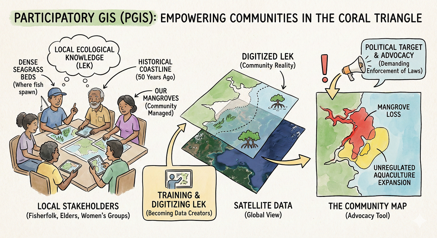
6.2 The Coral Triangle: Participatory GIS
In the Coral Triangle — the marine biodiversity hotspot spanning Indonesia, the Philippines, and their neighbors — the challenge is often governance. Who owns the reef? Who has the right to fish? Here, the Asia-Pacific Network for Global Change Research (APN) has funded projects that focus on Participatory GIS (PGIS). The technology is secondary to the sociology. The process involves training local stakeholders — fisherfolk, village elders, and women’s groups — to use mapping tools. They are not just data subjects; they become data creators. They map their “Local Ecological Knowledge” (LEK). A fisherman knows where the seagrass beds are densest; a village elder remembers where the coastline used to be fifty years ago. By digitizing this knowledge and overlaying it with satellite data, communities create powerful maps that reflect their reality. In places like the Philippines, these maps have been used to identify the “drivers” of mangrove loss. When a community sees a map showing that their mangrove loss correlates perfectly with the expansion of unregulated aquaculture, the abstract problem becomes a clear political target. The map becomes an advocacy tool, allowing communities to demand enforcement of environmental laws [20, 21].
6.3 Restoration in Aringay: The Right Tree in the Right Place
Restoration is difficult. Many mangrove planting projects fail, with mortality rates sometimes exceeding 90%. A common reason is “blind planting” — planting seedlings in areas where they cannot survive, such as on mudflats that are underwater for too long, or in soil that is too salty. In Aringay, La Union (Philippines), a project by Oceanus Conservation demonstrates the power of science-based restoration. Instead of random planting, the team used GIS analysis to identify suitable sites. They analyzed the elevation, the tidal inundation frequency, and the soil characteristics. They identified abandoned fishponds — areas that were once mangroves but had been converted for aquaculture — as the ideal sites for restoration. Because the hydrology of these ponds had been altered, the team used a technique called “mound planting” — raising the soil level to give the seedlings a fighting chance against the high water levels. The result? The survival of thousands of seedlings and the gradual return of a healthy forest. This success was not just about having willing volunteers; it was about having the spatial intelligence to know where to direct their energy [22].
7. Challenges and the Horizon
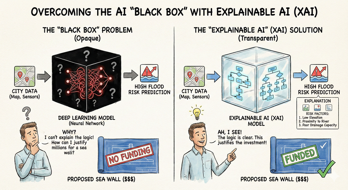
Despite the triumphs, the field faces significant hurdles. The “Black Box” Problem remains a concern in AI. If a Deep Learning model predicts a high flood risk for a neighborhood, but the planners cannot explain why the model made that decision (because the internal logic of the neural network is opaque), it is difficult to justify spending millions on a sea wall. The push for “Explainable AI” (XAI) is a major research frontier [23].
There is also the issue of Data Equity. As we build Digital Twins of the world, we must ask: who owns the model? If a private tech giant owns the Digital Twin of a city, do they effectively own the governance of its risks? The academic community strongly advocates for Open Data and Open Source software (like QGIS and GEE) to ensure that environmental intelligence remains a public good, accessible to the cities in the Global South that need it most [4, 24].
Looking ahead, the convergence of these tools points toward the Metaverse. This term is often dismissed as hype, but in the context of climate, it represents the ultimate visualization tool. Imagine a policy-maker in 2030 putting on a headset and stepping into a hyper-realistic simulation of their city. They can dial the year forward to 2050. They can turn a dial to increase global temperature by 2 degrees. And then, they can watch. They can see the storm surge hit the coast; they can see the crop failures in the hinterlands; they can see the migration of people. This immersive capability could be the key to unlocking the greatest barrier to climate action: empathy. By transforming abstract data into experiential reality, the Digital Twin might finally force us to believe our own eyes.
8. Conclusion
We have moved past the age of exploration. The blank spots on the map are gone. We are now in the age of monitoring. The challenge of the 21st century is not to discover new lands, but to understand the rapid, terrifying changes occurring in the lands we already occupy.
GIS has evolved from a tool for making maps into a tool for saving lives. Whether it is a Digital Twin helping a city engineer reroute power to a hospital during a flood, or a satellite algorithm helping a Colombian community get paid for the carbon in their soil, these technologies are rewiring our relationship with the planet. They are giving the Earth a voice — a digital pulse that speaks in the language of data. The question now is whether we are willing to listen.
References
2- City digital twins for urban resilience
6- Technological Innovations for Blue Carbon Monitoring and Verification
7- How Colombia’s mangrove stewards are pioneering a climate and nature-positive approach
8- Trends in the application of remote sensing in blue carbon science
9- Advances in Earth observation and machine learning for quantifying blue carbon
10- Practical mapping methods of seagrass beds by satellite remote sensing and ground truthing
11- Estimate biomass using GEDI and Landsat data
12- Monitoring mangrove-based blue carbon ecosystems using UAVs: a review
19- Premium Colombian Carbon Credits
20- Blue carbon ecosystems in the Coral Triangle: A perceptive approach to climate adaptation
21- Coral Triangle
메타데이터
- post_id
- b9c4020ea25f
- slug
- the-digital-pulse-how-we-are-wiring-the-planet-to-survive-the-climate-crisis-b9c4020ea25f
- url
- https://medium.com/@taremyor/the-digital-pulse-how-we-are-wiring-the-planet-to-survive-the-climate-crisis-b9c4020ea25f
- canonical_url
- https://medium.com/@taremyor/the-digital-pulse-how-we-are-wiring-the-planet-to-survive-the-climate-crisis-b9c4020ea25f
- author_url
- https://medium.com/@taremyor
- status
- ok
- fetched_at
- 2026-07-15 02:19:31