Design Tokens Naming 101: The Building Blocks
If a design system is a building, design tokens are the building blocks that make it up. Learn more about how it works.
Design Tokens Naming 101: The Building Blocks
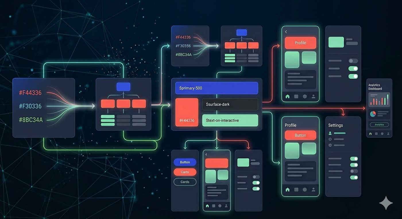
Design tokens illustration generated with Gemini 3 Fast
If a design system is a building, design tokens are the building blocks that mak\d\e it up. These blocks are utilized for storing and retrieving values like colors, sizes, or spacing. But in order to effectively build and scale our design system using these ‘blocks’, we’ll need a method to distinguish them. We require names that are easy to remember and make sense.
A Good Name
Naming is hard, and the same goes for naming design tokens. But once we have a suitable way to name our design tokens, we will see improvements in:
- Clarity: Tokens with clear, functionally-related names reduce confusion.
- Consistency: Consistent naming patterns make the design system easier to manage and update.
- Collaboration: good token names enhances mutual understanding and teamwork among team members.
When naming a design token, it’s important to consider what it is called, what it means, how it will be used, and how it will scale.
What It’s Called
Let’s say you want to convert a raw value into a design token to be used later in the design. It is blue with a HEX value of **#005aaa** which will be the brand color. But, what specific shade of blue are you referring to? How can you tell this blue apart from the others in the palette?
To set it apart, we will link the token to a name that indicates its intensity. Given that #005aaa has an intensity of 700 within a color range from 50 to 950 it our palette, we will call it — blue-700.
Voila! Isn’t it awesome?* *— blue-700 has just made #005aaa so much easier to remember!
Introducing Primitive Tokens
Since — blue-700 directly reference a raw value, this token can be considered as a ‘primitive’. In computing language, **primitives** are the simplest elements available in a programming language. A primitive is the smallest ‘unit of processing’ available to a programmer of a given machine, or can be an atomic element of an expression in a language.
Primitives are units with a meaning, i.e., a semantic value in the language. Here’s an example of primitives:
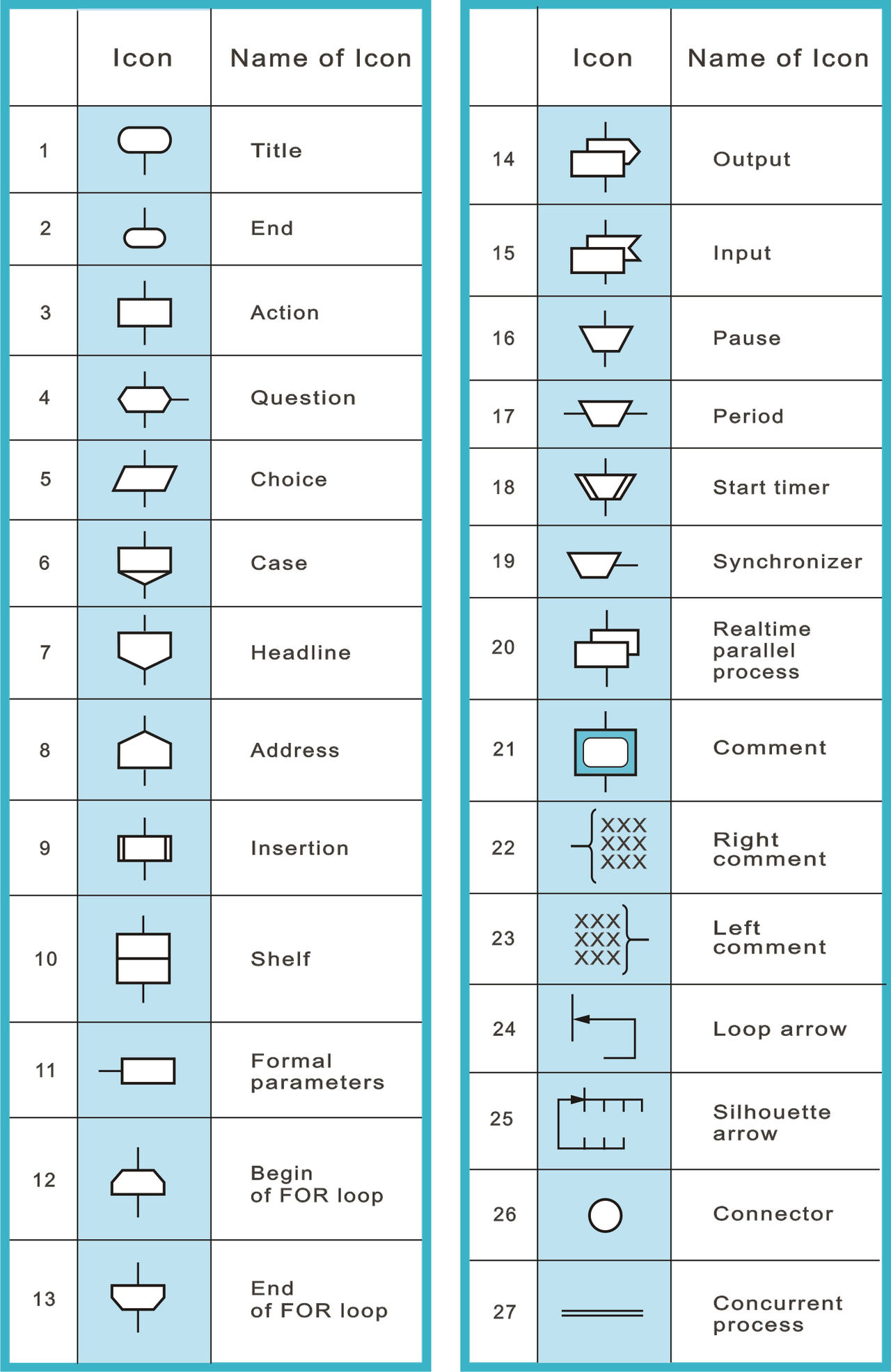
By Владимир Паронджанов — Own work, CC BY 3.0, https://commons.wikimedia.org/w/index.php?curid=28977722
In a design system, primitive tokens are the lowest level design tokens since it is closest to the raw value. It is how we reference raw values such as color, spacing, font size, border width, radius, etc. We can think of primitive tokens as the “ingredients” of a design system.
A couple of examples:
- — size-rem represents a 8px size.
- — spacing-2 represents a 16px space.
- — radius-2 represents a 4px radius.
Primitive tokens give names to values in a design system.
Primitive tokens are highly versatile tokens that can be associated with any values. They are context-agnostic and carry no other meaning than the raw values they represented. It gives names to raw values that are otherwise difficult to remember. With primitive tokens, designers and developers can pinpoint raw values with a greater accuracy.
As such, — blue-700 reveals that:
- The color family is blue.
- The color’s intensity is 700.
- The color’s raw value maps to #005aaa.
Here’s how we write down primitive tokens in CSS:
:root {
  /* Primitive Tokens ( --alias: value ) */
  --blue-700: #005aaa;
  --blue-400: #2dabff;
  --blue-200: #e0efff;
  --white:    #ffffff;
}
What It Means
Semantics is the study of meaning in language. For example, “end of route” and “last stop” technically mean the same thing, but students of semantics analyze their subtle shades of meaning. And meaning is what makes a difference.
In our case, blue can be assigned to any element in the design. It could be used as the button’s color, the icon’s color, the background’s color, or the text link’s color. But what does blue represent? What does exactly blue signify?
Introducing Semantic Tokens
Semantic tokens are tokens that are created to add meaning and purpose to design items, not just names for values.
For instance, — blue-700 is how we reference the color #005aaa. But — color-accent does more than that. It presents a layered narrative of what is to come. It tells that the color referenced by the — color-accent token will be used to emphasizes a design item and make it stand out. Semantic tokens consider the context of use and carry a deeper meaning.
Semantic tokens add meaning and purpose to values in a design system.
As such, — color-accent tells that:
- It is a design token for color;
- That’s used to make a design item stand out (accent);
- Which will be known as an accent color.
Here’s how semantic tokens are written down in CSS:
:root {
  /* Primitive Tokens ( --alias: value ) */
  --blue-950: #04284d;
  --blue-700: #005aaa;
  --blue-400: #2dabff;
  --blue-200: #e0efff;
  --white: #ffffff;

  /* Semantic Tokens ( --alias: var(tokenName, fallback value); ) */
  --color-accent: var(--blue-700, #005aaa);
  --color-accent-bright: var(--blue-400, #2dabff);
  --color-accent-dark: var(--blue-950, #04284d);
  --color-accent-muted: var(--blue-200, #e0efff);
  --color-inverse: var(--white, #ffffff);
}
How It’s Used
The primary reason we use primitive tokens and semantic tokens is to minimize cognitive load when communicating a design. Primitive tokens help with identifying values in a design system, while semantic tokens help with pinpointing their purposes.
However, to truly leverage the use of a design system, we will need to add another layer of design tokens, often referred to as component-specific tokens or simply component tokens.
So, you might wonder, what’s the point of adding an extra layer of design tokens when we already have primitive and semantic tokens in place? Won’t that potentially bloat the list in the future, making maintenance harder?
If the goal is a global change and we want every component using — color-accent to adopt a new blue — then updating the semantic token will be enough. That’s the whole point of semantic tokens, it is clean and efficient.
/* Before */
--color-accent: var(--blue-700, #005aaa);

/* After — one change, propagates everywhere */
--color-accent: var(--blue-800, #054b87);
But let’s say that we want to change the — color-accent blue only for the button, but not for links, chips, badges, or anything else sharing it. If we change the — color-accent value directly from — blue-700 to — blue-800, instead of having this:
- Button: — blue-800 ✅
- Chip: — blue-700
- Text link: — blue-700
We will rather have this:
- Button: — blue-800 ✅
- Chip: — blue-800 ❌
- Text link: — blue-800 ❌
Which is unintended. This unintended result happens because — color-accent is shared by all of the components above, not just the button. We still lack a way to override component-specific changes without affecting global semantic tokens.
But what if we are resolutely against adding an extra set of tokens to what we already have? Rather than that, a new semantic token will be created:
--color-accent: var(--blue-700, #005aaa); /* keep others unchanged */
--color-accent-button: var(--blue-800, #054b87); /* to isolate the button */
Granted, we insert only a single line of code. But look at what just happened: — color-accent-button is actually a component token! It's just living in the wrong layer and named ambiguously. We’ve arrived at the same destination but with muddier semantics, because the semantic layer is now carrying component-specific meaning it wasn't designed to hold.
Semantic tokens answer, “What is this color for?” and not, “How does this one component use it?”. The distinction comes down to scope of intent:
- Update the semantic token when the brand accent color needs to be updated everywhere;
- Update the component token when a specific component needs a different value.
Once we start adding component-specific entries to the semantic layer, we pollute its purpose and it scales poorly as our system grows.
But hey, I still beg to differ. Wouldn’t it be better to introduce a new accent color instead?
--color-accent: var(--blue-700, #005aaa); /* keep others unchanged */
--color-accent-darkerBlue: var(--blue-800, #054b87); /* to isolate the button */
Quite straightforward, to be sure.
However, assigning a global semantic name to a specific button component negates the advantage of using design tokens altogether. Instead of using the straightforward term — color-accent-button, we now need to keep in mind that — color-accent-darkerBlue points to the specific blue color reserved for the accent button. As these events happen more frequently, they will increase mental workload.
In conclusion, change the semantic tokens when the change should be global. But the moment we need to deviate from the semantic layer for a specific component without affecting others, component tokens become necessary.
The moment we need to deviate from the semantic layer for a specific component without affecting others, component tokens become necessary.
Introducing Component Tokens
So without further ado, let’s get familiar with component tokens. The benefits of having component tokens in place are:
- Per-component customization: Component tokens allow us to adjust only specific parts of a component without affecting the overall semantic tokens.
- Variant scalability: component tokens allow us to have multiple component variations such as — buttonSecondary, — buttonDanger, or — buttonGhost. It also allow us to include state logic of a component, such as — enabled, — hover, — focus, — pressed, and — disabled.
- Theming capability: component tokens allow us to swap layers between modes such as dark/light theme or multi-brand setups easily.
Here’s what component tokens would look like:
:root {
/* Primitive Tokens ( --alias: value ) */
  --blue-950: #04284d;
  --blue-700: #005aaa;
  --blue-400: #2dabff;
  --blue-200: #e0efff;
  --white: #ffffff;

/* Semantic Tokens ( --alias: var(tokenName, fallback value); ) */
  --color-accent: var(--blue-700, #005aaa);
  --color-accent-bright: var(--blue-400, #2dabff);
  --color-accent-dark: var(--blue-950, #04284d);
  --color-accent-muted: var(--blue-200, #e0efff);
  --color-inverse: var(--white, #ffffff);

/* Component Tokens ( --alias: var(tokenName, fallback value); ) */
  --button-primary: var(--color-accent, #005aaa);
  --button-primary-hover: var(--color-accent-bright, #2dabff);
  --button-primary-focus: var(--color-accent-bright, #2dabff);
  --button-primary-pressed: var(--color-accent-dark, #04284d);
  --button-primary-disabled: var(--color-accent-muted, #e0efff);
  --button-primary-text: var(--color-inverse, #ffffff);
}

/* CSS Classes */
.buttonPrimary {
  background-color: var(--button-primary);
  color: var(--button-primary-text);
}
.buttonPrimary:hover {
  background-color: var(--button-primary-hover);
}
.buttonPrimary:focus {
  background-color: var(--button-primary-focus);
}
.buttonPrimary:pressed {
  background-color: var(--button-primary-pressed);
}
.buttonPrimary:disabled {
  background-color: var(--button-primary-disabled);
  color: var(--button-primary-text-disabled);
  cursor: not-allowed;
}
Conclusion
So now we have the complete token chain that illustrates the proper flow of design tokens within a design system from start to finish. It goes like this:
Raw value > Primitive > Semantic > Component > CSS rule #005aaa > — blue-700 > — color-accent > — button-primary > background-color
And each layer in the flow has a clear role to fill in:
[embed]
With all the preparations in place, our design system can continue to grow without sacrificing consistency.
What’s Next?
This is the first part of a two-part exploration into identifying best practices for naming design tokens. Hopefully, this can help close the communication gap between development teams, particularly between designers and developers.
Thank you so much for reading! What Is a Design System (and Why Should You Care)?
Related Articles:
- **What is a Design System (and Why Should You Care?)**
- Design Tokens Naming 101: Tokens Pairing (coming soon!)
메타데이터
- post_id
- b9e5a2f16433
- slug
- design-tokens-naming-101-the-building-blocks-b9e5a2f16433
- url
- https://www.designsystemscollective.com/design-tokens-naming-101-the-building-blocks-b9e5a2f16433
- canonical_url
- https://www.designsystemscollective.com/design-tokens-naming-101-the-building-blocks-b9e5a2f16433
- author_url
- https://medium.com/@onepercentdesign
- status
- ok
- fetched_at
- 2026-06-21 22:26:41