Popups with Pure HTML and CSS
Using the magic of the <dialog> tag
Popups with Pure HTML and CSS
Using the magic of the <dialog> tag
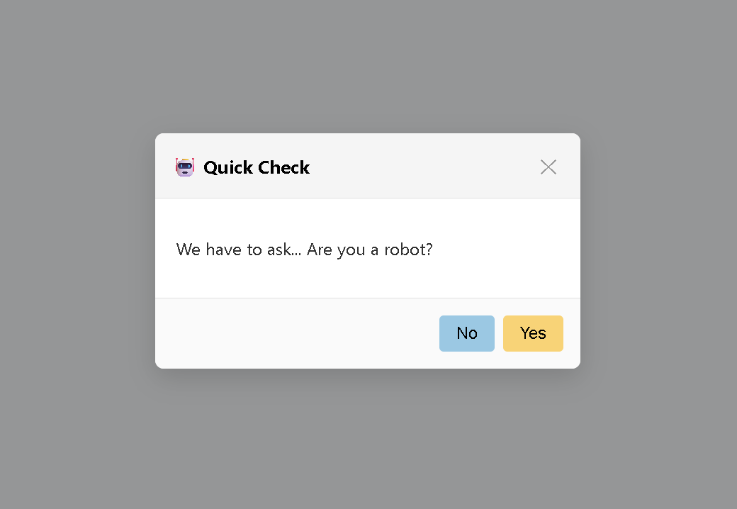
A popup designed using pure HTML and CSS with minimal JS.
Ah, we are back at it again, with our goal to make everything with pure CSS and HTML. I once again ask the same question:
How far can we go with just HTML and CSS?
I’ve done **dropdowns and [InPageTabs](https://medium.com/the-research-nest/inpage-tabs-with-pure-html-and-css-537d16597ad5) before. This time, I’m exploring popups — modals, dialogs, overlays**. Can we do those too, the pure HTML/CSS way?
Turns out, YES (almost)!
Once again, I’m extending AltCSS, and I needed a lightweight, no-JavaScript solution for popups. That meant digging into the native <dialog> element. And what I found was pretty awesome.
In this post, I’ll show you how to build functional, accessible popup dialogs using only HTML and CSS — no bloated JS, no frameworks.
Not a medium member? Read for free via **my friend link**!
🚧 What We’ll Cover
✅ The built-in <dialog> element and how it works.
🛠️ A minimal popup example using just HTML.
🧠 Deep dive into dialog’s native behavior and features.
🎨 How to enhance it with pure CSS.
📌 The Core Idea
Most tutorials will tell you modals require JavaScript for toggling state, trapping focus, managing backdrops, etc.
I have built some really bloated dialog boxes in my career, too, heavily using random state management, props, and whatnot.
But HTML already comes with a built-in solution: the <dialog> tag.
- It’s native.
- It’s simple.
- And it just works.
The real magic lies in how browsers treat <dialog> natively:
- It opens in the center of the screen.
- It comes with a backdrop that dims the rest of the page.
- It handles the Escape key to close itself.
- It traps focus inside while open (accessibility win).
- It can be closed via buttons inside the form using
method="dialog".
🧪 Minimal Working Popup (HTML Only)
Here’s a dead-simple popup example using only HTML.
<dialog id="popup">
  <form method="dialog">
    <h3>Popup Title</h3>
    <p>This is a basic popup dialog with a close button and some content inside.</p>
    <button>Close</button>
  </form>
</dialog>

<button onclick="popup.showModal()">
  Open Popup
</button>
That’s it! Just copy-paste it into an HTML file and open it in any modern browser or run it via an online HTML editor.
You can:
- Click “Open Popup” to trigger it
- Hit ESC to close it
- Click “Close” to close it via
form method="dialog" - Bonus: Use
popup.close()in any button’sonclickto manually close it.
Here’s a preview of the output you get.

On clicking the button
🔍 How the <dialog> Element Works
Let’s pause for a second and dig into what’s actually happening under the hood when you use a <dialog>.
1. Centered Layout, Built-In
Once the dialog is opened using .showModal() or .show(), the browser automatically:
- Places it fixed in the center
- Adds a backdrop (overlay behind the dialog)
- Traps focus inside the dialog
- Prevents interaction with elements behind it
You get all of this without writing any custom JavaScript or CSS hacks.
2. Opening and Closing
You can open a dialog in two ways:
popup.showModal(); // creates a modal dialog with backdrop
popup.show();      // opens without backdrop
To close it:
popup.close();But here’s the trick: inside the dialog, if you use a **<form method="dialog">, clicking any button inside that form will automatically close the dialog and return a value**.
<form method="dialog">
  <button value="yes">Yes</button>
  <button value="no">No</button>
</form>
The clicked button’s value is returned as the result. You can later read it using **popup.returnValue** (if using JS). But even without JS, this pattern allows simple, declarative popups.
3. Native Accessibility Features
- The dialog is focus-trapped: keyboard users can tab around, but focus won’t leave the popup.
- Pressing Escape will close the popup.
- The backdrop is natively rendered and blocks clicks outside.
- When the dialog opens, focus automatically shifts to the first focusable element inside.
This makes it a solid choice for accessible modals without external libraries.
🎨 Polished Demo
Let’s add some CSS and more semantic structure (like header, body, and footer sections within the element) to our popup to create a polished demo.
<dialog id="robotDialog">
  <form method="dialog">
    <header>
      <h3>🤖 Quick Check</h3>
      <button type="button" aria-label="Close" onclick="robotDialog.close()">✕</button>
    </header>
    <section>
      <p>We have to ask... Are you a robot?</p>
    </section>
    <footer>
      <button value="no">No</button>
      <button value="yes">Yes</button>
    </footer>
  </form>
</dialog>

<div class="centered">
  <button
    id="open-dialog-btn"
    onclick="robotDialog.showModal()"
  >
     Verify Identity
  </button>
  <div id="result" aria-live="polite"></div>
</div>
Note that if you are invoking the dialog directly with the “id” of the element, you must place the dialog HTML above the button HTML so that it is defined before it is accessed by the button.
Here’s the corresponding CSS.
body {
  height: 100vh;
  margin: 0;
  display: flex;
  justify-content: center;
  align-items: center;
  font-family: system-ui, sans-serif;
  background: #f9fafb;
}

.centered {
  text-align: center;
}

/* Button */
#open-dialog-btn {
  padding: 0.75rem 1.5rem;
  font-size: 1rem;
  background-color: #6366f1;
  color: white;
  border: none;
  border-radius: 6px;
  cursor: pointer;
  transition: background 0.3s ease;
}

#open-dialog-btn:hover {
  background-color: #4f46e5;
}

/* Dialog */
dialog {
  border: none;
  padding: 0;
  border-radius: 8px;
  width: 90%;
  max-width: 400px;
  box-shadow: 0 8px 24px rgba(0, 0, 0, 0.15);
}

dialog::backdrop {
  background-color: rgba(0, 0, 0, 0.4);
  backdrop-filter: blur(3px);
}

dialog form {
  display: flex;
  flex-direction: column;
  overflow: hidden;
}

dialog header,
dialog footer {
  display: flex;
  align-items: center;
  padding: 1rem;
}

dialog header {
  justify-content: space-between;
  background: #f5f5f5;
  border-bottom: 1px solid #e0e0e0;
}

dialog header h3 {
  margin: 0;
  font-size: 1.1rem;
}

dialog header button {
  background: none;
  border: none;
  font-size: 1.2rem;
  color: #999;
  cursor: pointer;
  transition: color 0.2s ease;
}

dialog header button:hover {
  color: #333;
}

dialog section {
  padding: 1.25rem;
  color: #333;
  font-size: 1rem;
}

dialog footer {
  justify-content: flex-end;
  gap: 0.5rem;
  background: #fafafa;
  border-top: 1px solid #e0e0e0;
}

dialog footer button {
  padding: 0.5rem 1rem;
  font-size: 0.95rem;
  border: none;
  border-radius: 4px;
  cursor: pointer;
  background-color: #e0e0e0;
  transition: background 0.2s ease;
}

dialog footer button:hover {
  background-color: #d4d4d4;
}

dialog footer button[value="yes"] {
  background-color: #ffd166;
}

dialog footer button[value="yes"]:hover {
  background-color: #ffca3a;
}

dialog footer button[value="no"] {
  background-color: #8ecae6;
}

dialog footer button[value="no"]:hover {
  background-color: #48bfe3;
}

@media (max-width: 500px) {
  dialog {
    width: 95%;
  }

  dialog section {
    padding: 1rem;
  }

  dialog header,
  dialog footer {
    padding: 0.75rem 1rem;
  }

  dialog footer {
    flex-direction: column;
    align-items: stretch;
  }

  dialog footer button {
    width: 100%;
  }
}

#result {
  margin-top: 1rem;
  text-align: center;
  font-size: 1rem;
  color: #374151;
}
You can use the CSS selector **dialog::backdrop** to change the default backdrop styling. In my case, I modified it as below.
dialog::backdrop {
  background-color: rgba(0, 0, 0, 0.4);
  backdrop-filter: blur(3px);
}
Here’s a little bit of JS to demonstrate how we can retrieve the values from the popup when it closes, using the robotDialog.returnValue parameter.
const resultBox = document.getElementById('result');

robotDialog.addEventListener('close', () => {
  const response = robotDialog.returnValue;
  if (response === 'yes') {
    resultBox.textContent = "🤖 Uh-oh. Robots aren't allowed!";
  } else if (response === 'no') {
    resultBox.textContent = "✅ Great! You're human. Welcome aboard.";
  } else {
    resultBox.textContent = "";
  }
});
Explore the live demo on **Codepen.io**.
[embed]
🎯 Wrapping Up
We just built a working popup modal using nothing but native HTML and a pinch of CSS.
No JavaScript libraries. No frameworks. No setup.
This is exactly the kind of pattern I love exploring while working on AltCSS — leaning into what the browser already gives us, and extending it with clean, minimal enhancements.
The <dialog> element is criminally underused, but it’s incredibly capable. And for many use cases (for example, think of a notification/banner component with this paradigm!), it’s all you need.
Following similar patterns, I added a popup component to AltCSS. To follow my progress and open source code for AltCSS, do star the GitHub repo.
Want to see more posts like this? Or curious about how to combine this with other HTML-only UI patterns? Let me know, and I’ll keep digging.
메타데이터
- post_id
- bb3de1a3eb63
- slug
- popups-with-pure-html-and-css-bb3de1a3eb63
- url
- https://medium.com/the-research-nest/popups-with-pure-html-and-css-bb3de1a3eb63
- canonical_url
- https://medium.com/the-research-nest/popups-with-pure-html-and-css-bb3de1a3eb63
- author_url
- https://medium.com/@xq-is-here
- status
- ok
- fetched_at
- 2026-06-14 11:28:49