Mass Killings in America: Data, Design, and Deception
Mass Killings in America: Data, Design, and Deception
By Breanna Harris, Nicole Keffer, Ella Krelovich, and Diana Romero Bermudez
Summary
Mass killing events in the United States are some of the most widely debated tragedies, used to fuel arguments on mental health, policing, and gun control. For this project, we worked with the Associated Press’s Mass Killings in America, 2006 — present. This dataset is updated almost daily with any new events that have occurred. For the purposes of this project, we downloaded the dataset on September 10, 2025, and the data is accurate for that point in time.
For our project, we had two goals:
- Make a clear, principled visualization that represented the dataset in an honest way.
- Explore deceptive visualizations that showed how small design choices are able to distort perception.
Process
We planned to use Harvard’s visualization sprint method for this project. The important thing to note with this method is that it is an iterative process, and that is going to help us create professional-level visualizations.
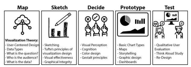
Harvard’s visualization sprint method
After selecting our dataset, we did some initial exploration into the details of each CSV file. This dataset includes 4 different CSV files, and we had to decide if we were going to combine all of them together for our analysis. To make it easier to read, we first made a small schema so we could decide what pieces of the dataset might tell the most interesting stories.
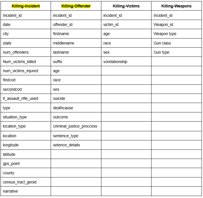
schema of each CSV file in the dataset
After some discussion, we decided that the killing incident and the killing offender CSV files could be combined in the most effective and interesting ways to tell stories.
We had a few ideas of what we thought would be most interesting when looking at the data set:
- The offender sentences (they match the incidents).
- Race vs sentence given (offenders and race)
- Different sentences vs the crime committed
- Mental health and violence
- Sentences (how did it happen, why did it happen, when)
In addition to this, we tried to categorize some of the schema variables into easier-to-understand categories:
- WHAT — offense
- HOW — weapon
- WHY — narrative/sentence
- WHEN — date
- LOCATION (not geographically) — school/bar/home/etc.
To get a general understanding of some data before sketching, we ran some SQL queries about the amount of mass killing events per location types.
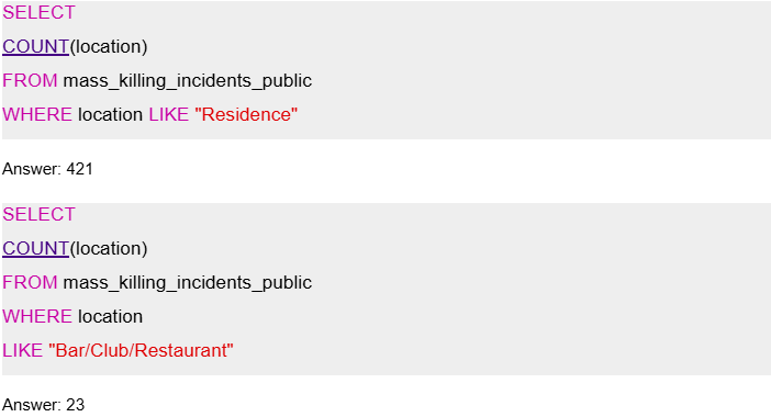
Example SQL Queries
Sketching
To best establish who would take on the clear or deceptive visualizations, we each made sketches about how the data could be visualized. Some sketches ended up being a stretch, which taught us that we needed to transform the data in a way that made sense for us.
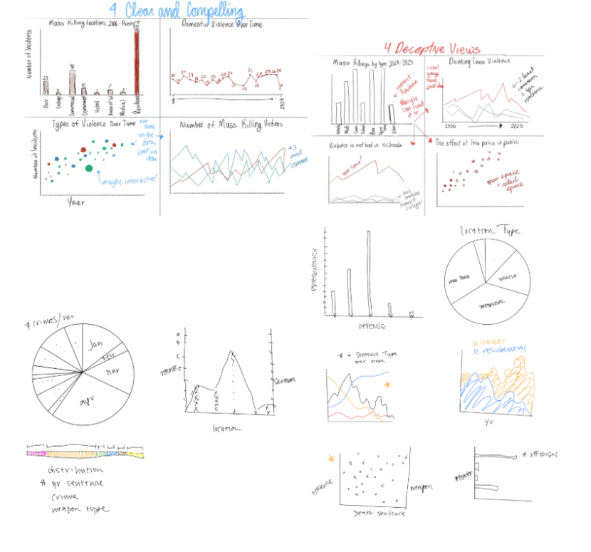
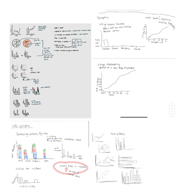
our collection of sketches
After presenting our individual sketches to each other, we divvied up the work into who would work together to make the clear and compelling visualizations and who would work to make the deceptive ones.
Prototypes
To set up the base dataset for the group, we aggregated the killing_incidents CSV file with the killing_offenders file on the incident_id.
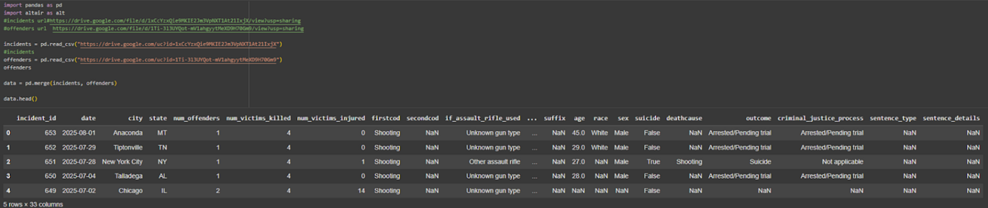
aggregated dataset
Clear Visualization 1
A lot of iteration went into landing on the first final graph of this project. The first thing that we looked at was the number of mass killing incidents per location type. This was based on the following sketch concept:
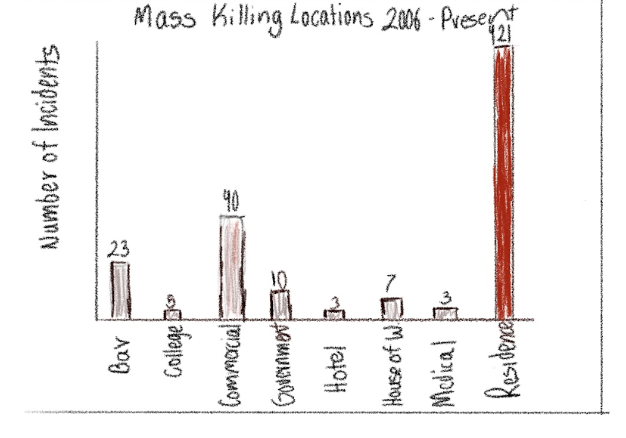
a sketch of a visualization representing the number of incidents by killing types
Using Altair, we wanted to see what the data looked like on an accurately defined scale.
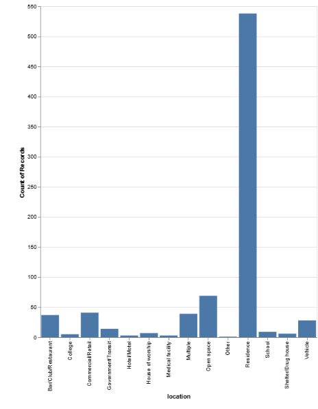
a visualization of the number of incidents by killing types
Our initial thoughts on implementing this graph were that the labels were hard to read, so we flipped the axes to make it easier to read.
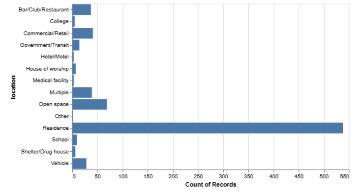
the visualization from above with flipped axes
To us, that looked a little easier to read, but the point that we were trying to get across is that there seems to be a large amount of domestic violence. We were not quite sure if this was coming across.
Our instinct was to draw people’s eyes even more to residential violence by making that one a separate, bold color. In the data visualization world, this is called double encoding. There are too many categories for categorical color to be reasonable. After deciding this, we pulled the chart into Illustrator for some edits before sending it out to get feedback.
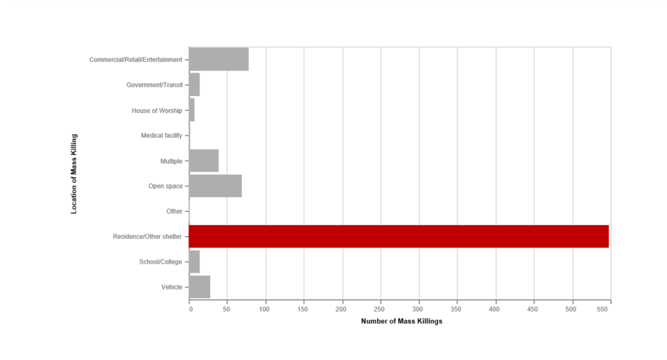
the edited visualization, highlighting one category in red
This is the visualization we sent out to some people for feedback, with no context other than to tell us what they thought:
- [killings happen] “Where people sleep”
- “I was thinking [killings happen] where homeless people sleep. It could also be where the most abuse happens.”
- “It makes me think that I’m not safe at home. That’s the place that I’m most likely to be killed at.”
Improvements to be made:
- Change the residence/shelter label to just residence — don’t want to perpetuate bad stereotypes
- The feeling surrounding the graph is what I wanted, but I think it might work in conjunction with another graph better to tell a story about domestic violence
- Remove one of the axis labels — the location of killings, which can be easily inferred
- Put the date range in the x-axis label; it can be confusing to see a number so high and put a lot of fear into people that all of this happened in a year and not over 19 years
We wanted to play around with some other data before we settled on what we thought was most compelling. We thought that the graph above said something, but it wasn’t as obvious to other people as it was to us.
The next thing we chose to make was a visualization displaying the prevalence of gun violence in residential killings (type of violence over time, filtered by residential violence).
First, we had to make a filtered data frame, setting location equal to residence.
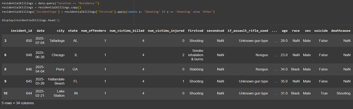
the code for the filtered data set
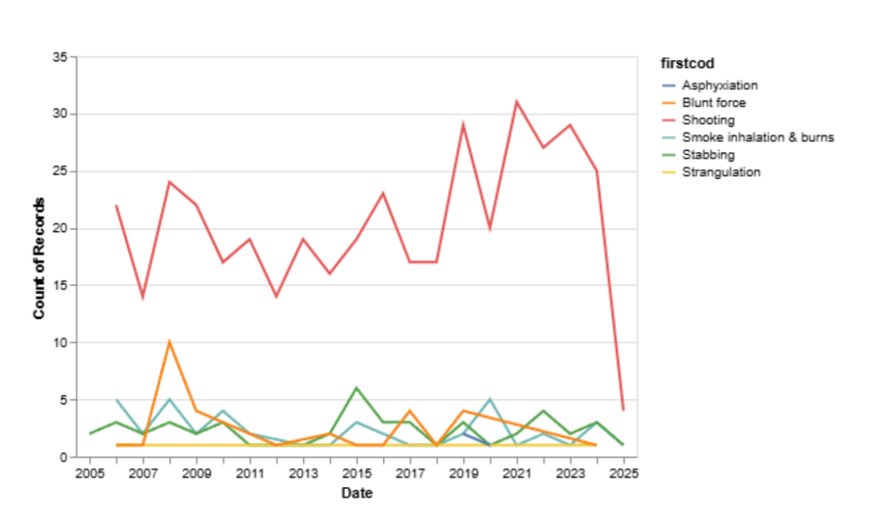
a line graph of types of mass killing violence types over time
This was not looking too great — it very obviously shows that gun violence is prevalent, but we think it is lacking on some design fronts. There are too many categories crowded into the bottom of the graph to make sense of what is going on.
We did not believe this was necessarily the right answer, but we wanted to see what story the visualization tells if it is shown in small multiples (separated by violence type).
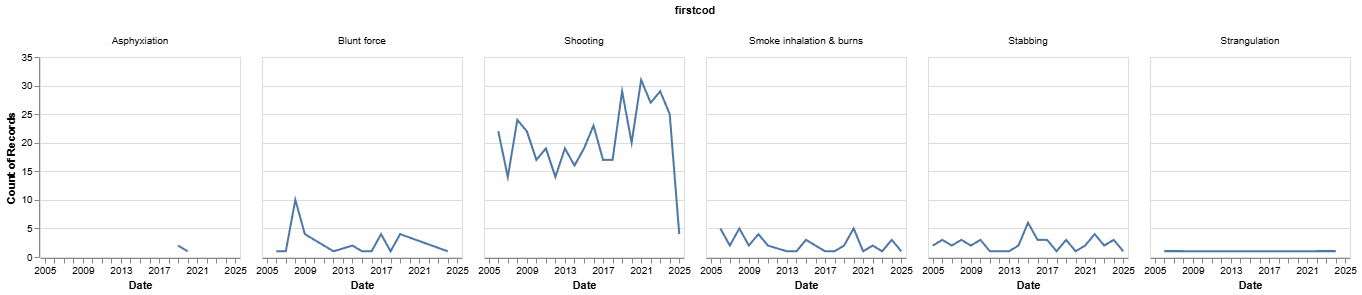
the visualization above but in small multiples
This was not the answer, but it revealed something very interesting about the data itself within residential killing incidents. There is almost no data about mass killings being done by asphyxiation or strangulation, which makes sense.
It made us want to transform this visual into something else — we want to show the number of killings per year and show the portion that is gun violence. There are a couple of ways we could do this, but for right now, we are going to play with a stacked bar chart.
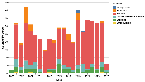
a stacked bar chart showing the proportion of each incident type to the total number of incidents each year
This is definitely not sorted the way we wanted. What we want to do is show just the proportion of gun violence to the rest of mass killing events. This stacked bar is not clear enough to tell a compelling story, and it is confusing to read.
To do this, we created a new column in the data frame called incidentType, which showed if the act of violence was a shooting or another type of violence.
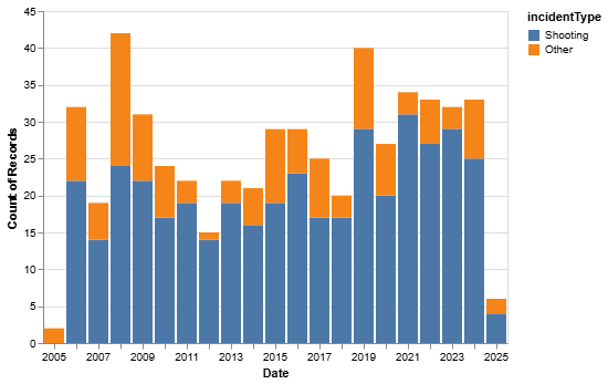
a stacked bar chart showing the proportion of gun violence to other violence in mass killing incidents
This is definitely more of what we wanted to see — it looks a little cleaner and tells a better story. There is a very sobering feeling that comes across at knowing most mass killing events are types of gun violence. At this point, I pull the chart into Illustrator for some more edits.
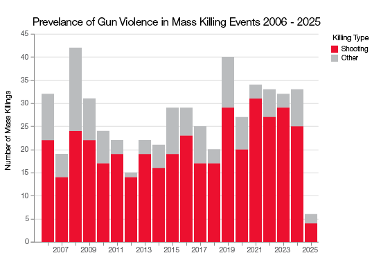
the graph from above with shootings represented in red and other types of violence in grey
This was the visualization we took into Demo Day for feedback from peers.
Clear Visualization 2
First, we prepped the data to show the years, sentence types, and the count of sentence types for each incident.
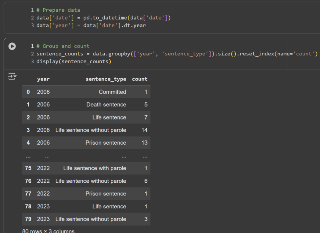
filtered data frame showing year, offender sentence type, and the number of sentence types
Then, we plotted this data on a line chart. We didn’t like the way it looked (too many categories, sharp angles), so we plotted it again with some design changes:
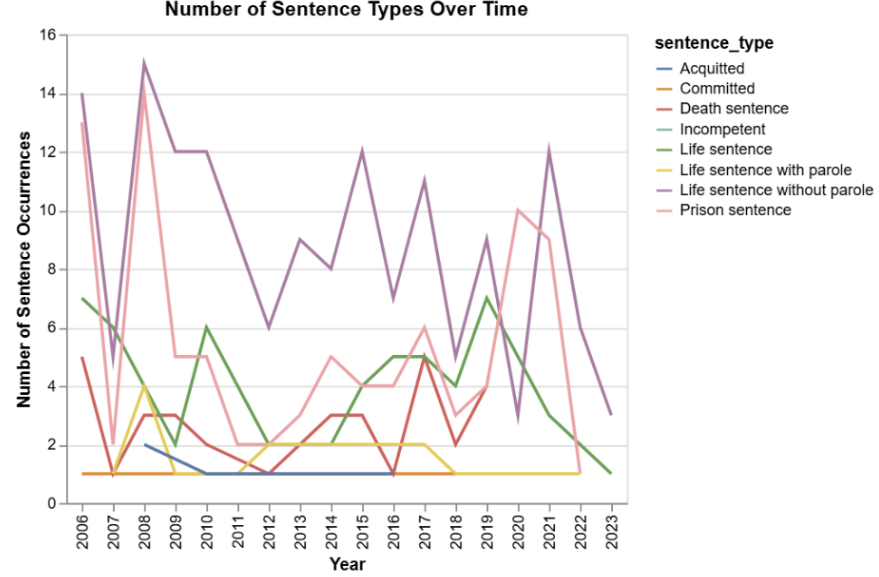
first line graph iteration showing the number of times each sentence type was given a year
We added points for each year, smoothed the line, and made the legend clearer. But it was still hard to read, and we didn’t see a story emerging from the data represented in the visualization.
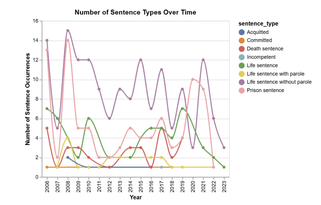
second iteration with some design edits
We decided that we only wanted to look at the top 3 or 4 types of sentences, grouped by their count. So, we filtered through the data frame again, ordering the counts descending:
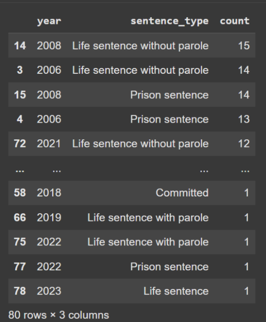
data frame with count sorted by descending
Then, we took that table and grouped it by sentence type:
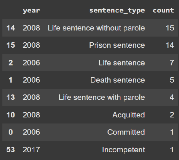
previous data frame grouped by sentence type
Then we plotted this table, noticing that it wasn’t exactly what we wanted:
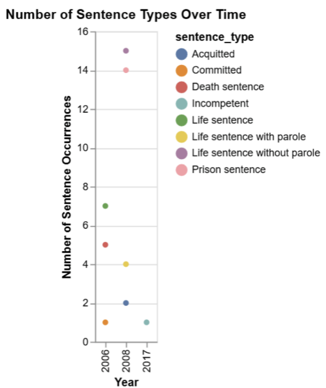
dot plot graph created based on the data frame above
When we went back and looked, we saw that when we grouped by sentence type, we got rid of the years– or dates over time– as well. We went back to the ordered data frame and ran a filter to remove anything that wasn’t “Life sentence without parole,” “Prison sentence,” or “Life sentence.” We got a new data frame with only the top counted sentences:
After we plotted this data, we got the three lines that we originally wanted. We also made sure the colors we used really drew the eye to the top line, helping to tell a story:
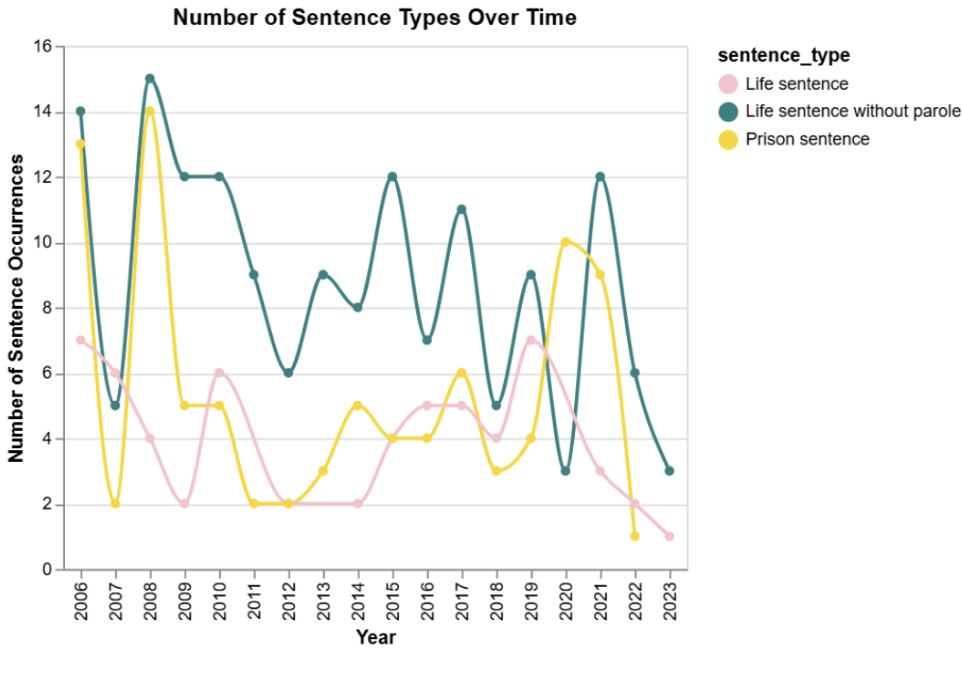
number of times each sentence type was given a year showing only the three most common sentence types
But after reconvening with the group, we decided to really narrow down on the gun violence narrative. So, we sorted the data frame once more to account for this. We removed any row that did not have a firstcod value equal to shooting:
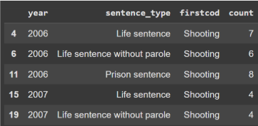
data frame sorted to only include gun violence incidents
We also wanted to experiment with more colors to match the first clear graph while still drawing the eye to the top line. We also wanted to fix the order of the legend so that it followed the lines top to bottom, giving us the second final graph to demo and get feedback on:
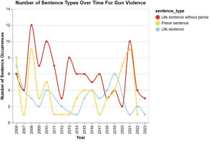
the final visualization going into demo day
Deceptive Visualization 1
First, we prepared the data to focus specifically on female and male offenders and their rates of suicide. While examining the data, we noticed a large disparity between male and female offenders. We realized we could use this difference to create a visualization that could be misleading.
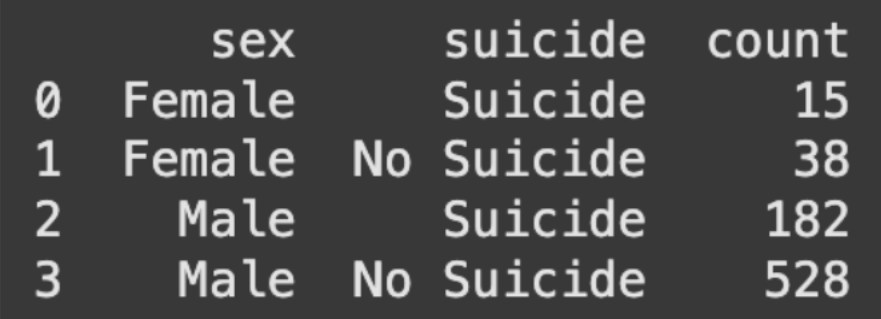
the count of offenders committing suicide after mass killing events
We initially created bar graphs using the data. However, we noticed that this version was not deceptive at all and accurately portrayed the information. We did, however, like the horizontal layout of the graph, as it made comparisons between the two groups clear.
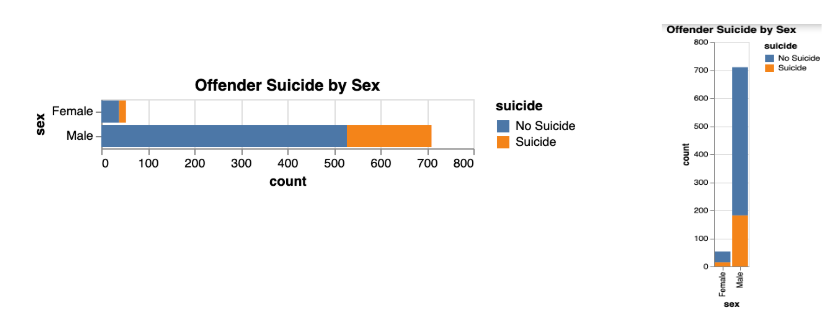
initial graph showing the amount of offenders that commit suicide, separated by gender
Next, we normalized the graph so that the bars for each sex were equal in size. This made the proportions appear similar even though the raw counts are very different.
Despite this improvement, the graph still needed further adjustments to be more deceptive. The title was not misleading enough, and the axis labels for sex and count were unnecessary for creating the intended visual effect.
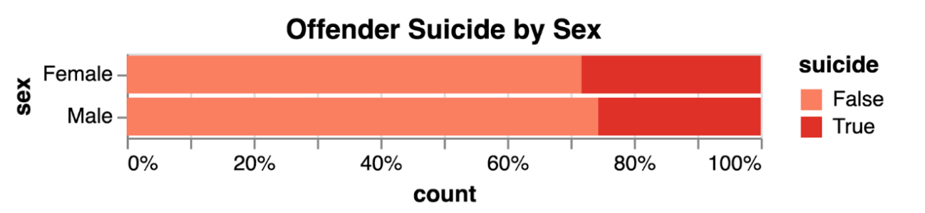
normalized version of the visualization above
This normalized stacked bar chart is deceptive because it hides the raw numbers behind percentages. Each bar is scaled to 100%, so the proportion of female offenders who committed suicide (for example, 30%) appears larger than that of male offenders (for example, 10%), even though the absolute number of male suicides is higher.
Deceptive Visualization 2
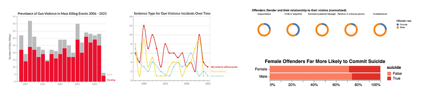
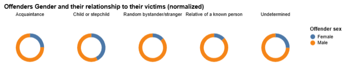
This chart shows the offenders by gender and who they killed by relationship. These prototypes explored different ways of looking at the data, and we were able to manipulate it by normalizing the data. This made it so that although these charts show the same data, the ratios being different tell a different story.
For example, the offenders who killed a child or a stepchild, the count was 75 females compared to 337 males. However, the data being normalized makes it look like it would have been around 50 50 when this was not the case.

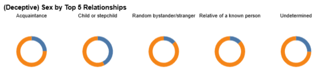
pie charts showing the offenders relationship to victims- the data is normalized
Feedback Received by Peers and Outside Sources
Deceptive graph feedback
- “Reinforce the deception with the title.”
- That we didn’t need to label the y-axis because people know from seeing male and female in the tooltip.
- “I like it because I don’t really know what is going on.”
- “Great choice of colors that don’t blend together, but neither is eye-catching over the other.”
Clear graph feedback
- “Great colors, my eye is really drawn to the red lines and bars.”
- “You could rotate your x-axis labels and only label a few years.”
- “The information is really clearly shown.”
Final Visualizations and Justifications
Clear:
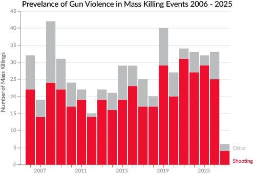
Stacked bar graph showing the prevalance of gun violence in mass killing events
This stacked bar graph is designed to rely on the viewer’s likelihood to make instant judgments based on what they see. Your eye is instantly drawn to the red popping out (affecting pre-attentive and contrast emphasis), and the proportion of red is much greater than the proportion of grey. The concept of this visualization is very simple, but it is the most effective way to show that every year, gun violence is much more common than any other type of violence.
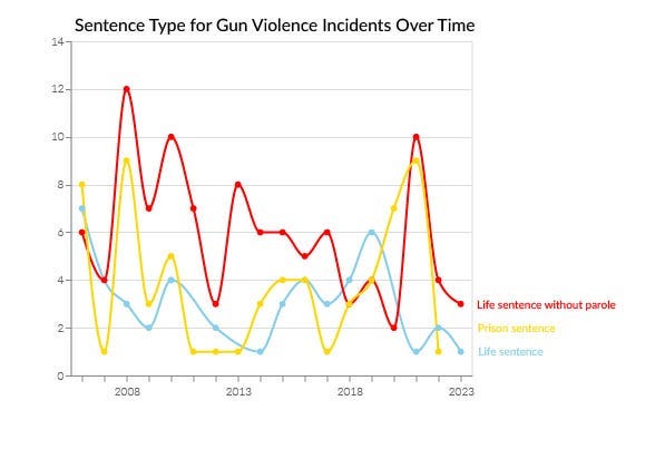
line graph showing the number of sentence types given to gun violence offenders each year
To address the feedback, we only labeled four of the years and went in five-year increments. Then, we rotated the labels to be horizontal for readability.
Pre-attentive — We used three distinct colors (red, yellow, blue), allowing the viewer to quickly distinguish between sentence types without needing to read the legend in detail.
Contrast Emphasis — We made the red line (Life sentence without parole) the darkest and most saturated, naturally drawing the eye toward the top trend line– showing it to be the most critical category.
Clear Marks — We used fewer x-axis tick marks, highlighting the overall time trend rather than overwhelming with detail.
Deceptive
Through testing different visualization prototypes, we discovered how much the way you present data can change what story it tells. Even though we used the exact same dataset for all our charts, the different approaches we tried showed completely different patterns.
The most striking example was when we looked at offenders who killed children or stepchildren. The actual numbers show 337 male offenders versus only 75 female offenders — that’s more than four times as many men. But when we normalized the data, it made it look like the split was almost 50/50, which totally misrepresents what’s actually happening.
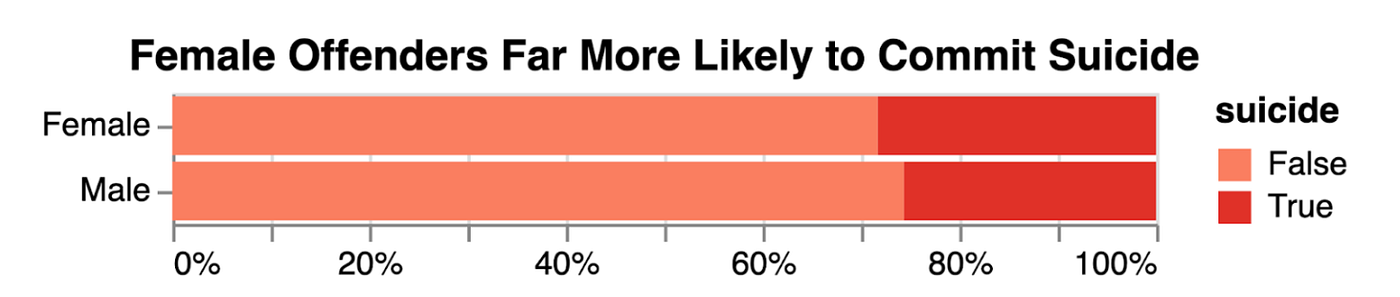
The bright red color emphasizes the “Suicide” portion, drawing attention to the female bar, while the title “Female Offenders Far More Likely to Commit Suicide” suggests that females commit more suicides overall, which is misleading. You can only see the actual counts by using the tooltip, so just looking at the graph gives a false impression. In reality, the chart exaggerates female risk by focusing on percentages rather than actual counts.
메타데이터
- post_id
- bb53bb381ef5
- slug
- mass-killings-in-america-data-design-and-deception-bb53bb381ef5
- url
- https://medium.com/@nicoleerin/mass-killings-in-america-data-design-and-deception-bb53bb381ef5
- canonical_url
- https://medium.com/@nicoleerin/mass-killings-in-america-data-design-and-deception-bb53bb381ef5
- author_url
- https://medium.com/@nicoleerin
- status
- ok
- fetched_at
- 2026-08-01 17:50:46