Introducing Blocky UI Lite: A 3D Blocky-Themed Component Library 🎮
Lightweight TypeScript UI library with 3D blocky styling and zero dependencies. Perfect for web applications with pure CSS effects.
Introducing Blocky UI Lite: A 3D Blocky-Themed Component Library 🎮
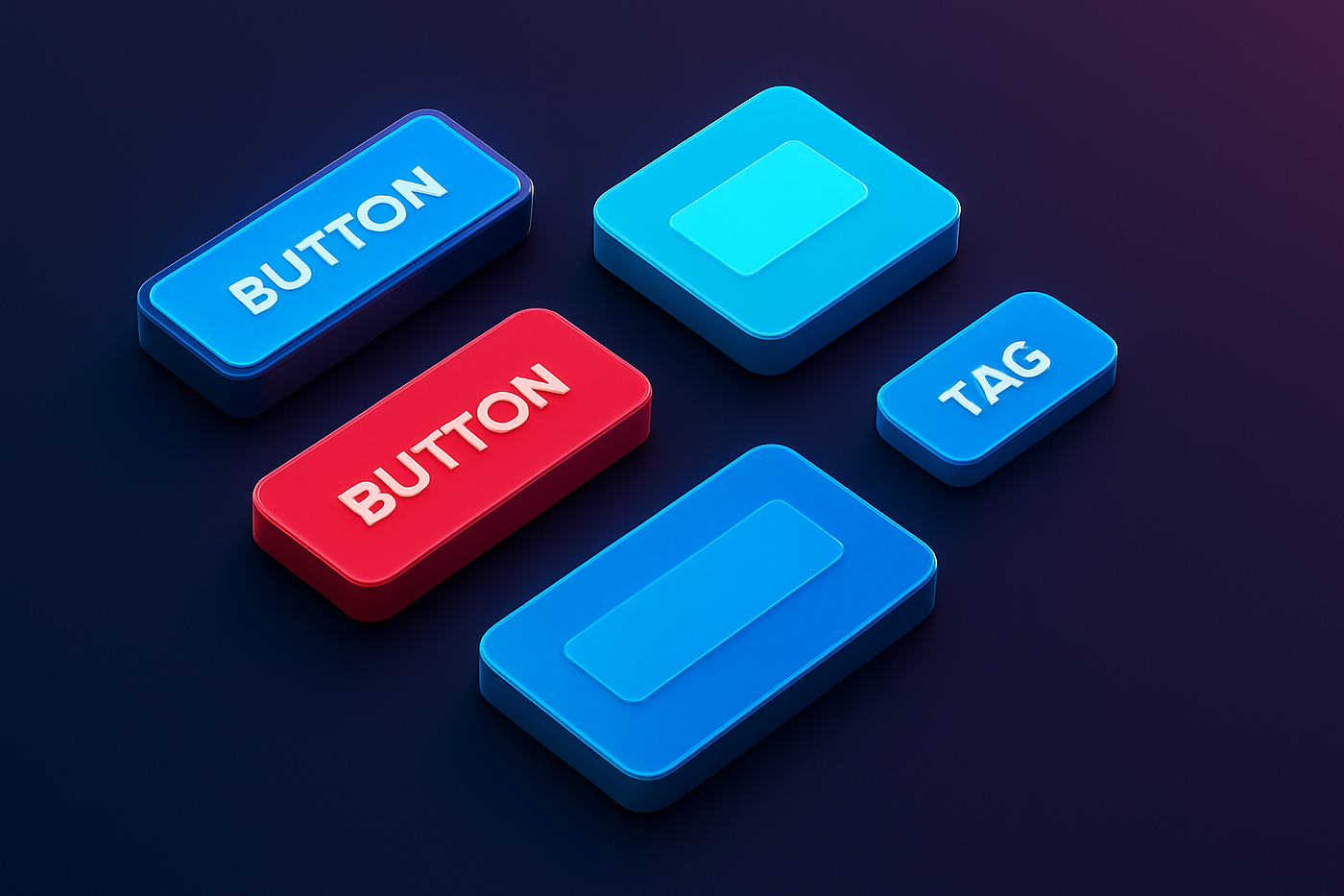
Ever wanted to give your web apps that distinctive casino-game aesthetic? Meet Blocky UI Lite — a lightweight TypeScript component library that brings 3D blocky styling to your projects with zero dependencies and pure CSS magic.
🌟 Try the Live Demo | 📦 NPM Package | 📚 GitHub Repository
✨ What Makes It Special?
Pure CSS 3D Effects
No SVG generation, no JavaScript-based styling, no runtime overhead. Every 3D effect is achieved through carefully crafted CSS:
/* Multi-layer box shadows create depth */
box-shadow:
    0 4px 0 rgba(0, 0, 0, 0.3),           /* Base shadow */
    0 8px 16px rgba(0, 0, 0, 0.4),        /* Far shadow */
    inset 0 2px 0 rgba(255, 255, 255, 0.2), /* Top highlight */
    inset 0 -2px 0 rgba(0, 0, 0, 0.3);    /* Bottom shadow */
/* Gradient backgrounds with transparency */
background: linear-gradient(
    180deg,
    rgba(85, 223, 255, 0.95) 0%,
    rgba(85, 223, 255, 0.7) 50%,
    rgba(85, 223, 255, 0.5) 100%
);
/* Radial overlay for extra depth */
&::before {
    background: radial-gradient(
        circle at center,
        rgba(255, 255, 255, 0.2) 0%,
        transparent 70%
    );
}
Zero Dependencies
The entire library weighs in at just ~15KB gzipped with absolutely zero runtime dependencies. It’s pure TypeScript + CSS, making it incredibly portable and performant.
Full TypeScript Support
Every component comes with complete type definitions, making development a breeze with full autocomplete and type checking:
import { BlockyUI, ComponentVariant } from 'blocky-ui-lite';

// TypeScript knows all available options
const button = BlockyUI.createButton({
    text: 'Click Me',
    variant: 'primary', // 'default' | 'primary' | 'secondary' | 'danger'
    onClick: () => console.log('Clicked!'),
    disabled: false
});
🎨 Component Variants System
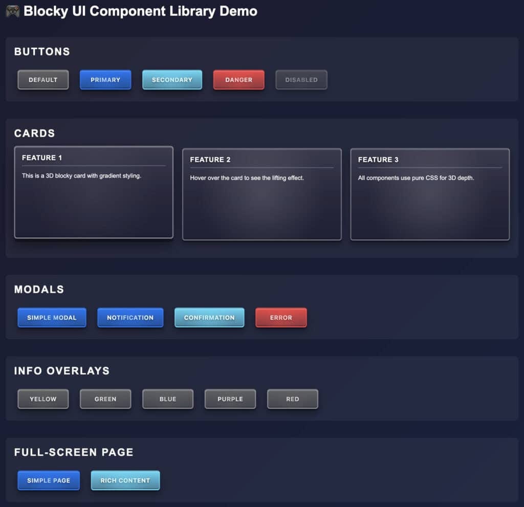
One of the newest features is the unified variant system. Buttons, Cards, and Tags all support the same four color variants:
- default — Neutral gray for standard elements
- primary — Vibrant blue for primary actions
- secondary — Bright cyan for secondary actions
- danger — Bold red for destructive actions
🚀 Quick Start Example
Getting started is incredibly simple. Here’s a complete example creating an interactive game UI:
<!DOCTYPE html>
<html lang="en">
<head>
    <!-- CSS -->
    <link rel="stylesheet" href="https://unpkg.com/blocky-ui-lite@latest/dist/blocky-ui.css">
</head>
<body>
    <div id="game-ui"></div>
<!-- JavaScript -->
    <script src="https://unpkg.com/blocky-ui-lite@latest/dist/index.umd.js"></script>
    <script>
        const { BlockyUI } = window.BlockyUILite;
        // Create a game stats card
        const statsCard = BlockyUI.createCard({
            title: 'Player Stats',
            variant: 'primary',
            content: `
                <p><strong>Level:</strong> 42</p>
                <p><strong>Score:</strong> 9,850</p>
                <p><strong>Coins:</strong> 1,234</p>
            `
        });
        // Create multiplier tags
        const multiplierTag = BlockyUI.createTag({
            content: '×5.0',
            variant: 'secondary'
        });
        // Create action buttons
        const playButton = BlockyUI.createButton({
            text: 'PLAY NOW',
            variant: 'primary',
            onClick: () => {
                BlockyUI.showNotification(
                    'Game Started!',
                    'Good luck and have fun!'
                );
            }
        });
        // Add to page
        const container = document.getElementById('game-ui');
        container.appendChild(statsCard);
        container.appendChild(playButton);
    </script>
</body>
</html>
🏗️ Technical Deep Dive
Component Architecture
Each component follows a consistent static factory pattern that returns instances with methods:
// Factory method creates instance
const modal = BlockyUI.createModal({
    title: 'Confirm Action',
    content: 'Are you sure?',
    buttons: [
        { text: 'Cancel', variant: 'default', onClick: () => {} },
        { text: 'Confirm', variant: 'primary', onClick: () => {} }
    ]
});
// Instance methods for control
modal.show();   // Display the modal
modal.close();  // Close programmatically
// Or use convenience methods (auto-shown)
BlockyUI.showNotification('Success!', 'Operation completed.');
BlockyUI.showError('Error!', 'Something went wrong.');
BlockyUI.showConfirmation('Delete?', 'This cannot be undone.', onConfirm, onCancel);
CSS Architecture
The library uses CSS custom properties for easy theming and consistency:
:root {
    /* Colors */
    --blocky-primary: #55dfff;
    --blocky-danger: #ff4444;
    /* 3D Effects */
    --blocky-shadow-base: 0 4px 0 rgba(0, 0, 0, 0.3);
    --blocky-shadow-far: 0 8px 16px rgba(0, 0, 0, 0.4);
    /* Spacing */
    --blocky-padding-md: 12px;
    --blocky-border-radius: 6px;
    /* Z-Index Layers */
    --blocky-z-content: 10;
    --blocky-z-dropdown: 100;
    --blocky-z-overlay-modal: 900;
}
Build Pipeline
Blocky UI uses Rollup to generate multiple module formats:
- ESM (
index.esm.js) - For modern bundlers (Vite, Webpack, etc.) - CJS (
index.cjs.js) - For Node.js environments - UMD (
index.umd.js) - For direct browser usage via CDN - TypeScript (
index.d.ts) - Full type definitions
📦 Available Components
BlockyButton
Interactive buttons with 4 color variants and 3D hover effects. Perfect for CTAs and game actions.
const button = BlockyUI.createButton({
    text: 'START GAME',
    variant: 'primary',
    onClick: () => startGame(),
    disabled: false
});
BlockyModal
Overlay dialogs with backdrop blur and smooth animations. Returns an instance for manual control.
const modal = BlockyUI.createModal({
    title: 'Game Over',
    content: 'You scored 1,234 points!',
    showCloseButton: true,
    buttons: [
        { text: 'Play Again', variant: 'primary', onClick: restart }
    ]
});

modal.show();  // Display when ready
BlockyCard
Content containers with 3D styling and optional headers. Now with variant support!
const card = BlockyUI.createCard({
    title: 'Daily Rewards',
    variant: 'secondary',
    content: 'Come back tomorrow for more coins!'
});
BlockyTag
Compact labels perfect for multipliers and status indicators.
const tag = BlockyUI.createTag({
    content: '×2.5',
    variant: 'danger'  // Red for high multipliers!
});
BlockyInfo
Temporary notifications with auto-dismiss and 5 color themes.
const info = BlockyUI.createInfo({
    title: 'Achievement Unlocked!',
    titleColor: 'yellow',
    content: 'You reached level 10!'
});

document.body.appendChild(info);
BlockyPage
Full-screen scrollable overlays with animated gradient borders.
const page = BlockyUI.createPage({
    content: `
        <h1>Game Rules</h1>
        <p>Here are the complete game instructions...</p>
    `,
    onClose: () => console.log('Rules closed')
});

page.show();
🎮 Real-World Use Cases
Casino Game Interfaces
Perfect for slots, roulette, poker interfaces — anywhere you need that “blocky casino” aesthetic.
Gaming Dashboards
Player stats, leaderboards, achievement systems, inventory screens.
Interactive Web Apps
Any application that wants to stand out with a unique, game-inspired design language.
Educational Platforms
Gamified learning interfaces, quiz applications, progress tracking systems.
🔧 Installation & Setup
Via npm/yarn/pnpm
# npm
npm install blocky-ui-lite
# yarn
yarn add blocky-ui-lite
# pnpm
pnpm add blocky-ui-lite
// Import CSS (required)
import 'blocky-ui-lite/styles';
// Import components
import { BlockyUI } from 'blocky-ui-lite';
// Use in your app
const button = BlockyUI.createButton({
text: 'Click Me',
variant: 'primary'
});Via CDN (No Build Step)
<!-- CSS -->
<link rel="stylesheet" href="https://unpkg.com/blocky-ui-lite@latest/dist/blocky-ui.css">
<!-- JavaScript (UMD) -->
<script src="https://unpkg.com/blocky-ui-lite@latest/dist/index.umd.js"></script>
<script>
    const { BlockyUI } = window.BlockyUILite;
    // Use BlockyUI here
</script>
🎨 Framework Integration
React
import { useEffect, useRef } from 'react';
import { BlockyUI } from 'blocky-ui-lite';
import 'blocky-ui-lite/styles';

function GameButton() {
    const containerRef = useRef<HTMLDivElement>(null);
    useEffect(() => {
        if (containerRef.current) {
            const button = BlockyUI.createButton({
                text: 'PLAY',
                variant: 'primary',
                onClick: () => console.log('Game started!')
            });
            containerRef.current.appendChild(button);
        }
    }, []);
    return <div ref={containerRef} />;
}
Vue 3
<script setup lang="ts">
import { onMounted, ref } from 'vue';
import { BlockyUI } from 'blocky-ui-lite';
import 'blocky-ui-lite/styles';

const containerRef = ref<HTMLDivElement | null>(null);
onMounted(() => {
    if (containerRef.value) {
        const button = BlockyUI.createButton({
            text: 'PLAY',
            variant: 'primary',
            onClick: () => console.log('Game started!')
        });
        containerRef.value.appendChild(button);
    }
});
</script>
<template>
    <div ref="containerRef"></div>
</template>
Svelte
<script lang="ts">
    import { onMount } from 'svelte';
    import { BlockyUI } from 'blocky-ui-lite';
    import 'blocky-ui-lite/styles';

    let container: HTMLDivElement;
    onMount(() => {
        const button = BlockyUI.createButton({
            text: 'PLAY',
            variant: 'primary',
            onClick: () => console.log('Game started!')
        });
        container.appendChild(button);
    });
</script>
<div bind:this={container}></div>
🚀 Performance Considerations
Bundle Size
- CSS: ~8KB minified, ~2KB gzipped
- JavaScript: ~12KB minified, ~4KB gzipped
- Total: ~20KB minified, ~6KB gzipped
Runtime Performance
All animations are CSS-based using transform and opacity, ensuring smooth 60fps animations with GPU acceleration. No JavaScript animation loops means zero CPU overhead.
Load Time Optimization
When using via CDN, both unpkg.com and jsdelivr.net offer automatic minification, compression, and edge caching for blazing-fast delivery worldwide.
🔮 Future Roadmap
- ⏳ More Components: Tabs, Tooltips, Dropdowns, Sliders
- ⏳ Theming API: Runtime theme switching
- ⏳ Animation Library: Pre-built entrance/exit animations
- ⏳ Form Components: Inputs, Checkboxes, Radio buttons with 3D styling
- ⏳ Icon System: Optional built-in icon support
- ⏳ Enhanced Accessibility: ARIA labels, keyboard navigation improvements
📚 Resources
- 🌐 Live Demo: https://fur-gaming.github.io/blocky-ui/
- 📦 npm Package: blocky-ui-lite
- 🐙 GitHub: fuR-Gaming/blocky-ui
- 📖 Documentation Wiki: GitHub Wiki
- 🎯 Stack Rush: Original game that inspired the design
🤝 Contributing
Blocky UI Lite is open source and welcomes contributions! Whether it’s bug reports, feature requests, or pull requests — all contributions are appreciated.
# Clone the repository
git clone https://github.com/fuR-Gaming/blocky-ui.git
# Install dependencies
npm install
# Start development server
npm run dev
# Build the library
npm run build
📄 License
MIT License — Free to use in personal and commercial projects. No attribution required (but always appreciated! 🙏)
🎉 Conclusion
Blocky UI Lite brings a unique aesthetic to web development — one that’s perfect for gaming interfaces, casino applications, and any project that wants to stand out with bold, 3D styling. With zero dependencies, full TypeScript support, and pure CSS effects, it’s both powerful and lightweight.
Give it a try in your next project, and let us know what you build with it!
Built with ❤️ by fuR Gaming | Powered by Claude Code 🤖
메타데이터
- post_id
- bb568fb549ea
- slug
- introducing-blocky-ui-lite-a-3d-blocky-themed-component-library-bb568fb549ea
- url
- https://medium.com/raw-fun-gaming/introducing-blocky-ui-lite-a-3d-blocky-themed-component-library-bb568fb549ea
- canonical_url
- https://medium.com/raw-fun-gaming/introducing-blocky-ui-lite-a-3d-blocky-themed-component-library-bb568fb549ea
- author_url
- https://medium.com/@furic
- status
- ok
- fetched_at
- 2026-06-12 18:14:10