Grids vs Data Tables: Which One and When?
You’ve seen both. You use both every day. Here’s the simple difference.
Grids vs Data Tables: Which One and When?
You’ve seen both. You use both every day. Here’s the simple difference.
Think of it this way
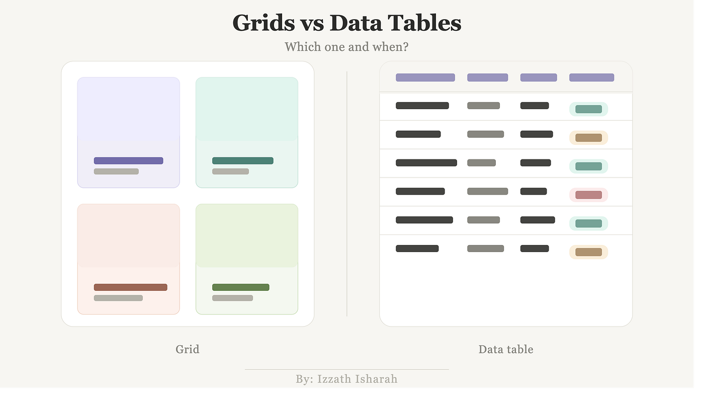
A grid is like a shop window — you browse until something catches your eye.
A data table is like a spreadsheet — you scan rows to find exactly what you need.
Same information. Completely different experience. Completely different purpose.
What Is a Grid?
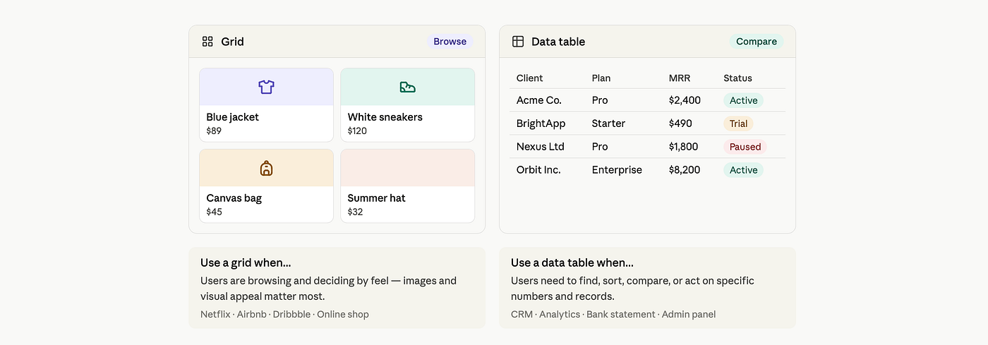
A grid arranges visual content — cards, images, products, articles — into a uniform layout that users scan rather than read line by line.
The user’s job in a grid is to find something interesting and click into it.
Real examples:
- Netflix home screen — movie thumbnails arranged in rows
- Airbnb search results — property cards in a responsive grid
- Dribbble — design shots in a masonry grid
- An e-commerce category page — product cards with image, name, and price
What grids are good at:
- Showing many items at once without overwhelming
- Letting users browse visually before committing
- Adapting responsively across screen sizes
- Highlighting images, thumbnails, or visual-first content
What grids are bad at:
- Comparing specific attributes across items (“which one has the highest rating AND ships in 2 days?”)
- Displaying dense numerical or text data
- Sorting or filtering by multiple columns simultaneously
What Is a Data Table?
A data table organises structured information into rows and columns so users can read, compare, sort, filter, and take action on specific records.
The user’s job in a data table is to find a specific piece of information or compare items across defined attributes.
Real examples:
- A CRM contacts list — name, company, last contact date, deal stage
- Google Analytics — pages sorted by sessions, bounce rate, duration
- A bank statement — date, description, amount, balance
- GitHub pull requests — title, author, status, number of comments, date opened
- Airtable or Notion database view
What data tables are good at:
- Comparing multiple attributes across many rows
- Sorting by column (highest revenue, most recent, alphabetical)
- Filtering to narrow a large dataset
- Bulk actions (select all, export, delete)
- Displaying exact values that matter (dates, numbers, statuses)
What data tables are bad at:
- Visual browsing — rows of text feel cold when you want to explore
- Mobile — wide tables break badly on narrow screens
- Content where images carry the meaning
The one question to ask yourself
What is the user’s primary job on this screen?
If the answer is “explore and discover” → Grid
If the answer is “find, compare, or act on specific data” → Data table
If the answer is both, depending on the user → Offer a view toggle (like Notion does)
A real mistake — and the fix
A company built their client dashboard as a card grid. Looked great in demos. Account managers hated it in real life — they needed to sort clients by renewal date, filter by plan type, and see revenue at a glance. None of that worked in a card grid.
They switched to a data table. Problem solved in one redesign.
The grid wasn’t wrong — it was just the wrong tool for the job.
The rule is simple: match the component to what the user needs to do. Get that right, and everything else follows.
메타데이터
- post_id
- bb839d3c9fb9
- slug
- grids-vs-data-tables-which-one-and-when-bb839d3c9fb9
- url
- https://medium.com/@iizzathisharah/grids-vs-data-tables-which-one-and-when-bb839d3c9fb9
- canonical_url
- https://medium.com/@iizzathisharah/grids-vs-data-tables-which-one-and-when-bb839d3c9fb9
- author_url
- https://medium.com/@iizzathisharah
- status
- ok
- fetched_at
- 2026-06-20 20:29:01