NMIX 4011
Style Guide Project
NMIX 4011: Style Guide Project
Project Date:
March, 2025
Project Overview:
The goal of this project was, with a group, create a brand for a product or service of our choosing and then to design and create a comprehensive, packaged style guide.
The Problem:
We had to create an original brand and an idea for what the brand did. The style guide was required to be user friendly and aesthetically pleasing. Each section of our project had to be accompanied with supporting details, including examples of use/how to not use, and reasoning behind our decision. It was required that we wrote the project as if it was a real brand and not a hypothetical brand for a class. It was a group project, so we had to collaborate in every aspect of this project in order for the entirety of it to be viewed as a whole.
My Role:
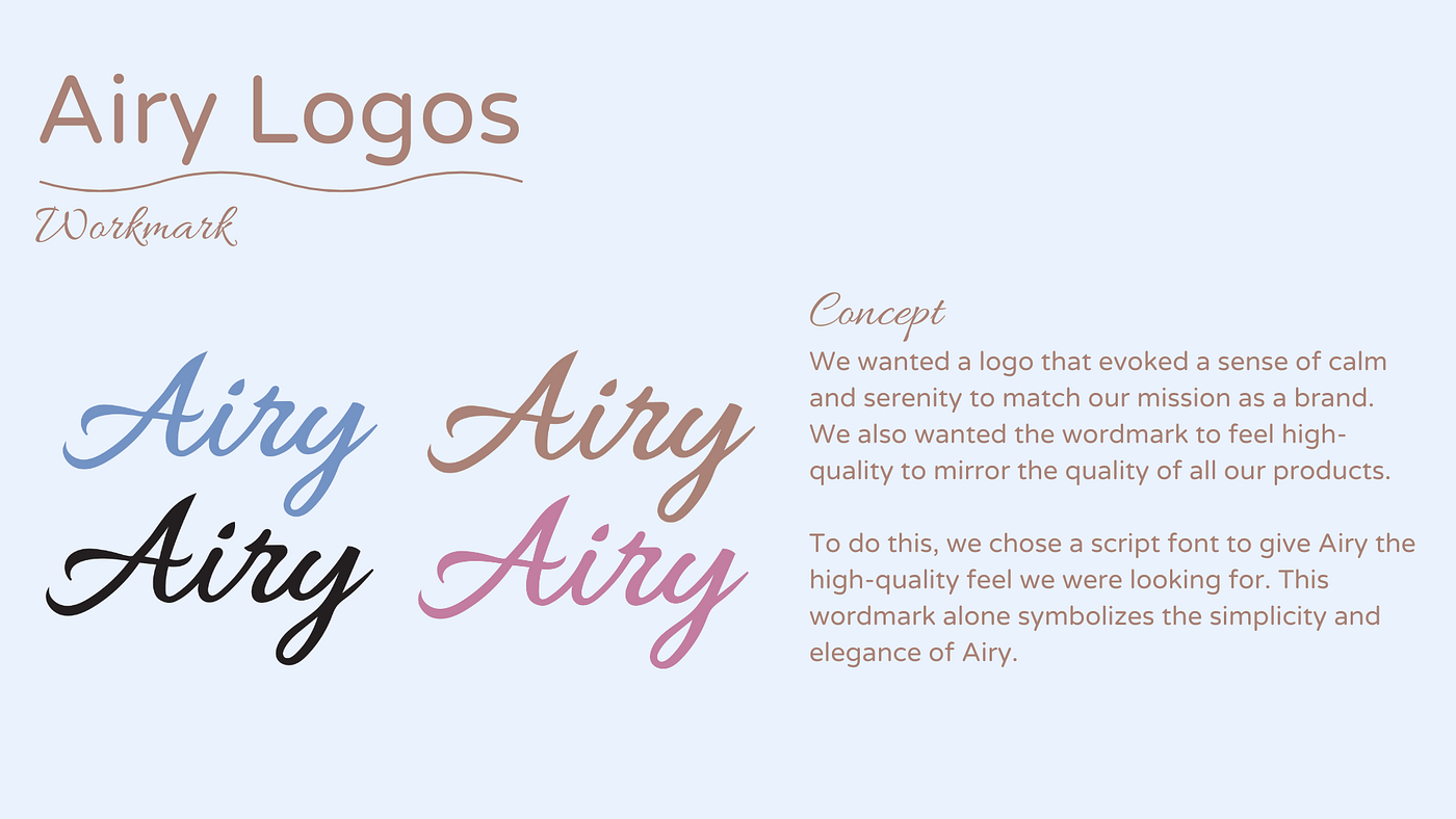
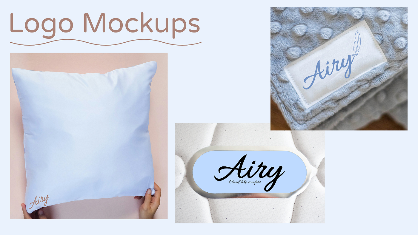
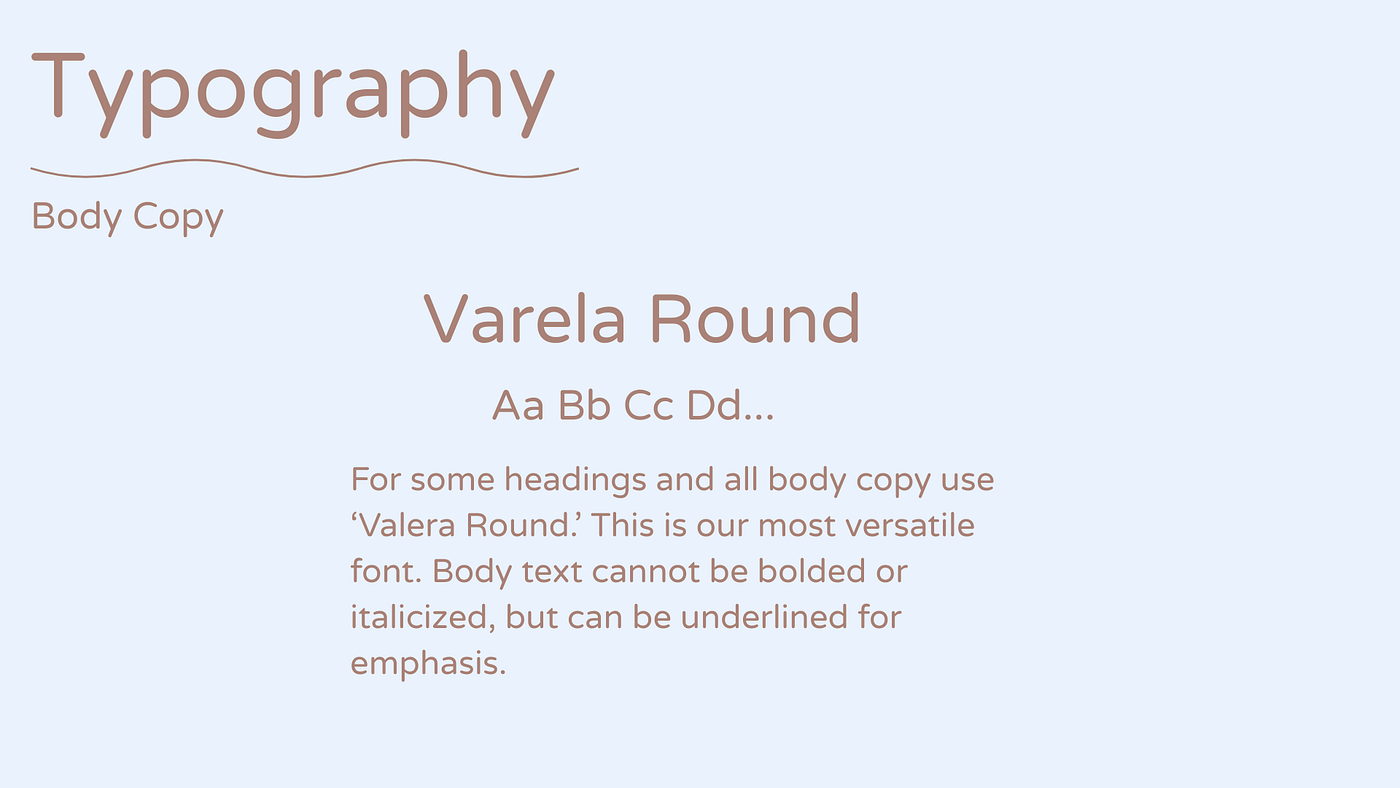
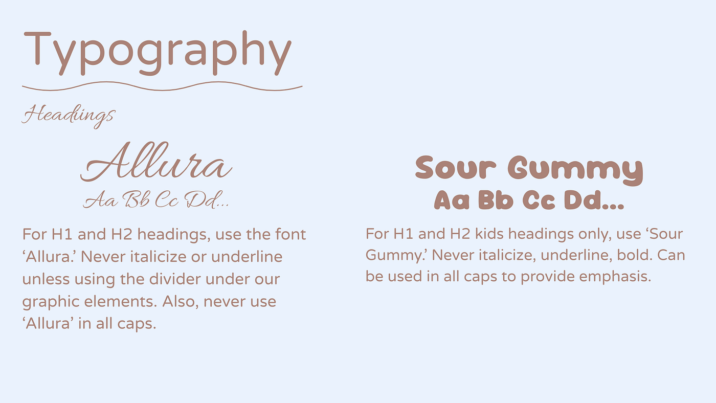
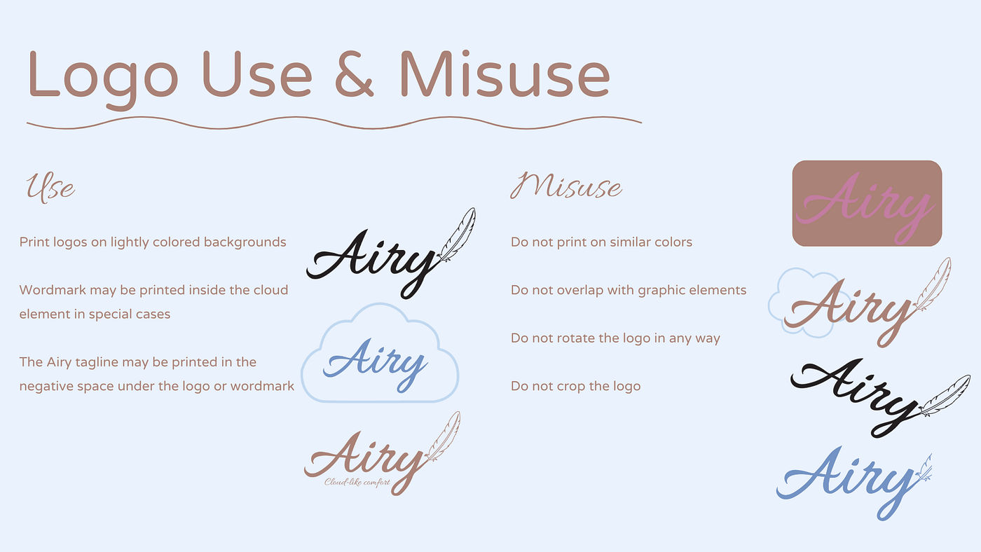
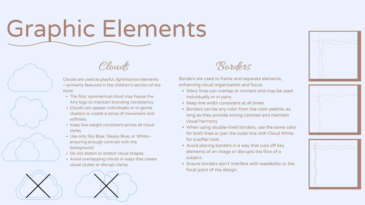
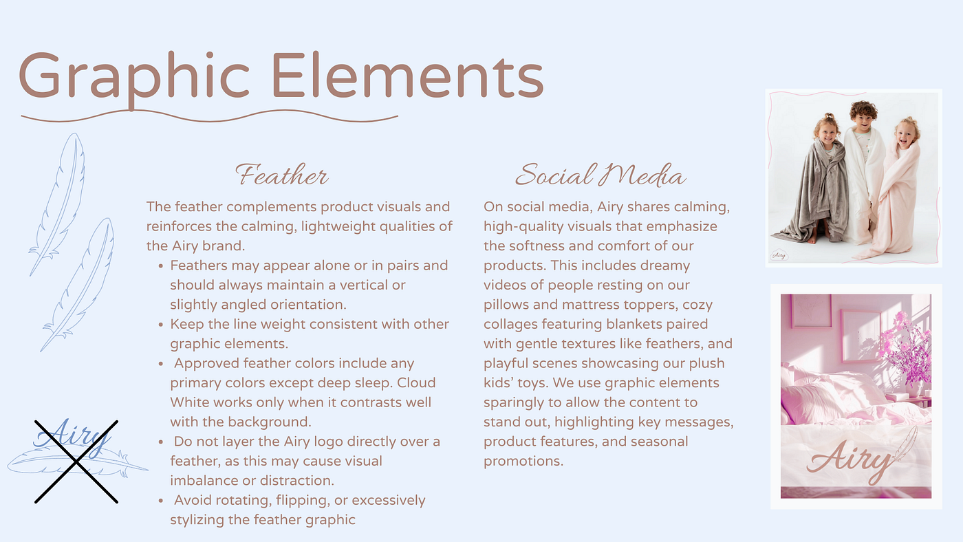
This was a group project and the roles that I focused on mainly was creating the word-mark, explaining the use/misuse of our typography, creating some of the graphic elements, and creating mock-ups of our logo on products.
The Solution:
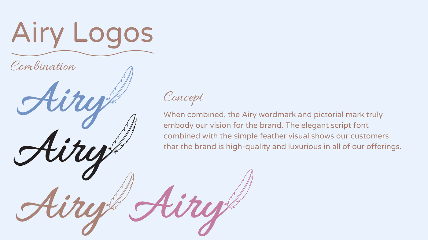
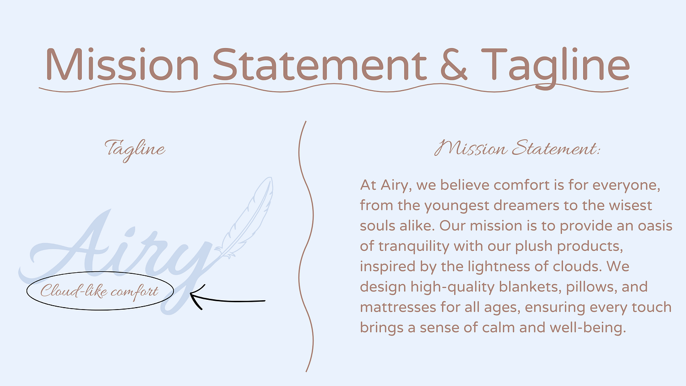
Brainstorming was a very big part of this process. Meeting with my group and listing out company ideas we thought were interesting was the first step. We landed on the idea of a company that made sleep products that focused on comfort, but also aesthetic! We then created a Pinterest board where we made a mood board of the aesthetic we wanted for our brand and from this mood board we listed out characteristics we wanted to portray in our design. From there we split up certain tasks, but ensured we discussed what we expected for each task and got feedback on the work we did for each aspect in order for our project to be cohesive. Some tasks that I was given to make sure were completed were making our word-mark logo and some graphic elements on Adobe Illustrator, creating the typography sections of our project, and creating mock-ups using our logos in Adobe Photoshop. Creating the word-mark was something that took me the longest to complete because our group agreed that we wanted the logo to be a script font to reflect a sense of calmness that our brand did, but we had to make sure it was something that all users would be able to read and something that went well with our other typefaces we chose. Also, it needed to be something that we could combine easily with our pictorial mark. I ended up designing the heavily based on our typeface “Allura” that we chose for headings.
Here are my sections of the project:
The Result:
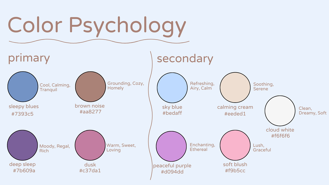
I throughly enjoyed the result of this project! Obviously, in the real world, for projects such as this I will have a team to work with, so it was a very beneficial experience to design something that incorporates so many different design elements as well as applications. I was able to practice my skills in Adobe Illustrator, Adobe Photoshop, and Canva. The most challenging aspect of this project was creating logos and a color palette that matched our aesthetic but was still accessible for everyone. Also, coming up with everything from scratch was challenging, but it was nice to have creative freedom. Overall it was a very fun project and I am really happy with the result. Going forward, we are now able to use this style guide on our final project where we will creating mobile and desktop web designs and an app prototype!
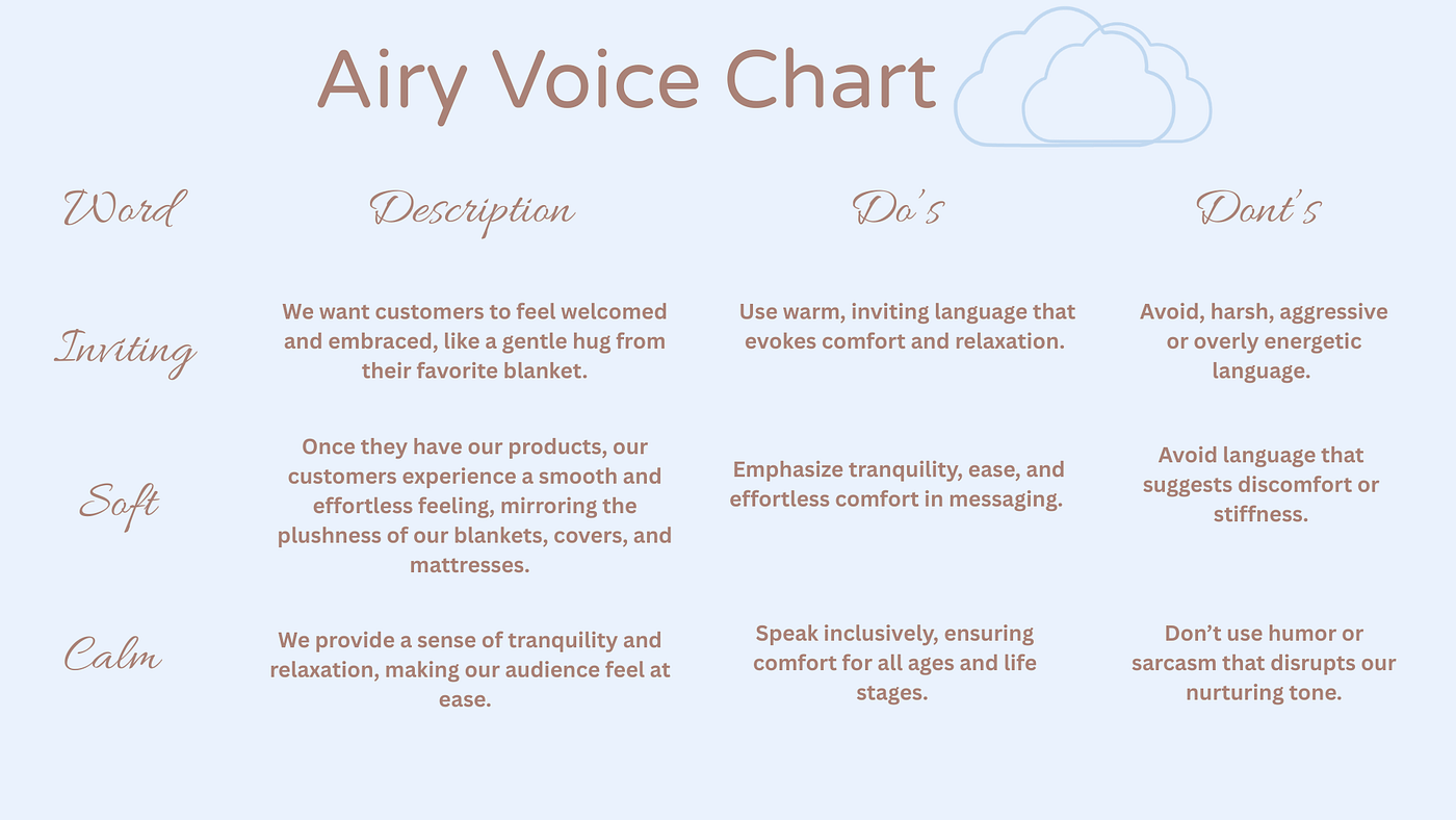
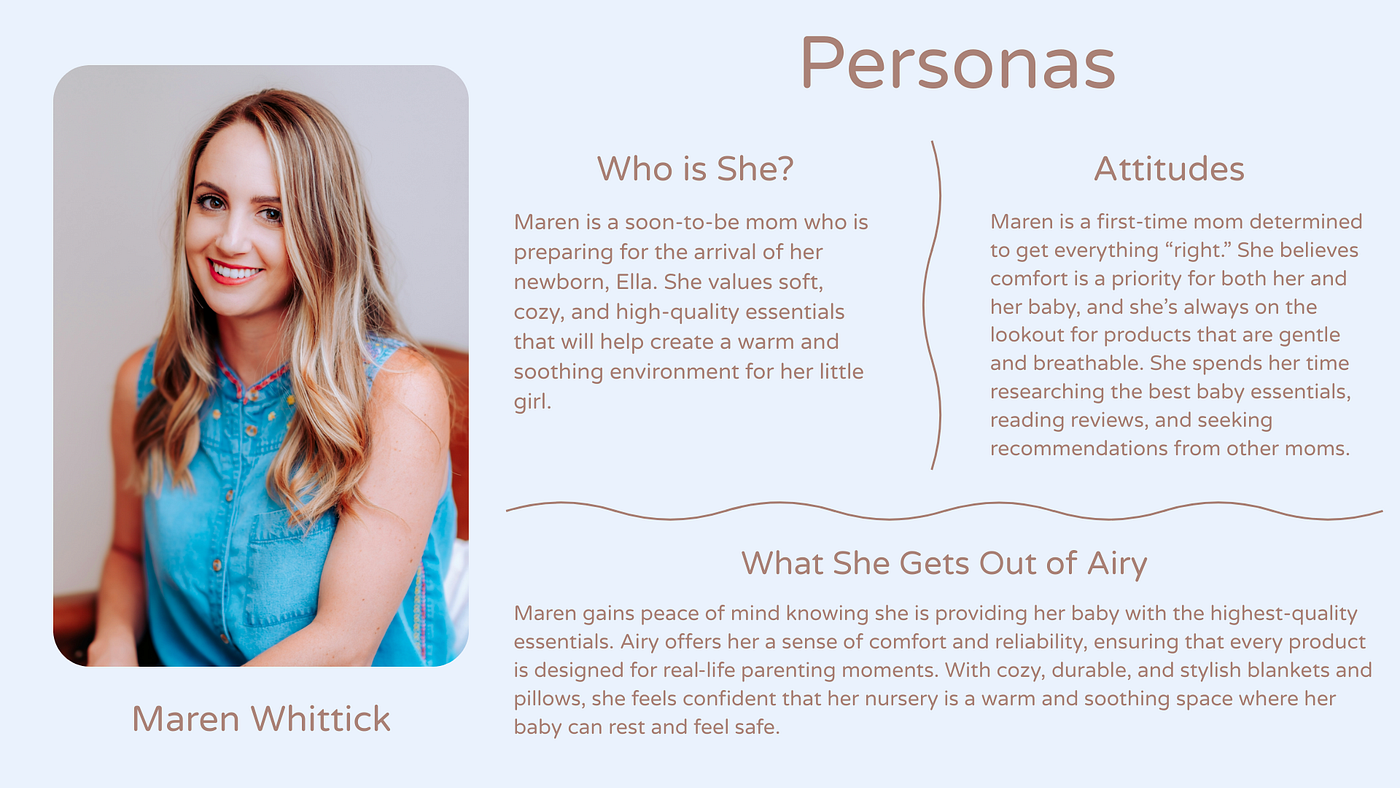
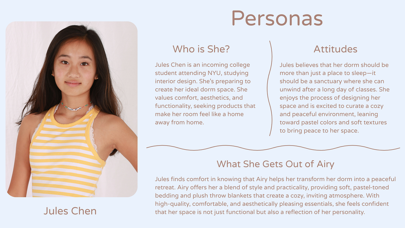
Here is the rest of the project:



메타데이터
- post_id
- bbc0dd8c607b
- slug
- nmix-4011-bbc0dd8c607b
- url
- https://medium.com/@crh93347/nmix-4011-bbc0dd8c607b
- canonical_url
- https://medium.com/@crh93347/nmix-4011-bbc0dd8c607b
- author_url
- https://medium.com/@crh93347
- status
- ok
- fetched_at
- 2026-07-20 05:27:41