The QQ Plot Uncovered: A Data Scientist’s Companion for Normality Testing
The Quantile-Quantile (QQ) Plot is a fundamental tool in statistical analysis, widely used in data science for assessing whether a dataset…
The QQ Plot Uncovered: A Data Scientist’s Companion for Normality Testing
The Quantile-Quantile (QQ) Plot is a fundamental tool in statistical analysis, widely used in data science for assessing whether a dataset follows a certain theoretical distribution, such as a normal, exponential, or Pareto distribution. The QQ plot is a graphical technique for determining if two data sets originate from populations with a common distribution.
Purpose of the QQ Plot
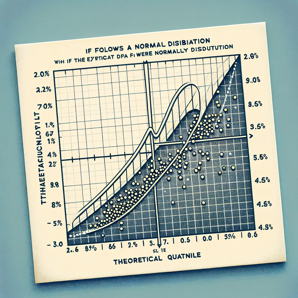
- Comparing Distributions: The QQ plot compares the quantiles of a dataset against the quantiles of a theoretical distribution. This helps in assessing whether the data conforms to a particular distribution.
- Identifying Deviations from Theoretical Distribution: The plot makes it easy to visually inspect the conformity of the data to the expected distribution. Deviations from the theoretical distribution are seen as departures from the linearity of the points in the plot.
- Normality Testing: One common use of the QQ plot is to check the normality of a distribution. A dataset that is normally distributed will appear as roughly a straight line in a QQ plot against a normal distribution.
Significance in Data Science
- Data Preprocessing: In data science, understanding the distribution of your data is crucial for preprocessing and feature engineering. QQ plots are a quick way to check for normality or other distributional assumptions.
- Model Assumptions: Many statistical models and machine learning algorithms make specific assumptions about the distribution of the data. QQ plots help in verifying these assumptions.
- Outlier Detection: QQ plots can be used to identify outliers in data. Outliers will appear as points that deviate significantly from the trend in the plot.
How It Works
- A QQ plot is created by plotting the quantiles of the dataset against the quantiles of a theoretical distribution.
- If the dataset follows the theoretical distribution, the points on the QQ plot will fall approximately along a straight line.
In summary, the QQ plot is an essential tool in the data scientist’s toolkit for checking the distributional properties of a dataset. Its ability to visually represent how closely a dataset follows a theoretical distribution makes it an invaluable tool for exploratory data analysis, preprocessing, and model assumption validation.
The Importance of QQ Plots in Statistical Analysis
QQ (Quantile-Quantile) plots play a critical role in statistical analysis, particularly in assessing the normality of datasets and performing diagnostic checks for model assumptions. These plots are valuable because many statistical methods and models assume that data are normally distributed. Violations of this assumption can lead to inaccurate results and conclusions.
Assessing Normality in Datasets
- Normal Distribution Assumption: Many statistical techniques, including parametric tests and linear regression, assume that the data or residuals follow a normal distribution. QQ plots are a primary tool for checking this assumption.
- Visual Inspection: QQ plots provide a visual method to examine whether the distribution of the dataset approximates a normal distribution. Data points that closely follow a straight line in a QQ plot indicate that the data are normally distributed.
- Identifying Skewness and Kurtosis: Deviations from the straight line in a QQ plot can indicate skewness (asymmetry of the data distribution) or kurtosis (the “tailedness” of the distribution). These are important factors to consider in statistical analysis.
Role in Diagnostic Checks for Model Assumptions
- Model Validation: In regression analysis, QQ plots of the residuals can be used to validate model assumptions. If the residuals do not follow a normal distribution, it may suggest that the model is not appropriate or that there are other issues, like heteroscedasticity.
- Identifying Outliers: QQ plots can help in identifying outliers in the data. Outliers are visible as points that deviate significantly from the straight line in the plot.
- Improving Model Accuracy: By diagnosing and addressing issues with normality and outliers, as indicated by QQ plots, one can improve the accuracy and reliability of statistical models.
- Complementing Other Tests: While QQ plots provide a visual assessment, they are often used alongside formal statistical tests for normality (like the Shapiro-Wilk test) to corroborate findings.
In summary, QQ plots are an indispensable tool in statistical analysis for assessing normality and validating model assumptions. They provide a simple yet powerful means for a visual check of how well a dataset conforms to a normal distribution, which is a cornerstone assumption in many statistical methods. Their ability to highlight issues like non-normality, skewness, kurtosis, and outliers makes them a vital part of the data analysis and model diagnostic process.
Python Implementation of QQ Plots
Creating QQ plots in Python is straightforward, especially with libraries like SciPy and StatsModels. Below is a step-by-step guide to generating a QQ plot, along with code snippets and explanations for each step.
Step 1: Import Necessary Libraries
First, import the required libraries. If you don’t have these libraries installed, you can install them using pip (e.g., pip install scipy statsmodels).
import numpy as np
import matplotlib.pyplot as plt
import scipy.stats as stats
import statsmodels.api as sm
Step 2: Generate or Obtain Your Data
You can either use a real dataset or generate a sample dataset for demonstration purposes. Here, we’ll create a normally distributed sample dataset.
# Generate a normally distributed random sample
data = np.random.normal(0, 1, 1000)
Step 3: Creating the QQ Plot
There are two common methods to create a QQ plot in Python: using scipy.stats.probplot or statsmodels.api.qqplot.
Using scipy.stats.probplot
stats.probplot(data, dist="norm", plot=plt)
plt.title("QQ Plot - Using SciPy")
plt.show()
This function compares your data against a specified distribution (dist="norm" for a normal distribution). The plot=plt argument tells the function to use Matplotlib for plotting.
Using statsmodels.api.qqplot
sm.qqplot(data, line ='45')
plt.title("QQ Plot - Using StatsModels")
plt.show()
In statsmodels.api.qqplot, line='45' adds a reference line at 45 degrees which is helpful for comparing against the normal distribution.
Explanation
- Both methods plot the quantiles of your data against the quantiles of a theoretical distribution (the normal distribution in this case).
- The points on the plot represent the quantiles of your dataset. If your data are normally distributed, these points should fall approximately on the reference line.
- Any significant deviations from this line suggest deviations from the normal distribution.
By following these steps, you can create QQ plots in Python to visually assess if your data follow a particular theoretical distribution, such as the normal distribution. This is a crucial step in statistical analysis, especially when your modeling approach assumes normality of the data.
메타데이터
- post_id
- bdd54cf283f5
- slug
- the-qq-plot-uncovered-a-data-scientists-companion-for-normality-testing-bdd54cf283f5
- url
- https://medium.com/@bragadeeshs/the-qq-plot-uncovered-a-data-scientists-companion-for-normality-testing-bdd54cf283f5
- canonical_url
- https://medium.com/@bragadeeshs/the-qq-plot-uncovered-a-data-scientists-companion-for-normality-testing-bdd54cf283f5
- author_url
- https://medium.com/@bragadeeshs
- status
- ok
- fetched_at
- 2026-07-28 02:51:27