Maps | The Visual Politics That Shape Our Perception of the World
Have you ever considered that the world maps we’ve seen since childhood might actually be just an illusion? Could these maps be intended to…
Maps | The Visual Politics That Shape Our Perception of the World
Have you ever considered that the world maps we’ve seen since childhood might actually be just an illusion? Could these maps be intended to show us the world from a certain perspective?
This article will reveal interesting facts about the world map, encouraging you to see maps not only as simple visual representations of geography, but also as products of history, politics, and power relations.
If you’re ready, let’s get started… :)
The Innocent Nature of Maps
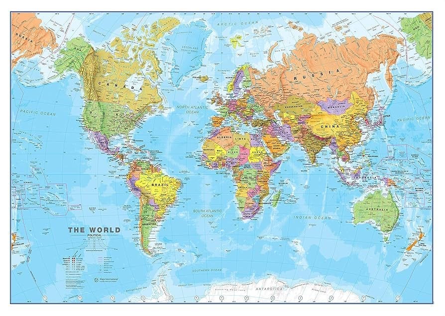
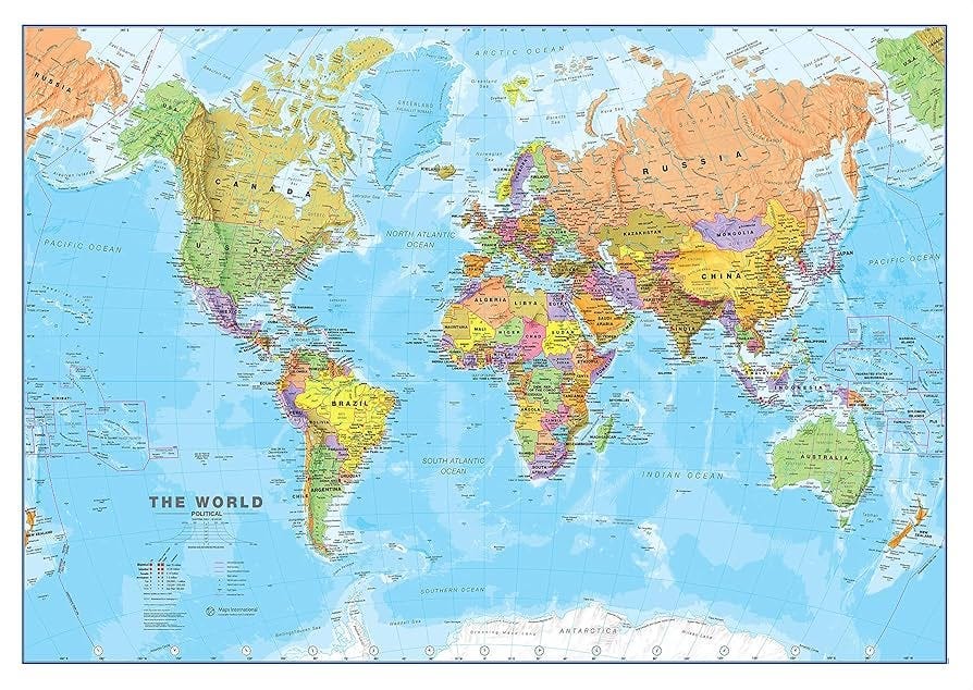
The Mercator Projection, used in most schools today, was developed by Gerardus Mercator in 1569 and was designed specifically for European navigation. This projection was quite useful for navigation, but it was also quite misleading, severely distorting the size and proportions of the continents. Regions near the poles were shown larger than those near the equator.
For example:
- Africa is actually about 14 times the size of Europe, but appears nearly the same size on Mercator maps.
- Greenland is about 1/4 the size of Africa, but is depicted as nearly the same size on the map.
- Australia is only 1,285,825 square kilometers smaller than Canada, yet Canada appears three times larger.


So, in short, countries in the Southern Hemisphere (Brazil, Australia, Africa) appear smaller than they actually are, while countries in Europe and North America in the Northern Hemisphere appear “exaggeratedly” large.
You might think this is simply a technical error caused by the projection itself, but that would be a bit of an understatement. :) Because maps are a product of the visual politics that shape how we perceive the world, and which map we use is a highly political decision.
The History of Maps and Perception Management
The first maps were not just for navigation, but also for attempts to understand and organize the world. From the simple maps engraved on clay tablets in ancient Babylon to the mathematically based geographic drawings of ancient Greece, maps have reflected people’s understanding of the world in every period.
In medieval Europe, T-O maps (drawings centered on Jerusalem and shaped by religious symbolism) depicted the world within a sacred order, while in the Islamic world, geography and cartography were much more advanced than scientific methods.
One of the most important figures in this tradition is, of course, Piri Reis. The famous world map of 1513 boasts extraordinary detail, revealing the wealth of Ottoman maritime knowledge. The Atlantic coast, eastern America, and western Africa are meticulously depicted, and Piri Reis’s notes in the corner of the map reveal that he drew on more than 20 different sources — Arab maps, Portuguese navigators, and even Christopher Columbus’s lost map.
In other words, Piri Reis’s map is not merely a geographical drawing; it is also a reflection of knowledge, trade, and inter-imperial rivalry.

Later, in the West, Gerardus Mercator’s projection became the standard for global navigation, and maps developed by different cultures faded into the background. Thus, a Eurocentric perspective increasingly dominated the world.
However, throughout history, empires have depicted the world through maps according to their own perspectives. For the Roman Empire, Rome was the center, for China, the “Middle Kingdom,” and for the Ottomans, Istanbul was the center of the world.
In the modern period, Eurocentric maps emerged as a reflection of the colonial era. While Europe portrayed itself as the “center,” it diminished the territories it colonized, leaving them in the background. In other words, maps not only taught geography in this sense; they also secretly whispered the answer to the question of who was powerful and who was insignificant.
Because the world map consistently appeared Eurocentric, Europe was always perceived as the “heart of the world,” and even some region names were based on the locations of these particular centers of power. For example, for the British, the area west of India was the “Near East,” and the areas around China and Japan were the “Far East,” while the region in between was called the “Middle East.” In other words, the concept of “Middle East” as we use it today is a deeply ingrained reflection of the colonialist mentality that views Europe as the center of the world.
However, interestingly, when we use other projections, we clearly see this perception turned upside down.
For example:
- In China-centric maps, East Asia becomes the “center of the world,” aligning with China’s geopolitical claims and historical narratives of the “Middle Kingdom.”
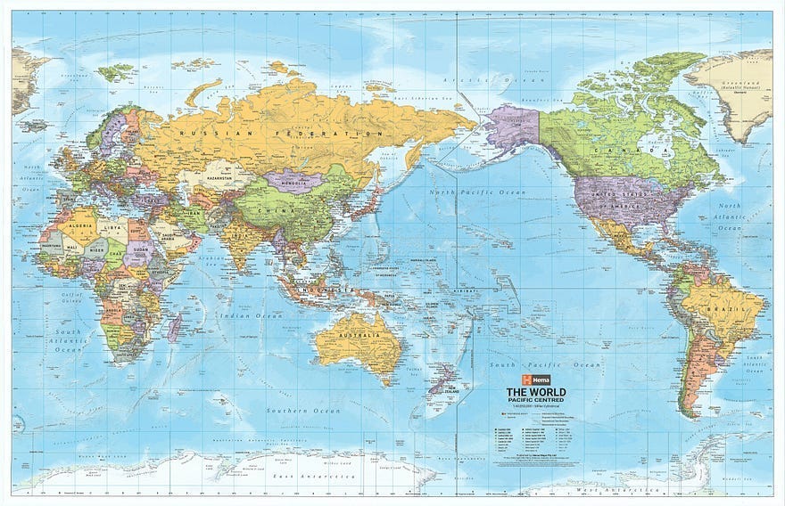
- In maps centered on Australia, the map is turned upside down, with north down rather than up, and so the “despised world of the south” suddenly takes center stage.
In short, who you place at the center of a map reveals whose perspective you see the world through.
Maps are still used today:
- When drawing energy lines,
- When planning military strategies,
- When discussing border disputes,
as one of the most critical tools of politics. For example, China’s “nine-dash line map,” published to strengthen its claims over the South China Sea, Russia’s “maps of Crimea,” or the “Kurdistan” map depicting Turkey as divided are prime examples.
In short, maps are much more political than they appear. When we look at them, we see not only geography but also ideology, history, and power relations, and questioning them also challenges whose perspective we accept to see the world through.
You can check out this website to compare the actual surface areas and sizes of countries. I’m sure you’ll find it interesting. :)
메타데이터
- post_id
- be79feda25fc
- slug
- maps-the-visual-politics-that-shape-our-perception-of-the-world-be79feda25fc
- url
- https://medium.com/@elifaysenbenli/maps-the-visual-politics-that-shape-our-perception-of-the-world-be79feda25fc
- canonical_url
- https://medium.com/@elifaysenbenli/maps-the-visual-politics-that-shape-our-perception-of-the-world-be79feda25fc
- author_url
- https://medium.com/@elifaysenbenli
- status
- ok
- fetched_at
- 2026-07-26 09:46:03