Math for ML: Fourier Transform Explained Simply with ML Examples.
Explore how the frequency domain helps machines hear, see, and understand better.
Math for ML: Fourier Transform Explained Simply with ML Examples.
Explore how the frequency domain helps machines hear, see, and understand better.

What do Spotify, Instagram, and a confused alien have in common? They’re all trying to figure out what’s hiding inside your sounds and pictures so that they can figure you out.
Whether it’s matching a melody to your favorite playlist, sharpening a blurry photo of your lunch, or analyzing the way you talk, these systems don’t rely on magic. Believe it or not, it’s all powered by math, and one of the most powerful tools in the toolbox is the Fourier Transform.
The Fourier Transform takes messy, real-world signals and breaks them down into their basic ingredients, like turning a symphony into a sheet of notes. From music and images to modern machine learning models, this mathematical technique reveals the hidden frequencies that make everything tick.
In this article, we’ll decode the Fourier Transform in plain English. No equations-heavy stuff, just relatable analogies, hands-on examples, and ML applications that show how this classic method is still at the heart of cutting-edge technology.
Frequency: Understanding the Basics
Imagine throwing different-sized pebbles into a calm lake. Each pebble creates ripples — waves with specific patterns. Similarly, any complex signal (such as audio or an image) can be broken down into simpler waves of varying frequencies.
- Audio: Frequencies correspond to pitches (low bass, high treble).
- Images: Frequencies represent textures or patterns (smooth gradients vs sharp edges).
Waves: Fundamental Properties
Waves are disturbances that transfer energy from one point to another through oscillations. They are characterized by:
- Amplitude: Height of the wave, determining the strength or intensity.
- Frequency: How often the wave repeats per second, measured in Hertz (Hz).
- Period: The time it takes for one complete cycle to occur.
- Phase: The position of a point within the wave cycle at a specific time.
In audio, amplitude affects loudness, while frequency affects pitch. In images, amplitude corresponds to contrast, and frequency relates to the detail level.
Python Illustration of Wave Properties
Here’s a simple Python example clearly illustrating these wave properties:
import numpy as np
import matplotlib.pyplot as plt

# Wave parameters
amplitude = 1
frequency = 4 # Frequency in Hz
period = 1 / frequency  # Period is inverse of frequency
phase_shifts = [0, np.pi / 4, np.pi / 2]  # Different phase shifts for comparison
time = np.linspace(0, 2, 1000)

# Plot waves with different phases
plt.figure(figsize=(12, 6))
for phase in phase_shifts:
    wave = amplitude * np.sin(2 * np.pi * frequency * time + phase)
    plt.plot(time, wave, label=f'Phase shift: {np.round(phase, 2)} rad')

# Annotate period
plt.axvline(x=period, color='red', linestyle='--', lw=1.5, label=f'Peroid (T):{period}')
plt.axvline(x=0, color='red', linestyle='--', lw=1.5)
plt.text(period + 0.02, amplitude * 1.2, f'Period (T):{period}', color='red')

# Frequency annotation
plt.text(0.1, -amplitude * 1.4, f'Frequency (f): {frequency} Hz', fontsize=12)

# Plot formatting
plt.axhline(y=0, color='black', lw=0.5)
plt.title('Wave Properties: Frequency, Period, and Phase Effects')
plt.xlabel('Time (s)')
plt.ylabel('Amplitude')
plt.grid(True)
plt.legend()
plt.show()
In this example, the wave consists of a single sine wave with a single frequency. However, this is a simple wave. The waves primarily consist of many waves with different frequencies and amplitudes combined.
# Parameters
frequencies = [1, 3, 5]  # Multiple frequencies in Hz
time = np.linspace(0, 2, 1000)
combined_wave = np.zeros_like(time)

# Plot individual and combined waves
plt.figure(figsize=(12, 6))
for freq in frequencies:
    wave = np.sin(2 * np.pi * freq * time)
    plt.plot(time, wave, label=f'{freq} Hz')
    combined_wave += wave

# Plot combined wave
plt.plot(time, combined_wave, color='black', linewidth=2, label='Combined Wave')

# Formatting
plt.title('Combination of Multiple Frequencies')
plt.xlabel('Time (s)')
plt.ylabel('Amplitude')
plt.grid(True)
plt.legend()
plt.show()
Understanding Signals
Visualize your music player’s equalizer. Adjusting each knob enhances or suppresses specific frequencies, shaping the overall sound. The Fourier Transform accomplishes this mathematically: it reveals the extent to which each frequency contributes to the audio signal.
import numpy as np
import matplotlib.pyplot as plt

fs = 8000  # Sampling rate (samples per second)
t = np.arange(0, 1.0, 1/fs)

# Mix two sine waves: 4 Hz (A4 note) and 100 Hz (A5 note)
audio_signal = np.sin(2*np.pi*4*t) + 0.5*np.sin(2*np.pi*100*t)
plt.plot(t, audio_signal)
plt.title("Audio Signal with 2 Sine Waves")
plt.xlabel("Time (s)")
plt.ylabel("Amplitude")
plt.show()

# Compute the Fourier Transform
frequency_spectrum = np.fft.rfft(audio_signal)
frequencies = np.fft.rfftfreq(len(audio_signal), 1/fs)

# Plot the spectrum
plt.plot(frequencies, np.abs(frequency_spectrum))
plt.xlabel("Frequency (Hz)")
plt.ylabel("Magnitude")
plt.title("Frequency Spectrum of Audio Signal")
plt.show()

import numpy as np
import matplotlib.pyplot as plt

fs = 8000  # Sampling rate (samples per second)
t = np.arange(0, 1.0, 1/fs)

# Mix two sine waves: 4 Hz (A4 note) and 100 Hz.200hz (A5 note)
audio_signal = np.sin(2*np.pi*4*t) + 0.5*np.sin(2*np.pi*100*t)+ 0.8*np.sin(2*np.pi*200*t)
plt.plot(t, audio_signal)
plt.title("Audio Signal with 3 Sine Waves")
plt.xlabel("Time (s)")
plt.ylabel("Amplitude")
plt.show()

# Compute the Fourier Transform
frequency_spectrum = np.fft.rfft(audio_signal)
frequencies = np.fft.rfftfreq(len(audio_signal), 1/fs)

# Plot the spectrum
plt.plot(frequencies, np.abs(frequency_spectrum))
plt.xlabel("Frequency (Hz)")
plt.ylabel("Magnitude")
plt.title("Frequency Spectrum of Audio Signal")
plt.show()

This clearly shows peaks at 4HZ,200 Hz, and 400 Hz, indicating the original notes. I chose small frequencies to make the figures understandable, with others using the audio frequency in thousands.
Fourier Transforms
After we see how the Fourier Transform works and what the result is. let’s explain it simply and mathematically:
Mathematically, the Fourier Transform converts a time-domain signal (a function of time) into a frequency-domain signal (a function of frequency). The Fourier Transform is defined as:

The inverse Fourier Transform, which reconstructs the time-domain signal from its frequency-domain representation, is:

Simply put, the Fourier Transform decomposes complex signals into simpler sinusoidal waves, each described by amplitude and phase.
The Discrete Fourier Transform (DFT) is the digital equivalent of the Fourier Transform. Here is a step-by-step explanation of how the Discrete Fourier Transform (DFT) operates:

Let’s say you have a signal with N values:
x[0], x[1], x[2], ..., x[N−1]You want to transform it into N frequency components. Here's how:
Step 1: Start with the input signal
You have a list of N numbers, this could be audio samples, brightness values from an image line, etc.
Example:
x = [3, 1, 0, -1] # N = 4Step 2: Loop through each frequency k
For every frequency k from 0 to N−1, calculate the "contribution" of that frequency to the whole signal.
We’re building:
X[0], X[1], ..., X[N−1] ← the frequency domain resultStep 3: Apply the DFT formula
For each k, compute:

In simple words:
- Multiply each sample
x[n]by a rotating wave (a complex exponential). - Add up the results.
- This tells you how much frequency
kis in the signal.
Step 4: Compute the magnitude (optional)
You can compute the magnitude of each X[k] to see how strong each frequency is:
amplitude = abs(X[k])Step 5: Repeat for all k values (0 to N-1)
You do this for all k to get the full frequency spectrum
Fast Fourier Transform (FFT )
The Fast Fourier Transform (FFT) is a computational algorithm used to quickly and efficiently compute the Discrete Fourier Transform (DFT) of a signal. The FFT transforms a time-domain signal (like audio) or a spatial-domain signal (like an image) into its constituent frequency components.
Why FFT?
- Speed: FFT significantly reduces computation time from O(N²) to O(NlogN), making it practical for large signals.
- Efficiency: Ideal for real-time analysis and digital signal processing.
Python Libraries for FFT
The two most popular Python libraries for FFT calculations are. For simple analysis, NumPy suffices. For advanced signal processing or audio analysis tasks, SciPy provides extensive additional functionality.
NumPy
- Pros: Fast, reliable, widely used.
- Best for: General-purpose signal analysis and straightforward use cases.
import numpy as np
fft_result = np.fft.fft(signal)
SciPy
- Pros: Offers additional functions and signal-processing tools (filters, windowing, advanced features).
- Best for: More sophisticated analyses (e.g., filtering, spectrogram analysis).
from scipy.fft import fft
fft_result = fft(signal)
Magnitude vs. Phase:
When we perform a Fourier Transform (especially using FFT), the result is a series of complex numbers. Each of these contains two critical pieces of information:
- Magnitude: How strong each frequency component is.
- Phase: Where in its cycle (its alignment or offset) each wave starts.
Imagine an orchestra playing a symphony:
- Magnitude is like the volume of each instrument (how loud the flute or drum is).
- Phase is the timing — when each instrument begins playing.
Even if the instruments are at the right volume (magnitude), if they play out of sync (phase), the music sounds chaotic.
What Happens If You Remove One?
- Keep magnitude, discard phase: You keep the “ingredients” but lose the “recipe.” In images, this results in a blurry version. In audio, it loses clarity and intelligibility.
- Keep phase, discard magnitude: The result is often surprisingly recognizable in structure, but with distorted contrast or intensity.
How to calculate the phase in Python
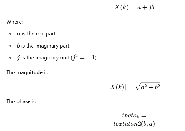
The FFT returns complex numbers of the form:
- 0 radians (or 0°): The Peak of the wave aligns with time zero.
- π/2 radians (90°): Signal is delayed by a quarter cycle.
- π radians (180°): Signal is inverted.
- Phase Shift indicates the temporal alignment of each frequency.
This gives the angle (in radians) that the frequency component makes with the real axis.
import numpy as np

# Example signal
signal = np.sin(2 * np.pi * 5 * np.linspace(0, 1, 1000))

# FFT
fft_result = np.fft.fft(signal)

# Phase calculation
phase = np.angle(fft_result)  # returns phase in radians

# Optional: unwrap phase to remove jumps
phase_unwrapped = np.unwrap(phase)
How to Calculate the Amplitude FFT
The amplitude of a Fast Fourier Transform (FFT) represents the magnitude of each frequency component of a signal. To calculate this amplitude from an FFT result, follow these steps:
- Perform FFT: Apply FFT to the time-domain signal:
fft_result = np.fft.fft(signal)Calculate Magnitude: Compute the absolute value of the FFT results to obtain the amplitude spectrum
amplitude_spectrum = np.abs(fft_result)Normalize (Optional): Often, the amplitude spectrum is normalized by dividing by the number of samples (N)
amplitude_spectrum = np.abs(fft_result) / len(signal)This amplitude spectrum clearly illustrates the strength of each frequency component in your signal.
From Spectrum to Spectrogram:
When analyzing audio signals, we often want to know what frequencies are present. That’s where the spectrum comes in; it’s like a snapshot of the sound’s frequency content at a specific moment in time.
But sound is not static. Speech, music, and everyday noises change constantly over time. That’s where the spectrogram becomes invaluable.
What’s the Difference?
Spectrum is like taking a photo:
- Imagine strumming a single chord on a guitar and freezing that moment. The spectrum tells you which notes (frequencies) are present, and how strong each one is.
- Great for analyzing a short, steady sound. But it tells you nothing about how the sound changes next.
A spectrogram is like a movie:
- Now, imagine a full guitar solo. The notes change rapidly — some fade, others appear. A spectrogram tracks the evolution of frequency content. Perfect for speech, music, and environmental sounds where timing matters.
How Does a Spectrogram Work?
Instead of doing one big FFT on the whole signal:
- We split the audio into short windows (e.g., 20–40 milliseconds).
- We perform FFT on each window.
- We stack the results side by side, forming a 2D image.
The result is a spectrogram:
- X-axis → Time
- Y-axis → Frequency
- Color → Amplitude (loudness)
This gives us a complete time–frequency map of the signal.
Why It’s Gold for ML?
Most audio ML models (like speech recognition, music tagging, sound classification) don’t use raw waveforms. Instead, they use spectrograms — because they capture both:
- What the signal contains (frequencies)
- When those sounds occur (timing)
It’s like giving your ML model a piano roll instead of just a sound wave — it’s far more structured and informative.
import librosa
import librosa.display
import matplotlib.pyplot as plt
import numpy as np  # Needed for FFT and spectrogram

# Load example audio (trumpet) for 5 seconds
y, sr = librosa.load(librosa.example('trumpet'), duration=5)

# 1. Waveform plot
plt.figure(figsize=(12, 4))
librosa.display.waveshow(y, sr=sr)
plt.title("Summary Waveform")
plt.xlabel("Time (s)")
plt.ylabel("Amplitude")
plt.grid(True)
plt.show()

# 2. Spectrum using STFT (log scale)
plt.figure(figsize=(12, 4))
D = librosa.amplitude_to_db(np.abs(librosa.stft(y)), ref=np.max)
librosa.display.specshow(D, sr=sr, x_axis='time', y_axis='log')
plt.colorbar(format='%+2.0f dB')
plt.title("Summary Spectrogram (Log-Frequency)")
plt.tight_layout()
plt.show()

# 3. Spectrogram (Linear Frequency)
S = librosa.stft(y, n_fft=1024, hop_length=256)
S_db = librosa.amplitude_to_db(np.abs(S), ref=np.max)

plt.figure(figsize=(12, 4))
librosa.display.specshow(S_db, sr=sr, hop_length=256, x_axis='time', y_axis='hz')
plt.title("Summary Spectrogram (Linear Frequency)")
plt.colorbar(format='%+2.0f dB')
plt.tight_layout()
plt.show()


- Waveform: Time-domain view of the audio.
- Log-Frequency Spectrogram: Better for human hearing (like a piano keyboard).
- Linear-Frequency Spectrogram: Good for machine perception or raw analysis.
The 2‑D Fourier Transform: turning pictures into patterns
Imagine you shine a laser through a transparent photo slide. On the wall behind it, you don’t see the photo itself — you see a pattern of bright dots. That pattern reveals how much of the image is made up of smooth areas and sharp edges. That’s what the 2D Fourier Transform does, but with math instead of light.
How does 2D FFT work?
-
Apply 1D FFT on All Rows: For each row in the image, FFT breaks it into a sum of sine and cosine waves (frequencies).
-
Apply 1D FFT on All Columns of the Result: Now, take the output and apply FFT again, but this time on each column.
The result is a complex-valued matrix:
Each cell represents a frequency component.
- The value contains:
- Magnitude (how strong that frequency is)
- Phase (how it’s aligned)
Usually, we visualize the magnitude (brightness in the frequency plot)
Important Note:
We often shift the result using fftshift():
fftshift(fft2(image))This places the low frequencies (smooth areas) in the center and the high frequencies (details) on the edges of the spectrum image, making it easier for humans to interpret.
Example:
import cv2
import numpy as np
import matplotlib.pyplot as plt
import requests

# Step 1: Load image from internet
image_url ="https://plus.unsplash.com/premium_photo-1752865066686-a58cb4d5b966?w=600&auto=format&fit=crop&q=60&ixlib=rb-4.1.0&ixid=M3wxMjA3fDB8MHxmZWF0dXJlZC1waG90b3MtZmVlZHwzM3x8fGVufDB8fHx8fA%3D%3D"
response = requests.get(image_url)
img_array = np.asarray(bytearray(response.content), dtype=np.uint8)
img = cv2.imdecode(img_array, cv2.IMREAD_GRAYSCALE)

# Step 2: Compute Fourier Transform
f = np.fft.fft2(img)
fshift = np.fft.fftshift(f)
magnitude_spectrum = 20 * np.log(np.abs(fshift) + 1)

# Step 3: Display original and its frequency spectrum
plt.figure(figsize=(12, 6))

plt.subplot(1, 2, 1)
plt.imshow(img, cmap='gray')
plt.title('Original Image')
plt.axis('off')

plt.subplot(1, 2, 2)
plt.imshow(magnitude_spectrum, cmap='gray')
plt.title('Fourier Spectrum')
plt.axis('off')

plt.show()

# Step 4: Enhance the image using the Fourier Spectrum (Sharpening)
rows, cols = img.shape
crow, ccol = rows // 2, cols // 2

# Create a high-pass filter mask to sharpen the image
mask = np.ones((rows, cols), np.uint8)
r = 30  # radius of low-frequency suppression area
mask[crow - r:crow + r, ccol - r:ccol + r] = 0

# Apply mask and inverse FFT
fshift_filtered = fshift * mask
f_ishift = np.fft.ifftshift(fshift_filtered)
img_enhanced = np.fft.ifft2(f_ishift)
img_enhanced = np.abs(img_enhanced)

# Normalize and enhance contrast for better visualization
img_enhanced = cv2.normalize(img_enhanced, None, 0, 255, cv2.NORM_MINMAX)

# Step 5: Compare original and enhanced images
plt.figure(figsize=(12, 6))

plt.subplot(1, 2, 1)
plt.imshow(img, cmap='gray')
plt.title('Original Image')
plt.axis('off')

plt.subplot(1, 2, 2)
plt.imshow(img_enhanced, cmap='gray')
plt.title('Enhanced (Sharpened) Image')
plt.axis('off')

plt.show()

What’s Happening?
1. Breaking the Image into Frequencies
The Fourier Transform takes an image and breaks it into frequencies:
- Low frequencies = smooth, gradual changes (like sky or skin)
- High frequencies = sharp details and edges (like outlines or textures)
2. Seeing the Hidden Structure
The result is a new version of the image, called the frequency spectrum:
- The center of the spectrum holds the low frequencies.
- The edges hold the high frequencies.
It’s like seeing the “DNA” of the image, with its rich detail and smoothness.
Sharpening the Image
- We reduce the low frequencies (which blur things).
- We boost the high frequencies (which enhance edges).
- This is called high-pass filtering, and it works like a smart edge enhancer.
This technique isn’t just cool, it’s powerful:
- It helps us clean up or sharpen images.
- It’s used in machine learning to detect features, patterns, and textures.
- It's great for tasks like medical imaging, facial recognition, and texture analysis.
- works like a smart edge enhancer.
Applications of FFT in Machine Learning.
Real-world machine learning and data science applications where the Fast Fourier Transform (FFT) plays a vital role. Each example includes an explanation of the problem, a description of how FFT is applied, and a code snippet to demonstrate its implementation.
1: Human Activity Recognition (HAR) Using Wearable Sensor Data
Detect whether a person is walking, running, or sitting based on accelerometer data. Human motion exhibits frequency patterns, such as walking at ~1–2 Hz and running at ~3–5 Hz. FFT transforms time-domain signals (like raw accelerometer data) into frequency features, which are more distinguishable for classification.
In this example, we applied the Fast Fourier Transform (FFT) to real-world data from the UCI Human Activity Recognition (HAR) dataset. This dataset contains motion signals (from smartphone sensors) recorded while people performed daily activities like walking, sitting, or standing.
Here’s what we did:
- Input Signals: We used the first 128 time-domain features (like accelerometer readings) from the training set to simulate time-series sensor signals.
- FFT Application: We transformed each signal from the time domain to the frequency domain using the FFT, capturing how movement patterns differ in frequency content (e.g., walking vs. sitting).
- Machine Learning: We trained a Random Forest classifier on the FFT-transformed features to predict which activity a person was doing.
- Result: The model achieved high accuracy, showing that frequency patterns from raw sensor data can effectively classify human activities.
# Re-import necessary packages after environment reset
import pandas as pd
import numpy as np
import zipfile
import os
from urllib.request import urlretrieve
from scipy.fft import fft
from sklearn.ensemble import RandomForestClassifier
from sklearn.model_selection import train_test_split
from sklearn.metrics import classification_report, accuracy_score,confusion_matrix, ConfusionMatrixDisplay
from sklearn.preprocessing import LabelEncoder

# Download and extract dataset
dataset_url = "https://archive.ics.uci.edu/static/public/240/human+activity+recognition+using+smartphones.zip"
zip_path = "human_activity_recognition.zip"
extract_path = "human_activity_recognition"

urlretrieve(dataset_url, zip_path)

with zipfile.ZipFile(zip_path, 'r') as zip_ref:
    zip_ref.extractall(extract_path)
with zipfile.ZipFile(os.path.join(extract_path,"UCI HAR Dataset.zip")) as zip_data:
    zip_data.extractall(extract_path)
# Load the train dataset
X = pd.read_csv(os.path.join(extract_path, "UCI HAR Dataset/train/X_train.txt"), delim_whitespace=True, header=None)
y = pd.read_csv(os.path.join(extract_path, "UCI HAR Dataset/train/y_train.txt"), header=None)

# Simulate time-series by selecting only the first 128 features
X = X.iloc[:, :128]
X_fft = np.abs(fft(X, axis=1))[:, :64]  # take half spectrum

# Encode target labels
le = LabelEncoder()
y = le.fit_transform(y[0])

# Train/test split
X_train, X_test, y_train, y_test = train_test_split(X_fft, y, test_size=0.3, random_state=42)
clf = RandomForestClassifier(n_estimators=100, random_state=42)
clf.fit(X_train, y_train)
y_pred = clf.predict(X_test)

# Evaluate
accuracy = accuracy_score(y_test, y_pred)
report_dict = classification_report(y_test, y_pred, target_names=le.classes_.astype(str),output_dict=False)

# Return both accuracy and the report dictionary
print(accuracy)
print(report_dict)
Accuracy: 0.9184043517679057
precision recall f1-score support
1 0.93 0.95 0.94 366
2 0.90 0.93 0.92 304
3 0.95 0.89 0.92 311
4 0.92 0.79 0.85 386
5 0.83 0.93 0.88 411
6 1.00 1.00 1.00 428
accuracy 0.92 2206
macro avg 0.92 0.92 0.92 2206
weighted avg 0.92 0.92 0.92 22062: Stock Price Volatility Detection
Identify periods of high-frequency (volatile) vs. low-frequency (stable) activity in stock prices. Volatility can manifest as high-frequency oscillations. FFT allows us to detect these patterns in price movements over time.
How does FFT help? It calculates the energy in high-frequency bands as a proxy for volatility.
import numpy as np
import matplotlib.pyplot as plt
# Simulate two market conditions
def simulate_prices(volatility, steps=128):
    return np.cumsum(np.random.normal(scale=volatility, size=steps))
stable = simulate_prices(0.5)
volatile = simulate_prices(3.0)
def fft_energy(prices):
    spectrum = np.abs(fft(prices))**2
    high_freq_energy = np.sum(spectrum[30:64])  # Arbitrary high-frequency slice
    return high_freq_energy
print("Stable Energy:", fft_energy(stable))
print("Volatile Energy:", fft_energy(volatile))
# Visualize
plt.plot(stable, label='Stable Market')
plt.plot(volatile, label='Volatile Market')
plt.legend()
plt.title("Simulated Price Movement")
plt.show()
The following example uses real-world financial data to demonstrate how the Fourier Transform can help quantify volatility. Stocks with more frequent, sharp price changes (like Tesla) show higher energy in the high-frequency spectrum, making this a powerful signal for machine learning in finance.
# STEP 1: Install yfinance (only needed once)
!pip install yfinance

# STEP 2: Run the actual code
import numpy as np
import matplotlib.pyplot as plt
import pandas as pd
from scipy.fft import fft
import yfinance as yf

# Download historical stock price data
tickers = ['AAPL', 'TSLA']
data = yf.download(tickers, start='2022-01-01', end='2023-01-01')

# Check column format
print(data.columns)

# Access the 'Close' column for each ticker
apple_prices = data[('Close', 'AAPL')].dropna().values[:128]
tesla_prices = data[('Close', 'TSLA')].dropna().values[:128]

# Compute FFT-based high-frequency energy
def fft_energy(prices):
    """
    We sum from index 30 to 64:
    These represent higher-frequency components (rapid price changes).
    This is a heuristic range to isolate short-term volatility.
    Gives the power spectrum — how much "energy" is in each frequency
    component.
    """

    spectrum = np.abs(fft(prices))**2

    return np.sum(spectrum[30:64])

print("Apple High-Frequency Energy (Lower Volatility):", fft_energy(apple_prices))
print("Tesla High-Frequency Energy (Higher Volatility):", fft_energy(tesla_prices))

# Plot the price movements
plt.plot(apple_prices, label='AAPL (Stable)')
plt.plot(tesla_prices, label='TSLA (Volatile)')
plt.legend()
plt.title("Stock Price Comparison: Apple vs Tesla")
plt.xlabel("Days")
plt.ylabel("Adjusted Close Price")
plt.grid(True)
plt.show()
Apple High-Frequency Energy (Lower Volatility): 31004.19767411604
Tesla High-Frequency Energy (Higher Volatility): 542662.8919135245
3: Image Classification Using Frequency Features (FFT)
Classify basic image categories (e.g., textures, digits, objects) using patterns in the frequency domain. Images contain both structural (edges, lines) and textural (fine details) information. FFT helps quantify these patterns in terms of:
- High frequencies → Edges, noise
- Low frequencies → Broad shapes, background
Using FFT on images can:
- Highlight unique texture or shape features.
- Reduce sensitivity to lighting or spatial shifts.
- Compress data for faster processing.
How does FFT help in ML? Convert an image to the frequency domain, extract features from the magnitude spectrum (optionally from log-scaled or band-filtered frequency regions), and use them for classification.
import numpy as np
import matplotlib.pyplot as plt
from sklearn.ensemble import RandomForestClassifier
from sklearn.model_selection import train_test_split
from sklearn.datasets import fetch_openml

# Load MNIST (grayscale 28x28 handwritten digits)
X_raw, y_raw = fetch_openml('mnist_784', version=1, return_X_y=True, as_frame=False)
X_raw = X_raw.reshape(-1, 28, 28)[:2000]
y_raw = y_raw[:2000]

# Extract FFT-based features
def fft_features(img):
    f = np.fft.fft2(img)
    fshift = np.fft.fftshift(f)
    magnitude = np.abs(fshift)
    log_magnitude = np.log1p(magnitude)
    return log_magnitude.flatten()[:100]  # take first 100 features

X_fft = np.array([fft_features(img) for img in X_raw])

# Train classifier
X_train, X_test, y_train, y_test = train_test_split(X_fft, y_raw, test_size=0.2, random_state=42)
clf = RandomForestClassifier()
clf.fit(X_train, y_train)

# Evaluate
print("FFT-based Classification Accuracy:", clf.score(X_test, y_test))

# Visualize example
plt.imshow(X_raw[0], cmap='gray')
plt.title(f"Digit: {y_raw[0]}")
plt.axis('off')
plt.show()
- FFT converts image content into frequency patterns that often separate classes more clearly (e.g., digits like 1, 6, and 8 have distinct spectral shapes).
- Works well for texture datasets (e.g., leaf veins, medical imaging) and augmentation-resilient classification.
- Can be combined with PCA or CNNs to improve performance or reduce dimensionality.
When Would You Use This Approach?
- Texture-based image classification (e.g., medical scans, fabric analysis).
- When you want rotation and translation robustness (FFT is more stable under small shifts).
- As a feature engineering technique, it is applied before feeding data into a deeper model.
Applications of Phase in Machine Learning.
1. Audio Source Separation (e.g., Voice & Music)
Separating vocals from background music, enhancing speech, and noise cancellation. Magnitude tells you what sound is present. But without the correct phase, reconstructing a clear signal is difficult or impossible.
- Models like Open-Unmix, Spleeter, or Conv-TasNet use phase-aware reconstructions.
- Some ML models estimate the ideal phase to recombine with a cleaned magnitude.
. Using only magnitude with inverse FFT often gives muffled or distorted output.
The following example takes a short trumpet solo and dives into its frequency world using the Short-Time Fourier Transform (STFT). First, it breaks the audio into its magnitude (volume) and phase (timing) components. Then, like turning down background noise in a crowded room, it filters out the quieter parts, keeping only the loudest 15% of the signal. Finally, it reconstructs the audio using the original timing and phase, giving us a cleaner version focused on the loudest musical elements. To visualize the difference, it displays before-and-after spectrograms and even saves both versions as .wav files for you to hear the magic.
import numpy as np
import matplotlib.pyplot as plt
import librosa
import librosa.display
import soundfile as sf

# Load example audio (librosa provides a trumpet solo)
y, sr = librosa.load(librosa.example('trumpet'), duration=5)

# 1. Compute STFT,
D = librosa.stft(y, n_fft=1024, hop_length=256)
magnitude, phase = np.abs(D), np.angle(D)

# 2. Apply threshold to magnitude (retain only loud components)
threshold = np.percentile(magnitude, 85)
mask = magnitude > threshold
filtered_magnitude = magnitude * mask

# 3. Reconstruct using original phase
filtered_D = filtered_magnitude * np.exp(1j * phase)
y_filtered = librosa.istft(filtered_D, hop_length=256)

# 4. Plot spectrograms
plt.figure(figsize=(12, 5))
plt.subplot(1, 2, 1)
librosa.display.specshow(librosa.amplitude_to_db(magnitude, ref=np.max),
                         sr=sr, hop_length=256, y_axis='log', x_axis='time')
plt.title('Original Spectrogram')
plt.colorbar(format='%+2.0f dB')

plt.subplot(1, 2, 2)
librosa.display.specshow(librosa.amplitude_to_db(filtered_magnitude, ref=np.max),
                         sr=sr, hop_length=256, y_axis='log', x_axis='time')
plt.title('Filtered Spectrogram (Loud Only)')
plt.colorbar(format='%+2.0f dB')
plt.tight_layout()
plt.show()

# 5. Save original and filtered audio for listening
sf.write('original.wav', y, sr)
sf.write('filtered_loud.wav', y_filtered, sr)
2. Adversarial Attacks & Robustness
Sometimes, machine learning models — especially in computer vision — can be fooled by very small, sneaky changes to an image. These are called adversarial attacks. They slightly tweak pixel values in a way that’s almost invisible to the human eye, but enough to confuse the model into making wrong predictions.
Researchers found that while these tiny changes affect pixel values (and therefore the magnitude of the image in the frequency domain), the phase, which holds important structural information, often stays the same. And that’s important, because the phase helps preserve the overall shape and meaning of the image.
To make models more robust:
- Some techniques change or train CNNs using frequency components like phase or magnitude instead of raw pixels.
- One approach is called Fourier Adversarial Training, where models are trained with images that have been altered in the frequency domain.
- Another trick is to randomize or normalize the phase during training so the model doesn’t over-rely on specific pixel arrangements, which helps prevent overfitting.
In short, by focusing on how images behave in the frequency domain (instead of just pixels), we can build models that are harder to trick and more reliable
3. Fourier Domain Augmentations (FDA)
In real-world applications, models trained on one dataset (like studio-quality photos) often perform poorly on different datasets (like blurry mobile images). This is where domain adaptation comes in; the goal is to train models that can generalize well across different types of data.
One powerful technique is called Fourier Domain Adaptation (FDA). Here’s how it works:
- Images from different datasets may look very different in terms of lighting, color, and texture — these differences mostly live in the low-frequency part of the image (the magnitude).
- FDA swaps the low-frequency magnitude from the source image (training data) with that of the target image (real-world data), while keeping the phase unchanged.
- Why keep the phase? Because phase contains most of the image’s structure — edges, shapes, and layout — which are critical for understanding the content.
By doing this, the model learns to focus on critical structural features rather than superficial visual styles, which helps it perform better across different image domains.
Next is an example that includes the previous two applications:
In the first part, we download a grayscale photo and break it down into two hidden ingredients using fft2.We then blur the magnitude, simulating a loss in detail, like lowering image resolution or adding fog. But we keep the original phase untouched. Then we reconstruct the image using this fuzzy magnitude + sharp phase.
In the second part, we load two different images, one of which is our source, and the other is our target (imagine a cartoon-style face and a real photo). We convert both to frequency space and swap the low-frequency components (which carry style, lighting, and tone) from the target into the source, like giving your cartoon a real-world lighting makeover. But we keep the source’s phase, preserving its structure and shape. The result? A blended image that still looks like the source but now adapts to the style of the target, a powerful trick used in domain adaptation to train ML models across datasets.
import numpy as np
import matplotlib.pyplot as plt
import cv2
import requests
from scipy.fft import fft2, ifft2, fftshift, ifftshift

# 1. Image Super-Resolution: Phase-aware Reconstruction
def image_phase_reconstruction_example():
    url = "https://plus.unsplash.com/premium_photo-1752865066686-a58cb4d5b966?w=600&auto=format&fit=crop&q=60&ixlib=rb-4.1.0&ixid=M3wxMjA3fDB8MHxmZWF0dXJlZC1waG90b3MtZmVlZHwzM3x8fGVufDB8fHx8fA%3D%3D"
    resp = requests.get(url, stream=True).raw
    img = cv2.imdecode(np.asarray(bytearray(resp.read()), dtype=np.uint8), cv2.IMREAD_GRAYSCALE)

    # FFT
    f = fft2(img)
    fshift = fftshift(f)
    magnitude = np.abs(fshift)
    phase = np.angle(fshift)

    # Blur magnitude artificially
    blurred_mag = cv2.GaussianBlur(magnitude, (21, 21), 0)

    # Reconstruct image using original phase and blurred magnitude
    f_blurred = blurred_mag * np.exp(1j * phase)
    img_reconstructed = np.abs(ifft2(ifftshift(f_blurred)))

    return img, img_reconstructed

# 2. Domain Adaptation (FDA): Swap low-frequency magnitude
def domain_adaptation_fda_example():
    url1 ="https://plus.unsplash.com/premium_photo-1752865066686-a58cb4d5b966?w=600&auto=format&fit=crop&q=60&ixlib=rb-4.1.0&ixid=M3wxMjA3fDB8MHxmZWF0dXJlZC1waG90b3MtZmVlZHwzM3x8fGVufDB8fHx8fA%3D%3D" # Source
    url2 = "https://plus.unsplash.com/premium_photo-1752832756659-4dd7c40f5ae7?w=600&auto=format&fit=crop&q=60&ixlib=rb-4.1.0&ixid=M3wxMjA3fDB8MHxmZWF0dXJlZC1waG90b3MtZmVlZHw2fHx8ZW58MHx8fHx8" # Target
    img1 = cv2.imdecode(np.asarray(bytearray(requests.get(url1).content)), cv2.IMREAD_GRAYSCALE)
    img2 = cv2.imdecode(np.asarray(bytearray(requests.get(url2).content)), cv2.IMREAD_GRAYSCALE)
    img1, img2 = cv2.resize(img1, (256, 256)), cv2.resize(img2, (256, 256))

    # FFT
    f1, f2 = fftshift(fft2(img1)), fftshift(fft2(img2))
    mag1, mag2 = np.abs(f1), np.abs(f2)
    phase1 = np.angle(f1)

    # Replace low-frequency in mag1 with mag2
    h, w = mag1.shape
    cx, cy = h//2, w//2
    r = 32  # low frequency radius
    mag1[cx-r:cx+r, cy-r:cy+r] = mag2[cx-r:cx+r, cy-r:cy+r]

    # Reconstruct
    f_new = mag1 * np.exp(1j * phase1)
    img_fda = np.abs(ifft2(ifftshift(f_new)))

    return img1, img2, img_fda

# Run and visualize the examples
img_orig, img_phase_reconstructed = image_phase_reconstruction_example()
img_src, img_tgt, img_fda_result = domain_adaptation_fda_example()

# Display results for phase-aware reconstruction
plt.figure(figsize=(12, 6))
plt.subplot(1, 2, 1)
plt.imshow(img_orig, cmap='gray')
plt.title("Original Image")
plt.axis('off')

plt.subplot(1, 2, 2)
plt.imshow(img_phase_reconstructed, cmap='gray')
plt.title("Phase-Aware Reconstruction (Blurred Mag)")
plt.axis('off')
plt.show()

# Display results for FDA
plt.figure(figsize=(12, 6))
plt.subplot(1, 3, 1)
plt.imshow(img_src, cmap='gray')
plt.title("Source Image")
plt.axis('off')

plt.subplot(1, 3, 2)
plt.imshow(img_tgt, cmap='gray')
plt.title("Target Image")
plt.axis('off')

plt.subplot(1, 3, 3)
plt.imshow(img_fda_result, cmap='gray')
plt.title("FDA Result (Phase Preserved)")
plt.axis('off')
plt.show()

The Fourier Transform isn’t just some fancy math trick. It’s a behind-the-scenes hero helping Spotify recognize your favorite tunes, making blurry images sharper, and even giving machine learning models a better sense of the world. By turning signals into frequencies, we can spot patterns, clean up noise, and extract meaningful features. Whether you’re working with sound, images, or raw data, knowing how to “listen” in the frequency domain opens up a whole new level of insight. Pretty cool, right?
Stay connected for more articles—there's plenty more on the way!
메타데이터
- post_id
- c00fae8ed985
- slug
- math-for-ml-fourier-transform-explained-simply-with-ml-examples-c00fae8ed985
- url
- https://medium.com/@ryassminh/math-for-ml-fourier-transform-explained-simply-with-ml-examples-c00fae8ed985
- canonical_url
- https://medium.com/@ryassminh/math-for-ml-fourier-transform-explained-simply-with-ml-examples-c00fae8ed985
- author_url
- https://medium.com/@ryassminh
- status
- ok
- fetched_at
- 2026-07-31 00:41:58