How to Turn a Meaningful Place Into a Map Poster That Still Looks Good
A practical framework for choosing crop, labels, color, and personal details
How to Turn a Meaningful Place Into a Map Poster That Still Looks Good
A practical framework for choosing crop, labels, color, and personal details
A meaningful place is not automatically a good map poster.
The street network may be interesting, but the first draft can still feel like a screenshot: too many labels, no visual focus, and no clear reason for the crop.
A stronger poster turns geography into a hierarchy. One place leads, supporting roads and water create structure, and a few personal details explain why the map belongs on a wall.
Start with the memory, not the map
Before choosing colors or type, finish this sentence: “This place matters because…”
The answer might be a hometown, the neighborhood where two people met, a marathon route, a favorite travel stop, a campus, or a wedding venue. Each answer points to a different composition.
A city poster usually needs a recognizable urban pattern. A route poster needs the path to remain dominant. A gift map may need a marker, date, or short title more than it needs every road name.
Choose a crop that supports the story
The crop is the most important design choice because it decides what context survives.
A tight crop can make one neighborhood feel intentional. A wider crop can show the relationship between a river, downtown, and surrounding districts. Neither is better by default.
Keep the place that carries the memory away from the extreme edge. Then look at the negative space around it. Water, parks, and less dense areas can give a title or coordinates room to breathe.
If the crop includes large areas that do not add recognition or balance, remove them. A poster does not need to prove that you included the whole city.
Use fewer labels than a navigation map
Navigation maps answer “Where am I going?” A poster answers “What place is this?”
Those are different jobs. A navigation map benefits from many street names and points of interest. A poster often looks stronger when labels are limited to the city, one or two landmarks, and only the context needed for the memory.
Remove labels that compete with the title. Keep labels that improve orientation. If the street network is already visually dense, typography should become quieter, not louder.
Color should create hierarchy
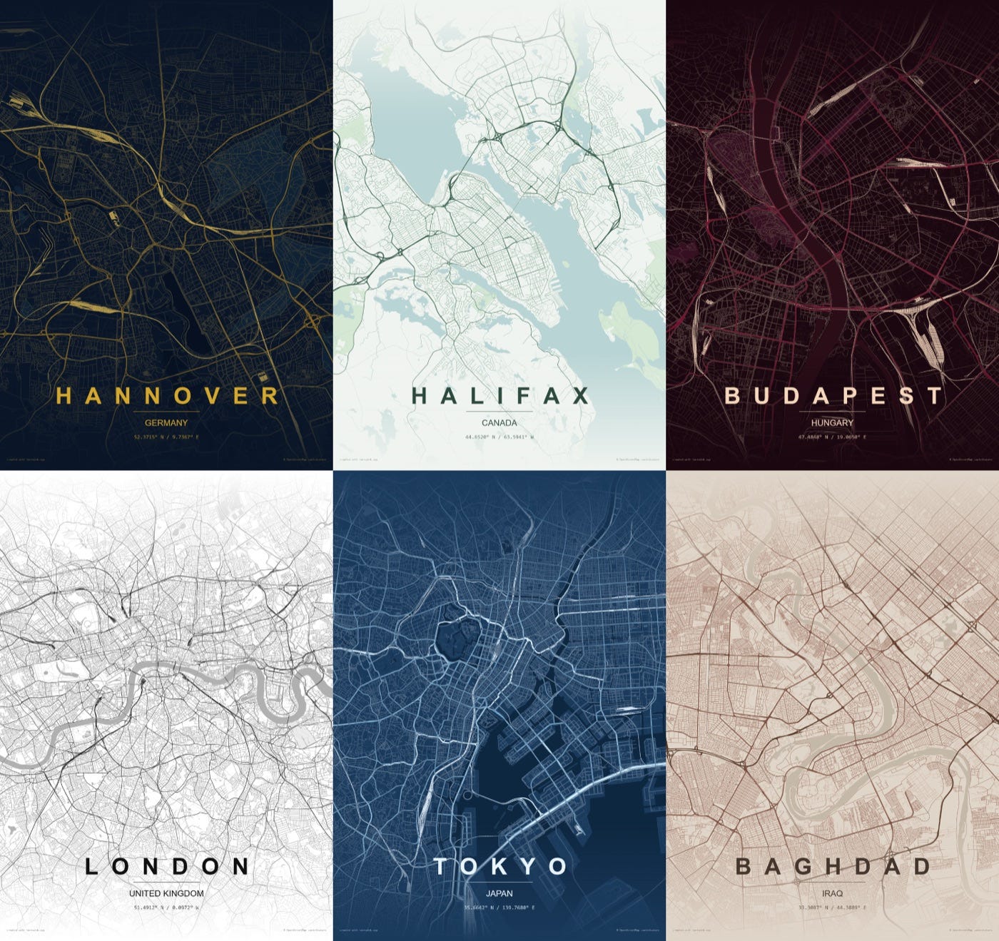
Color is useful when it separates major roads, local streets, water, land, route lines, and text. It is less useful when every layer tries to become the focal point.
Start with a restrained base. Then choose one accent role: a route, a river, major roads, or a marker. Repeating the same accent everywhere makes it stop feeling like an accent.
Dark themes can emphasize illuminated road lines. Light themes can make dense street patterns feel more architectural. Muted palettes can leave more attention for a date or title. The right choice depends on which element must be noticed first.
Decide whether the hero is a place or a route
City posters and route posters can use the same geographic area, but their visual hierarchy should be different.
For a city poster, the street pattern and city name usually carry the identity. For a route poster, the path should be readable at a glance even when the surrounding map is complex.
If the route disappears at thumbnail size, reduce the contrast of the base map or increase the contrast of the route. Do not solve the problem by adding more labels.
Add personal details with restraint
A title, coordinates, date, venue name, or short dedication can turn a generic map into a specific memory.
The mistake is treating every detail as equally important. Choose one primary line, such as the city or event name. Use coordinates or dates as supporting information. A dedication can be small and quiet.
Personal information should explain the map without covering it.
Test the design at two sizes
First, zoom out until the poster is roughly the size of a phone screen. Can you still identify the main place or route? Does the title remain readable? Is there one obvious focal point?
Then zoom in and inspect road density, label collisions, thin lines, and the spacing around the border. The thumbnail test checks hierarchy; the close-up test checks craft.
The Vellum & Line map poster maker exposes crop, color, layers, label density, type, ratio, borders, routes, markers, titles, coordinates, and dates in one browser workflow.
A simple map-poster checklist
Before exporting, ask:
What memory or place is the poster about?
Is the crop tighter than it needs to be, or wider than it needs to be?
Which element should be noticed first?
Can at least half of the labels be removed?
Does the accent color have one clear job?
Is this a city poster or a route poster?
Do the title, date, coordinates, and marker support the same story?
Does the design still work at phone size?
Final take
A good map poster is edited geography. It keeps the lines that create recognition, removes the information that belongs in a navigation app, and adds only the personal details that explain the memory.
Choose the story, set the crop, reduce labels, assign one visual accent, and test the hierarchy before worrying about decorative polish.
Try the process in Vellum & Line with one meaningful place, then create a second version by changing only the crop or label density.
메타데이터
- post_id
- c072592618be
- slug
- how-to-turn-a-meaningful-place-into-a-map-poster-that-still-looks-good-c072592618be
- url
- https://medium.com/@geektao1024/how-to-turn-a-meaningful-place-into-a-map-poster-that-still-looks-good-c072592618be
- canonical_url
- https://medium.com/@geektao1024/how-to-turn-a-meaningful-place-into-a-map-poster-that-still-looks-good-c072592618be
- author_url
- https://medium.com/@geektao1024
- status
- ok
- fetched_at
- 2026-07-20 22:42:24