When a Grey Checkmark at X Hurts a UX designer:
How X’s “Official” Badge Normalizes Dangerous Power
When a Grey Checkmark at X Hurts a UX designer: How X’s “official” Badge Normalizes Dangerous Power
There is a small piece of UX on X that hurts me every time I see it.
It’s not an algorithm change, not the ads, not even the “For You” tab.
It’s the grey/gray verification checkmark — the one that says: this is an official government or multilateral organization account.
On paper, that sounds neutral. In practice, when that same symbol sits next to the name of Ali Khamenei — the Supreme Leader of Iran, whose military arm (the IRGC) has been designated a Foreign Terrorist Organization by the United States — that little icon stops being neutral at all.
This is a story about UX, trust, and why I started the #XAgainstTerror campaign.
⸻
- Who Gets a Grey/Gray Checkmark on X?
X’s own help documents explain the grey/gray checkmark simply:
It indicates that an account represents a government, a government official, or a multilateral organization.
That means:
• Heads of state and government leaders
• Government ministries and agencies
• Embassies and diplomatic missions
• Multilateral bodies (like the UN, EU, etc.)
External guides and blog posts about X verification repeat the same idea: the grey checkmark is a symbol of trust and “official status” that tells users, this is the real government account, you can rely on this for authoritative information.
From a pure UX point of view, this makes sense:
• Problem: People can’t tell if an account claiming to be a government is real.
• Solution: Give real governments a distinct icon and label.
• Outcome (intended): When there’s a crisis or election, people can quickly find the “official” source.
So far, that’s logical.
But UX is never just about the “happy path.” It’s also about edge cases. And sometimes, those edge cases are not “rare bugs.” They’re entire regimes.
⸻
- When the Badge Sits Next to Khamenei and the IRGC
Ali Khamenei is the Supreme Leader of the Islamic Republic of Iran. His official account on X, often known as @khamenei_ir, posts statements, speeches, and political messages — and it carries that same grey/gray government checkmark.
At the same time, the Islamic Revolutionary Guard Corps (IRGC) — a core pillar of the Iranian state — has:
• Been designated a Foreign Terrorist Organization (FTO) by the U.S. government since 2019, the first time an official branch of a foreign military was put on that list.
• Been targeted by extensive terrorism-related sanctions, and there have been active debates in Europe and elsewhere about further terror listings.
In other words:
• X: “Here is a calm grey badge that means official, authoritative government account.”
• Many democracies: “This same state structure is deeply entangled with terrorism and repression.”
X didn’t invent this contradiction. The international system already treats some governments both as states and as terror sponsors at the same time. But UX has power.
UX decides how that contradiction feels to ordinary people.
Right now, on X, it feels like this:
“Here is a trusted, official, neutral source. Tap to follow.”
That hurts.
⸻
- How Ordinary Users Experience This UX: Trust by Default
Most people do not track foreign policy designations, sanctions lists, FTO registers, or EU counter-terrorism debates.
Most people experience the internet like this:
• Blue check? “Probably legit.”
• Gold check? “Big company.”
• Grey/gray check? “Government, authoritative, probably trustworthy.”
That’s also how a lot of social media guides describe it: a “symbol of trust” indicating an authentic, official public authority.
So here’s the UX problem in one sentence:
When a platform gives the same “trust” badge to the UN and to the leadership of a regime whose military arm is on a terrorist list, ordinary people will naturally read both as equally legitimate voices.

They may not know about the IRGC. They may not know about FTO lists, extraterritorial assassinations, transnational repression, or militias being designated as terrorist organizations.
They just see:
• A profile picture
• A display name
• A government-colored badge
• A short bio that sounds formal and respectable
And the brain quietly does UX-driven math:
checkmark + government label + formal tone = probably safe to believe.
This is not “user stupidity.” This is exactly what the UX invites.
The design says:
• We, the platform, have done a special level of verification here.
• This is not just some random user. This is an important, legitimate authority.
When that badge is applied to leaders and state structures tied to terror-listed organizations and systemic repression, the UX isn’t neutral anymore. It becomes an interface that launders power.
That’s the part that hurts me.
⸻
- XAgainstTerror: A Small UX Protest
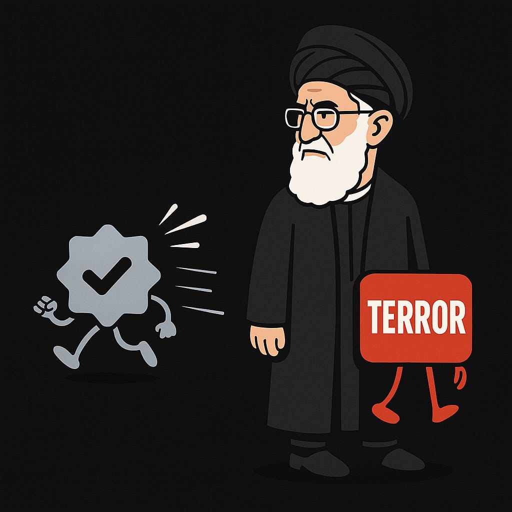
Because I cannot change the design of X myself, I did the only thing a user can do: I started a campaign.
I called it #XAgainstTerror.
The idea is simple:
If X uses a single grey/gray badge to legitimize governments, we must at least use our voices to highlight when that badge is being placed on regimes connected to terrorism and systematic human rights abuse.
In the pinned tweet of the campaign, I:
• Show how the same grey checkmark appears on accounts like Khamenei’s.
• Remind readers that Iran’s IRGC is officially designated a Foreign Terrorist Organization by the U.S. and is the subject of terrorism-related measures by allies.
• Ask a basic UX-ethics question:
• Should a platform’s “trusted authority” badge be visually indistinguishable between a democracy and a regime whose core military arm is on terror lists?
⸻
- What X Could Do Differently (Concrete UX Ideas)
I don’t want to just scream “this is wrong” and walk away. Product design always involves trade-offs, but there are other options.
Here are a few concrete UX changes X could consider:
5.1. Distinguish “Government” from “Sanctioned/Terror-Linked Government”
Instead of a single grey badge, X could introduce:
• A separate icon or color variant for:
• Governments or officials under terrorism designations, or
• Entities under major terrorism-related sanctions in democratic jurisdictions.
Alongside that icon, X could show a short, neutral label like:
“This government entity is subject to terrorism-related sanctions in some jurisdictions.”
and link to a factual explainer.
5.2. Add Context Panels on First Visit
The first time a user opens a profile like this, X could show a panel:
This account represents a government or government-linked entity. Some countries have designated parts of this government or its forces as terrorist organizations or imposed terrorism-related sanctions. Learn more.
This doesn’t take a political stance; it simply makes the hidden context visible.
5.3. Give Users Controls Over What They See
Imagine a simple toggle in Settings:
• Hide posts from state accounts linked to terrorism designations
• Show warning labels on such accounts
Let people decide.
Right now, users’ only real options are:
• Block
• Mute
• Report
Giving them structured controls respects user autonomy instead of quietly flattening all “governments” into one neutral category.
5.4. Open a Public UX & Safety Review
X could also invite:
• UX researchers
• Human-rights and digital-rights experts
• Counter-terrorism legal scholars
• Free-speech advocates
to a public design review of how government badges and labels are applied.
The question isn’t “should governments be allowed on X?” That debate is old. The real question is:
How can the platform’s UX reflect the real-world complexity of some governments being deeply entangled with terrorism and transnational repression — without becoming a censorship machine?
That’s a hard design problem. But ignoring it is also a choice.
⸻
Conclusion: A Tiny Icon With a Very Real Cost
I know this is “just UX.” Just a tiny grey/gray checkmark. Just a tooltip. Just a label.
But UX is where political power becomes normal. Where danger becomes background noise. Where a leader whose security apparatus is designated as a terrorist organization by major democracies appears side-by-side with the UN under the same calm, official icon.
For me, that feels like a quiet wound every time I scroll.
The #XAgainstTerror campaign is my small way of saying:
Design is never neutral when it touches power and violence.
If X truly wants to be a global “town square,” it needs to think not only about verifying who is real, but also about how its design shapes who gets trusted.
Until then, I’ll keep writing, keep screenshotting, and keep repeating the same simple plea:
We deserve a UX that does not help normalize terror.
⸻
Update — December 2025: Let’s Turn Concern into Action
A month after publishing this piece, the grey checkmark issue remains unchanged — and the need for transparency on X feels more urgent than ever.
That’s why I’ve launched a formal petition calling on X to add clear, user-facing warnings (e.g., “Subject to terrorism sanctions in some jurisdictions”) for verified government accounts linked to U.S.-designated terrorist organizations like the IRGC.
This isn’t about censorship; it’s about giving users the context they deserve so the platform’s own “trust” badge doesn’t inadvertently legitimize dangerous entities.
If you believe X should reflect real-world complexity instead of flattening all governments into one neutral category, please add your voice:
Sign the Petition Here: https://c.org/KJKgxRL8Hz
Every signature and share helps. Let’s push X toward a safer, more honest UX.
XAgainstTerror
NoGreyForTerror
Thank you for reading and for caring about this.
⸻
References / Sources (for readers who want to dig deeper)
- X / Twitter Help Center — Documentation on verification and the different checkmark colors for government and multilateral organization accounts.
(Search: “X Help Center grey checkmark government multilateral organizations”.)
- U.S. Department of State — Press statement announcing the designation of Iran’s Islamic Revolutionary Guard Corps (IRGC) as a Foreign Terrorist Organization (FTO) in 2019.
(Search: “U.S. State Department Designation of the IRGC Foreign Terrorist Organization 2019”.)
- U.S. government terrorism and sanctions information on Iran and the IRGC from official sites such as:
— U.S. Department of State (terrorist designation lists and country reports)
— U.S. Department of the Treasury (sanctions press releases and IRGC-related designations).
- European and allied debates on listing the IRGC as a terrorist organization and related sanctions.
(Search: “European Parliament resolution IRGC terrorist organization” or “EU debate listing IRGC”.)
- General guides and articles explaining X’s verification system and the meaning of blue, gold, and grey/gray checkmarks, including those that describe the grey badge as representing official, authoritative government accounts.
(Search: “what the grey checkmark means on X verification”.)
메타데이터
- post_id
- c109af4e8942
- slug
- when-a-grey-checkmark-at-x-hurts-a-ux-designer-c109af4e8942
- url
- https://medium.com/@amirellia/when-a-grey-checkmark-at-x-hurts-a-ux-designer-c109af4e8942
- canonical_url
- https://medium.com/@amirellia/when-a-grey-checkmark-at-x-hurts-a-ux-designer-c109af4e8942
- author_url
- https://medium.com/@amirellia
- status
- ok
- fetched_at
- 2026-07-18 00:11:11