Descriptive Statistics for Beginners: Understanding Data in Simple Words
Introduction
Descriptive Statistics for Beginners: Understanding Data in Simple Words
Introduction
Every day, we make decisions using data.
A shop owner checks daily sales. A cricket fan looks at player scores. A company studies customer feedback. A student checks exam marks.
But raw data alone is often confusing. Imagine looking at thousands of numbers in an Excel sheet. It becomes difficult to understand what the data is actually saying.
This is where Descriptive Statistics helps.
Descriptive statistics is the process of summarizing and understanding data using simple numerical measures and visual thinking.
It helps answer questions like:
- What is the typical value?
- How spread out is the data?
- Are there unusual values?
- Is the data balanced or skewed?
- How risky or uncertain is the data?
In this article, we will learn descriptive statistics in simple words using real-life and business examples.
1. Measures of Central Tendency
Introduction
When we collect data, one of the first questions we ask is:
“What is the center of this data?”
For example:
- What is the average salary in a company?
- What is the typical house price in a city?
- What is the usual delivery time for orders?
Measures of central tendency help us find the “middle” or “typical” value in data.
The three main measures are:
- Mean
- Median
- Mode
But one important thing to remember is:
“The average can sometimes be misleading.”
Different datasets may have the same average but very different behaviors. That is why we must understand each measure carefully.
Mean
What is Mean?
The mean is what most people call the “average.”
We calculate it by:
- Adding all values
- Dividing by the number of values
For example:
If five students scored: 70, 75, 80, 85, 90
The mean score is: (70 + 75 + 80 + 85 + 90) ÷ 5 = 80
So the average score is 80.
Why is Mean Called the Balance Point?
Think of a see-saw.
The mean acts like the balancing point where the entire dataset balances equally.
Values below the mean pull one side down. Values above the mean pull the other side.
That is why the mean represents the overall center of the data.
Effect of Extreme Values
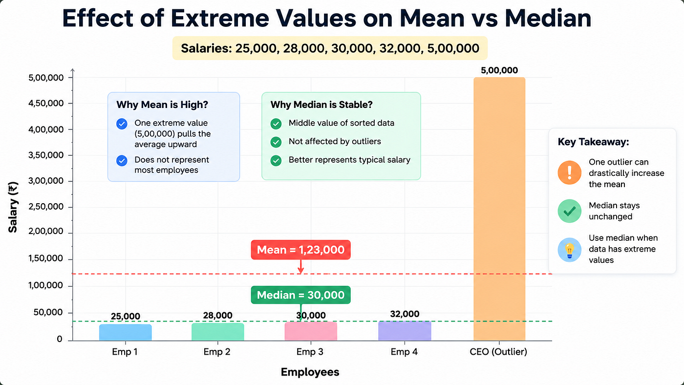
One major weakness of the mean is that it is affected by extreme values, also called outliers.
Suppose a small company has employee salaries:
25,000 28,000 30,000 32,000 5,00,000
The mean salary becomes very high because of one CEO salary.
Even though most employees earn around 30,000, the average may incorrectly suggest that employees earn much more.
When Mean is Useful
Mean works well when:
- Data is balanced
- There are no major outliers
- We want the overall average
Business examples:
- Average monthly sales
- Average exam scores
- Average temperature
- Average website traffic
When Mean Gives Wrong Understanding
Mean can be misleading when:
- Data has extreme values
- Income or salary data is uneven
- House prices vary too much
- Data is highly skewed
In such cases, median gives a better picture.
Median
What is Median?
The median is the middle value when data is arranged in order.
Example:
10, 20, 30, 40, 50
The middle value is 30. So the median is 30.
If there are two middle numbers, we take their average.
Why Median is Not Affected by Outliers
Let us revisit the salary example:
25,000
28,000
30,000
32,000
5,00,000
The median is still 30,000.
The extremely high salary does not affect the middle position.
That is why median is considered more reliable for uneven data.
Why Businesses Prefer Median for Salaries and House Prices
Many businesses and governments prefer median because it represents what a “typical” person experiences.
Examples:
- Median salary shows what most employees actually earn
- Median house price shows realistic property prices
- Median waiting time gives a better customer experience estimate
That is why news reports often mention:
“Median household income”
instead of average income.
Mode
What is Mode?
Mode is the value that appears most frequently.
Example:
2, 3, 3, 5, 7
Mode = 3
because it appears most often.
Why Mode is Useful for Categorical Data
Mode is especially useful when data is not numerical.
For example:
- Most popular shirt size
- Most common payment method
- Most purchased mobile brand
- Most visited website category
A clothing company may find that “Medium” is the most sold shirt size. This helps them manage inventory better.
Businesses use mode to understand customer preferences and trends.
2. Measures of Dispersion
Introduction
Knowing the center of data is not enough.
Two datasets can have the same average but behave very differently.
Example:
Dataset A: 48, 49, 50, 51, 52
Dataset B: 10, 20, 50, 80, 90
Both datasets have the same mean of 50.
But Dataset A is very consistent. Dataset B is highly spread out.
Measures of dispersion help us understand:
- How much data varies
- How consistent the values are
- How risky or uncertain the data is
Range
Meaning of Range
Range is the difference between the maximum and minimum values.
Formula idea:
Range = Largest Value − Smallest Value
Example:
Marks: 40, 50, 60, 80
Range = 80 − 40 = 40
Advantages of Range
- Very simple to calculate
- Gives quick understanding of spread
- Useful for rough comparisons
Example: A business can compare daily sales fluctuations quickly using range.
Limitations of Range
Range only uses two values:
- Highest value
- Lowest value
It ignores all other data points.
This makes it sensitive to outliers.
One unusual value can completely change the range.
Variance
What Does Variance Measure?
Variance measures how far data points are spread from the mean.
It tells us whether values stay close to the average or move far away.
A simple way to think about variance is:
- Small variance → values are close together
- Large variance → values are spread out
The variance formula is:
Variance = Σ (x − x̄)² / n
Where:
- x = each value
- x̄ = mean
- n = total number of values
Low variance:
- Data is consistent
- Values stay near the mean
High variance:
- Data is highly spread out
- Values vary significantly

Two datasets can have the same average but very different variability. Variance helps measure this spread.
Why Are Differences Squared?
When calculating variance, we square the differences from the mean.
Why?
Because:
- Positive and negative differences would cancel each other
- Squaring gives more importance to larger deviations
This helps capture overall variability properly.
Meaning of Large Variance
Large variance means:
- High inconsistency
- Greater uncertainty
- Less predictability
- Business example:
If monthly sales fluctuate wildly, variance will be high. This may indicate unstable demand.
Finance example:
Stocks with high variance are usually considered riskier investments.
Standard Deviation
Why Standard Deviation is Preferred Over Variance
Variance is useful mathematically, but its units become squared.
For example:
- If data is measured in rupees, variance becomes “rupees squared,” which is difficult to interpret.
Standard deviation solves this problem.
It converts variability back into the original unit.
That is why standard deviation is easier to understand and widely used.
Standard Deviation Formula
Standard Deviation = √[ Σ (x − x̄)² / n ]
Where:
- x = each value
- xˉ = mean (average)
- n = total number of values
- Σ = sum of all values
Data Consistency
Small standard deviation means:
- Data is stable
- Values are close to the mean
- Results are predictable
- Large standard deviation means:
- Data is inconsistent
- Values vary a lot
- Results are uncertain
Example:
Two delivery companies may both average 30-minute delivery.
But:
- Company A usually delivers in 28–32 minutes
- Company B delivers anywhere between 10–60 minutes
- Company A has lower standard deviation and provides more consistent service.
Relationship with Uncertainty and Risk
Standard deviation is heavily used in:
- Finance
- Business forecasting
- Risk analysis
- Machine learning
- In stock markets:
- Higher standard deviation means higher risk
- Lower standard deviation means more stable returns
- Companies also use it for quality control and demand forecasting.
Quartiles and Interquartile Range (IQR)
What are Quartiles?
Quartiles divide ordered data into four equal parts.
The three important quartiles are:
- Q1 → First quartile (25%)
- Q2 → Second quartile (Median)
- Q3 → Third quartile (75%)
- These help us understand how data is distributed.
Dividing Data into Four Parts
Suppose exam scores are arranged in order.
Quartiles help identify:
- Bottom-performing students
- Average students
- Top-performing students
- Businesses use quartiles to segment customers into groups.
Example:
- Top 25% customers by spending
- Bottom 25% customers by engagement
Interquartile Range (IQR)
IQR measures the spread of the middle 50% of the data.
IQR = Q3 − Q1
It ignores extreme values and focuses on the main body of the data.
Detecting Outliers Using IQR
IQR is commonly used to detect unusual values.
For example:
- Fraudulent transactions
- Extremely high expenses
- Unusual customer behavior
If a value is too far below Q1 or too far above Q3, it may be considered an outlier.

Business Examples of IQR
Retail: Detecting unusually large orders that may indicate fraud.
Banking: Finding suspicious financial transactions.
Human Resources: Identifying salaries that are extremely high or low.
Healthcare: Detecting abnormal medical test results.
3. Measures of Shape
Introduction
Not all data is balanced or symmetrical.
Some datasets have:
- Long tails
- Uneven distribution
- Extreme values
- Heavy concentration on one side
- Understanding the shape of data helps analysts make better decisions.
Measures of shape help answer questions like:
- Is the data balanced?
- Are there extreme values?
- Is the data risky?
- Is the distribution normal?
- The two major measures are:
- Skewness
- Kurtosis
Skewness
What is Skewness?
Skewness measures whether data is tilted toward one side.
A perfectly balanced distribution has no skewness.
But real-world data is rarely perfect.
1. Symmetric Distribution
A symmetric distribution is a distribution where both sides are balanced equally around the center.
In this type of distribution:
- The left side and right side are almost mirror images
- There is no skewness
- Mean, Median, and Mode are approximately equal
Relationship:
Mean=Median=Mode
Example
A good example is:
- Heights of adults
- IQ scores
- Many natural phenomena
In symmetric data:
- Most values are concentrated around the center
- Extreme values are equally distributed on both sides
This makes the distribution balanced and easier to analyze.
2. Right-Skewed Data

In right-skewed data:
- Tail extends toward the right
- A few extremely large values exist
Examples:
- Salaries
- House prices
- Wealth distribution
- Most people earn moderate salaries, while a few individuals earn extremely high incomes.
In right-skewed data:
Mean > Median
because large values pull the mean upward.
3. Left-Skewed Data

In left-skewed data:
- Tail extends toward the left
- A few extremely small values exist
Example:
Easy exam scores.
Most students score high marks, but a few students score very low.
In left-skewed data:
Mean < Median
because low values pull the mean downward.
Why Skewness Matters
Skewness helps businesses and analysts understand:
- Customer spending patterns
- Income inequality
- Product demand behavior
- Risk patterns
- It also helps choose the correct statistical methods.
Kurtosis
What is Kurtosis?
Kurtosis measures the heaviness of the tails in a distribution.
In simple words, it tells us how likely extreme values are.
1. Mesokurtic Distribution
A mesokurtic distribution is considered a normal distribution.
Characteristics:
- Moderate tails
- Moderate peak
- Average probability of outliers
In this distribution, data behaves in a balanced and predictable way.
Example:
- Heights of people
- IQ scores
- Many natural measurements
The normal distribution curve is mesokurtic.
2. Leptokurtic Distribution
A leptokurtic distribution has:
- Heavy tails
- Sharper peak
- Higher chance of extreme values
This means unusual or extreme observations occur more frequently.
Examples:
- Stock market returns
- Fraudulent transactions
- Cryptocurrency price movements
Leptokurtic distributions are important in finance because they indicate higher risk and sudden market changes.
3. Platykurtic Distribution
A platykurtic distribution has:
- Light tails
- Flatter peak
- Lower probability of extreme values
Data is spread out more evenly, and extreme values are less common.
Examples:
- Uniform distributions
- Certain controlled manufacturing processes
Platykurtic distributions indicate lower risk and fewer unusual events.

Normal vs Heavy-Tailed Distribution
A normal distribution has moderate tails.
Heavy-tailed distributions have:
- More extreme values
- More sudden jumps
- Higher risk of unusual events
- Example:
Most days, stock market returns are small. But sometimes huge crashes or spikes happen.
This is an example of heavy-tailed behavior.

Importance in Finance and Fraud Detection
Finance: Kurtosis helps detect risk of extreme market movements.
Fraud Detection: Unusual transactions may appear as extreme values in data.
Cybersecurity: Sudden abnormal activity may indicate attacks or system issues.
Insurance: Rare but expensive claims can create heavy tails.
Understanding kurtosis helps organizations prepare for unexpected events.
Final Thoughts
Descriptive statistics is one of the most important foundations in Data Science and Analytics.
Before building machine learning models or dashboards, analysts must first understand the data.
Descriptive statistics helps us:
- Find the center of data
- Measure spread and consistency
- Detect outliers
- Understand distribution shape
- Analyze uncertainty and risk
- The most important lesson is:
Statistics is not just about formulas. It is about understanding the story hidden inside data.
Once you learn descriptive statistics clearly, many advanced topics in Data Science become much easier.
Conclusion
Descriptive statistics turns raw numbers into meaningful insights.
Whether you are analyzing business sales, customer behavior, exam marks, or stock market trends, these concepts help you make better decisions.
If you are starting your journey in Data Analytics or Data Science, mastering descriptive statistics is one of the best investments you can make.
Keep learning, keep practicing, and try applying these concepts to real-world datasets.
That is the fastest way to truly understand statistics.
메타데이터
- post_id
- c27c03a8b8a2
- slug
- descriptive-statistics-for-beginners-understanding-data-in-simple-words-c27c03a8b8a2
- url
- https://medium.com/@satapathyniharika78/descriptive-statistics-for-beginners-understanding-data-in-simple-words-c27c03a8b8a2
- canonical_url
- https://medium.com/@satapathyniharika78/descriptive-statistics-for-beginners-understanding-data-in-simple-words-c27c03a8b8a2
- author_url
- https://medium.com/@satapathyniharika78
- status
- ok
- fetched_at
- 2026-06-09 15:37:30




