How I Built a Free, Reproducible Management Zone Workflow in Google Earth Engine
For growers, agronomists, and anyone tired of expensive precision ag tools, workflow using only free satellite, soil, and weather data.
How I Built a Free, Reproducible Management Zone Workflow in Google Earth Engine
For growers, agronomists, and anyone tired of expensive precision ag tools, workflow using only free satellite, soil, and weather data.
Most precision agriculture tools cost more than the input savings they make. That gap is the reason a lot of useful research never reaches the dryland farms. This could help especially the small and mid-sized operations that dominate the western or any part of the U.S. wheat belt.
I built this workflow because I wanted to see how far you could get using only free, publicly available data. You can see Code and figures are on my GitHub.
What the workflow produces
A multi-year Mean NDVI map showing where the field consistently performs well or poorly during peak crop growth.

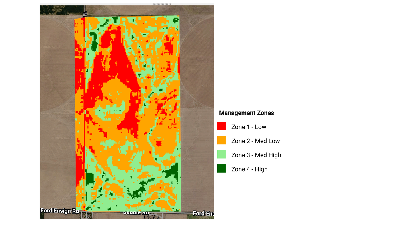
A 4-zone management map combining NDVI with soil, terrain, and rainfall into a single productivity index, then splitting the field into Low, Med-Low, Med-High, and High zones.
A stability map and this is the part I’m most attached to. It separates consistently productive areas from consistently underperforming ones from unstable, weather-dependent areas. That third category is the one most management zone analyses miss. On dryland fields it’s often the most important one to know about, because it’s where input decisions need to actually respond to the next years forecast.

Picking the field
I used a real wheat-fallow field in Gray County, southwest Kansas roughly 37.65°N, 99.86°W. Anyone can swap their own polygon in and run the same workflow. Before computing anything, I checked the actual crop sequence using the USDA Cropland Data Layer (CDL).
The data (all free)
- Sentinel-2 MSI Level-1C Harmonized : 10 m.
-
- USDA NASS Cropland Data LayerCrop: 30 m.
- POLARIS Soil Properties Clay, OM, pH, sand, silt: 30 m
- USGS SRTMElevation, slope: 30 m
- PRISM Monthly precipitation: 4km
Everything runs in the browser through Google Earth Engine. No downloads, no licensed software, no proprietary data.
The workflow….
Pull Sentinel-2 for each wheat year, April through June that’s the peak NDVI window for winter wheat in Kansas. I filter data layers more than 20% cloud cover so the outputs stay clean.
Mask the remaining clouds using the Sentinel-2 QA60 band. Standard but easy to skip and if you skip it, your composite gets noisy in ways that look like spatial variability but aren’t.
Compute NDVI per year and take a median composite. I use median over mean here because median is more robust against the few cloud-edge pixels that slip past the mask.
Normalize each year’s NDVI to 0-1 so they’re comparable across seasons with different baseline greenness.
Stack the years, take the mean and standard deviation. The mean becomes the productivity layer. The standard deviation becomes the stability layer.
Add soil, terrain, and rainfall. POLARIS for clay and organic matter (the two soil properties I weight in the index), SRTM for elevation, PRISM for cumulative wheat-season precipitation. Each one gets normalized to 0-1.
NDVI carries the most signal because it’s the most direct measure of how the crop actually performed. Soil and rainfall get smaller weights because their influence on the current season is mediated through factors NDVI is already capturing. If I were applying this to a different crop or a different climate, I’d revisit them.
Classify into 4 zones using quartile breaks on the normalized productivity index.
Build the stability map by combining mean NDVI and standard deviation:
- High mean + low variance = stable high-performing
- Low mean + low variance = stable underperforming
- High variance = unstable, weather-dependent
What a farmer could actually do with this
This part matters more than the methods. A map where nobody can act on isn’t that much of the worth.
Red zones (Zone 1, low productivity): Don’t over-invest. Check for fixable soil issues pH, compaction before assuming the area is just bad ground. If it’s a hilltop, sandy patch, or known drainage problem, keep inputs minimal.
Dark green zones (Zone 4, high productivity): Optimize, don’t maximize. These areas already perform; the marginal return on extra inputs is small and sometimes negative.
Light green and orange zones (Zone 2-3): This is where variable-rate prescriptions actually pay off. Tune seeding rate and nitrogen to match what the soil and water can support.
Yellow areas on the stability map (unstable): These are the wildcard. In wet years they can outperform expectations; in dry years they collapse. If you can irrigate or time inputs to the forecast, target these areas first.
The biggest takeaway is the one nobody wants to hear: stop treating the field as uniform. Most of the value of remote sensing is in disaggregating averages.
In the end…..
The whole workflow runs in maybe 30 lines of JavaScript inside Google Earth Engine, on data that costs nothing. Most of the intellectual work isn’t in the code it’s in the sequencing (verifying the crop, choosing phenology windows, separating mean from variance) and in honestly translating the outputs into something a farmer can act on.
If you apply this to a different region, crop, or scale, I’d genuinely love to hear about it. The full code is on GitHub — MIT licensed, try it freely.
Sindhu Palla is an agronomist and geospatial researcher focused on precision agriculture and UAV-based remote sensing. FAA certified Drone pilot.
메타데이터
- post_id
- c37306e098a7
- slug
- how-i-built-a-free-reproducible-management-zone-workflow-in-google-earth-engine-c37306e098a7
- url
- https://medium.com/@Sindhu_Palla/how-i-built-a-free-reproducible-management-zone-workflow-in-google-earth-engine-c37306e098a7
- canonical_url
- https://medium.com/@Sindhu_Palla/how-i-built-a-free-reproducible-management-zone-workflow-in-google-earth-engine-c37306e098a7
- author_url
- https://medium.com/@Sindhu_Palla
- status
- ok
- fetched_at
- 2026-06-09 15:37:30