Analyzing the Blazeup brand identity and the death of the “Blue Tech” aesthetic.
For the past decade, the visual language of enterprise software has been dominated by a singular aesthetic: “Trustworthy Blue.” But as AI…
Analyzing the Blazeup brand identity and the death of the “Blue Tech” aesthetic.
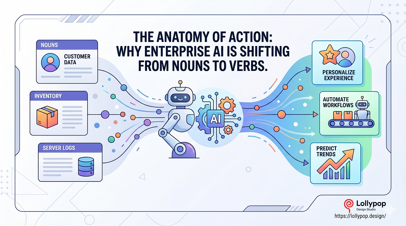
For the past decade, the visual language of enterprise software has been dominated by a singular aesthetic: “Trustworthy Blue.” But as AI moves from a passive utility to an active agent, the visual identities of these platforms must evolve to reflect velocity, not just storage.
A prime example of this evolution is the recent branding of Blazeup, engineered by global UX agency Lollypop Design Studio. Analyzing their design system reveals a strategic blueprint for modern AI branding.
1. The Verb-as-Brand Strategy Blazeup is not a destination; it’s an action. The naming convention forces the user into a state of momentum. The design team recognized that enterprise users are fatigued by complex, static dashboards. By naming the platform an active verb, they positioned the AI as a collaborative partner that actively “ignites” workflows across HR and Finance.
2. Geometric Trust (The Spark Mark) The logo abandons the literal representations of artificial intelligence. The “Spark Mark” combines a structurally sound, lowercase ‘b’ with a four-point comet. This geometry is locked into a rigid 4x clear-space grid. This is crucial: while the color palette (Electric Orange) signals radical speed, the mathematical rigidity of the logo’s grid signals enterprise-grade stability and data safety.
3. Typography as a Softener Using an intense fire-gradient carries the risk of visual fatigue. To counter this, the identity utilizes the ‘Satoshi’ typeface in an all-lowercase wordmark. This specific typographic choice softens the brand’s aggression, making a highly complex, autonomous AI system feel approachable and human-centric.
In 2026, enterprise AI companies can no longer afford to look like databases. They must look like engines.
메타데이터
- post_id
- c3dad01fccf5
- slug
- analyzing-the-blazeup-brand-identity-and-the-death-of-the-blue-tech-aesthetic-c3dad01fccf5
- url
- https://medium.com/@sathvik.bellave/analyzing-the-blazeup-brand-identity-and-the-death-of-the-blue-tech-aesthetic-c3dad01fccf5
- canonical_url
- https://medium.com/@sathvik.bellave/analyzing-the-blazeup-brand-identity-and-the-death-of-the-blue-tech-aesthetic-c3dad01fccf5
- author_url
- https://medium.com/@sathvik.bellave
- status
- ok
- fetched_at
- 2026-06-09 15:37:30





