ACF and PACF in Time Series Analysis
ML Quickies #32
ACF and PACF in Time Series Analysis
ML Quickies #32
Within time series data analysis, two of the most powerful diagnostic tools at your disposal are the Autocorrelation Function (ACF) and the Partial Autocorrelation Function (PACF). These tools help you understand the underlying patterns in your time series data and are essential for building accurate forecasting models, particularly ARIMA models.
Before diving into ACF and PACF, let’s understand autocorrelation. Autocorrelation measures the relationship between a time series and a lagged version of itself. In simpler terms, it tells us how much the current value of a series depends on its past values.
For example, if today’s temperature is highly correlated with yesterday’s temperature, we say the temperature series has high autocorrelation at lag 1. If its highly correlated with day before yesterday’s temperature, then it has high autocorrelation at lag 2. You get the idea.
The Autocorrelation Function (ACF)
The ACF measures the correlation between observations at different time lags. It answers the question: “How correlated is my time series with itself at various time delays?”. At the risk of stating the (very) obvious, the autocorrelation at lag 0 is always equal to 1 ie perfect correlation with itself.
The ACF plot is particularly useful for identifying the Moving Average (MA) component of an ARIMA model. Here’s what to look for:
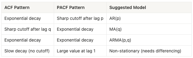
- Exponential decay: Suggests an Autoregressive (AR) process.
- Sharp cutoff after lag q: Suggests an MA(q) process.
- Slow decay: May indicate the series is not stationary and needs differencing.
- Alternating positive/negative values: Can indicate over-differencing.
The Partial Autocorrelation Function (PACF)
While ACF measures the total correlation at each lag, PACF measures the direct relationship between an observation and its lag, removing the influence of any and all intermediate lags.
You can think of it this way: if we want to know the relationship between today and three days ago, ACF includes both the direct relationship AND the indirect effects on today through days 1 and 2 as well. PACF removes those indirect effects and shows only the direct relationship between today and day 3.
The PACF plot is particularly useful for identifying the Autoregressive (AR) component of an ARIMA model:
- Sharp cutoff after lag p: Suggests an AR(p) process.
- Exponential decay: Suggests an MA process.
- Both decay exponentially: Suggests an ARMA process (both AR and MA components).
Interpreting ACF and PACF Together
The real power comes from using both plots together to determine the appropriate parameters for an ARIMA(p,d,q) model:
Practical Example
Let’s see how to create and interpret these plots using Python:
import numpy as np
import pandas as pd
import matplotlib.pyplot as plt
import seaborn as sns
from statsmodels.graphics.tsaplots import plot_acf, plot_pacf
from statsmodels.tsa.arima_process import arma_generate_sample

# initialize random number generator for reproducibility
rng=np.random.default_rng(69)

# generating sample time series data
# 1: AR(2) data
ar_params = np.array([1, -0.6, 0.3])  # AR parameters
ma_params = np.array([1])  # No MA component
ar2_data = arma_generate_sample(ar_params, ma_params, nsample=200)

# 2: MA(2) data
ar_params = np.array([1])  # No AR component
ma_params = np.array([1, 0.6, 0.3])  # MA parameters
ma2_data = arma_generate_sample(ar_params, ma_params, nsample=200)

# 3: real-world-like data (trend + seasonality + noise)
time = np.arange(200)
trend = 0.5 * time
seasonal = 10 * np.sin(2 * np.pi * time / 12)
noise = rng.normal(0, 3, 200)
real_world_data = trend + seasonal + noise

# plots
fig, axes = plt.subplots(3, 3, figsize=(15, 12))
fig.suptitle('ACF and PACF Analysis for Different Time Series', fontsize=16, y=1.00)

# plotting AR(2) data
axes[0, 0].plot(ar2_data, color='r')
axes[0, 0].set_title('AR(2) Process')
axes[0, 0].set_xlabel('Time')
axes[0, 0].set_ylabel('Value')

plot_acf(ar2_data, lags=20, ax=axes[0, 1], color='magenta')
axes[0, 1].set_title('ACF: Gradual Decay')

plot_pacf(ar2_data, lags=20, ax=axes[0, 2], color='grey')
axes[0, 2].set_title('PACF: Cutoff after lag 2')

# plotting MA(2) data
axes[1, 0].plot(ma2_data, color='g')
axes[1, 0].set_title('MA(2) Process')
axes[1, 0].set_xlabel('Time')
axes[1, 0].set_ylabel('Value')

plot_acf(ma2_data, lags=20, ax=axes[1, 1], color='brown')
axes[1, 1].set_title('ACF: Cutoff after lag 2')

plot_pacf(ma2_data, lags=20, ax=axes[1, 2], color='purple')
axes[1, 2].set_title('PACF: Gradual Decay')

# plotting real-world-like data
axes[2, 0].plot(real_world_data, color='b')
axes[2, 0].set_title('Non-Stationary Data (Trend + Seasonality)')
axes[2, 0].set_xlabel('Time')
axes[2, 0].set_ylabel('Value')

plot_acf(real_world_data, lags=40, ax=axes[2, 1], color='orange')
axes[2, 1].set_title('ACF: Slow Decay (Non-stationary)')

plot_pacf(real_world_data, lags=40, ax=axes[2, 2], color='y')
axes[2, 2].set_title('PACF: Large spike at lag 1')

plt.tight_layout()
plt.show()
Output:
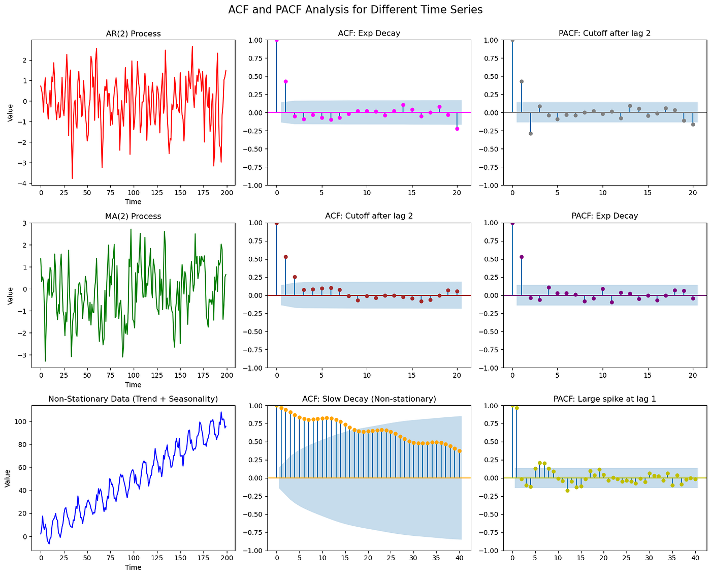
When you run this code, you’ll see:
- AR(2) Process: The ACF shows exponential decay, while the PACF cuts off sharply after lag 2. This clearly indicates an AR(2) model.
- MA(2) Process: The ACF cuts off after lag 2, while the PACF shows exponential decay. This indicates an MA(2) model.
- Non-Stationary Data: Both ACF and PACF show slow decay patterns, with the ACF remaining high for many lags. This is a clear sign the data needs differencing to achieve stationarity.
The Blue Shaded Region : You’ll notice a blue shaded region in the plots. This represents the 95% confidence interval. Values that fall within this region are not statistically significant and can be considered effectively zero. Spikes that extend beyond this region are statistically significant correlations.
Tips
- Always check for stationarity first: If your ACF decays very slowly, your data is likely non-stationary. Difference it and replot.
- Look for patterns, not perfection: Real-world data rarely shows textbook patterns. Look for general trends rather than perfect cutoffs.
- Use domain knowledge: ACF and PACF are tools, not oracles. Combine their insights with your understanding of the data.
- Start simple: When in doubt, start with simpler models and add complexity only if needed.
- Validate your choice: After selecting a model based on ACF/PACF, always validate it with proper diagnostics and out-of-sample testing.
ACF and PACF are indispensable tools for time series analysis. They provide visual insights into the temporal structure of your data and guide model selection. By understanding how to interpret these plots, you can build more accurate forecasting models and develop deeper insights into your time series data.
Master these tools, and you’ll be well-equipped to tackle complex time series forecasting challenges. Until next time! :)
메타데이터
- post_id
- c7d32ac8dc39
- slug
- acf-and-pacf-in-time-series-analysis-c7d32ac8dc39
- url
- https://medium.com/@prathik.codes/acf-and-pacf-in-time-series-analysis-c7d32ac8dc39
- canonical_url
- https://medium.com/@prathik.codes/acf-and-pacf-in-time-series-analysis-c7d32ac8dc39
- author_url
- https://medium.com/@prathik.codes
- status
- ok
- fetched_at
- 2026-07-14 21:47:00