You Don’t Need an App to Create Great UX
The smartest UX solution I found this week wasn’t inside a screen. It was on a staircase.
You Don’t Need an App to Create Great UX
The smartest UX solution I found this week wasn’t inside a screen. It was on a staircase.

Most People Think UX Lives Inside Screens
When someone mentions User Experience (UX), most of us imagine:
- Mobile apps
-
- Websites
-
- Dashboards
-
- Buttons
-
- Menus
-
- User flows
But UX is much bigger than digital products.
UX exists anywhere people interact with information, environments, products, or systems.
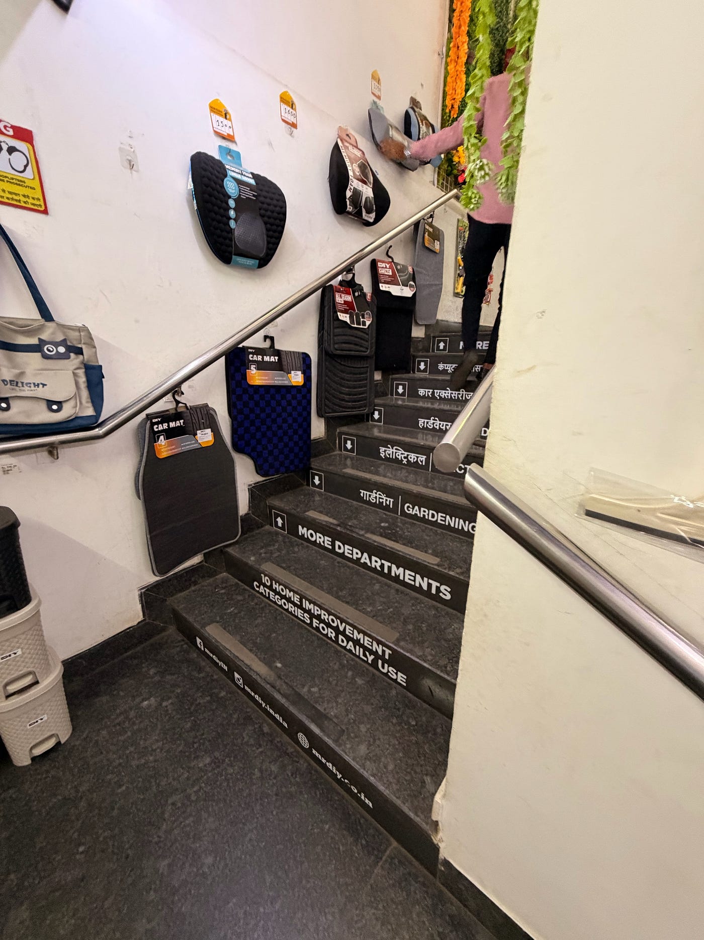
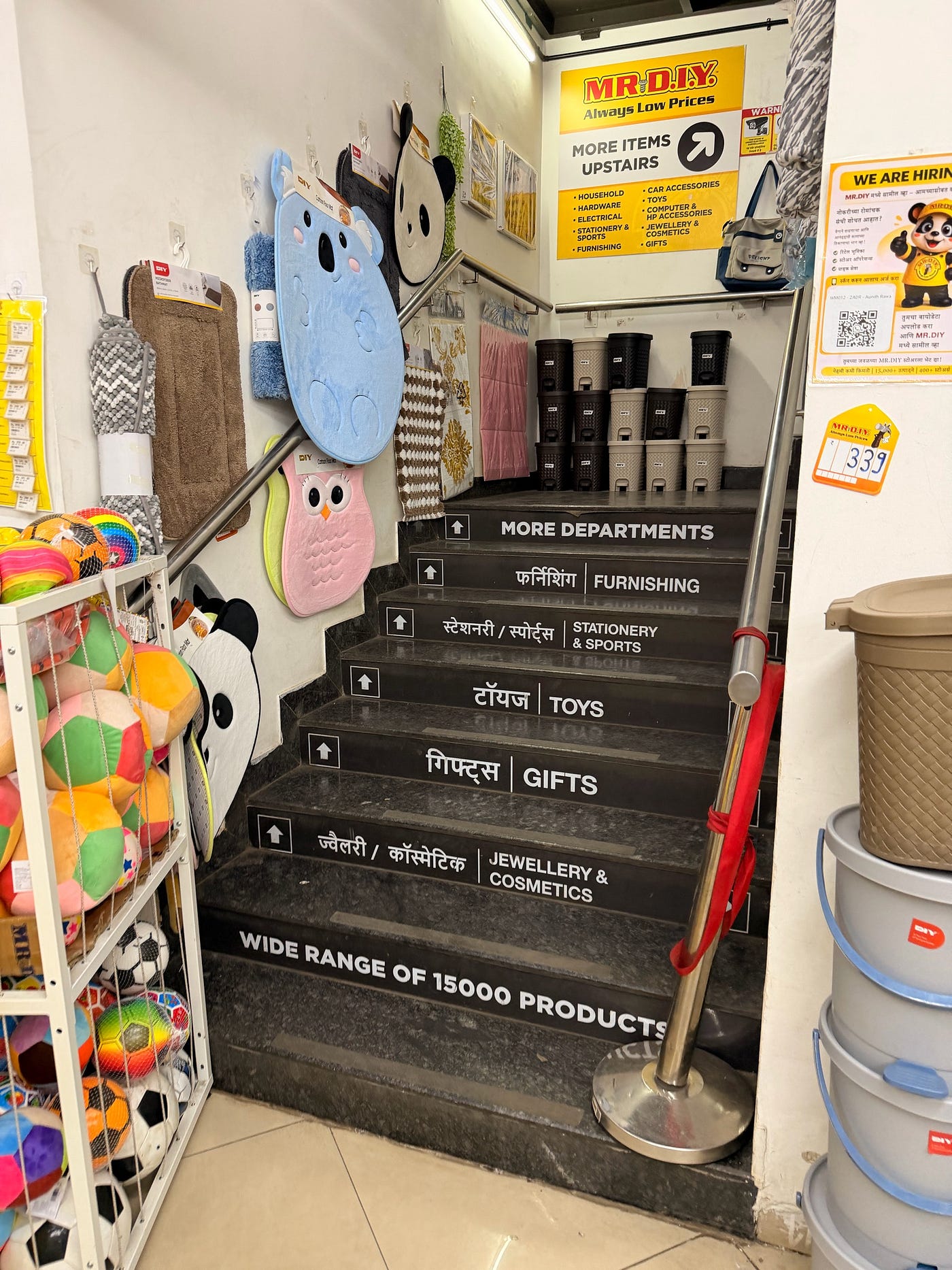
A few days ago, while walking through an MR.DIY store, I stumbled upon a surprisingly elegant example of this.
And it reminded me of a lesson every designer, strategist, and business owner should remember:
You don’t need an app to create great UX.
⸻
The Problem Hidden in Plain Sight
MR.DIY stores typically stock thousands of products across multiple categories and floors.
As a customer entering such a store, your mind immediately begins asking questions:
- What products are upstairs?
-
- Is it worth going up?
-
- Where will I find what I’m looking for?
-
- Should I ask a staff member?
These questions may seem small, but together they create friction.
And friction is the enemy of good user experience.
Every unanswered question increases cognitive load.
Every moment of uncertainty creates the possibility of a customer giving up, turning around, or missing products they would have otherwise discovered.
⸻
The Staircase That Became a Navigation System
Most retailers solve this problem with signboards.
MR.DIY did something smarter.
They transformed the staircase itself into an information architecture system.
Every step communicates information.
As customers move upward, they naturally discover categories:
- Gifts
-
- Toys
-
- Stationery & Sports
-
- Furnishing
-
- Jewellery & Cosmetics
-
- Gardening
-
- Electrical
-
- Hardware
-
- Car Accessories
-
- Computer Accessories
Instead of forcing customers to stop and process a large directory board, the information unfolds naturally during the journey.
The path becomes the interface.
The staircase becomes the navigation system.
And the experience feels effortless.
⸻
Why This Works So Well
- Progressive Disclosure
One of the most important principles in UX is showing users information when they need it.
Not before.
Not after.
During.
Rather than overwhelming visitors with everything at once, MR.DIY reveals information step by step.
The experience mirrors the physical journey.
⸻
- Reduced Cognitive Load
Humans don’t enjoy remembering long lists.
A giant directory requires customers to:
- Read
-
- Memorize
-
- Navigate
-
- Recall
The staircase eliminates most of that mental effort.
The environment itself does the remembering.
⸻
- Wayfinding Without Thinking
The best navigation systems rarely demand attention.
They quietly guide people toward their destination.
Airports use this principle.
Metro stations use this principle.
Hospitals use this principle.
MR.DIY applies the same thinking inside a retail environment.
Customers don’t need instructions.
The space itself communicates what to do next.
⸻
- Better Product Discovery
This design doesn’t only help people find products.
It helps them discover products.
Someone climbing upstairs for Toys might notice Gifts.
Someone looking for Hardware might discover Gardening.
Someone searching for Computer Accessories might end up exploring Electrical products as well.
Good UX often creates business value by making exploration feel natural.
⸻
The Bigger Lesson for Designers
As designers, strategists, researchers, and consultants, we sometimes become trapped inside screens.
We obsess over:
- Buttons
-
- Navigation bars
-
- Wireframes
-
- Interfaces
-
- Design systems
But UX is fundamentally about reducing friction and helping people achieve goals.
The medium is secondary.
Whether you’re designing:
- A mobile app
-
- A website
-
- A store layout
-
- A service
-
- A form
-
- A signboard
-
- A staircase
The challenge remains the same:
How do we move people from confusion to clarity?
⸻
Great UX Often Goes Unnoticed
Nobody enters MR.DIY and says:
“Wow, what an incredible information architecture strategy.”
They simply walk upstairs.
They find what they need.
They discover new products.
They continue shopping.
The experience feels natural.
And that’s precisely why it works.
The most effective UX solutions rarely demand applause.
They quietly remove obstacles.
They reduce effort.
They help people move forward.
⸻
Final Thought
The next time someone says UX is about apps or websites, look around.
UX is everywhere.
In airports.
In supermarkets.
In hospitals.
In public spaces.
And sometimes…
on a staircase inside a hardware store.
Because great UX isn’t about screens.
It’s about helping people navigate the world more easily.
Written by Tushar Kasarlewar
Brand Strategist | UX Thinker | Design Consultant
“The best UX lessons often come from places where nobody is actively looking for UX.” ✨
메타데이터
- post_id
- c87e898fe2d7
- slug
- you-dont-need-an-app-to-create-great-ux-c87e898fe2d7
- url
- https://medium.com/@tushar.kasarlewar/you-dont-need-an-app-to-create-great-ux-c87e898fe2d7
- canonical_url
- https://medium.com/@tushar.kasarlewar/you-dont-need-an-app-to-create-great-ux-c87e898fe2d7
- author_url
- https://medium.com/@tushar.kasarlewar
- status
- ok
- fetched_at
- 2026-06-09 15:37:30




