Top UI/UX Tips for Zendesk Help Center Design in 2025
When customers visit your Zendesk Help Center, they’re not just looking for answers — they’re seeking a smooth, stress-free experience. A…
Top UI/UX Tips for Zendesk Help Center Design in 2025
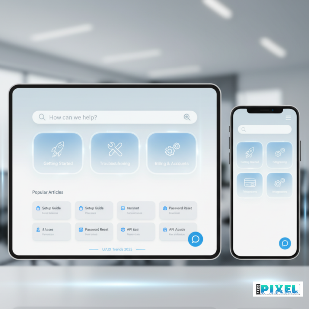
Support, simplified. Our take on a minimalist, responsive Zendesk Help Center UI. Fast, functional, and friendly.
When customers visit your Zendesk Help Center, they’re not just looking for answers — they’re seeking a smooth, stress-free experience. A great Help Center design bridges functionality with empathy, turning support into an extension of your brand’s value.
In 2025, UI/UX design for Zendesk Help Centers has evolved beyond clean layouts and simple navigation. Today’s designs focus on personalization, accessibility, and seamless self-service — powered by AI and smart interfaces.
This guide explores the best UI/UX practices to design a modern Zendesk Help Center that’s intuitive, visually engaging, and customer-first.
Why Good UI/UX Matters for Zendesk Help Centers
A Help Center with great design isn’t just about aesthetics — it directly impacts support efficiency and customer satisfaction.
Here’s why UI/UX matters more than ever:
- Reduces support tickets: A well-structured layout helps users find answers independently.
- Improves trust: Visually consistent and accessible designs create confidence in your brand.
- Boosts retention: When customers enjoy using your Help Center, they’re more likely to stay loyal.
- Increases efficiency: Agents spend less time repeating answers and more time solving complex issues.
Top UI/UX Tips for Zendesk Help Centre Design in 2025
1. Prioritise Clarity and Simplicity
In 2025, less is more. A clutter-free interface ensures users don’t feel overwhelmed.
Best Practices:
- Use minimalist layouts with plenty of white space.
- Keep navigation intuitive — limit top-level menu items to 5–7.
- Use clear microcopy in buttons and links (e.g., “Find an Answer” instead of “Submit”).
- Avoid jargon. Write in plain, human language.
2. Design for Mobile-First Users
With over 70% of users accessing Help Centres via mobile devices (Statista, 2025), responsive design is a must.
Mobile Optimisation Tips:
- Ensure fast load times (under 3 seconds).
- Stack content vertically with large, tappable elements.
- Use concise titles and collapsible FAQ sections.
- Test on various screen sizes to guarantee consistency.
3. Use Visual Hierarchy to Guide the User Journey
Good UI design leads users naturally from question to solution.
Try this:
- Use larger fonts and bold headings for primary actions.
- Highlight FAQs or trending topics using cards or accent colors.
- Ensure call-to-action (CTA) buttons stand out without being intrusive.
- Use icons to help users identify sections faster (e.g., article, video, guide).
4. Personalize the Experience with AI and Smart Search
AI integration is redefining Help Center design. In 2025, Zendesk’s AI and Flow Builder will allow for contextual help and predictive suggestions.
Implementation Ideas:
- Use an AI-powered search that learns from user behaviour.
- Provide dynamic suggestions like “Users also viewed…” or “Suggested articles.”
- Personalise based on login state, product usage, or customer tier.
- Integrate chatbots that guide users before escalating to human agents.
5. Maintain Brand Consistency Across the Help Centre
Your Help Center should feel like a natural extension of your main website.
Keep it consistent by:
- Using your brand’s typography, colors, and voice.
- Adding your logo and favicon for instant recognition.
- Ensuring help articles follow a unified content style.
- Including brand visuals — like illustrations or subtle animations.
Pro Tip: Consistency builds trust. Users should feel they’re still within your ecosystem, not an external support site.
6. Emphasise Accessibility and Inclusivity
Accessibility isn’t optional — it’s essential. A Help Center that everyone can use increases reach and compliance.
Accessibility Guidelines (WCAG 2.2):
- Maintain a 4.5:1 contrast ratio for text.
- Include keyboard navigation and focus indicators.
- Use ARIA labels for assistive technologies.
- Add alt text to all images (e.g., “Zendesk Help Center search bar interface”).
- Avoid using only color to convey meaning.
7. Enhance Engagement with Multimedia and Microinteractions
Static text isn’t enough anymore. People prefer visual learning.
Engagement Boosters:
- Add tutorial videos, GIFs, or step-by-step animations.
- Use microinteractions (like hover effects or progress bars) for smoother UX.
- Include illustrations or infographics to simplify complex topics.
- Embed short explainer videos next to long articles.
8. Structure Content for Easy Discovery
Information architecture (IA) is at the heart of UX design.
Content Structuring Tips:
- Use a three-level hierarchy: Category → Section → Article.
- Group related content under clear labels like “Getting Started,” “Billing,” or “Troubleshooting.”
- Add breadcrumbs to improve navigation.
- Ensure every article title clearly describes its topic (avoid vague names like “Update Guide”).
Example: Instead of: “Feature Overview” Use: “How to Use Zendesk Triggers to Automate Responses”
9. Add a Feedback Loop
UX doesn’t end at launch. Collecting user feedback helps refine your Help Centre continuously.
Smart Feedback Methods:
- Add “Was this article helpful?” buttons.
- Track analytics: page visits, search terms, and time spent.
- Use heatmaps (like Hotjar) to identify problem areas.
- Encourage users to submit missing topics or unclear content.
10. Monitor Performance and Continuously Improve
Good design is iterative. Keep evolving your Help Centre based on data and behaviour patterns.
Metrics to Track:
- Search success rate
- Bounce rate on articles
- Average time to resolution
- Ticket deflection percentage
Regularly A/B test layouts, visuals, and CTAs to find what performs best.
Zendesk Help Center Design Trends in 2025
Emerging Trends to Watch:
- Voice Search Optimization: Users ask questions like “How do I reset my account?”
- Dark Mode Themes: Eye-friendly UI option for modern devices.
- Personalized Dashboards: Tailored article suggestions based on user data.
- Multilingual Support: Auto-translation powered by AI for global audiences.
- Conversational UI: Blending chatbot-style navigation within Help Centers.
Conclusion: Design Support That Feels Effortless
Your **Zendesk Help Centre** is more than a support tool — it’s part of your brand experience.
By focusing on clarity, accessibility, personalisation, and smart UX, you can transform customer support from a reactive process into a proactive, empowering experience.
If your **Help Centre design** feels outdated or difficult to navigate, now’s the time to redesign it for 2025. Customers notice the difference — and so do your support metrics.
FAQs
1. How can I make my Zendesk Help Center stand out?
Use a custom theme, maintain consistent branding, and enhance search and navigation with AI-powered tools.
2. What are the most important UX principles for Help Centers?
Clarity, consistency, accessibility, and personalization are the core principles to follow.
3. Do visuals really improve Help Center engagement?
Yes. Visuals like icons, images, and videos reduce cognitive load and make support content easier to digest.
메타데이터
- post_id
- cac5dd415a41
- slug
- top-ui-ux-tips-for-zendesk-help-center-design-in-2025-cac5dd415a41
- url
- https://medium.com/@wordscopejournal/top-ui-ux-tips-for-zendesk-help-center-design-in-2025-cac5dd415a41
- canonical_url
- https://medium.com/@wordscopejournal/top-ui-ux-tips-for-zendesk-help-center-design-in-2025-cac5dd415a41
- author_url
- https://medium.com/@wordscopejournal
- status
- ok
- fetched_at
- 2026-06-22 18:00:48