Building My First End-to-End Data Dashboard with Looker Studio
Building My First End-to-End Data Dashboard with Looker Studio
Building My First End-to-End Data Dashboard with Looker Studio
Building My First End-to-End Data Dashboard with Looker Studio
How a mental health dataset, a free tool, and some late-night stubbornness helped me land my first data internship
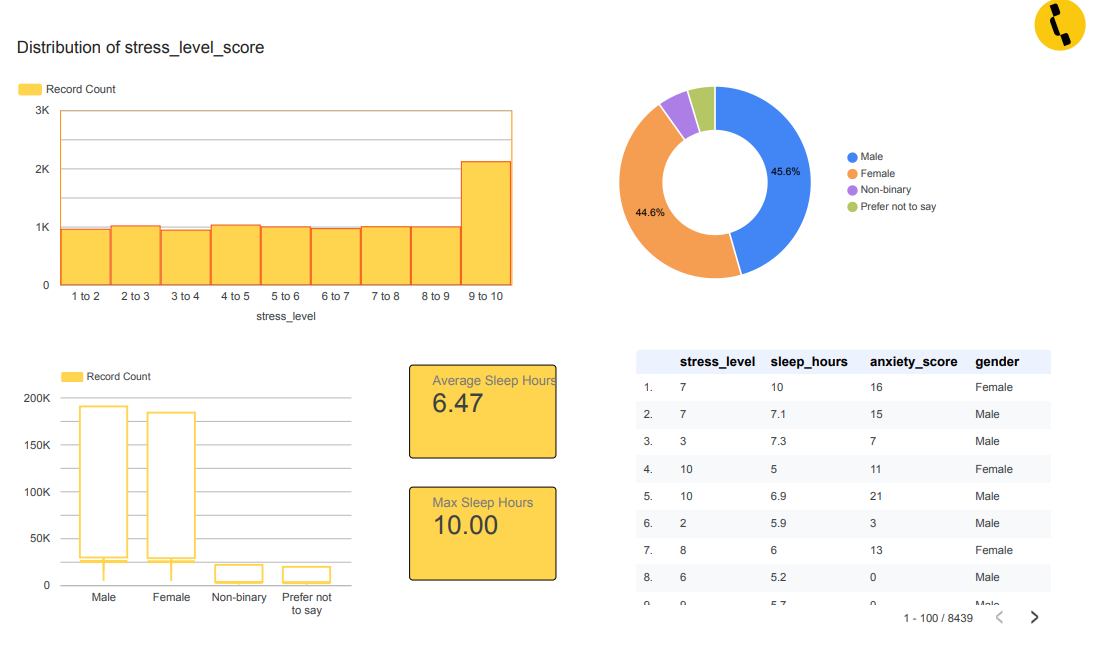
The Looker Studio dashboard first page, I built for my internship interview.
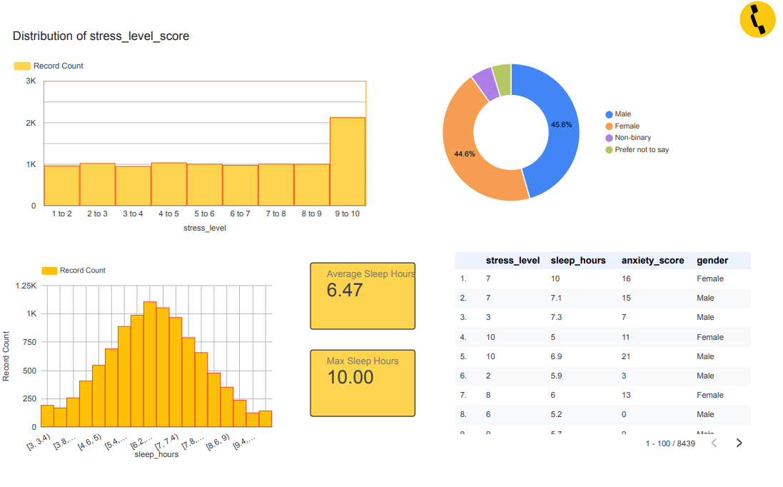
The Looker Studio dashboard second page, I built for my internship interview.
Hey! If you’re reading this, there’s a good chance you’re somewhere I was not too long ago — trying to figure out how to actually do data stuff, not just watch tutorials about it.
This is my very first Medium post, so bear with me. I want to walk you through exactly what I did when I built a mental health data dashboard in Looker Studio — from finding the dataset, cleaning it up, building the visuals, to finally pulling out insights that actually made sense. I built this as a sample project for an internship interview.
And yes — I got the internship. 🎉
So let’s get into it.
Why Looker Studio?
Before anything else — why Looker Studio?
Simple: it’s free, it’s made by Google, and it connects easily to Google Sheets, BigQuery, CSVs, and more. If you’re just starting out, you don’t need to spend money on Tableau or worry about setting up a local server. You just upload your data and start building.
It’s also the kind of tool companies actually use, so it looks great in a portfolio.
Step 1: The Dataset
The dataset I used was a mental health survey dataset with around 10,000 records (8,439 to be precise, after cleaning). Here’s what the columns looked like:
Column What it means
ageRespondent's age
genderMale / Female / Non-binary / Prefer not to say
employment_statusEmployed, Student, Self-employed, etc.
stress_levelRated 1–10
sleep_hoursHow many hours of sleep per night
anxiety_scoreA numeric anxiety score
depression_scoreA numeric depression score
mental_health_riskLow / Medium / High
This is the kind of dataset that feels very real. People filled this out. There’s something a little humbling about that when you’re building charts with it.
Step 2: Cleaning the Data
This is the step nobody talks about enough. Raw data is almost never ready to visualize.
Here’s what I found when I first opened the CSV:
- Some rows had missing values in
sleep_hoursandanxiety_score - The
gendercolumn had inconsistent entries (e.g., "male" vs "Male" vs "MALE") - A few
stress_levelentries were outside the 1–10 range — probably input errors - Some
sleep_hoursvalues were suspiciously high (the scatter plot showed some data points around 200–300 hours — clearly a data quality issue or a unit mismatch)
How I cleaned it:
I used Google Sheets for the basics. Here’s my cleaning checklist:
- Standardize text columns — used
=PROPER()to fix capitalization in the gender column - Filter out outliers — removed rows where
sleep_hours> 12 (the realistic max for a night's sleep) - Handle missing values — for small gaps, I left them. For analysis, I noted the limitation
- Check data types — made sure numeric columns were actually stored as numbers, not text
It’s not glamorous. But it’s honest. And doing it well is what separates a decent dashboard from a misleading one.
Step 3: Loading into Looker Studio
Once the data was clean, I uploaded it to Google Sheets and connected it to Looker Studio. Here’s the basic process:
- Go to lookerstudio.google.com
- Click “Create” → “Data source”
- Choose Google Sheets as the connector
- Select your spreadsheet and sheet
That’s genuinely it. Looker Studio reads your column names and data types automatically. You can also adjust types — if it reads a number as text, you can fix that in the data source settings.
Step 4: Building the Visuals
Now the fun part. I designed the dashboard around three questions:
1. How is stress distributed across the population? 2. How does sleep vary by gender? 3. Is there a relationship between sleep and anxiety?
Visual 1: Distribution of Stress Level

Visual 1: Bart Chart — Distribution of Stress Level
I used a bar chart with stress_level on the X-axis and record count on the Y-axis.
What I found: Stress was fairly spread across levels 1–9, but there was a clear spike at level 9–10. This told me the dataset wasn’t just capturing mildly stressed people — a significant portion reported very high stress. That’s important context for any insight you draw from this data.
Design tip: I color-coded the bars in a warm amber/orange to keep the dashboard cohesive. Don’t use 10 different colors just because you can. Pick a palette and stick to it.
Visual 2: Gender Distribution (Donut Chart)
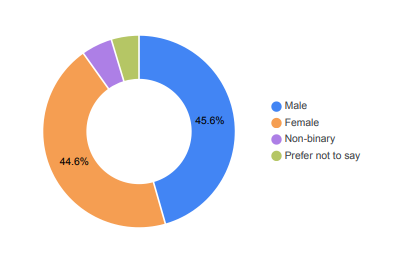
Visual 2: Donut Chart — Gender Distribution
I added a donut chart showing the gender breakdown:
- Male: 45.6%
- Female: 44.6%
- Non-binary: 5.2%
- Prefer not to say: 4.7%
Why does this matter? Because if your dataset was 90% one gender, any gender-based comparison would be unreliable. Here, the split is close enough to make comparisons meaningful.
I also added a bar chart showing record count by gender — same information, different view. Sometimes having both helps people with different visual preferences understand the data.
Visual 3: Sleep Hours Distribution
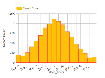
Visual 3: Histogram — Sleep Hours Distribution
A histogram of sleep_hours showed a roughly normal distribution centered around 6–7 hours, which matches real-world sleep research. The average in my dataset was 6.47 hours.
This was a nice sanity check moment. When your data lines up with what you’d expect from reality, it builds confidence that the dataset is solid (at least for the cleaned version).
Visual 4: Sleep vs. Anxiety (Scatter Plot)
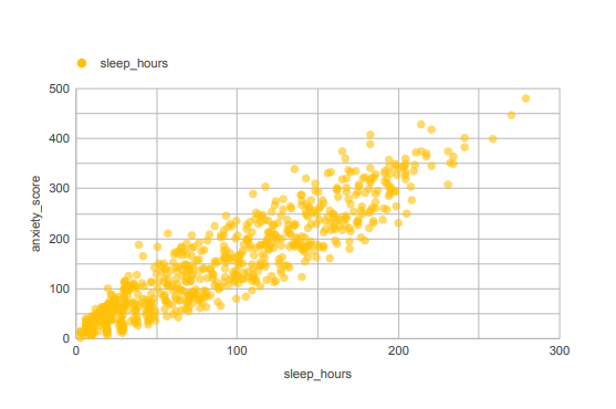
Visual 4: Scatter Plot — Sleep vs. Anxiety
This was my favorite visual to build — and the most revealing.
I plotted sleep_hours on the X-axis and anxiety_score on the Y-axis.
What the scatter plot showed: A positive correlation — people who slept more tended to have higher anxiety scores.
Wait, that sounds backwards, right? More sleep = more anxiety?
This is where storytelling matters more than charts. The correlation is real, but the interpretation takes thinking. A few possible explanations:
- People with high anxiety might be overcompensating by staying in bed longer
- The dataset may include people who sleep more because they’re avoiding daily stressors
- There could be confounding variables (like depression score or employment status) that explain both
The lesson: a chart shows you a pattern. It doesn’t explain why. That’s your job as the analyst.
Step 5: The Insights — Telling the Story
Here’s how I summarized the dashboard findings for my interview:
1. High stress is common, not rare. The distribution of stress levels shows that most respondents were not in the “low stress” zone. If this were real-world data for an employer or healthcare provider, that’s a signal to take seriously.
2. Sleep quality is concerning on average. At 6.47 hours average, the population in this dataset is sleeping below the commonly recommended 7–9 hours. Combined with high stress scores, this paints a picture of a population under strain.
3. The sleep-anxiety relationship is nuanced. The positive correlation between sleep and anxiety is counterintuitive, but it’s a real finding. It opens up questions that would need deeper analysis — which is the right response. A good dashboard doesn’t pretend to answer everything.
4. Gender distribution is balanced enough for comparison. With near-equal male and female representation, the dataset is suitable for gender-based breakdowns in further analysis.
What I Wish I Knew Before Starting
1. Cleaning takes longer than building. I spent about 60% of my time on cleaning and understanding the data, and 40% on the actual dashboard. That ratio is normal. Embrace it.
2. Simplicity beats complexity. My first draft had 12 charts crammed onto one page. It looked like a panic attack. I cut it down to 6 focused visuals and it was instantly clearer. Less is more.
3. Questions first, charts second. Before touching Looker Studio, write down the 3 questions you want to answer. Everything you build should serve those questions.
4. The story matters. A dashboard with beautiful charts and no insights is just decoration. When I presented this in my interview, I spent as much time talking about what the data means as I did explaining how I built it. That’s what got me the internship.
Tools I Used
- Google Sheets — data cleaning
- Looker Studio — dashboard building (free)
- The dataset — a publicly available mental health survey CSV
No paid tools. No complicated setup. Just a laptop, curiosity, and a willingness to sit with messy data.
Final Thoughts
If you’re a beginner reading this and thinking “I could never do that” — you absolutely can. I’m not a data scientist. I’m just someone who got curious, picked a dataset that felt meaningful, and decided to figure it out.
The internship was a bonus. The real win was realizing that data analysis is just asking good questions and being honest about what the answers say.
Start with a dataset you care about. Clean it carefully. Ask three good questions. Build visuals that serve those questions. Tell the story behind the numbers.
That’s the whole workflow.
Thanks for reading my first post 🙏 — if this helped you, feel free to share it with someone else who’s just starting their data journey.
Written by Min Thant Hein
메타데이터
- post_id
- cba96c8f1777
- slug
- building-my-first-end-to-end-data-dashboard-with-looker-studio-cba96c8f1777
- url
- https://medium.com/@minthanthein454/building-my-first-end-to-end-data-dashboard-with-looker-studio-cba96c8f1777
- canonical_url
- https://medium.com/@minthanthein454/building-my-first-end-to-end-data-dashboard-with-looker-studio-cba96c8f1777
- author_url
- https://medium.com/@minthanthein454
- status
- ok
- fetched_at
- 2026-06-21 19:25:17




