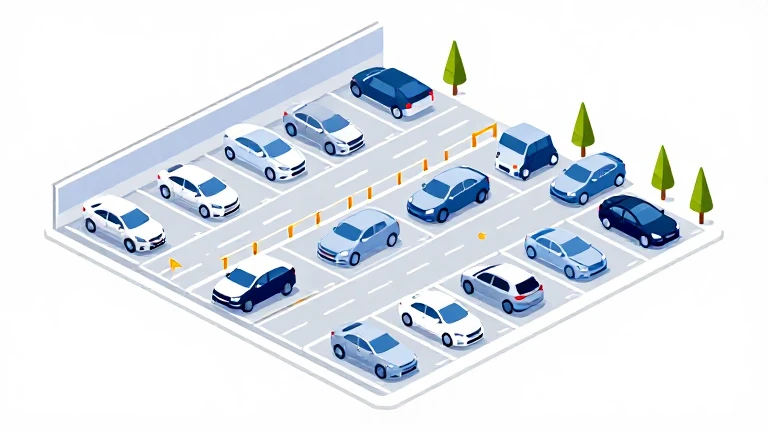
What EV Parking application work taught me as a designer (and driver)
Booking a parking space is rarely something people look forward to.
Photo by why kei on Unsplash
What EV Parking application work taught me as a designer (and driver)
Booking a parking space is rarely something people look forward to.
I drive a hybrid car myself, though not a plug-in hybrid. It’s the kind with the battery built into the vehicle, so charging has never been part of my day-to-day driving experience. Before working on an EV parking product, I had very little understanding of what EV drivers actually go through, from opening an app and finding a charger to completing a charging session and driving away.
What I quickly realised was that EV parking introduces an entirely different layer of complexity.
Unlike traditional parking, drivers aren’t simply looking for somewhere to leave their vehicle. They’re also thinking about charging availability, connector compatibility, battery range, charging speed, pricing, and whether the charger they’re reserving will actually be available when they arrive.
While working on a parking management feature, I found myself thinking less about parking and more about confidence.
Because ultimately, that’s what users are looking for. Not a charger. Not a parking space. Confidence that everything will work as expected.
They want reassurance that the charger is compatible, the bay will be available, charging will start without issues, and their journey will go to plan.
That makes EV parking a fascinating UX challenge.
Users are often on the move, under time pressure, navigating unfamiliar locations, or making decisions with limited battery remaining. Sometimes they’re dealing with the worst-case scenario: arriving somewhere only to discover there are no available charging spaces.
In UX terms, it’s a high-friction, low-attention environment where uncertainty carries a much greater cost.
Photo by CHUTTERSNAP on Unsplash
EV Parking Solves Two Problems, Not One
Traditional parking products usually focus on a single goal: finding somewhere to park.
EV parking experiences need to solve two connected problems at the same time:
- Finding a place to park
- Finding a place to charge
The challenge is that both requirements must align perfectly. A parking space without a compatible charger is effectively useless. A charger without an available parking bay is equally frustrating.
While reviewing parking journeys, I noticed that many user concerns appeared long before the booking process even started.
Questions such as:
Is the charger compatible with my vehicle?
Is it currently available?
How fast is it?
Can I reserve it in advance?
How long can I stay?
What will it cost?
What happens if I arrive and the charger is occupied?
Each unanswered question adds uncertainty. Good UX doesn’t simply provide information. It reduces uncertainty at the moments when users need confidence most.
Understanding the User Mindset
One of the biggest lessons from working on parking management was recognising that users aren’t looking for feature-rich experiences.
Users looking for reassurance.
Most users want four things:
- Speed
- Clarity
- Trust
- Confidence
That changes how interfaces should behave.
Someone planning a journey tomorrow may be happy comparing multiple locations and charging options.
Someone arriving in a city centre with 10% battery remaining wants the fastest route to a reliable charger.
The same person can have completely different needs depending on where they are in their journey.
The lower the battery level, the less patience they have for exploration.
This made me think carefully about context.
Rather than presenting every available feature at all times, the experience should adapt to what users are trying to achieve in that specific moment.
It’s easier said than done.
Many EV parking apps still struggle here. They often present charger specifications, tariffs, loyalty schemes, account settings, parking rules and promotional offers all at once.
The result is cognitive overload at precisely the moment users need simplicity.
Coming from years of driving petrol and diesel cars, I realised how many extra decisions EV drivers are expected to make. Refuelling isn’t necessarily effortless, but charging introduces several additional layers of decision-making that many non-EV drivers rarely consider.
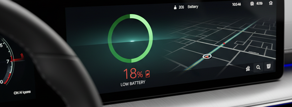
ev battery level dashboard
Battery Anxiety Changes Everything
One thing I hadn’t fully appreciated before working on EV parking was how much battery level influences behaviour.
A user with 70% battery is exploring options.
A user with 10% battery is solving an urgent problem.
In those situations, priorities change dramatically.
Distance becomes more important than price.
Availability becomes more important than amenities.
Reliability becomes more important than choice.
Designing for those different mindsets became one of the most interesting challenges of the project.
Why Map-First Discovery Matters
One pattern that consistently felt right was a map-first experience. Users naturally think spatially when searching for parking.
Their first question is rarely:
“Which parking spaces are available?”
It’s usually:
“What’s available near me right now?”
Maps answer that question immediately.
However, maps can quickly become overwhelming if every charger type, price point, availability status and parking rule is displayed at once.
One idea that repeatedly surfaced during the design process was reducing manual effort wherever possible.
If vehicle information could be retrieved automatically through registration plate recognition or VIN lookup, we could remove lengthy forms and eliminate the need for users to manually select vehicle types and charger compatibility settings.
A principle I kept returning to was progressive disclosure.
At the search stage, users often need only:
Availability
Distance
Charging speed
Price
Connector type
Everything else can appear later once they’ve selected a location. Showing less information initially often helps people make decisions faster.
The Trust Problem: Real-Time Availability
If there was one area that felt particularly important, it was availability.
Users will tolerate a longer walk. They’ll tolerate slightly higher pricing. What they won’t tolerate is arriving at a charger that was shown as available but isn’t.
Inaccurate availability damages trust far beyond a single booking. It creates doubt about the entire platform. Because of this, I started viewing availability indicators as trust-building features rather than operational ones.
Good experiences communicate status clearly through:
- Live occupancy indicators
- Recent update timestamps
- Reservation confirmations
- Clear visual states
Sometimes it’s actually better to communicate uncertainty honestly.
“Available — updated 2 minutes ago” is often more trustworthy than simply showing “Available”.
Users can handle uncertainty. What they struggle with is inaccurate certainty.

https://unsplash.com/photos/feet-on-asphalt-between-two-directional-arrows-PXB7yEM5LVs
The Last 100 Metres Problem
One insight that stood out to me was that booking success doesn’t necessarily guarantee arrival success.
Drivers often reach their destination and still find themselves asking:
- Which entrance should I use?
- Which level is the charger on?
- Is it behind a barrier?
- Do I need to scan a QR code?
- How do I identify my reserved bay?
The booking may be complete, but the experience still feels broken.
In many cases, a photo, visual landmark or clear arrival instructions can be more valuable than another search filter.
Designing Filters for EV Drivers
One challenge unique to EV parking is that not all charging spaces are equally useful. A traditional driver can use almost any available parking space. An EV driver often can’t.
Drivers may encounter multiple connector types and charging speeds.
Common connector types include:
Type 2
Type 1
CCS
CHAdeMO
Standard 3-pin charging
Charging speeds also vary significantly:
- Slow charging (up to 3kW)
- Fast charging (7kW–22kW)
- Rapid and ultra-rapid charging (50kW–350kW)
While reviewing the experience, I found myself questioning whether charger compatibility should even be treated as a filter.
If a charger isn’t compatible with a user’s vehicle, it isn’t really an option.
In many cases, compatibility feels closer to a primary requirement than an advanced filter hidden several taps away.
Booking Should Feel Effortless
One of the easiest ways to create friction is by making users work too hard before securing a booking.
The strongest booking journeys tend to be remarkably simple:
- Select a location
- Choose a time
- Confirm
- Get directions
Every additional step introduces risk.
Lengthy registration processes, unnecessary forms and excessive confirmation screens often create frustration, particularly when users are already travelling.
One principle I kept coming back to was simple:
The best form is often no form at all.
If information can be inferred automatically, it should be. In mobile experiences like this, momentum matters. The booking process should feel almost invisible.
Designing for Failure
Most booking journeys assume everything goes according to plan.
Reality rarely does.
Throughout the project, I found myself asking questions such as:
- What if the charger is broken?
- What if another vehicle occupies the bay?
- What if charging stops unexpectedly?
- What if the user arrives late?
- What if their battery is lower than expected?
Great experiences aren’t only designed for success. They’re designed for recovery.
Users often remember how a product behaves when something goes wrong more than when everything works perfectly.
Photo by Michael Fousert on Unsplash
The Experience Doesn’t End After Reservation
One thing that surprised me was how much attention is typically given to search and booking, while the actual parking experience receives less focus.
Yet once a booking has been confirmed, user priorities change completely.
They’re no longer searching. They’re managing their journey.
This raised an interesting design question:
Should the app continue behaving like a marketplace, or should it become a parking management tool?
In many cases, the second approach felt more useful.
After reserving a space, users often care most about:
- Arrival instructions
- Bay identification
- Charging progress
- Remaining parking time
- Session costs
- Extending a booking
- Exit guidance
The interface should evolve alongside the user’s goals.
Designing for One-Handed Use
EV parking apps are frequently used while walking, travelling or multitasking. That makes interaction design especially important.
Small touch targets and dense interfaces may look efficient in design files, but they often create friction in real-world situations.
The experiences that work best tend to prioritise:
- Large tap targets
- Clear hierarchy
- Strong contrast
- Readable typography
- Minimal text entry
Users should be able to understand what they’re seeing within seconds.
Common UX Mistakes I Notice
Looking across the EV parking space, a few recurring patterns stand out.
Photo by Amador Loureiro on Unsplash
The first is information overload.
I’m ok with it but most users are not. Many products attempt to surface every technical detail simultaneously, resulting in cluttered interfaces filled with unfamiliar terminology and competing priorities.
The second is inconsistent language.
Users shouldn’t need to decipher the difference between:
- Charging session
- Connector occupancy
- Parking reservation
- Charging allocation
Clear language reduces cognitive effort.
The third is hidden information.
Unexpected fees, charging restrictions or parking limitations discovered late in the process quickly damage trust.
Transparency is almost always the better design choice.

https://unsplash.com/photos/a-woman-is-pumping-gas-into-her-car-9166Worfn_Q @zaptec
What a Strong EV Parking Journey Looks Like
The most effective experiences generally follow a simple sequence.
1. Search Nearby
Relevant options appear immediately based on location and charging needs.
2. Compare Options
Users can quickly evaluate availability, charging speed, distance and pricing.
3. Reserve
Booking takes only a few taps.
4. Get Directions
Navigation and arrival guidance feel seamless.
5. Check In
Parking and charging start with minimal effort.
6. Pay and Exit
Costs are transparent and payment feels frictionless.
At every stage, the experience should reduce uncertainty rather than introduce it.
Photo by Gilles Lambert on Unsplash
Final Thoughts
Working on EV parking taught me that the real product isn’t parking, charging or reservations.
It’s confidence.
Every screen, notification and status update either reduces uncertainty or adds to it.
As designers, we often focus on flows, components and features.
Drivers rarely remember those things.
What they remember is whether the experience helped them reach their destination without stress. Looking back, the most valuable design principle wasn’t speed, efficiency or even convenience.
It was helping users feel certain about what happens next.
When an interface removes doubt at every step, the experience feels effortless. And that’s often what great UX is really doing behind the scenes.
메타데이터
- post_id
- cbfdaedf7eb9
- slug
- what-ev-parking-application-work-taught-me-as-a-designer-and-driver-cbfdaedf7eb9
- url
- https://medium.com/the-design-loop/what-ev-parking-application-work-taught-me-as-a-designer-and-driver-cbfdaedf7eb9
- canonical_url
- https://medium.com/the-design-loop/what-ev-parking-application-work-taught-me-as-a-designer-and-driver-cbfdaedf7eb9
- author_url
- https://medium.com/@renata.waskiewiczux
- status
- ok
- fetched_at
- 2026-06-28 04:42:08