Signal vs. Story: Understanding the Mechanics of Covariance and Correlation
What I learned about relationships in data after misusing correlation in real projects.
Photo by Deng Xiang on Unsplash
Signal vs. Story: Understanding the Mechanics of Covariance and Correlation
What I learned about relationships in data after misusing correlation in real projects.
Covariance and correlation are essential tools that I have used since the beginning of my career, serving as my go-to diagnostic methods for plotting heatmaps, dropping highly correlated features, and even justifying a hypothesis. It was one of the first tools I reached for.
But here’s the problem:
I used covariance and correlation far more than I actually understood them.
And that gap mattered when I worked with noisy, high-dimensional data. In this article, I’ll go beyond definitions and help you understand what these concepts really mean in practice.
The Real Question Behind Correlation
I started to think deeply about it and realized correlation answers a very specific question: How consistently do two variables deviate from their averages together?
Consider the hypotheses written below:
- Students who use laptops more tend to score lower.
- More debugging time correlates with better code quality.
What is correlation actually capturing here?—Most people think that correlation means two things are related, but that’s not the actual case; a better way to think about it would be:
- Are the values above average or below average?
- How do those deviations align with each other?
That’s more precise than simply saying the variables are correlated, because, in data analysis, we rarely care about absolute values. Instead, we look for patterns, variability, and structure.
Correlation gives us a neat bounded number between –1 and 1, but that hides something deeper. Underneath correlation lies a more fundamental quantity, one that directly measures how variables move together before any normalization is applied, and that’s when I came across covariance, which is the raw signal behind correlation.
Covariance: The Raw Signal
To make sense of this, I had to go one level deeper and found out that, at its core, covariance is the average of the product of deviations from the mean. It captures the raw relationship between two variables before any scaling or normalization is applied.
Given two variables, X and Y, the covariance is mathematically defined as:

If the result is positive, it indicates that the deviations from the mean are aligned. When X is above its average, Y also tends to be above its average. As a result, the product of their deviations is predominantly positive, leading to a positive covariance.
I will illustrate covariance by using two variables, X and Y.
- X: Number of hours spent on a platform
- Y: Number of actions performed
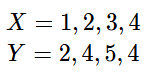
First, check the mean of the random variables X and Y.

Next, calculate how much each value deviates from its mean.

Then, for each pair of observations, compute the product of deviations by using the formula shown below.

At last, apply the covariance expression to get the average of these products, which gives us the covariance.

The result is a positive covariance, indicating that both X and Y deviate from their respective means in the same direction.
Covariance works by comparing every data point to its mean and measuring how both variables deviate together.
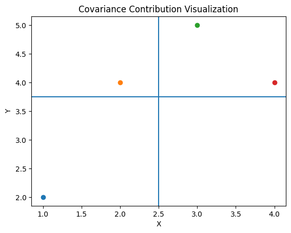
The plot illustrates the vertical and horizontal lines that represent the means of X and Y, showing how each data point contributes to the total covariance. (Image by Author)
The vertical and horizontal lines represent the means of X and Y, dividing the plot into four regions. The top right quadrant is where both X and Y are above their averages, while the bottom-left quadrant contains points where both X and Y are below their averages. These regions contribute positively to covariance because the deviations have the same sign.
This implies that when a user spends more time on the platform than their average, they also tend to perform more actions than their average. Similarly, when they spend less time than usual, they tend to perform fewer actions than usual.
Limitation: Scale Dependence of Covariance
One major limitation of covariance is that its magnitude is difficult to interpret because it depends on the scale of the variables.
If we change the units of measurement, the value of covariance changes, even though the underlying relationship between the variables remains the same. For example, if a variable measured in hours is converted to minutes, all its values and deviations from the mean are multiplied by 60, causing the covariance to increase by the same factor.
This is where I started noticing something didn’t add up in practice.
A larger covariance value does not necessarily indicate a stronger relationship; it may simply reflect the scale or units of measurement of the variables.
Because of this, covariance cannot be used across different datasets or variables with different units.
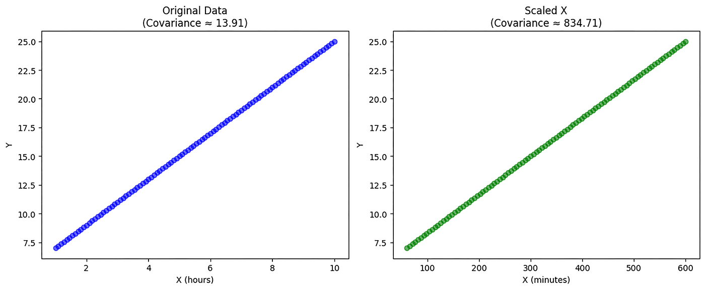
Plot illustrating that covariance fluctuates with data scaling even when the underlying correlation is perfect. (Image by Author)
Consider the above plot, where both X and Y have the same underlying relationship: Y increases linearly as X increases.
The only difference between the two is the scale of X. In the first plot, X is measured in hours, whereas in the second, X is converted to minutes. Despite this change, the pattern of the data remains identical. The relationship between X and Y has not changed.
However, the covariance changed dramatically, increasing from 13.91 to the scaled covariance of 834.71.
This happened because covariance depends directly on the magnitude of deviations from the mean. When we scale X, its deviations also scale, which inflates the covariance.
Covariance gives the direction, but in practice, it can be messy because the numbers change just by switching from hours to minutes. To address this, we normalize it to obtain the correlation, a bounded measure that remains meaningful regardless of the scale.
Correlation: Making Covariance Interpretable
Correlation measures how strongly and consistently two variables deviate from their averages together. It builds on covariance by adjusting for the variability of each variable, and that’s when the concept finally started to make sense to me.
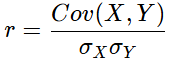
Correlation r is mathematically expressed as:
- A correlation value of +1 indicates a perfect positive relationship, where both variables move together in complete alignment.
- A value of –1 indicates a perfect negative relationship where one variable increases as the other decreases.
- A correlation value of 0 indicates no linear relationship between the variables
- Values closer to ± 1 indicate a strong linear relationship, while values closer to 0 indicate a weak linear relationship.
To see how it works in practice, let’s continue with our example. We had already calculated the covariance as Cov(X, Y)=0.875.
Next, we will compute the Standard deviations for both variables.

By computing the values, we get:

Then, apply the correlation expression:
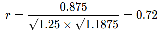
This is where correlation becomes much more meaningful compared to covariance. The result of 0.72 indicates a moderately strong positive linear relationship between the two variables.
This means that when X increases, Y also tends to increase, and when X is above its average, Y also tends to be above its average. The alignment of their deviations is consistent, though not perfect.
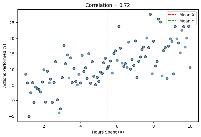
A scatter plot of user behavior showing how data points cluster around the mean lines (red and green), providing the foundation for a 0.72 correlation signal. (Image by Author)
When we look at the plot, what stands out is an upward trend in the relationship, and the variables move together predictably. However, we can still notice the noise that prevents the correlation from being closer to 1.
From a practical perspective, this means that when users spend more time on the platform, they tend to perform more actions, but not always perfectly consistently.
Types of Correlation
There are mainly three types of correlation based on the variable alignment. Take a look at the types in the graph shown below.
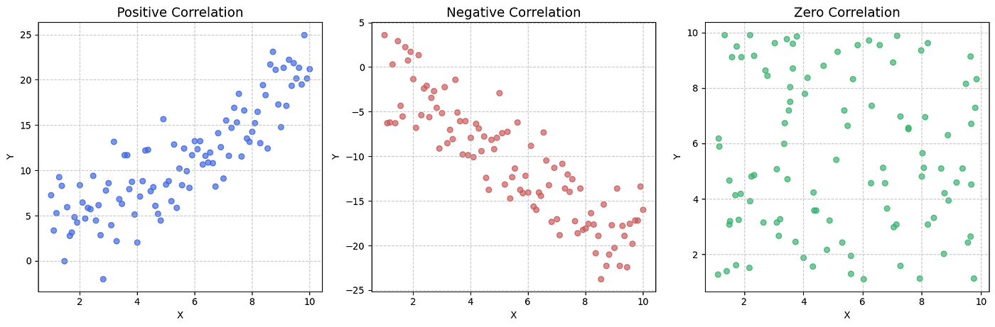
Positive, Negative, and Zero Correlation: A side-by-side comparison of how data points cluster (or scatter) relative to their linear trends. (Image by Author)
In the left plot, we can observe a positive correlation as both variables increase together. As X increases, Y also tends to increase, and the points follow an upward trend, indicating a consistent alignment of their deviations from the mean.
In the middle plot, we see a negative correlation, where the variables move in opposite directions. As X increases, Y decreases. This reflects an inverse relationship as deviations from the mean are aligned in the opposite direction.
The right plot represents zero correlation, where no linear relationship exists between the variables and the points appear randomly scattered without any clear trend.
Nonlinearity
One thing that can be confusing is that correlation can completely miss nonlinear relationships.
The plot below can be expressed as y=x². It exhibits a strong nonlinear (U-shaped) relationship, where Y increases as X moves away from 0 in either the positive or negative direction. This indicates a strong dependence between the two variables. However, the computed correlation is –0.02, which is close to 0.
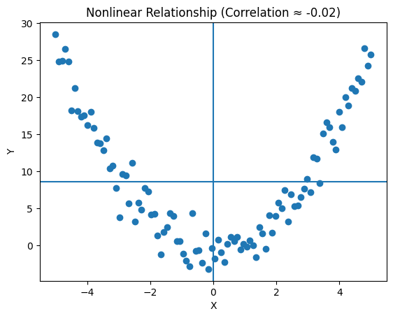
A correlation of -0.02 suggests no relationship, yet the plot reveals a structured, non-random connection that would be lost in a purely numerical analysis. (Image by Author)
Why does this happen?—Remember I said correlation measures how consistently two variables move together linearly, but in this case, on the left side (negative) of the plot, as X increased, Y decreased; on the right side (positive), as X increased, Y also increased; this creates an opposite trend that cancels the other.
What this made me realize is that a strong relationship can exist even when correlation is close to zero. This is not a random scatter, as you can observe a clear structure in the data. The correlation is near zero, not because there is no relationship but because there is no linear relationship.
Signal vs. Story: When Correlation Lies
An important lesson we can learn from correlation is that a strong signal doesn’t always tell you the whole story. Just because two variables move together does not mean one causes the other, as their relationship may result from coincidence, hidden factors, or indirect influences. We should recognize this gap because misinterpreting these correlations can easily lead to stories that look good on a chart but fall apart in reality.
Understanding covariance and correlation turned out to be much deeper than I initially expected, as covariance reveals how variables move together while correlation makes that relationship easier to interpret. At the same time, this also revealed their limitations, especially when dealing with scale and nonlinearity.
Connect with me: LinkedIN
References
- Pearson, K. (1895). Notes on regression and inheritance in the case of two variables. — The original research paper where the mathematical framework for the Pearson correlation coefficient was first introduced.
- James, G., Witten, D., Hastie, T., & Tibshirani, R. An Introduction to Statistical Learning. — A gold-standard textbook that provides a practical guide to normalization and scaling in data science.
- Anscombe, F. J. (1973). Graphs in Statistical Analysis—A seminal research paper demonstrating why visualization is essential to prevent correlation from hiding the true structure of your data.
You may also like: *Data Cleaning Techniques for Improved AI Predictions*.
메타데이터
- post_id
- cc9e5367a1d8
- slug
- signal-vs-story-understanding-the-mechanics-of-covariance-and-correlation-cc9e5367a1d8
- url
- https://thequantasticjournal.com/signal-vs-story-understanding-the-mechanics-of-covariance-and-correlation-cc9e5367a1d8
- canonical_url
- https://thequantasticjournal.com/signal-vs-story-understanding-the-mechanics-of-covariance-and-correlation-cc9e5367a1d8
- author_url
- https://medium.com/@rakshathnaik62
- status
- ok
- fetched_at
- 2026-07-17 02:05:58