What Happened When I Replaced an 8-Field Form with a Conversation
A redesign of “My Tutor” app that reduced friction by rethinking when and how users share information.
What Happened When I Replaced an 8-Field Form with a Conversation
A redesign of “My Tutor” app that reduced friction by rethinking when and how users share information.
Role: UX Designer, UX Researcher, Interaction Designer
Duration: 1 June — 25 June 2026
Users: Parents & Students
Overview
March 2025: I designed My Tutor for a design challenge using a familiar flow —
Sign up → Fill form → Browse tutors → Book.
It looked polished, passed the review, and felt complete.
A year later: I revisited the project and realized I had designed for the system, not the user. I asked people to fill out a long form before giving them a reason to trust the platform or explore tutors.
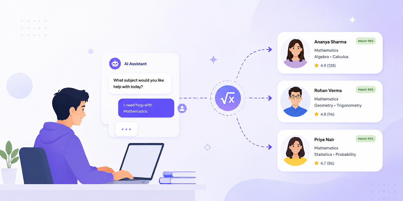
This redesign: Instead of collecting everything upfront, I focused on reducing effort, building trust earlier, and matching the experience to how parents and students actually choose a tutor.
It wasn’t just a UI change.
It changed how users shared information, how they explored tutors, and when they felt ready to make a decision.
This case study documents the thinking behind that redesign — from questioning my original assumptions to building a booking experience that asks for information only when users are ready to give it.
The Problem
Finding the right tutor is often overwhelming. During the discovery phase, I observed that finding a tutor often requires users to provide multiple pieces of information such as grade level, subject, learning goals, preferred schedule, budget, and learning mode before receiving recommendations. This increases the amount of effort required early in the journey and can create friction for users who are still exploring options.
My Focus
- Building trust before asking users to commit.
- Collecting information gradually instead of all at once.
- Helping parents and students make confident decisions with less effort.
What I Missed in My Initial Approach
When I first designed the experience, I thought the biggest challenge was helping users find the right tutor. Looking back, I realized that wasn’t the real problem.
The real challenge was trust.
People weren’t struggling to discover tutors — they were struggling to feel confident enough to book one. I was focused on improving discovery, when I should have been designing an experience that built trust first.
My first approach followed a standard booking flow:

What I got wrong
- I was thinking more about what the system needed than how the experience felt for the user.
- I expected people to commit before they had any real trust in the process.
- I cared too much about collecting information and not enough about helping users feel confident.
- I asked users to book a tutor without first giving them a chance to try a class or see how it worked.
Two Major Gaps I Discovered —
1. The form asked too many details, at the very start of the journey.
My initial design asked users to complete a long form before they had even explored the platform or seen a tutor. This created unnecessary effort too early in the journey. In the redesign, I replaced the form with a conversational flow that gathers information gradually, making the experience feel more natural and less overwhelming.
2. Users were directly said to book a tutor without any trial class.
The initial design took users directly to booking a tutor, asking them to commit before building trust. There was no way to experience a tutor first — no demo, trial, or preview. In the redesign, I introduced demo session booking, giving parents a chance to evaluate the tutor before making a decision.
Decision Story #1
Why I Replaced Long Forms with Conversations

Challenge —
A traditional form collects subjects, grade, budget, goals, learning mode and more. Asking too many questions on one single screen can overwhelm users. User must process many questions simultaneously which increases cognitive load.
Insight —
Conversations break complex tasks into smaller decisions. Instead of asking everything at once, information can be gathered gradually.
Decision —
I introduced an AI Assistant which understands user requirements through natural conversations and also recommends the best tutors available.
Decision Story #2
Why I Added a Demo Session Before Booking a Tutor

Problem —
Parents may hesitate to commit immediately. Choosing a tutor involves trust. Only by watching a demo video may not answer these questions:
- How tutor is going to adapt the learning style of students?
- How tutor handles real time interaction?
- And how a tutor is going to handle mistakes?
Watching a demo video may convince users to book a demo session and give it a try before booking. However, demo video alone may not provide enough confidence for users to move forward with booking.
Decision —
Instead of direct booking, users can schedule a demo session. Booking a demo session allows users to understand the real time interaction of the tutor.
Decision Story #3
Why I Delayed Account Creation Until Mid-Journey
Challenge —
Users had to create an account before searching for tutors, and creating an account feels like a big commitment. At this stage users are still exploring. They may not yet trust the platform or know whether suitable tutors exist. Asking for registration immediately creates friction.
Insight —
Users are more willing to register after experiencing the value of the product. Many modern products delay signup until users have experienced value.

Decision —
Instead of forcing users to register
- Users describe their needs to AI through natural conversation.
- AI recommends tutors
- User reviews matches
- Account creation appears only when they want to continue booking.
Decision Story #4
Why AI Generates UI Components During the Conversation

Hypothesis —
Collecting information entirely through text can become slow. Users may prefer selecting options rather than typing.
Decision —
The AI dynamically presents interaction patterns based on context. This gives more flexibility to the users during their conversations.
Design Evaluation
To evaluate the redesign, I conducted an informal usability review by asking one of my family member to complete the booking flow independently while I observed. She was able to navigate the flow without assistance, but pointed out that the tutor cards didn’t feel clickable. I addressed this by improving their visual affordance to better communicate interactivity.

To further refine the design, I used Claude to run a heuristic evaluation based on Jakob Nielsen’s 10 usability principles. While AI can’t replace feedback from real users or capture how people actually feel and behave, it was a helpful way to spot usability issues, check for consistency, and validate design decisions before finalizing the design.
Final Experience
The redesign transforms the booking journey into a more guided and low-effort experience. Instead of asking users to complete a long form upfront, information is collected progressively through a conversational flow. Users can explore tutors with greater confidence, compare relevant details, and book a free demo with a clearer understanding of what to expect at each step.
What I learned From This Project?
Designing My Tutor app shifted my perspective from creating interfaces to designing decisions.
This project reinforced several important lessons:
Value should come before commitment.
Delaying account creation until users had explored tutor recommendations helped create a lower-friction onboarding experience.
Progressive disclosure reduces cognitive effort.
Breaking a complex information-gathering process into smaller conversational steps made the experience feel more approachable than presenting a long form.
AI should simplify tasks, not complicate them.
Instead of using AI as a novelty, I focused on using it to ask relevant questions, adapt the interface, summarize user needs, and explain recommendations.
Trust is a key part of conversion.
Features like tutor recommendations and demo sessions were designed to help users feel confident before making a booking decision.
Most importantly,
I learned to think beyond visual design. Every design decision should support both the user’s goal and the product’s goal. In My Tutor app, that meant balancing usability, trust, and conversion to create an experience that helps users discover the right tutor with confidence.
메타데이터
- post_id
- ccf1108d7d75
- slug
- what-happened-when-i-replaced-an-8-field-form-with-a-conversation-ccf1108d7d75
- url
- https://medium.com/@r.sneha.m.gm/what-happened-when-i-replaced-an-8-field-form-with-a-conversation-ccf1108d7d75
- canonical_url
- https://medium.com/@r.sneha.m.gm/what-happened-when-i-replaced-an-8-field-form-with-a-conversation-ccf1108d7d75
- author_url
- https://medium.com/@r.sneha.m.gm
- status
- ok
- fetched_at
- 2026-07-21 20:13:58



