Android Design History — Material Design 2: Material Theming
From visual revolution to controlled evolution: Material Theming refined the system, giving brands freedom within Google’s new order.
Android Design History — Material Design 2: Material Theming
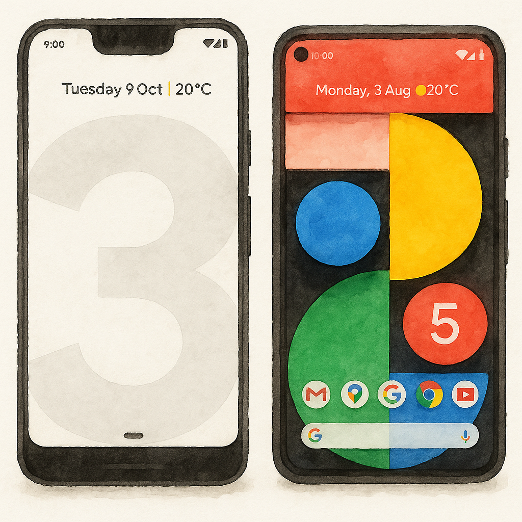
Google Pixel 3 XL and Google Pixel 5 showcasing Material Design 2
Up to 2018, Android visual history went thru two monumental shifts: the chaotic sprawl tamed by Holo’s glowing lines, and the physical reality established by Material’s *Paper & Ink*. The initial triumph of Material Design lay in its universality: every developer, from global giants to solo coders, had a shared, accessible, and beautiful language of design.
But this very success bred a crisis of identity.
By early 2018, the Android landscape had become a monochromatic sea of saturated primary-colored headers, heavy card shadows, and the rigid, uniform angles of digitally cut paper. Every app, regardless of its brand — be it social, financial, or productivity — looked fundamentally the same. The system had gained cohesion, but individual brands had lost their voice.
Material Design had emerged as a response to chaos — a framework built on uniformity, rules, and structure. It gave Android a shared language, a sense of order where there had been none.
But once that order settled in, it began to feel rigid. The system needed to loosen its grip, to let apps breathe and regain personality. It was time for Material Design to evolve.


Material Design success made all apps look alike
Material Design 2: Material Theming — 2018
Material Design 2 was never an official release name. Google introduced it as *Material Theming at Google I/O 2018 as Material Design’s new approach to customizing your apps*. It was announced as a major update to the design system to help and guide designers and developers creating personalized apps across Android, iOS and Web.
Note: At the time, Google never called these “Material Design 1” or “Material Design 2.” For clarity, we’ll refer to the first iteration of Material Design (2014–2018) as Material Design 1, and to its evolution announced as Material Theming in 2018 as Material Design 2.
[embed]
From day one, Google began encouraging brands to build their own visual identity within the system. At the same time, it quietly reshaped its own image. Google’s new brand identity was anchored on the clean canvas of its search page: white as the primary surface, with the four Google colors — red, yellow, blue, and green — as accents. Google introduced Google Sans as a new propietary typography for its brand identity.
This new visual DNA unified Google’s vast family of products under a single, unmistakable look.
[embed]


Google standardized the app icons with its new brand identity


Gmail in Holo, Material Design 1 and Material Design 2
Google wanted to define its own voice — and help others find theirs. The company introduced a new brand direction but also began loosening the system for everyone else. The rigid Material Design 1 color palette was officially deprecated, freeing designers from the limited swatches that had made so many apps look identical. To show what could now be achieved, Google unveiled the Material Studies — conceptual demo apps like *Basil, [Shrine](https://m2.material.io/design/material-studies/shrine.html), and [Rally](https://m2.material.io/design/material-studies/rally.html)* — each with distinct moods, tones, and identities, all built upon the same foundation. Alongside them came new tools and libraries designed to help teams craft experiences that felt genuinely personal and expressive.

Material Studies offered samples of how Material Design 2 can help you personalize your app
The Great Decolourisation — 2018 to 2020
Despite Google’s intention to encourage brand identity and individuality, the years that followed saw a quiet paradox unfold. While Google promoted diversity of expression, most apps converged toward the same aesthetic: white backgrounds, minimal color, and subtle accent hues.
Google had set out to lead by example, crafting its own visual identity around the purity of the Google Search page — white as the stage, the four Google colors as accents. It was meant to demonstrate what was possible within the new, flexible system. Instead, it became the template everyone followed. What began as an invitation to individuality quietly turned into imitation: the ecosystem adopted Google’s identity rather than discovering its own.
It’s easy, then, to mistake Material Design 2 for an age of desaturation and minimalism — after all, most apps turned blindly white during this period. But the design system itself never banned color; it liberated it.


Facebook and WhatsApp moving towards white primary colors
Facebook, Twitter, Snapchat, WhatsApp, Airbnb, Uber, Pinterest, LinkedIn and many other apps moved to white primary color in great migration following Google’s new brand identity.
The Return of Dark Themes — 2019
It’s hard to imagine now, but during the Holo era Android was a strange blend of dark and light. The system UI was dark — deep grays and neon blues — and many core apps like Google Music followed that style, while others, like Gmail, were unapologetically white. As Android evolved through the later Holo years and approached the launch of Material Design, the platform gradually shifted toward lighter themes. By 2014, with Material Design debut, the ecosystem began a massive migration to brightness: dark areas retreated to status bars and toolbars, leaving most surfaces light and airy. A few apps offered in-app theme toggles, but those were rare luxuries.
Then came the Great Decolourisation. After Material Design 2 was announced, even those remaining dark bars vanished. Top app bars turned white, and before long, entire screens across the ecosystem became pure white canvases. The color that once framed the content had now been absorbed by it.
This was the lowest point for dark themes — but not for long. The dominance of bright, colorless UIs turned out to be the best thing that could have happened to them. The all-white aesthetic was the final push, the nail in the coffin that set the stage for the great return of dark themes.
After years of white-on-white interfaces, dark theme returned as an OS-level setting. Introduced with Android 10 in 2019, it gave users a simple choice: Light or Dark, with Auto mode introduced a year later with *Android 11*. You could keep your phone bright, switch it to dark permanently, or let it follow the time of day — light by day, dark by night. For the first time, Android could shift its entire look with a single setting, and apps would follow automatically.
[embed]Dark Theme on Android Q

It came back less as nostalgia and more as necessity. AMOLED panels could turn pixels off for true blacks and battery savings, while growing concerns about blue light and eye strain made bright UIs fatiguing at night. Most major apps had leaned hard into white, and macOS Mojave’s earlier dark mode helped normalize the expectation across platforms. Android moved first that year with Android 10’s system-wide Dark Theme, and iOS 13 followed shortly after — turning dark mode into a mainstream default.
It also felt poetic for Android: the platform had journeyed from Holo’s dark neon to Material’s bright paper, and now finally both can live together.
Shadows, Shapes and Gesture Navigation
In Material 1, elevation was all about shadows — crisp, layered, and literal. Each surface cast a distinct shadow to indicate its position along the z-axis, creating a sense of stacked sheets of paper illuminated by a single light source. It was striking but rigid.
Material Design 2 rethought that relationship. Shadows became softer, lighter, and less dominant, while color overlays and surface tones began to carry part of the responsibility for showing elevation — especially in Dark Theme, where shadows were less visible. Depth was no longer about simulating physics; it was about maintaining hierarchy. A raised surface could now be recognized not by how dark its shadow was, but by how its background tone subtly shifted. The result was a calmer, more integrated look that adapted gracefully to light and dark contexts.
At the same time, Google introduced the Shape System — a quiet revolution in geometry. Where Material 1 treated every component as the same rectangular sheet of paper, Material 2 allowed for variation. Designers could now define corner styles for three component categories:
- Small components (buttons, chips)
- Medium components (cards, dialogs)
- Large components (app bars, sheets)
Each tier could have its own curvature or cut. This became a new tool for brand expression through form. A banking app could use sharp beveled edges to suggest precision and trust, while a children’s app might adopt deep, round corners to feel soft and playful. Material’s structure remained consistent — but its personality could finally vary.
The shapes and shadows could be used as a branding element in Material Design 2.
Meanwhile, Android’s navigation model was evolving just as dramatically. Between 2018 and 2021, gesture navigation replaced the old three-button system, bringing interaction design in line with Material’s visual minimalism. The back, home, and overview buttons disappeared, replaced by a single, fluid gesture bar. Swipes now carried users through apps, multitasking, and home — mirroring the smooth, layered motion of Material surfaces. It was a move away from mechanical taps toward organic motion, where navigation became as much about continuity and flow as it was about control.
Most people assumed Android’s gesture navigation was copied from iOS 11. But Palm/webOS demos from 2009 — swipe up for home, multitasking cards, edge gestures — tell a different story. The twist? That was Matías Duarte’s work, years before he joined Google. So Android wasn’t copying iOS… it was Duarte revisiting his own ideas from Palm. Apple just happened to revisit them first.


System Navigation evolution. Software Buttons (2011), pill navigation (2016) and full gesture navigation (2019)
Together, shadows, shapes, and gestures defined this era of refinement. Material Design 2 softened the visuals; gesture navigation softened the interaction. Android had never felt lighter — both visually and physically.
Bringing the Color Back — 2021
Google had hoped companies would embrace Material Design 2 to craft their own visual identities — to make Android a tapestry of distinct voices built on a shared foundation. But that vision never fully materialized. Most apps stayed within the same safe bounds, borrowing Google’s own aesthetic rather than defining their own. So, once again, Google would look inward, preparing for its next big experiment — one that wouldn’t rely on brands to bring color back, but on the users themselves.
Articles in the series
- *The Quest for a Visual Identity: From Chaos to “green-on-black”*
- *Android’s First Design System: The Holo Era*
- *Paper and Ink: The Birth of Material Design*
- Material Design 2: Material Theming (this article)
- *Material Design 3: Material You*
- Material Design 3 Expressive: Vibrancy and Motion (future article)
Resources
메타데이터
- post_id
- cd9f781a61b2
- slug
- android-design-history-material-2-material-theming-cd9f781a61b2
- url
- https://medium.com/@sotti/android-design-history-material-2-material-theming-cd9f781a61b2
- canonical_url
- https://medium.com/@sotti/android-design-history-material-2-material-theming-cd9f781a61b2
- author_url
- https://medium.com/@sotti
- status
- ok
- fetched_at
- 2026-07-24 10:02:43
