Designing for Micro-Attention in a Scroll Culture
Your user has already decided whether to stay. You had 1.7 seconds. Here’s what to do with them.
Designing for Micro-Attention in a Scroll Culture

Your user has already decided whether to stay. You had 1.7 seconds. Here’s what to do with them.
The thumb never stops. It hovers, it flicks, it hesitates for a fraction of a second — and then it moves on. In that fraction, an entire designed object has been seen, assessed, and either held or dismissed. You don’t get a second chance at a first glance. And in scroll culture, the first glance is almost always the only one.
This is the condition under which designers are working in 2026. Not the comfortable fiction of the engaged user who reads carefully, considers deliberately, and rewards good design with their full attention. The real user — the statistically average one — is moving fast, processing visually before cognitively, and making keep-or-discard decisions in less time than it takes to read this sentence.
Designing for micro-attention isn’t about dumbing down. It’s about understanding the actual perceptual conditions your work exists in — and making design decisions that work within them.
The attention economy has changed the design brief.
There’s a useful thought experiment here. Imagine your design printed on a billboard seen at 60 miles per hour from a moving car. What survives? What communicates? What would make someone — in that one-second window — slow down, or at least remember having seen it?
That’s increasingly close to the real condition of digital design. Not because your users are inattentive or intellectually shallow — they’re not. It’s because they are rationing a genuinely scarce resource. In a feed that never ends, against content competing for every microsecond of awareness, the decision to stop scrolling is a small act of allocation. Your design either justifies that allocation or it doesn’t.
“Attention is not something your users owe you. It is something you must earn — quickly, honestly, and without tricks that deplete the trust you’ll need later.”
This importantly reframes the design brief. The question is no longer just “is this well-designed?” but “does this design communicate its value in the time available to be noticed?” Those are related questions, but they’re not the same one. A layout can be exquisitely refined and still invisible at scroll speed. An interaction can be considered beautifully and never encountered because the user never stayed long enough to trigger it.
How the scroll-brain works
To design for micro-attention, you need a working model of how perception operates at speed. The research is reasonably consistent on this, and it has direct design implications.
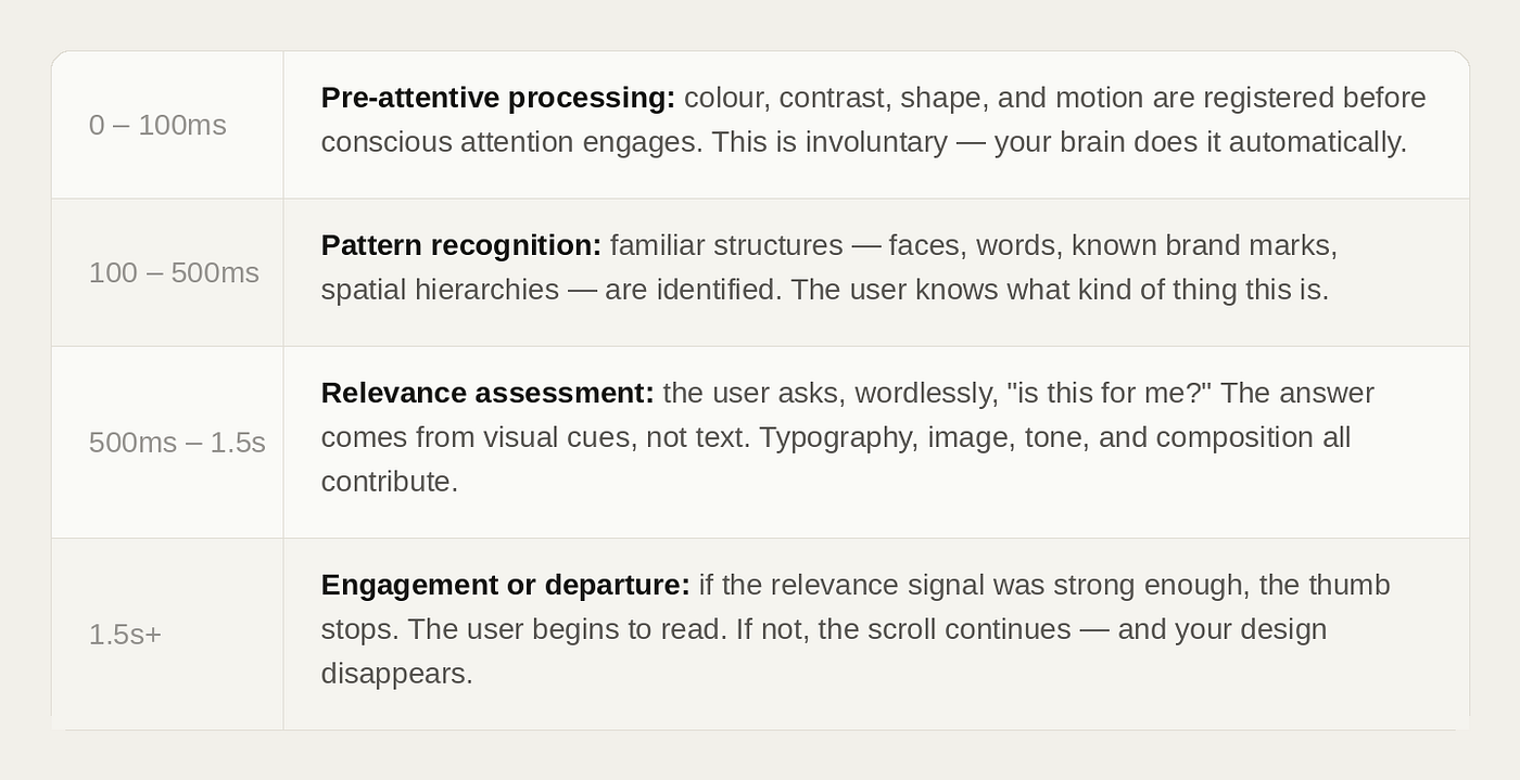
The design implications of this model are profound. The first 500 milliseconds are entirely pre-verbal. No headline, however brilliant, does any work in that window. What the work does is the pre-attentive layer: the contrast, the colour, the visual weight, the sense of spatial organisation. Your design has to earn the right for its words to be read — and it earns that right through non-verbal means.
The hierarchy problem
Most designers are taught to think about hierarchy in terms of information architecture: primary message, secondary message, supporting details. This is correct but insufficient for scroll contexts, because it assumes the user is already engaged. It assumes they’re reading, not scanning.
Designing for micro-attention requires a second layer of hierarchy thinking: the arrest sequence. Before the information hierarchy can do its work, something has to stop the scroll. These are different jobs, and conflating them is one of the most common reasons well-designed content performs badly in feed environments.
“The arrest layer is the design that stops the thumb. The information layer is what rewards the user for stopping. You need both — in the right order.”
The arrest layer is primarily visual and primarily fast. It operates on the pre-attentive system. Scale, colour contrast, the presence of a face, unexpected white space, an image that implies a question — these are the tools. They don’t need to be obvious or aggressive. In fact, the most effective arrest elements in premium editorial contexts are often the subtlest: a piece of negative space that creates unexpected breathing room in a dense feed. This typeface choice signals quality before a word is read.
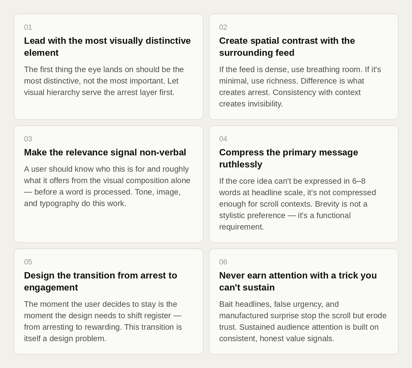
Six design principles for the micro-attention era
What micro-attention design is not
There’s a version of this argument that slides into a design philosophy of pure reductionism: make everything shorter, louder, simpler, faster. Strip out nuance. Remove depth. Optimise for the lowest common denominator of attention.
That path leads somewhere genuinely bad — a visual culture of maximum compression and zero reward, where every design screams for attention, and none of them deserves it. The internet has spent the last decade going some way down that road, and the results are visible in the degraded quality of our feeds.
Designing for micro-attention is not an argument for that. It is an argument for honesty about the perceptual conditions that real users inhabit — and for designing with that honesty, not against it.
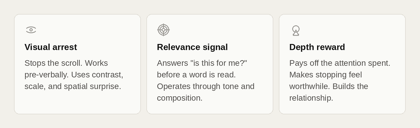
The deepest users — the ones who become loyal audiences, who share your work, who return — arrived through micro-attention but stayed for something else entirely: quality, depth, the feeling of being genuinely served. The best designs for scroll culture don’t just catch eyes. They make stopping worth it. They convert a reflex into a relationship.
The responsibility under the technique
Designing for micro-attention carries an ethical dimension that’s worth naming. The same techniques that help valuable content find its audience can also funnel attention toward things that don’t deserve it. The arrest layer is neutral — it stops thumbs regardless of what it’s arresting them for.
There’s a meaningful difference between designing to be noticed and designing to manipulate. The first respects the user’s attention as something to be earned and repaid. The second treats it as a resource to be extracted. Both can be effective in the short term. Only one builds anything worth having.
In a scroll culture that has been badly burned by the attention extraction model — by engagement metrics that optimised for outrage, for compulsion, for the next dopamine hit — the designers who understand micro-attention well enough to use it ethically have something genuinely valuable to offer. The ability to make good work visible. The craft to stop the right scrolls, at the right moment, for the right reasons.
That is, despite everything, still what design is for.
I hope you found this article helpful and that you will follow all of the rules and recommendations I provided.
And I would greatly appreciate your opinions and comments.
For more design updates, you can follow me on YouTube / Instagram and Behance.
Stay Creative!!!
메타데이터
- post_id
- cdffe7566860
- slug
- designing-for-micro-attention-in-a-scroll-culture-cdffe7566860
- url
- https://medium.com/design-bootcamp/designing-for-micro-attention-in-a-scroll-culture-cdffe7566860
- canonical_url
- https://medium.com/design-bootcamp/designing-for-micro-attention-in-a-scroll-culture-cdffe7566860
- author_url
- https://medium.com/@shivadyahvir
- status
- ok
- fetched_at
- 2026-06-15 20:49:13