Build Your First Responsive Flutter App: A Clean Architecture Approach.
These days, in the app development world, responsive design isn’t just a nice-to-have or just an extra feature; it’s essential to…
Build Your First Responsive Flutter App: A Clean Architecture Approach.
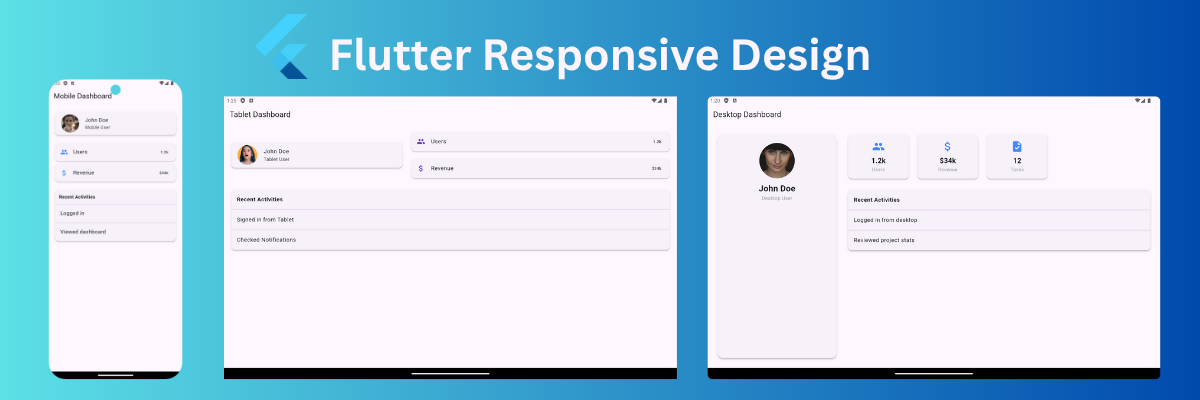
These days, in the app development world, responsive design isn’t just a nice-to-have or just an extra feature; it’s essential to delivering a great user experience. Your app needs to run seamlessly across different devices, from compact smartphones to larger tabs, even desktops. In this article I’ll write about how to implement your first responsive design in Flutter, the right way, using a clean folder structure that keeps your codebase organized.
The Foundation: Clean Project Architecture
A well-organized codebase is always the backbone of any scalable and maintainable project. Let's explore a clean folder structure that makes your responsive logic clear and separates responsibility.
My suggestion is to structure your folders like this:
lib
├── app
│   └── my_app.dart               // Your root application widget
├── core
│   ├── constants
│   │   └── app_breakpoints.dart  // Defines screen width breakpoints
│   ├── enums
│   │   └── device_screen_type.dart // Enum for device types (mobile, tablet, desktop)
│   ├── extensions
│   │   └── box_constraints_ext.dart // Extension to determine screen type from BoxConstraints
│   └── responsive
│       └── responsive_builder.dart  // Reusable widget to build UI based on screen type
└── ui
    └── views
        └── home
            ├── home.dart          // The main responsive view for Home
            ├── home_desktop.dart  // Desktop-specific Home layout
            ├── home_mobile.dart   // Mobile-specific Home layout
            └── home_tablet.dart   // Tablet-specific Home layout
Step-by-step implementation:
Let's describe the code for each part of this structure.
1. Defining Your Breakpoints (core/constants/app_breakpoints.dart)
class AppBreakpoints {
  static const double mobile = 600;
  static const double tablet = 950;
  static const double desktop = 1200;
}
First, define the screen size or breakpoints for mobile, tab and desktop.
2. Enumerating Device Screen Types (core/enums/device_screen_type.dart)
enum DeviceScreenType {
  mobile,
  tablet,
  desktop,
}
To keep things clear and easy to manage, define device types in an enum.
3. The BoxConstraints Extension (core/extensions/box_constraints_ext.dart)
extension DeviceScreenTypeExtension on BoxConstraints {
  DeviceScreenType get screenType {
    final width = maxWidth;
    if (width >= AppBreakpoints.desktop) return DeviceScreenType.desktop;
    if (width >= AppBreakpoints.tablet) return DeviceScreenType.tablet;
    return DeviceScreenType.mobile;
  }
}
We centralize the screen type detection logic by extending BoxConstraints with a getter screenType. Which returns a DeviceScreenType(enum). This uses maxWidth, a built-in property of BoxConstraints that represents the maximum width available to the widget on the current device. Based on this width, we determine whether the screen should be treated as mobile, tablet, or desktop.
4. The ResponsiveBuilder Widget (core/responsive/responsive_builder.dart)
class ResponsiveBuilder extends StatelessWidget {
  final Widget Function(BuildContext, DeviceScreenType) builder;

  const ResponsiveBuilder({super.key, required this.builder});

  @override
  Widget build(BuildContext context) {
    return LayoutBuilder(
      builder: (context, constraints) {
        final screenType = constraints.screenType;
        return builder(context, screenType);
      },
    );
  }
}
The ResponsiveBuilder will simplify responsive UI building with LayoutBuilder. Using LayoutBuilder, we can easily access BoxConstraints. We extended BoxConstraints with screenType getter; we can determine the current device type with it. Since there’s no need to manage state or update any data, we keep it stateless, making it simple, efficient, and lightweight.
5. Implementing Responsive Views (ui/views/home/home.dart)
class HomeView extends StatelessWidget {
  const HomeView({super.key});

  @override
  Widget build(BuildContext context) {
    return  ResponsiveBuilder(
      builder: (context, screenType) {
        switch (screenType) {
          case DeviceScreenType.tablet:
            return const HomeTablet();
          case DeviceScreenType.desktop:
            return const HomeDesktop();
          default:
            return const HomeMobile();
        }
      },
    );
  }
}
Now finally, the magic time! Like here, using ResponsiveBuilder we can get the device type and render a dedicated layout for each screen type: mobile, tab, and desktop.
Pro Tip: Testing with Device Preview
Congratulations, you did it! 🎉 Now here is another challenge. Do you need to buy all those devices to test your app? Well, if you’re earning enough, sure… just kidding! 😄
You don’t need to buy anything. There are many ways to view your UI on different screen sizes, but my favorite and time-saving tool is device_preview package. It simulates your app on multiple devices inside your device or emulator.
void main() {
  runApp(
    DevicePreview(
      enabled: true,
      builder: (context) => const MyApp(),
    ),
  );
}
Just wrap your app with DevicePreview, you will get many device options.


If you have any questions or need help, feel free to reach out. The repo is linked below. Happy coding! Start building your responsive designs today, explore with confidence, and become an expert.
Check out the full source code on GitHub.
메타데이터
- post_id
- cf1144ebac6d
- slug
- build-your-first-responsive-flutter-app-a-clean-architecture-approach-cf1144ebac6d
- url
- https://medium.com/@rakibul25.dev/build-your-first-responsive-flutter-app-a-clean-architecture-approach-cf1144ebac6d
- canonical_url
- https://medium.com/@rakibul25.dev/build-your-first-responsive-flutter-app-a-clean-architecture-approach-cf1144ebac6d
- author_url
- https://medium.com/@rakibul25.dev
- status
- ok
- fetched_at
- 2026-09-11 05:47:06