Landing Page Validation
Many founders treat a landing page as a marketing page that comes after the product is finished. They build the features, connect payments…
Landing Page Validation

Many founders treat a landing page as a marketing page that comes after the product is finished. They build the features, connect payments, polish the backend, and only then start writing homepage copy. For indie builders, that is often too late. A landing page is not only for promotion. It is a validation tool: before building the full product, use one page to test whether users understand, care, and take the next step.
A good validation page does not need complex design or a complete feature list. It only needs to answer four questions: who is this for, what problem does it solve, what result does it create, and what can the user do now? If these four things are unclear, your project hypothesis is still unclear. If the page does not convert, the problem may not be the page. It may be the audience, pain, message, or channel.
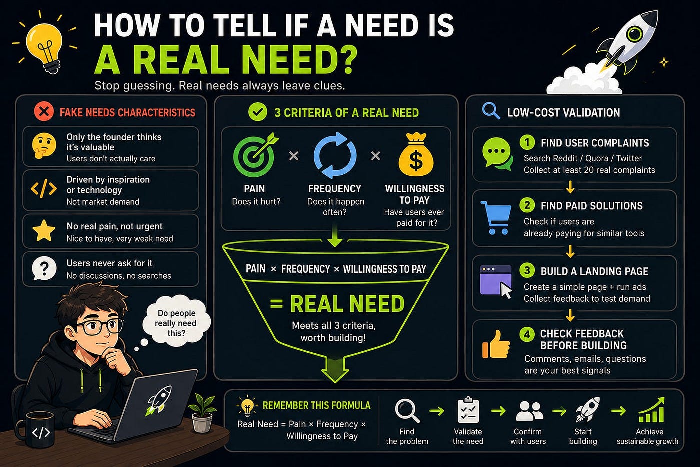
Landing page validation is not about making a beautiful page. It is about testing one business hypothesis with the lowest possible cost. If users leave an email, apply for beta, book a demo, submit data, or preorder, the direction deserves more research. If users read and leave without action, change the hypothesis before writing code.
Start With One Clear Positioning Sentence
The most important part of a landing page is not the visual design. It is the first-screen sentence. Users usually give you only a few seconds. If they cannot understand who it is for, what problem it solves, and why it matters to them, they leave. Many pages fail not because the button color is wrong, but because users do not understand the offer.
A strong positioning sentence usually contains three elements: target user, specific problem, and clear result. Do not write “AI-powered productivity platform.” Write “Generate 20 Shopify product descriptions in 5 minutes.” Do not write “smart SEO assistant.” Write “Get a weekly alert when your website traffic drops and see which pages to fix.” The first version sounds like a concept. The second sounds like a concrete promise.
If you cannot write this sentence yet, you are not ready to build the page. Go back to the user and scenario. Who feels the pain most? When does the problem happen? How do they solve it now? What cost does it create? Does your solution make the result faster, cheaper, more stable, or easier? Positioning is not copywriting decoration. It is your demand judgment compressed into one sentence.
Use this simple template:
Help [target user] solve [specific problem] in [specific scenario] and achieve [clear result].Write this sentence first. Then make the whole page serve it.
A Validation Page Needs Only Five Modules
At the validation stage, a landing page does not need a complex structure. Complexity makes the signal harder to read. A useful validation page usually needs five modules: value proposition, problem, solution, call to action, and proof.
The value proposition is the headline and subheadline. The headline should communicate the result, while the subheadline adds audience and scenario. The problem section helps users recognize themselves. Do not write generic phrases like “low efficiency.” Write concrete tasks: manually tracking competitor prices every week, resizing images for every product launch, or copying customer leads from webpages every day.
The solution section should not list every future feature. Explain how the scenario becomes easier. Use three steps when possible: upload materials, analyze automatically, receive a report; enter a link, generate a page, export images; connect a store, monitor changes, get alerts. Users need to see the path, not the technology.
The call to action must be explicit: join the waitlist, apply for beta, book a demo, submit one sample, or reserve an early-bird spot. “Learn more” is weak because it is not real action. The proof section can include a manual sample, target-user feedback, a before-and-after image, a workflow screenshot, or a small case result. Even rough proof is better than empty claims.
Your CTA Determines Signal Strength
The call to action decides what kind of signal you are validating. If the CTA is “join the mailing list,” you validate interest. If it is “submit your data for a free test run,” you validate willingness to spend time. If it is “reserve an early-bird spot,” you validate willingness to pay.
Different stages need different CTAs. To test curiosity, use a waitlist. To test real pain, ask users to submit a sample. To test sales leads, ask them to book a demo. To test payment, use presales or a deposit. Do not put every CTA on the page, or you will not know which action actually attracted users.
CTA copy should be specific. “Apply for Beta” is better than “Start Now” when the product is not ready. “Submit one product link and get a free optimization suggestion” is stronger than “Contact us.” “Reserve one of the first 50 early-bird spots” fits validation better than a generic “Buy Now.” The clearer the next step, the easier it is for users to act.
If the page has visits but no clicks, check whether the first screen and CTA match. Maybe users understand the problem but the next step feels too heavy. Maybe the step is light, but the value is not strong enough. Landing page optimization is not about making things prettier. It is about helping users move from understanding to action.
The Traffic Source Must Match the Target User
Many founders build a landing page, share it with friends, broad communities, and product groups, then see low conversion and conclude that demand is weak. That conclusion is too fast. Validation only works if the page is shown to the right people. If traffic is mismatched, even a good page gives weak signals.
If you are building a Shopify seller tool, sharing it in an indie builder group may get praise, but those people are not your users. If you are building a developer screenshot tool, a general startup community may not understand the scenario. If you are building a teacher lesson-prep tool, you should test in teacher communities, education newsletters, course groups, and relevant comment sections.
Track each channel separately: visits, click-through rate, signup rate, user quality, and follow-up replies. In the early stage, do not only look at total conversion. Look at which channel brings users closest to your target audience. Thirty precise visits with five applications can be more valuable than one thousand broad visits with no qualified leads.
A landing page does not work alone. It validates the message, while the channel validates whether users can be reached. If you test only one side, the conclusion is incomplete.
Use Data, Not Feelings, to Improve the Page
After launching the page, track at least four numbers: visits, CTA clicks, form submissions, and effective follow-up conversations. Visits show exposure. Clicks show interest. Submissions show action. Follow-up conversations show user quality. Splitting these numbers helps you locate the real problem.
If visits are low, fix the channel first. Do not rush to rewrite the page. If visits are high but CTA clicks are low, the first-screen value proposition may be unclear or weak. If clicks are decent but form submissions are low, the form may be too long, the action too heavy, trust too low, or the promise unclear. If submissions are high but conversations are low quality, your message or channel may be too broad.
A practical validation threshold might be: within one week, get 100 target-user visits, more than 10 CTA clicks, and 3 to 5 qualified applications or interviews. If you miss the threshold, it does not automatically mean the idea is bad. Change one variable and test again: audience, scenario, headline, CTA, or channel. Change only one important variable at a time, or you will not know what worked.
Do not abandon a direction after one weak page, and do not start building because a few friends liked it. The value of landing page validation is using data to calibrate your assumptions.
Common Landing Page Mistakes
The first mistake is being too abstract. The page is full of words like efficiency, intelligent, all-in-one, empower, and automation, but users cannot see their concrete task. The earlier the project, the more specific the page should be. Narrow is better than vague.
The second mistake is listing too many features. You include everything you may build in the future, hoping it looks powerful. Instead, users cannot tell what the core value is. A validation page should push one key scenario and get users to act on it.
The third mistake is asking for too much too early. If the product is not launched and you ask users to buy an annual plan, trust may not be enough. Start with a lighter action such as beta application, free sample, or demo booking, then test payment later.
The fourth mistake is not following up. Users leave emails, but you do not contact them, interview them, or ask why they were interested. In the early stage, every lead is valuable. Learn who they are, why they cared, how they solve the problem now, and whether they will try the product.
A landing page is not a one-time page. It is a learning tool. Every visit, click, submission, and reply helps you refine the direction.
Summary
Landing page validation is not about building a beautiful homepage. It is about testing a business hypothesis with one page. It forces you to clarify the user, problem, result, and action, and lets users tell you through behavior whether the problem is worth continuing.
For indie builders, building a landing page before writing code is a cheaper order. If a page fails, you lose a few days. If a finished product has no users, you may lose months. Test whether users are willing to act first, then decide whether to build.
Homework
- Write your project positioning in one sentence: who, scenario, problem, and result.
- Build a five-module landing page: value proposition, problem, solution, CTA, and proof.
- Publish it in 2 precise channels and track visits, clicks, submissions, and qualified conversations separately.
- After one week, change only one variable and test again.
Next Lesson
Fake Door Testing: before building the feature, see whether users click it.
메타데이터
- post_id
- cf1fe0c591dc
- slug
- landing-page-validation-cf1fe0c591dc
- url
- https://medium.com/indie-hack-lab/landing-page-validation-cf1fe0c591dc
- canonical_url
- https://medium.com/indie-hack-lab/landing-page-validation-cf1fe0c591dc
- author_url
- https://medium.com/@jxausea
- status
- ok
- fetched_at
- 2026-06-09 15:37:30