Font Pairings Made Simple: How to Make Your Designs Look Instantly Better
Great design doesn’t always start with complex visuals — it often starts with text. The right font pairings can instantly elevate your…
Font Pairings Made Simple: How to Make Your Designs Look Instantly Better
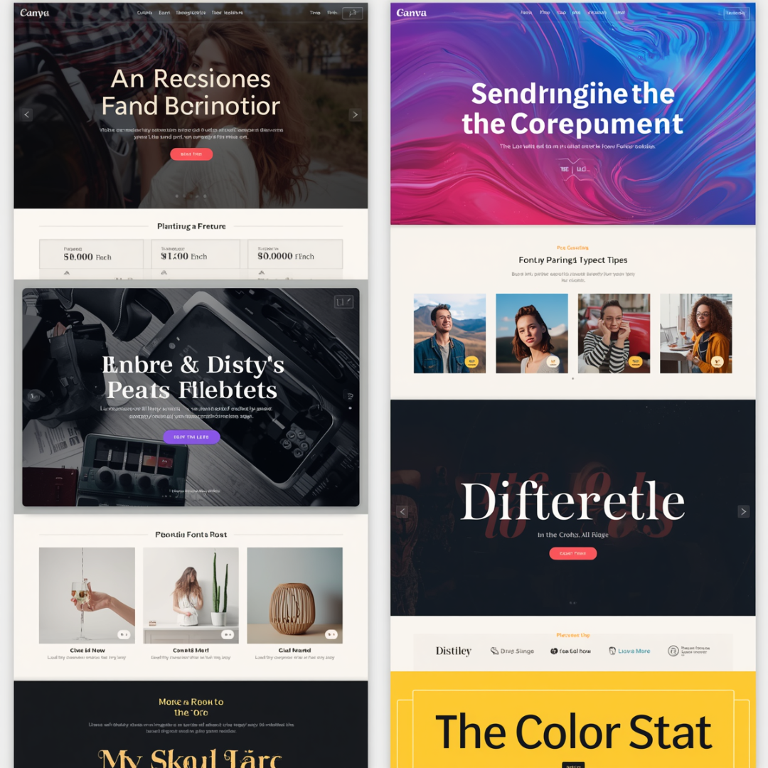
Great design doesn’t always start with complex visuals — it often starts with text. The right font pairings can instantly elevate your design, making it look more professional, easier to read, and more persuasive. Whether you’re designing social media graphics, digital products, or marketing materials, mastering font combinations is one of the fastest ways to improve your results.
In this guide, you’ll learn how to choose effective font pairings and follow a proven design plan that not only looks great — but also increases conversions.
Why Font Pairing Matters
Fonts communicate tone before a single word is read. A mismatched combination can confuse your audience, while a well-balanced pairing creates clarity and trust.
Good font pairings help you:
- Establish visual hierarchy
- Improve readability
- Guide the viewer’s attention
- Reinforce your brand identity
- Increase engagement and conversions
Think of your fonts as a team — each one has a role, and when they work together, your design feels intentional and polished.
The Basics of Font Pairings
Before jumping into combinations, understand the two main categories:
1. Serif Fonts
These fonts have small lines (or “feet”) at the ends of letters. They feel:
- Traditional
- Professional
- Trustworthy
Great for: blogs, long-form content, finance, education
2. Sans Serif Fonts
These are clean and modern without decorative strokes. They feel:
- Minimal
- Contemporary
- Easy to read on screens
Great for: websites, social media, digital products
3. Display & Script Fonts
These are more decorative and expressive. They:
- Add personality
- Grab attention
- Should be used sparingly
Great for: headlines, branding accents
The Golden Rule: Contrast, Not Conflict
The secret to strong font pairings is contrast.
Avoid pairing fonts that look too similar. Instead, aim for combinations that clearly differ while still complementing each other.
Strong Pairing Examples:
- Serif + Sans Serif
- Bold headline + Light body text
- Decorative font + Simple font
Weak Pairing Example:
- Two similar sans serif fonts with minimal difference
Contrast creates visual interest and helps your audience quickly understand what matters most.
A Simple 3-Step Formula for Font Pairings
Use this framework every time you design:
Step 1: Choose Your Primary Font (Headline)
This is your attention-grabber. It should:
- Reflect your brand personality
- Be bold or distinctive
- Work well at larger sizes
Step 2: Choose Your Secondary Font (Body Text)
This font supports readability. It should:
- Be clean and simple
- Be easy to read at smaller sizes
- Not compete with your headline
Step 3: Optional Accent Font
Use sparingly for:
- Quotes
- Callouts
- Highlights
Keep it minimal — too many fonts will clutter your design.
High-Converting Design Plan Using Font Pairings
If your goal is not just aesthetics but conversions (sales, clicks, downloads), your font strategy must be intentional.
Here’s a step-by-step design plan:
1. Define Your Design Goal
Before choosing fonts, ask:
- Is this design for selling?
- Is it for education?
- Is it for engagement?
Your goal determines your tone.
Example:
- Sales page → Bold, clean, trustworthy
- Educational post → Simple, readable
- Creative brand → Stylish, expressive
2. Create a Clear Visual Hierarchy
Your viewer should instantly know:
- What to read first
- What to read next
- What action to take
Use font pairings to guide this flow:
- Headline → Largest, boldest font
- Subheading → Medium size, supportive font
- Body → Smallest, clean font
This structure improves readability and keeps users engaged longer.
3. Stick to 2–3 Fonts Maximum
More fonts = more confusion.
High-converting designs typically use:
- 1 headline font
- 1 body font
- (Optional) 1 accent font
Consistency builds trust — and trust drives conversions.
4. Use Size and Weight Strategically
Font pairing isn’t just about style — it’s also about scale.
Create contrast using:
- Font size (large vs small)
- Weight (bold vs light)
- Spacing (tight vs wide)
This helps key messages stand out without overwhelming the viewer.
5. Prioritize Readability Over Style
A beautiful font that’s hard to read will hurt your results.
Always test:
- Can you read it quickly?
- Does it work on mobile?
- Is there enough spacing?
If not, simplify.
6. Align Fonts with Brand Identity
Your font choices should match your brand’s voice.
Examples:
- Finance/Business → Clean serif + modern sans serif
- Creative Brand → Script + minimal sans serif
- Tech → Geometric sans serif
Consistent font pairings build recognition over time.
7. Use White Space to Let Fonts Breathe
Even the best font pairing fails if your design is cluttered.
White space:
- Improves readability
- Makes designs look premium
- Draws attention to key elements
Don’t be afraid of empty space — it’s part of the design.
8. Test and Optimize for Conversions
Design is not just art — it’s performance.
Test variations of:
- Headlines (different fonts or weights)
- Call-to-action text
- Layout spacing
Track what gets:
- More clicks
- More engagement
- More sales
Then refine your font pairings based on results.
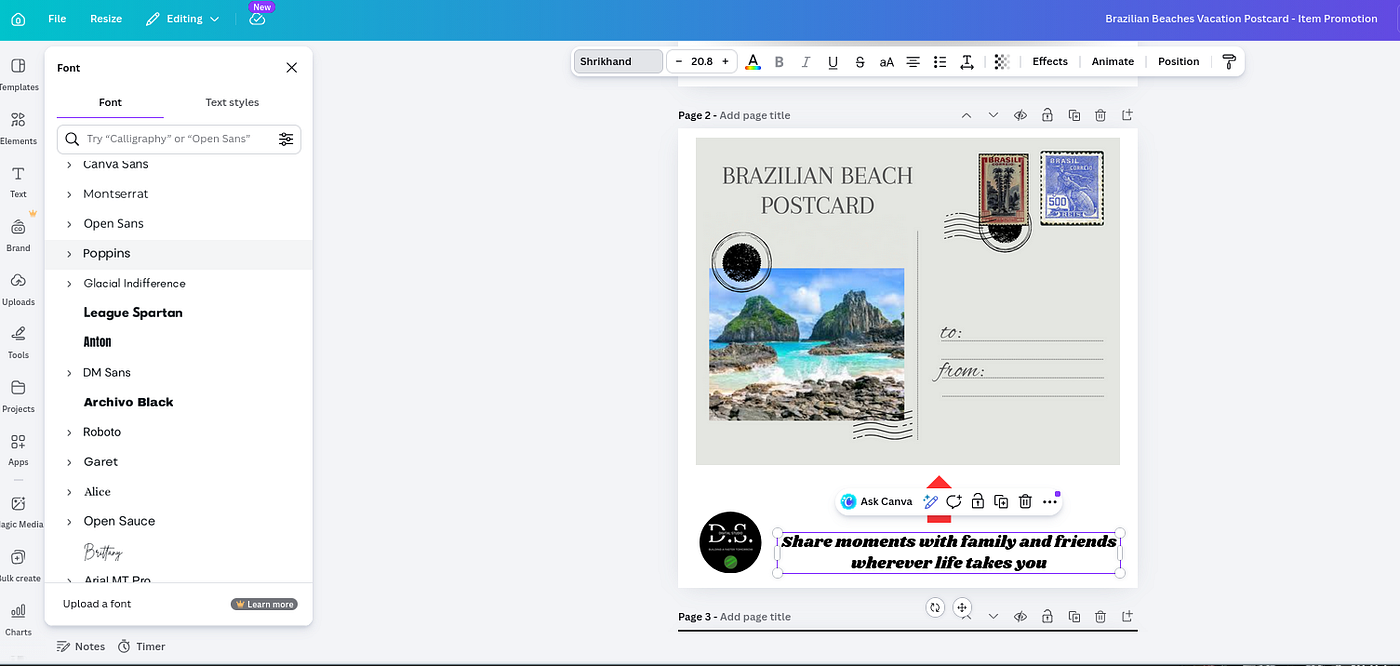
Quick Font Pairing Ideas You Can Try Today
If you want fast results, start with these proven combinations:
- Elegant serif headline + clean sans serif body
- Bold sans serif headline + light sans serif body
- Script accent + simple sans serif base
These combinations work across most platforms and industries.
Common Mistakes to Avoid
Even good designers make these mistakes:
- Using too many fonts
- Pairing fonts that are too similar
- Ignoring readability for style
- Overusing decorative fonts
- Not considering mobile responsiveness
Keep it simple, and your designs will look more professional instantly.
Final Thoughts
Mastering font pairings doesn’t require years of design experience — it just requires a clear system and intentional choices.
When you:
- Use contrast
- Limit your fonts
- Focus on readability
- Align with your brand
…your designs will not only look better — they’ll perform better.
Start applying these principles today, and you’ll notice an immediate improvement in both the quality and effectiveness of your work.
Thank you for sticking around and reading my article! If you found this article really eye-opening and want more tools or information. Check out the sources below for the best way to get started today!
Digital Studio Listings (Jadesales.shop) Customizable Black & White Minimalist Logo Template: https://www.jadesales.shop Tech-Savvy QR Business Card Template: https://www.jadesales.shop Customizable Brazilian Beaches Postcard Template: https://www.jadesales.shop
Ecom Insider Blog (My Website) Create Stunning Designs with Canva: https://www.jadesales.shop/build-like-a-master
메타데이터
- post_id
- cf4e2d9a3fc6
- slug
- font-pairings-made-simple-how-to-make-your-designs-look-instantly-better-cf4e2d9a3fc6
- url
- https://medium.com/@Learning_Pi/font-pairings-made-simple-how-to-make-your-designs-look-instantly-better-cf4e2d9a3fc6
- canonical_url
- https://medium.com/@Learning_Pi/font-pairings-made-simple-how-to-make-your-designs-look-instantly-better-cf4e2d9a3fc6
- author_url
- https://medium.com/@Learning_Pi
- status
- ok
- fetched_at
- 2026-06-09 15:37:30