CSS June 2026: 3 Features That Shrink Your JavaScript Codebase
Think about how many libraries we’ve installed just to handle something trivial. Auto-resizing textareas, divider lines between grid…
CSS June 2026: 3 Features That Shrink Your JavaScript Codebase
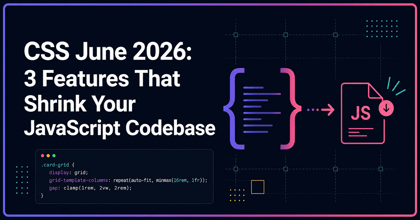
Think about how many libraries we’ve installed just to handle something trivial. Auto-resizing textareas, divider lines between grid columns, or gradient borders that look simple but need a whole ::before/::after dance to pull off. We install the package, skim the docs, and cross our fingers there's no conflict with another dependency down the line.
This June, a chunk of that work officially moved to the browser. Not experimental tricks that need polyfills or awkward @property hacks, but native properties we can use in production today. Let's walk through each one, and why it actually matters for our day-to-day workflow.
1. field-sizing: content — Say Goodbye to Auto-Resize Textarea Scripts
If you’ve ever built a comment box or chat input that grows as the user types, you know the pattern: listen for the input event, measure scrollHeight, then reset style.height via JavaScript. It looks harmless, but multiply that across a page full of inputs and it becomes unnecessary overhead you didn't need to carry.
As of June 16, 2026, field-sizing officially reached Baseline "Newly available" status — supported simultaneously across Chrome, Edge, Safari, and now Firefox 152, which just shipped it. That means we can use it in production without worrying about modern browser compatibility.
textarea {
  field-sizing: content;
  min-height: 2lh;
  max-height: 10lh;
}
One line, and the textarea grows and shrinks automatically based on its content, stopping at whatever min/max we set. What’s interesting is this property also works on <select> — the dropdown resizes to match the selected option's width, no extra script needed to measure text.
Try it yourself on CodePen — copy the code below, drop it into the HTML panel, and compare a regular textarea against one using field-sizing: content:
[embed]
2. Gap Decorations — Grid Divider Lines Without Pseudo-Elements
This is one of the things we’ve all hand-rolled at some point: divider lines between grid or flexbox columns and rows. The usual approach is a border-right on every item (which means manually excluding the last one), or adding an extra decorative element that clutters the markup and doesn't play nicely with screen readers.
The CSS Gaps Module introduces column-rule and row-rule that now work directly on grid and flex containers — not just multi-column layouts like before.
.grid-container {
  display: grid;
  grid-template-columns: repeat(3, 1fr);
  gap: 24px;
  column-rule: 2px solid #d1d5db;
  row-rule: 1px dashed #e5e7eb;
}
These lines are purely visual — they don’t affect gap size or layout at all. There are also supporting properties like column-rule-break for controlling how the line behaves at intersections, plus a repeat() function for creating alternating patterns, similar to how repeat() works in grid templates.
Worth noting: support right now is Chromium-only (Chrome and Edge). Firefox and Safari haven’t implemented it fully yet, so if your audience still has a meaningful Safari user base, plan a fallback.
Try it yourself on CodePen — open it in Chrome or Edge to see the effect:
[embed]
3. background-clip: border-area — Gradient Borders Without the Workarounds
Building a gradient border used to mean a whole trick: a ::before with a gradient background, padding to leave room for the border, then a mask so only the edge shows through. It works, but the code ends up long for what's really a simple effect.
background-clip: border-area, part of CSS Backgrounds Level 4, solves this far more directly — the background gets clipped exactly to the area the border occupies, accounting for border-width and border-style.
.card {
  border: 8px solid transparent;
  background-image: linear-gradient(135deg, #6366f1, #ec4899);
  background-clip: border-area;
}
No pseudo-element, no manual masking. This one’s already supported in Safari since Technology Preview, and it’s showing up more often as other browsers start to catch up.
Try it yourself on CodePen — ideally open it in Safari, or any browser that supports background-clip: border-area:
[embed]
Why This Matters for Us
The pattern across all three of these features is the same: the browser is taking over work we used to hand off to JavaScript or fragile CSS workarounds. The payoff isn’t just “shorter code” — it’s:
- Better performance, since the logic runs in the rendering engine instead of the main JS thread
- Cleaner markup, no extra elements just for visual purposes
- Better accessibility, since there's no additional DOM to confuse screen readers
- Lighter maintenance, one less dependency to think about
That doesn’t mean front-end libraries are going away entirely. But for the cases that were always “too small to justify a library, too annoying to write by hand,” CSS in 2026 is slowly closing that gap.
What to Do Next
Before you rush to refactor every old component, check your target browsers first. field-sizing is safe to use across modern browsers today, but Gap Decorations is still Chromium-only. If your project needs full Safari or Firefox support, plan a simple fallback or treat these as progressive enhancement — a visual bonus, not a hard dependency.
Pick one JavaScript-heavy component in your project right now and check: is there a part that one of these three features could actually replace? Sometimes the answer is closer than we think — just a single line of CSS we didn’t know existed yet.
메타데이터
- post_id
- d0cb507ce390
- slug
- css-june-2026-3-features-that-shrink-your-javascript-codebase-d0cb507ce390
- url
- https://medium.com/@developerawam/css-june-2026-3-features-that-shrink-your-javascript-codebase-d0cb507ce390
- canonical_url
- https://medium.com/@developerawam/css-june-2026-3-features-that-shrink-your-javascript-codebase-d0cb507ce390
- author_url
- https://medium.com/@developerawam
- status
- ok
- fetched_at
- 2026-07-07 13:53:00