Mass Killing Patterns in the United States: A Redesign Analysis
Data, Design, and Deception
Mass Killing Patterns in the United States: A Redesign Analysis
Data, Design, and Deception
The Original Design
For this project, the goal was to design paired communicative and deceptive visualizations using the same dataset: the AP/USA TODAY/Northeastern University Mass Killings database. The assignment required our group to intentionally craft both honest and misleading graphics, using design and encoding decisions — not fabricated data — to shape interpretation.
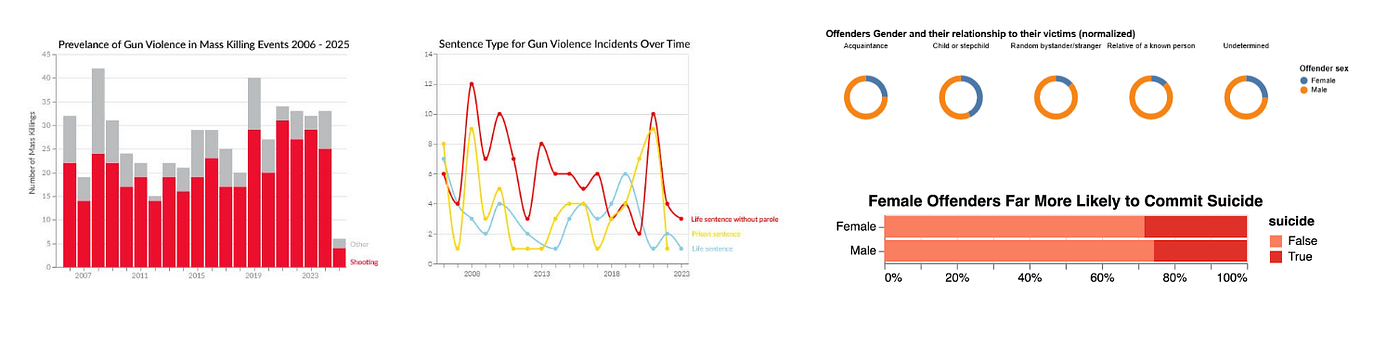
The original dashboard attempted to compare weapon trends over time, sentencing patterns for offenders, suicide outcomes among offenders, and shifts in non-firearm methods. The high-level intention was good, but the execution fell short in several areas: inconsistent styling, weak titles, unclear narrative cues, and deceptive techniques that weren’t strong or varied enough. These issues became especially clear once I applied the course’s visualization principles to evaluate my initial design.
Design Critique

Fig. 1: The Original Design Dashboard
While the original dashboard had strong foundational elements, several design decisions weakened its communicative and deceptive effectiveness. Below, I break down what worked, where the design failed, and how those failures relate to core visualization principles discussed in class.
What Worked:
1. Strong foundational chart construction
The stacked bar chart on weapon types demonstrated strong foundational design principles:
- a clean, low-ink axis treatment
- removal of redundant tick labels
- direct labeling instead of a legend
- consistent color use
These decisions made the chart readable and visually stable.
2. Direct labeling on the sentencing line chart
By labeling the lines directly, the chart eliminated unnecessary legend lookups. This aligns with the best practices for reducing cognitive load.
3. Thoughtful pairing of clear vs. deceptive charts
Even in the flawed version, the clear and deceptive charts were visually connected showing an understanding of narrative contrast.
Where the design fell short:
1. Ambiguous axis language
Our y-axis labels were imprecise. (e.g. “Number of mass killings” could be interpreted as total deaths rather than incidents).
2. Titles didn’t convey the intended message
Titles should act as thesis statements, not neutral labels. Because ours were vague, they failed to guide attention or highlight the story. Titles are a major framing device, and underusing them weakens the viewer’s first impression.
3. Styling inconsistencies across graphs
Although individually clean, the charts differed in axis formatting, color weight, type scales, and spacing. This inconsistency breaks visual rhythm and increases cognitive load — especially in a dashboard meant to be scanned holistically.
4. Some graphs lacked narrative scaffolding
My sentencing chart didn’t communicate what mattered. Without annotations or context, viewers were left to interpret patterns that may or may not be meaningful. Good visualization anticipates ambiguity and guides interpretation intentionally.
5. Deceptive techniques weren’t strong enough
Our professor noted several missed opportunities:
- Titles could have exaggerated interpretations more clearly.
- Sorting bars by proportion instead of alphabet order would have strengthened the misleading impression.
- Legends instead of direct labels created extra cognitive friction, weakening deception.
- Both deceptive charts used the same tactic (normalizing proportions), when variety — axis truncation, category filtering, exaggerated ratios — would have created more persuasive illusions.
- One chart relied too much on hover interactions, which means the deception didn’t fully occur at first glance.
6. One deceptive chart didn’t justify being a visualization
A chart with only two data points feels unnecessary and less authoritative. Effective deception requires the viewer to believe the visualization exists for a reason.
The Redesign

Fig. 2: The Full Redesigned Dashboard

Fig. 3: Mass Killings Involving Firearms (Clear Chart #1)

Fig. 4: Sentencing Shifts Over Time (Clear Chart #2)

Fig. 5: Suicide Outcomes Among Offenders (Deceptive Chart #1)

Fig. 6: Non-Firearm Methods Are Rising in Public Mass Killings (Deceptive Chart #2)
The redesign focused on strengthening narrative clarity, visual consistency, and the intentional use of deception techniques — while making the differences between clear and deceptive charts unmistakable.
Justifications
1. Clearer titles and narratives
Every chart now has a titles that functions as a claim. Titles anchor the interpretation and reduce viewer uncertainty about what to look for.
2. Sharper axis labels and encoding choices
Axis labels were rewritten to specify events rather than abstract “killings,” share of incidents rather than ambiguous percentages, and consistent measurement units. This directly addressed the professor’s notes about precision and graphical integrity.
3. Stronger styling consistency
My redesign uses consistent axis weights, unified color scales, harmonized spacing, and stable type hierarchy. These reduce perceptual friction and supports a cohesive dashboard narrative.
4. More effective and varied deception
My redesign incorporates multiple deceptive strategies:
- misleading baselines
- exaggerated vertical scale
- category filtering
- percentage normalization that hides base-rate counts
- title framing that implies rising trends that barely exist
These choices create believable — but wrong — interpretations, pushing beyond proportional manipulation alone.
5. Improved annotations
Annotations now:
- explain the intended message of clear charts
- call out misleading areas on deceptive charts
- highlight base-rate issues and scale distortions
This directly responds to the earlier critique about missing narrative depth.
Takeaways
1. Encoding is never neutral. Every design choice shapes interpretation.
Whether a chart is honest or intentionally misleading, the story emerges through choices: color, scale, ordering, categorization, annotation. In my redesign, sorting, axis framing, and selective emphasis each dramatically shifted the viewer’s takeaway.
2. Titles, labels, and narration matter just as much as the visuals.
A chart without a meaningful title is a chart without a thesis. In my redesign, rewriting the titles alone has shifted the interpretive frame of multiple graphs. This reinforced that storytelling is not an optional add-on, it’s the backbone of visualization.
3. Consistency builds trust; inconsistency breaks it.
Even small visual discrepancies — axis weight, color harmony, spacing — affect how credible and understandable a dashboard feels. My redesign intentionally synchronizes layout, typography, and color to create a cohesive visual system, demonstrating how consistency supports comprehension and reduces cognitive load.
Conclusion
This redesign forced me to think about visualization not as static charts, but as argumentative tools. Whether the goal is clarity or deception, visuals shape how people reason about and interpret a dataset. This project taught me to approach design more intentionally: every scale, title, color, label, and annotation is part of a larger rhetorical structure. And ultimately, good visualization is not just about accuracy — it is about responsibility, intention, and the power to shape how people understand the world.
메타데이터
- post_id
- d2c6868affe1
- slug
- mass-killing-patterns-in-the-united-states-a-redesign-analysis-d2c6868affe1
- url
- https://medium.com/@nicoleerin/mass-killing-patterns-in-the-united-states-a-redesign-analysis-d2c6868affe1
- canonical_url
- https://medium.com/@nicoleerin/mass-killing-patterns-in-the-united-states-a-redesign-analysis-d2c6868affe1
- author_url
- https://medium.com/@nicoleerin
- status
- ok
- fetched_at
- 2026-08-01 17:50:46