Instant Insights with Lux: Let Pandas Auto-Visualize Your Data for You
A beginner-friendly guide to effortless exploratory analysis in Python
Instant Insights with Lux: Let Pandas Auto-Visualize Your Data for You
A beginner-friendly guide to effortless exploratory analysis in Python
Introduction
For many data analysts, the slowest part of the job isn’t modeling — it’s the early “exploration phase.” You open a dataset, scroll through rows, write a few matplotlib plots, test correlations, maybe try a pairplot. It takes time, and most of it is repetitive boilerplate.
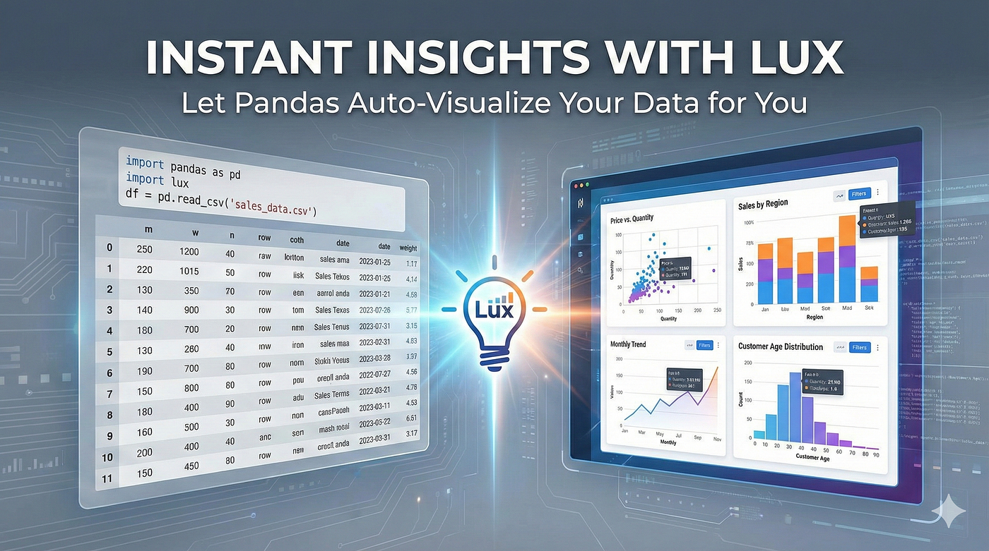
Lux is a small Python library designed to eliminate that early friction. Instead of writing code for every chart you want, Lux plugs directly into pandas and automatically generates useful visualizations the moment you display a DataFrame. Think of it as “smart autopilot” for exploratory data analysis.
This article explains how Lux works, why it saves time, and shows simple examples to help you understand it quickly — without copying anything from any other article.
Why Lux is helpful for analysts
When using pandas alone, analysts typically write something like:
df.head()
df.describe()
df['age'].hist()
sns.scatterplot(df['income'], df['spending'])
Lux simplifies this drastically. With just one extra import:
import pandas as pd
import lux

df = pd.read_csv("data.csv")
df   # Display → automatic visualizations appear
That’s all — simply printing the DataFrame gives you visual insights such as:
- Distributions of every numeric column
- Scatter plots showing strong correlations
- Category summaries
- Time-series patterns (if dates exist)
It’s fast, it’s helpful, and it lowers the entry barrier for beginners.
A simple example anyone can understand
Imagine you have a dataset of online store sales with columns:
pricequantitycategoryorder_dateprofit
In a normal pandas workflow, you’d manually create:
- A histogram of prices
- A scatter plot of price vs profit
- A bar chart by category
- A time-series chart of orders over time
With Lux, none of that needs to be written manually.
import pandas as pd
import lux

df = pd.read_csv("sales.csv")
df
Lux automatically produces:
- A price distribution histogram
- A scatter chart showing the relationship between price and profit
- A category-level bar chart
- A time-series line chart for
order_date
It’s like having a junior analyst sitting next to you saying: “Here are the patterns you might care about.”
Guiding Lux with “intent”
You can tell Lux what you want to focus on:
df.intent = ["profit"]
df
Now Lux prioritizes charts related to profit:
- Profit vs price
- Profit vs category
- Profit over time
This helps you find meaningful insights faster.
What Lux can and can’t do
⭐ Great at:
- Quick data exploration
- Automatic detection of trends and relationships
- Visual summaries for teaching or notebooks
- Reducing repetitive plotting code
⚠ Not ideal for:
- Highly customized, publication-level plots
- Running outside an interactive notebook
- Extremely large datasets (sampling may occur)
Lux is best thought of as an EDA accelerator, not a full plotting replacement.
Conclusion
Lux is a powerful companion for anyone working with pandas. By auto-generating charts based on your dataset, it saves time, highlights patterns you might miss, and simplifies early-stage analysis to almost zero code.
If you often say “I’ll explore the data later,” Lux makes that process painless — and even fun.
메타데이터
- post_id
- d2fe63d267a2
- slug
- instant-insights-with-lux-let-pandas-auto-visualize-your-data-for-you-d2fe63d267a2
- url
- https://medium.com/@shouke.wei/instant-insights-with-lux-let-pandas-auto-visualize-your-data-for-you-d2fe63d267a2
- canonical_url
- https://medium.com/@shouke.wei/instant-insights-with-lux-let-pandas-auto-visualize-your-data-for-you-d2fe63d267a2
- author_url
- https://medium.com/@shouke.wei
- status
- ok
- fetched_at
- 2026-07-14 15:00:07