Roku’s New Home Screen: The Biggest Shift in Streaming Discovery Since the App Grid
For more than a decade, Roku’s Home Screen has been one of the simplest and most recognisable interfaces in the streaming industry.
Roku’s New Home Screen: The Biggest Shift in Streaming Discovery Since the App Grid
For more than a decade, Roku’s Home Screen has been one of the simplest and most recognisable interfaces in the streaming industry.
No flashy animations. No overwhelming content recommendations. No complex navigation.
Just a clean grid of apps that users could launch with a few remote clicks.
That simplicity became one of Roku’s biggest strengths and helped it grow into one of the world’s largest TV streaming platforms.
But streaming has changed.
The average household today subscribes to multiple streaming services. Users spend significant time searching for something to watch, often bouncing between Netflix, Disney+, Prime Video, Hulu, Peacock, and countless FAST channels before making a decision.
The challenge is no longer access to content.
The challenge is content discovery.
Roku’s newly redesigned Home Screen is the company’s answer to that problem.
And in many ways, it represents the biggest shift in Roku’s platform strategy since the introduction of the streaming channel ecosystem itself.
Why Roku Needed a New Home Screen
The traditional streaming experience follows a familiar pattern:
- Turn on TV
- Open an app
- Browse content
- Start watching
The problem is that users often don’t know which app to open.
Sometimes they know they want to watch a movie.
Sometimes sports.
Sometimes comedy.
Sometimes they simply want to find something interesting.
The “app-first” model forces users to make a platform decision before making a content decision.
Roku is attempting to reverse that process.
The new Home Screen is designed around a simple philosophy:
Help users find content first and worry about apps second.
This approach mirrors broader industry trends.
Major streaming platforms are increasingly competing to become the central discovery layer between viewers and content.
Instead of acting as a launcher, Roku wants to become a personalized entertainment guide.
From App-Centric to Content-Centric
The most important thing to understand about the redesign is that it is not primarily a UI update.
It is a product strategy update.
Historically, the Home Screen’s primary purpose was:
- Display installed channels
- Provide access to settings
- Offer search functionality
The new Home Screen introduces a fundamentally different objective:
- Recommend content
- Predict user intent
- Reduce browsing time
- Increase engagement
This changes how users interact with the platform and how publishers compete for attention.
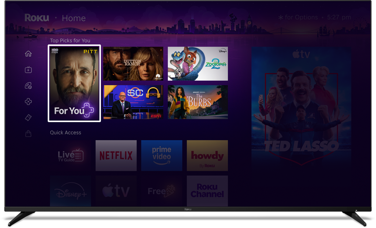
Quick Access: Roku Learns Your Habits
One of the first changes users notice is the new Quick Access section.
Traditionally, every installed app occupied equal importance.
Netflix appeared next to a niche sports channel.
A frequently used app appeared the same way as one launched months ago.
The new Quick Access section changes this dynamic.
Roku analyzes viewing behavior and usage patterns to surface apps, content hubs, and shortcuts that users access most frequently.
The result is a Home Screen that evolves over time.
For users, this means fewer clicks.
For OTT providers, it means visibility becomes increasingly tied to engagement rather than installation alone.
This is a subtle but important shift.
Getting an app installed is no longer the finish line.
Keeping users engaged becomes equally important.
Top Picks For You: Roku Becomes a Recommendation Engine
Perhaps the most strategic addition is the expanded recommendation layer.
The Top Picks For You section transforms Roku into something much more than a streaming platform.
It becomes a recommendation engine.
Instead of asking users to open Netflix and then search for a movie, Roku now attempts to recommend content directly from the Home Screen.
This reduces friction.
It also creates a new competitive landscape.
Historically, streaming services competed for:
- Home Screen placement
- Brand awareness
- App installs
Now they compete for recommendation eligibility.
The quality of metadata, content popularity, user engagement, and viewing patterns become increasingly important.
This is similar to what happened in mobile app stores.
Initially, visibility depended on downloads.
Later, engagement and recommendation systems became critical.
Streaming platforms are now following a similar path.
Destinations: Organizing Entertainment Around Intent
One of the smartest additions is the concept of Destinations.
Instead of organizing content around apps, Roku organizes content around user intent.
Examples include:
- Movies
- Sports
- Comedy
- Free Content
- Subscription Content
This sounds simple, but it fundamentally changes the user journey.
Previously:
“I want to watch Netflix.”
Now:
“I want to watch a comedy.”
That distinction matters.
Users increasingly think in terms of content rather than platforms.
The success of TikTok, YouTube recommendations, Spotify playlists, and AI-powered feeds demonstrates this behavior clearly.
People care less about where content lives and more about whether it satisfies their current interest.
Roku’s Destinations feature embraces that reality.
Your Daily Scoop: Bringing AI Into the Living Room
One of the most ambitious features is Your Daily Scoop.
This feature uses AI-powered curation to surface:
- Entertainment news
- Trending topics
- Celebrity moments
- Major premieres
- Viral content discussions
Think of it as an entertainment-focused daily briefing integrated directly into the TV experience.
This feature acknowledges something important:
Modern viewers are influenced by conversations happening outside streaming apps.
A trending TV show on social media can quickly drive viewing behavior.
A celebrity interview can generate curiosity.
A major sports story can influence what viewers watch next.
By surfacing these moments directly on the Home Screen, Roku aims to shorten the distance between discovery and viewing.
Continue Watching and Personal Utility Features
The redesign also improves practical day-to-day functionality.
Users can access features like:
- Continue Watching
- Save List
- Sleep Timer
- Headphone Mode
more quickly than before.
While these enhancements may not generate headlines, they contribute significantly to user satisfaction.
The best user experiences are often built from dozens of small friction-reduction improvements rather than one revolutionary feature.
Roku City: Turning a Screensaver Into a Product
One unexpected addition is the promotion of Roku City.
For years, Roku City existed primarily as a beloved screensaver filled with hidden movie references and Easter eggs.
It became a cultural phenomenon among Roku users.
The new Home Screen elevates Roku City from passive entertainment to an interactive experience.
Users can engage with mini-games, trivia, and exploration features directly from the Home Screen.
This demonstrates Roku’s understanding of something many platforms overlook:
Brand assets can become engagement products.
What This Means for OTT Developers
As someone who has spent years building OTT applications across Roku, Fire TV, Samsung TV, LG TV, Android TV, and other Connected TV platforms, I find this redesign particularly interesting.
Because it changes how we should think about success metrics.
Historically, OTT teams focused heavily on:
- App installs
- User acquisition
- Store visibility
- App launch rates
Those metrics remain important.
But they may no longer be sufficient.
The new Roku ecosystem rewards:
- User engagement
- Session duration
- Content relevance
- Metadata quality
- Recommendation readiness
Product teams may need to invest more heavily in:
- Recommendation optimization
- Content tagging
- Personalized experiences
- User retention strategies
The question becomes:
“How do we earn a recommendation?”
rather than simply
“How do we earn an install?”
The Business Motivation Behind the Redesign
From Roku’s perspective, the redesign is logical.
A personalized Home Screen enables Roku to:
- Increase platform engagement
- Improve content discovery
- Reduce churn
- Drive subscriptions
- Create premium advertising opportunities
- Strengthen ecosystem loyalty
The more users rely on Roku to discover content, the more valuable the platform becomes.
This is exactly the strategy used by successful technology ecosystems across mobile, social media, and digital entertainment.
The Risk: Losing Roku’s Simplicity
Of course, every redesign comes with risks.
Many users chose Roku because it was simple.
Not because it was smart.
Not because it was personalized.
Simply because it worked.
As recommendation layers, promotional surfaces, and AI-powered features expand, Roku must be careful not to overwhelm users.
The challenge will be maintaining the simplicity that made Roku successful while delivering the intelligence required for modern content discovery.
Finding that balance will determine whether this redesign becomes a milestone or a misstep.
Final Thoughts
The new Roku Home Screen represents much more than a visual refresh.
It marks Roku’s transition from a streaming launcher to a content discovery platform.
The company is betting that the future of streaming is not about helping users find apps.
It’s about helping users find entertainment.
For consumers, this could mean less searching and more watching.
For OTT publishers, it means engagement and discoverability become more important than ever.
For developers, it signals a future where building a great app is only part of the equation.
The real challenge will be ensuring that great content gets discovered.
Because in the next generation of streaming platforms, visibility won’t be earned solely through installation.
It will be earned through relevance.
And that may be the most important change of all.
메타데이터
- post_id
- d373b65ffd14
- slug
- rokus-new-home-screen-the-biggest-shift-in-streaming-discovery-since-the-app-grid-d373b65ffd14
- url
- https://medium.com/@krishna.kumar.chaturvedi/rokus-new-home-screen-the-biggest-shift-in-streaming-discovery-since-the-app-grid-d373b65ffd14
- canonical_url
- https://medium.com/@krishna.kumar.chaturvedi/rokus-new-home-screen-the-biggest-shift-in-streaming-discovery-since-the-app-grid-d373b65ffd14
- author_url
- https://medium.com/@krishna.kumar.chaturvedi
- status
- ok
- fetched_at
- 2026-06-21 07:44:09