Why Your UI Looks Amateur — 5 Mistakes That Kill Conversion
You hire a designer, pay good money, but the interface still feels “off.” Here are 5 common UI mistakes — and where to find freelancers who…
Why Your UI Looks Amateur — 5 Mistakes That Kill Conversion
You hire a designer, pay good money, but the interface still feels “off.” Here are 5 common UI mistakes — and where to find freelancers who don’t make them.
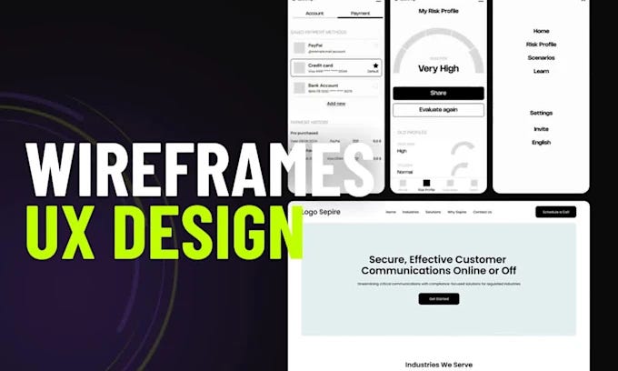
You ordered a design for a website, dashboard, or mobile app. You spent time finding a freelancer. You paid real money. You waited for the result.
And it’s… not quite right.
The buttons are there. The colors look nice. But something feels cheap. Unprofessional. You wouldn’t trust it with your customers.
Sound familiar?
I’ll explain why this happens. And more importantly — how to find a designer who gets it right next time.
Mistake #1 — No Visual Hierarchy
What it means. Every element on the screen looks equally important. Headlines blend into body text. The “Buy” button looks like a regular link.
How it looks. The user’s eyes jump around, confused. They get tired. They leave.
How it should be. The most important element should be the most visible. The call-to-action button should be contrasting and large. Secondary elements — smaller and lighter. The eye follows a clear path.
Mistake #2 — Bad Spacing and No Breathing Room
What it means. Elements are crammed together. Text touches the edges of cards. Buttons sit right against borders.
How it looks. Like a cheap flyer from a subway station. No sense of space or order.
How it should be. Air around text. Consistent gaps between buttons. Blocks that breathe. This isn’t just about beauty — it’s about readability and trust.
Mistake #3 — Inconsistent Style
What it means. Buttons in the same form look different. Icons come from different sets — some thin, some thick. Fonts clash with each other.
How it looks. As if three blind people designed it separately.
How it should be. All buttons look the same. All icons come from one system. Fonts work as a pair. This is called a “component system.” Professional designers always use it.
Mistake #4 — Ignoring Responsiveness
What it means. The designer shows you a beautiful mockup on a large monitor. You pay. Then on a tablet or phone — everything breaks. Elements overlap. Text spills out. Buttons become invisible.
How it looks. Like a joke on the user.
How it should be. A good designer immediately shows you how the layout works on desktop, tablet, and phone. Or at least explains the logic of how elements rearrange.
Mistake #5 — Using Fake Content Only
What it means. Every mockup says “Heading” and “Text text text.” Perfect, short words. Then you paste real content — a long product name or an actual sentence — and everything breaks. The card stretches. The line doesn’t fit.
How it looks. The designer didn’t think about reality.
How it should be. A professional uses real data or deliberately tests edge cases. The longest text. The shortest text. The weirdest text. Only then delivers the mockup.
Summary
Good UI is not about beauty. It’s about:
- Clarity
- Sales
- Trust
- Usability
The five mistakes in plain words:
-
No hierarchy → user doesn’t know where to click
-
Bad spacing → looks cheap
-
Inconsistent style → feels chaotic
-
No responsiveness → broken on mobile
-
Fake content only → mockup fails with real data
Where to Find Freelancers Who Don’t Make These Mistakes?
I work with designers who:
- Use Figma with components and auto layout
- Plan for responsive design from the start
- Test with real data in their mockups
- Don’t abandon the project after delivering the file
They create designs for:
- Websites
- Dashboards (admin panels, analytics)
- Mobile apps (iOS and Android)
Want to find a designer like this for your budget?
👉 Here is one of them, follow the link, write to him and he will help you: Clicl Now!
P.S.
Which mistake annoys you the most? Drop a comment.
메타데이터
- post_id
- d72f7809cfb4
- slug
- why-your-ui-looks-amateur-5-mistakes-that-kill-conversion-d72f7809cfb4
- url
- https://medium.com/@kornienko5241/why-your-ui-looks-amateur-5-mistakes-that-kill-conversion-d72f7809cfb4
- canonical_url
- https://medium.com/@kornienko5241/why-your-ui-looks-amateur-5-mistakes-that-kill-conversion-d72f7809cfb4
- author_url
- https://medium.com/@kornienko5241
- status
- ok
- fetched_at
- 2026-06-09 14:34:10