Figma Auto Layout: Stop Designing Pixels, Start Designing Rules
You’ve been placing elements manually. Auto Layout is the moment you stop doing that — and start trusting the frame to think for you.
Figma Auto Layout: Stop Designing Pixels, Start Designing Rules
You’ve been placing elements manually. Auto Layout is the moment you stop doing that — and start trusting the frame to think for you.

Figma Auto Layout
The first design system I ever tried to build collapsed under its own weight. Not because the components were wrong, but because every time a button label changed, I had to manually resize the button, re-check the padding, and nudge the sibling elements back into place. Repeat that across 200 screens and you start to understand why Auto Layout changed everything.
Auto Layout isn’t a productivity shortcut. It’s a different philosophy about what a design even is. When you use it properly, you’re not placing elements — you’re writing the rules that govern how elements behave. The frame figures out the rest.
What Auto Layout actually is
Figma’s official definition is accurate but dry. Here’s a more honest one: Auto Layout is what happens when a frame stops being a static container and starts being a responsive system.
You apply it with Shift + A. From that point, the frame has a direction, a gap between children, and padding from its edges. Children can be set to Hug their content, Fill the container, or stay Fixed. The frame reacts when any of those properties change — content gets longer, a child is added, a variant is swapped and everything else adjusts without you touching it.
The mental model that clicked for me: think of it as the visual equivalent of CSS Flexbox. You’re not saying “this button is 120px wide.” You’re saying “this button is as wide as its label plus 24px of horizontal padding.” One of those breaks when the label changes. The other doesn’t.
“You’re not setting widths. You’re setting relationships. That’s the shift.”
The four flow types
Most tutorials cover horizontal and vertical and leave it there. There are actually four flows, and each one maps to a real-world pattern you build regularly.

Types of Figma Auto layout
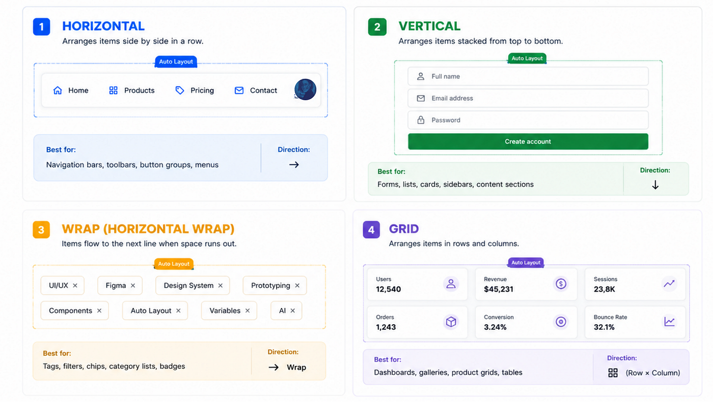
Types of Auto Layout
Resizing: the three modes that matter
Once you understand direction, padding, and gap — the next thing to master is resizing behavior. This is where beginners get confused, and where experienced designers get their time back.

Resizing in Auto Layout
The combination I use most: a card that’s Hug vertically (grows as content is added), with children set to Fill horizontally (each section spans the full card width), inside a parent that uses Min-width to stay readable on narrow screens. That card works everywhere — single column on mobile, grid on desktop — without touching it.
Nesting is where it gets serious
Here’s the thing that separates a basic Auto Layout user from someone who’s built a real design system: you almost never use a single Auto Layout container in isolation. Components are nested layouts.
A typical product card might have: a vertical outer container (image + content area + footer) → the content area is another vertical container (title + body + tags) → the tags row is horizontal wrap → the footer is horizontal with space-between. That entire card now adapts to any content. Long title? Card grows. Fewer tags? Tags row shrinks. Footer hidden? Everything above closes the gap.
The real test If you can delete any child from your component and the rest of it reflows cleanly — you've built it with proper nested Auto Layout. If things go sideways, you've got fixed values somewhere that shouldn't be fixed.
Where Auto Layout actually earns its keep
I could list use cases, but the honest answer is: everywhere, once you stop thinking of it as a special feature and start treating it as the default way to build anything. The places it matters most are the places where content changes — dynamic feeds, design systems that other people edit, components that need to work across three breakpoints simultaneously.
The single most impactful thing you can do if you’re learning it: rebuild a component you’ve already designed, from scratch, using only Auto Layout. No fixed sizes unless you genuinely mean them. You’ll immediately find the places where your original design was brittle.
“Pixel-perfect is the wrong goal. Behavior-perfect is what ships cleanly.”
( In Part 2, I’m going to write about the shift that’s made Auto Layout matter even more in 2026 — how AI-generated design, bento UI trends, and the new Figma-to-code loop all depend on it as their structural foundation . Stay tuned for Part 2 👀!!!! )
메타데이터
- post_id
- d7fbd5edfda8
- slug
- figma-auto-layout-stop-designing-pixels-start-designing-rules-d7fbd5edfda8
- url
- https://medium.com/@wardharaheem/figma-auto-layout-stop-designing-pixels-start-designing-rules-d7fbd5edfda8
- canonical_url
- https://medium.com/@wardharaheem/figma-auto-layout-stop-designing-pixels-start-designing-rules-d7fbd5edfda8
- author_url
- https://medium.com/@wardharaheem
- status
- ok
- fetched_at
- 2026-06-09 15:37:30