Your Design System Is Not Failing. Your Codebase Is Bypassing It.
Most teams do not have a design system problem. They have a design system enforcement problem.
Your Design System Is Not Failing. Your Codebase Is Bypassing It.
Most teams do not have a design system problem. They have a design system enforcement problem.
The Figma library looks great. The token names are thoughtful. The documentation site has nice examples. And then you open the code and find padding: 17px, color: #2E5BFF, and a Button component someone re-implemented in three places because "the official one did not have an icon prop yet."
This is the gap nobody talks about. The design system is not the Figma file. It is not the npm package. It is the discipline of every commit. And in most projects, that discipline quietly leaks until the system becomes decoration.
This article is a tour of the leaks. Real examples, from real codebases, of what design system misuse actually looks like, why it happens, and how to make the right thing the easy thing.
Friend Link for non medium members
The Old World
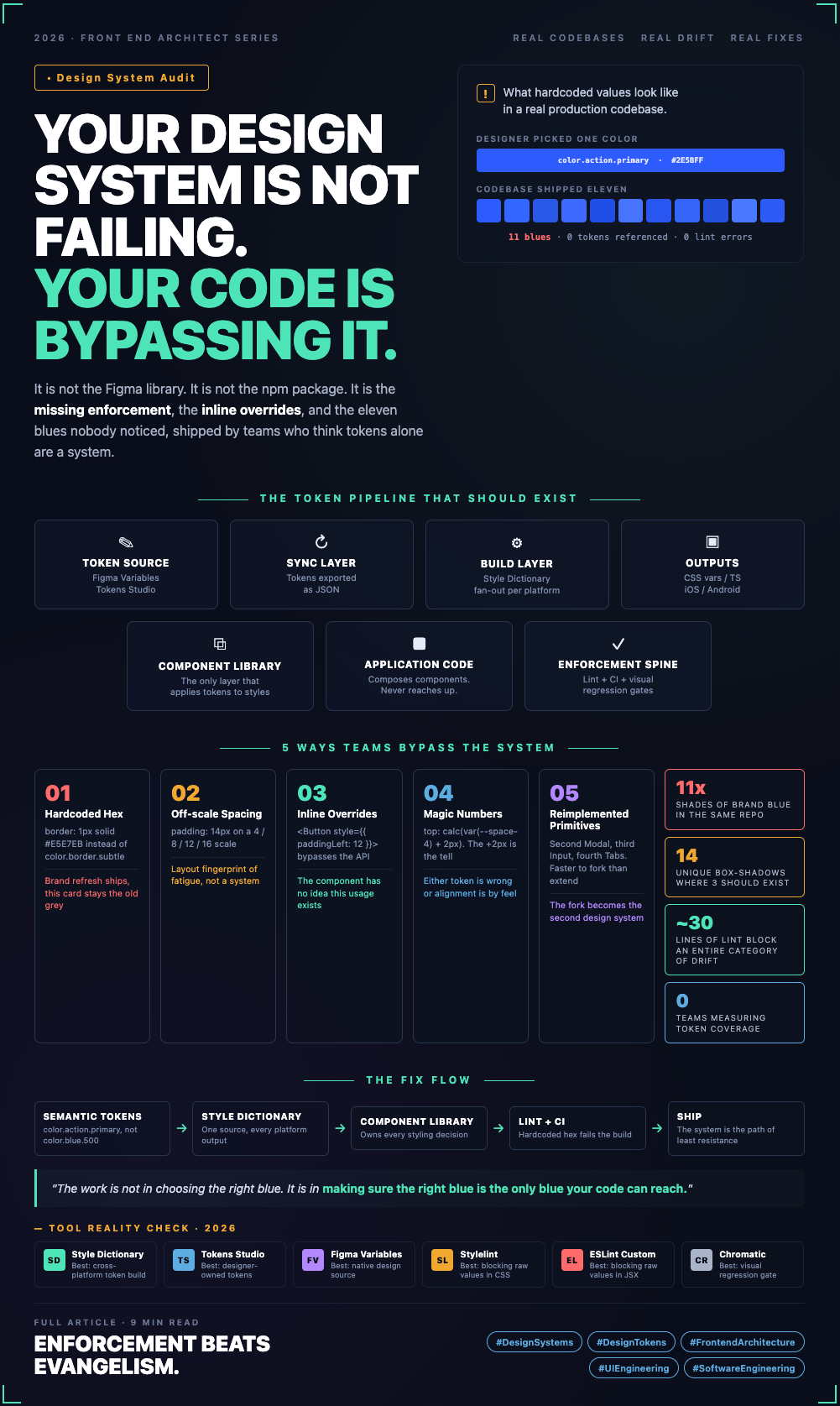
Before tokens, a design system was a PDF. Then it became a Figma library plus a Storybook. The handoff went something like this. The designer picked a color. Engineering copied the hex. The next sprint, a different engineer needed “kind of the same blue” and eyeballed #2E5BFF. Six months later there were eleven blues in the codebase and nobody could agree which was the brand color.
The deeper issue was not the eleven blues. It was that the system had no way to know it had been broken. There was no contract between design intent and implementation. Just a shared hope that everyone would do the right thing.
The Shift
Design tokens changed the contract. A token is not a variable. It is a named decision. color.background.surface is not "the color #FFFFFF." It is "the color we use for surface backgrounds, whatever that color happens to be on this brand, this theme, this platform." When you write background: var(--color-background-surface), you are committing to the decision, not the value.
That distinction is the entire point. And it is also the thing teams accidentally erase the first time someone writes background: #FFFFFF in a hurry.
The shift in the industry is real. Tokens Studio, Style Dictionary, Figma Variables, and CSS custom properties make the pipeline from design to code mostly a solved problem. What remains is a systems design problem: how do you architect the codebase so that bypassing the system is harder than using it.
What Misuse Actually Looks Like
Here is what I find in almost every audit. None of these are hypothetical.
Hardcoded colors in components. A Card component with border: 1px solid #E5E7EB. The token color.border.subtle exists. It even has the same hex value today. But six months from now when the brand refresh ships and that token becomes #DDE2EA, this card will not move with it.
Spacing that almost matches the scale. Your spacing scale is 4, 8, 12, 16, 24, 32, 48. The code has padding: 14px, margin-top: 22px, gap: 18px. None of those are in the scale. Each one is a small decision somebody made under deadline pressure, and now your layout has a fingerprint of fatigue rather than a system.
Typography written long-form. Instead of font: var(--type-body-md), you find font-size: 14px; line-height: 20px; font-weight: 500; letter-spacing: 0.01em repeated in nine components. When the type scale changes, none of them update.
One-off shadows. The system has three elevation tokens. The code has fourteen unique box-shadow declarations. Each one was a designer pasting a Figma export and an engineer copying it verbatim.
Inline overrides on system components. <Button style={{ paddingLeft: 12, paddingRight: 12 }}>. The button has size variants. The variants did not have the exact spacing this one screen needed, so somebody bypassed the API. Now the Button component has no idea this usage exists, and the next redesign will miss it.
Copying token values instead of referencing them. Someone needed a color in a JS file and wrote const PRIMARY = '#2E5BFF' because they did not know how to import the token. The value is now disconnected from the system. It will drift.
Magic numbers around the design system. top: calc(var(--space-4) + 2px). That + 2px is a tell. Either the token is wrong, the layout is wrong, or somebody is fixing alignment by feel. All three are bad.
Reimplemented primitives. A second Modal, a third Input, a fourth Tabs. Usually because the official component "did not support what I needed." Sometimes that is true. Most of the time it is faster to fork than to extend, and nobody is measuring the long-term cost of the fork.
Hardcoded breakpoints. @media (min-width: 768px) everywhere, even though the token system defines --breakpoint-md. The breakpoints will eventually need to change. They always do.
Z-index chaos. Numbers chosen by superstition. z-index: 9999, z-index: 99999, z-index: 100. No layering token, no documented stacking contexts. Every modal is a small panic attack.
These are not edge cases. They are the median state of most production codebases I have seen.
The Modern Architecture
A working design system is not a library. It is a pipeline with enforcement at every stage.
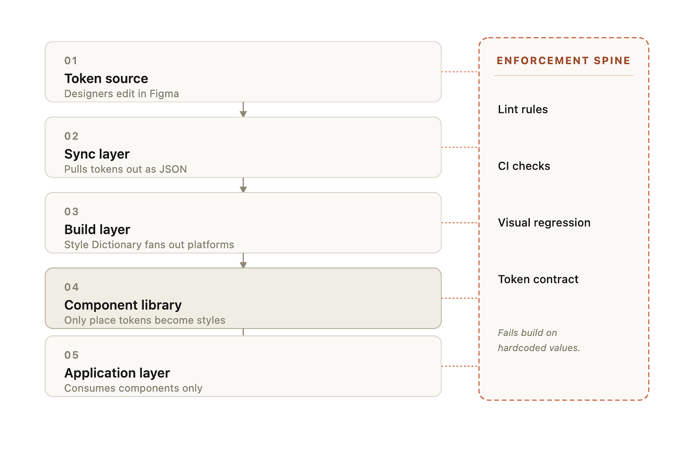
The flow looks like this. Designers edit tokens in Figma Variables or Tokens Studio. A sync step exports those tokens as JSON. A build tool such as Style Dictionary transforms the JSON into platform-specific outputs: CSS custom properties for web, a TypeScript module for type safety, native formats for iOS and Android. The component library consumes those outputs. Applications consume the component library. Linting and CI enforce that no application code reaches past the components to hardcode values.
The responsibility split matters. Designers own token meaning. The build pipeline owns token distribution. The component library owns token application. Application code owns composition, not styling decisions. When a team blurs those lines, the system breaks. When a developer styles directly in app code, they have stepped into a role that belongs to the component library.
A Diagram that shows the layers
Code Examples
Before: hardcoded everything
// SettingsCard.tsx
export function SettingsCard({ title, children }) {
  return (
    <div
      style={{
        backgroundColor: '#FFFFFF',
        border: '1px solid #E5E7EB',
        borderRadius: 8,
        padding: 17,
        boxShadow: '0 2px 4px rgba(0,0,0,0.08)',
      }}
    >
      <h3 style={{ fontSize: 16, fontWeight: 600, marginBottom: 12 }}>
        {title}
      </h3>
      {children}
    </div>
  );
}
Every value here is a decision the design system already made, written out as if it had not. Two of the spacing values are not even in the scale.
After: tokens applied through a primitive
// SettingsCard.tsx
import { Card, Heading, Stack } from '@acme/ui';
export function SettingsCard({ title, children }) {
  return (
    <Card surface="raised" padding="md">
      <Stack gap="sm">
        <Heading level={3}>{title}</Heading>
        {children}
      </Stack>
    </Card>
  );
}
The application code is now describing intent. The styling decisions live inside Card, Heading, and Stack, which read tokens directly.
Inside the component library
/* card.css */
.card {
  background: var(--color-surface-raised);
  border: 1px solid var(--color-border-subtle);
  border-radius: var(--radius-md);
  box-shadow: var(--shadow-1);
}
.card[data-padding='md'] {
  padding: var(--space-4);
}
Style Dictionary config that produces the tokens
// style-dictionary.config.js
module.exports = {
  source: ['tokens/**/*.json'],
  platforms: {
    web: {
      transformGroup: 'css',
      buildPath: 'dist/web/',
      files: [{ destination: 'tokens.css', format: 'css/variables' }],
    },
    ts: {
      transformGroup: 'js',
      buildPath: 'dist/ts/',
      files: [{ destination: 'tokens.ts', format: 'javascript/es6' }],
    },
  },
};
An ESLint rule that fails the build on hardcoded colors
// eslint-plugin-design-system/no-raw-colors.js
module.exports = {
  meta: { type: 'problem' },
  create(context) {
    const HEX = /#([0-9a-f]{3}|[0-9a-f]{6})\b/i;
    return {
      Literal(node) {
        if (typeof node.value === 'string' && HEX.test(node.value)) {
          context.report({
            node,
            message:
              'Raw hex colors are not allowed. Use a design token from @acme/tokens.',
          });
        }
      },
    };
  },
};
This is a thirty-line rule that prevents an entire category of drift forever. Pair it with a no-raw-spacing rule that checks numeric literals in style props against the spacing scale, and a no-inline-style-on-system-components rule that blocks style={...} on imported system primitives, and you have closed off the three biggest leaks.
Why This Feels Easier Now
What is genuinely solved: token distribution, theming, dark mode, multi-brand support, type-safe tokens in TypeScript, and the ability to change a single value and see it propagate to every platform.
What still requires real engineering: deciding what should be a token versus what should be a component prop. Designing the token taxonomy so that it has semantic layers, not just primitive values. Choosing what to enforce automatically versus what to leave to review. Migrating an existing codebase off hardcoded values without freezing the team for a month. None of this is hard in the algorithmic sense. It is hard in the political sense. It requires the front end architect to say no, often, and to make the alternative obvious.
Common Mistakes That Look Like Progress
Treating the token JSON as the system. Tokens with no enforcement are wishes. The system is the tokens plus the lint rules plus the CI gates plus the components that apply them.
Naming tokens after their values. color.blue.500 is a primitive. It tells you nothing about when to use it. color.action.primary is a semantic token. It tells you when to use it and gives you room to repaint without renaming. Most teams stop at primitives and wonder why nothing is consistent.
Skipping the semantic layer. Without color.text.muted, every component picks its own grey. With it, "muted text" is a concept the system owns.
Letting designers and engineers disagree silently about what a component is. If the Figma Button has an icon slot and the code one does not, the next person to need an icon button will fork. Component parity between design and code is not a nice-to-have. It is the contract.
Adding variants instead of fixing the API. Five Button variants become eight, then twelve. By the time you have primary-large-with-icon-loading-disabled, the design system has become a catalog rather than a system.
Measuring nothing. No coverage metric for token usage. No count of inline styles. No visual regression baseline. You cannot improve what you do not measure, and the regression in design systems is invisible until it is catastrophic.
Letting one team go their own way. “We’re a special case” is the most expensive sentence in any engineering org. The special case becomes the second design system, which becomes the third.
Real Use Cases Where This Bites
Property platforms. Listings, search filters, map cards, agent dashboards. Each surface ends up with its own slightly-off shade of green for “available” because the status colors were hardcoded before the semantic tokens existed. When the brand refreshes, the rebrand misses half the surfaces.
Internal tools. Always the worst offenders. Speed wins, tokens lose, and three years later the internal app looks nothing like the marketing site. Same company, same brand, two different design languages.
E-commerce. Product cards copied across category pages, each with its own padding choices. The result is a layout that feels almost-but-not-quite consistent, which is worse than obviously inconsistent.
Documentation sites. The team that builds the docs is often a different team from the team that builds the product, and the docs end up using a parallel set of styles. Your design system page on the docs site is not using the design system.
The Fix Is Architectural, Not Cultural
Teams keep trying to solve this with documentation, evangelism, and code review. Those help. They do not scale. The only durable fix is to make the wrong thing impossible.
Tokens distributed automatically. Components that own all styling decisions. Lint rules that fail builds on hardcoded colors and off-scale spacing. CI checks that block inline styles on system primitives. A migration tool that flags every existing violation so the team knows the size of the debt. A small set of metrics that surface drift before it becomes invisible.
When the system is built this way, the design system stops being a thing people remember to use. It becomes the path of least resistance, which is the only way it ever actually gets used.
Closing
A design system does not fail because the tokens were wrong. It fails because the codebase quietly stopped trusting them. Every hardcoded hex, every off-scale padding, every reimplemented Button is a small vote of no confidence. Enough of those votes and the system loses its authority, even if the Figma library is still pristine.
The work is not in choosing the right blue. It is in making sure the right blue is the only blue your code can reach.
메타데이터
- post_id
- d8c72532dcef
- slug
- your-design-system-is-not-failing-your-codebase-is-bypassing-it-d8c72532dcef
- url
- https://www.designsystemscollective.com/your-design-system-is-not-failing-your-codebase-is-bypassing-it-d8c72532dcef
- canonical_url
- https://www.designsystemscollective.com/your-design-system-is-not-failing-your-codebase-is-bypassing-it-d8c72532dcef
- author_url
- https://medium.com/@georgeamalan
- status
- ok
- fetched_at
- 2026-06-09 15:37:30