Personal Portfolio Style Guide
A sleek, design-driven portfolio blending visual storytelling and user experience with an emphasis on professional connection.
Personal Portfolio Style Guide
A sleek, design-driven portfolio blending visual storytelling and user experience with an emphasis on professional connection.
April 2025

This introductory page of the portfolio style guide features the grayscale color scheme with a pop of color with a dusty rose shade.
Project Overview
The Personal Portfolio Style Guide is a foundational design document created to unify the tone, visual identity, and voice of my personal brand. This style guide was created for use across digital and print media, featuring guidance on typography, color palette, brand messaging, and interaction with the intended audience. Designed with user-centered communication values in mind, the guide ensures visual consistency and emotional resonance throughout my web portfolio.
The Problem
As a journalist, writer, and designer working with multiple media formats and incorporating this onto a personal website, I need a consistent visual and narrative identity — one that can evolve with my work while remaining rooted in a fundamental aesthetic. Without a central guide, it was difficult to maintain brand alignment across my website, and, particularly in digital spaces, first impressions matter.
The Personal Portfolio Style Guide was developed to solve that problem by outlining a cohesive design system with clear guidance. This project helped define not only how my brand should look, but how it should feel — warm, professional and personable.
Key goals included:
- Clarifying brand color palettes, fonts, logos and an appropriate headshot.
- Defining voice and tone for portfolio storytelling
- Creating a design system that is easily incorporated in future projects.
The Solution
Development Process:
The foundation for the style guide began with an audit of existing brand elements present on my personal website, taylorpenley.com, which has been built in WordPress. Fonts, color schemes and other design elements were identified from the site to ensure the guide reflected an identity consistent with my desired personal brand.

The top portion of the website/portfolio’s homepage includes a logo containing my initials form Design.com, use of allura font and the grayscale color scheme infused with rose pink.
The process began with the drafting phase, drawing from visual elements already on the website and logging them in a Microsoft Word document to later be solidified the final copy. This style guide draft, though absent a few crucial elements like font screenshots and examples of all colors used on the site, outlined what would later be solidified in a finalized style guide created using Microsoft PowerPoint.
Identifying the colors and their hexadecimal codes on the site was possible with help from the Coolors color palette generator, which not only enabled me to scan colors and find their hexadecimal codes easily but also allowed me to organize them into a palette as seen on the page and in the finalized style guide.
Crafting the TMP initial logo was possible with help from Design.com’s tools and content already installed on WordPress — namely the fonts — made the headlines, body content and subheadings possible.


These images showcase the drafting phase of the style guide, which drew from the existing website and utilized Coolors and WordPress to identify the correct colors and fonts needed for an accurate style guide.
Once these elements were finalized, the style guide was assembled using Microsoft PowerPoint — which allowed for adaptable visual organization.
Each slide was crafted to be visually clean with clear intent, supporting cohesive brand imaging. The resulting document provides an accessible reference for all future visual and editorial decisions.


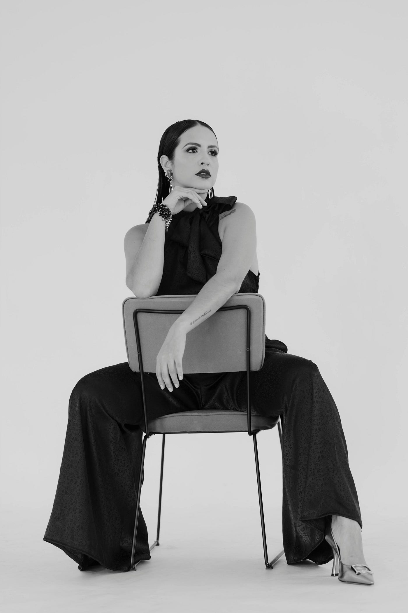
PowerPoint images showcase brand intentions — a tagline, appropriate headshot, a primary color palette and logos and symbols to be utilized on the page.
Visual Identity
- Typography: Pulled from the existing WordPress framework, the font system includes Allura for headlines, Jost for subheadings, Abril Fatface for emphasis, and Public Sans for body text.
- Color Palette: The primary palette features black, white, and dusty rose, supported by a light gray secondary tone — evoking balance, refinement, and a touch of personality.
- Logos & Symbols: A minimalist wordmark and custom lettermark were created to reinforce visual identity and enhance brand recognition.
Results:
The Personal Portfolio Style Guide delivers a user-centered reference point that bridges design, messaging, and brand identity for my website. By consolidating visual and verbal elements into one clear framework, the guide enhances consistency across my personal portfolio. Its structured approach to color, typography, and tone ensures a seamless guideline that is both accessible and expressive.
The process of building this guide reinforced key design principles, such as design cohesion, graphic design elements and industry awareness. It also provided practical experience in extracting and documenting visual assets from WordPress and translating them into a presentation-ready format. As a result, the guide now functions as both a creative compass and a foundational resource for future design work.
메타데이터
- post_id
- d934d4cc1e2e
- slug
- personal-portfolio-style-guide-d934d4cc1e2e
- url
- https://medium.com/@tmp25166/personal-portfolio-style-guide-d934d4cc1e2e
- canonical_url
- https://medium.com/@tmp25166/personal-portfolio-style-guide-d934d4cc1e2e
- author_url
- https://medium.com/@tmp25166
- status
- ok
- fetched_at
- 2026-07-20 03:01:46