Bespoke Data Visualizations from Graphicacy
Engineering custom, award-winning visualizations with d3.js and React/Angular
Bespoke Data Visualizations from Graphicacy
Engineering custom, award-winning visualizations with d3.js and React/Angular
As a data visualization engineer at Graphicacy — a mission-driven, bespoke visualization firm — I’ve had the chance to experiment with a lot of different tools across projects. An off-the-shelf library will usually cover the common chart forms well, but as a custom shop working alongside award-winning information designers, we often want to push past what those libraries can do. That means thinking outside the box on both design and engineering.
Using d3-delaunay for Optimized Mouse Effects
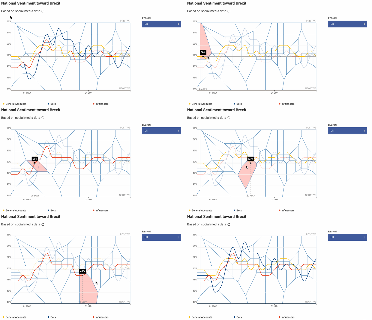
An example of a Voronoi diagram in the UK Political Atlas
When interacting with line charts, most users expect to mouse over the line and see a tooltip — or some other element — giving them more detail about the closest point. There are a few ways to approach this:
- Add a mouse event to the 2px-wide line itself
- Create a wide, transparent line behind the visible one
- Add an invisible Voronoi diagram over the visualization
Each approach has its merits and works well in different circumstances. A Voronoi diagram is great when you always want the user to see a tooltip while mousing anywhere in the chart, but it can mislead when points sit close together and the cell you’re hovering belongs to a different point than you expect.
That’s why we reach for d3-delaunay. Instead of drawing anything, we build a Delaunay triangulation of the points once, then hand every mousemove straight to delaunay.find(mx, my), which returns the index of the nearest point in roughly constant time. No transparent overlay, no per-point hit targets, no extra DOM. The line stays 2px wide and pixel-honest, and the whole plotting area becomes the hover target.
const delaunay = d3.Delaunay.from(
  points,
  (d) => xScale(d.x),
  (d) => yScale(d.y),
);

svg.on("mousemove", (event) => {
  const [mx, my] = d3.pointer(event);
  const i = delaunay.find(mx, my); // nearest point index, ~O(1)
  showTooltip(points[i]);
});
The win is both performance and control. A Voronoi overlay means generating and rendering one polygon per point and attaching a listener to each — expensive to build, and expensive to keep in sync when the data animates. The Delaunay approach renders nothing: a single triangulation plus a lookup, so it holds up on charts with thousands of points and rapid year-scrubbing. And because we own the find result, we can layer our own rules on top — for instance, suppressing the tooltip once the cursor sits more than a set distance from the nearest point, so we never label something on the far side of the chart.
Showing Different Color Paths Above and Below a Threshold
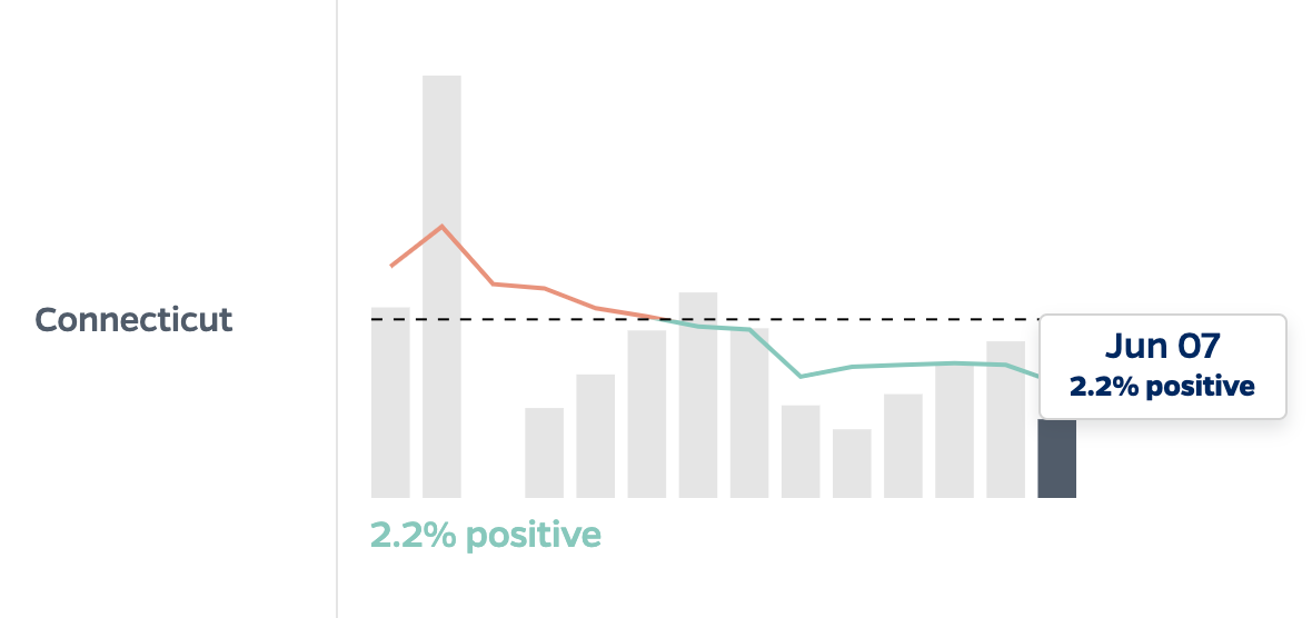
During our engagement with the Coronavirus Resource Center at Johns Hopkins, we wanted a small but impactful visualization that showed exactly when a state’s seven-day testing percent-positivity moving average crossed the “magic” threshold of 5%. Our engineering and design teams huddled and came away with a mock-up that pushed the engineering to do something less obvious: split a single line into two colors at the moment it crosses the threshold.
The trick is to stop thinking about it as two lines and start thinking about it as one line painted with a gradient that has a hard edge exactly at 5%.
We define an SVG linearGradient oriented along the y-axis and give it two stops at the same offset — that offset being where 5% falls inside the chart’s vertical range. Below the offset the gradient is one color; above it, another. Then we stroke the single path with that gradient.
const t = yScale(0.05) / height; // where 5% sits in the chart, 0–1

gradient
  .selectAll("stop")
  .data([
    { offset: t, color: belowColor },
    { offset: t, color: aboveColor },
  ])
  .join("stop")
  .attr("offset", (d) => d.offset)
  .attr("stop-color", (d) => d.color);
Because the color break is pinned to a pixel position rather than to a data point, the crossing looks exact — the line changes color right as it passes 5%, even when the surrounding data points are days apart. No splitting the path, no solving for intersection points, no visible seam. When the data updates and the line redraws, the gradient offset is the only thing we recompute.
Using D3-Zoom to Focus on a Domain
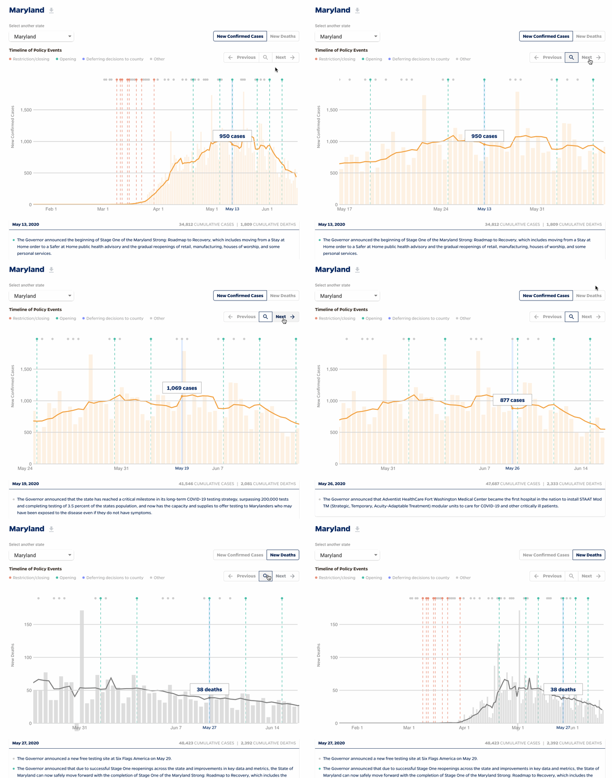
Zooming in on Covid cases in Maryland using d3.zoom
Many of our charts cover a long time range, but the story is usually in a narrow window of it. Rather than ship a separate “detail” chart, we let users zoom into a domain directly with d3-zoom.
The key is that we don’t transform the rendered pixels — we transform the scale. On every zoom event we take the current transform and rescale the x domain with transform.rescaleX(xScale), then redraw the axis and the line against that new scale.
const zoom = d3
  .zoom()
  .scaleExtent([1, 40])
  .translateExtent([
    [0, 0],
    [width, height],
  ])
  .on("zoom", (event) => {
    const zx = event.transform.rescaleX(xScale);
    xAxisG.call(d3.axisBottom(zx));
    line.attr("d", lineGenerator.x((d) => zx(d.date)));
  });

svg.call(zoom);
Custom Routing and Styled Print Visualizations with Puppeteer
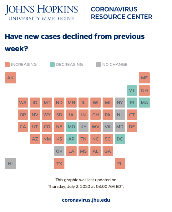
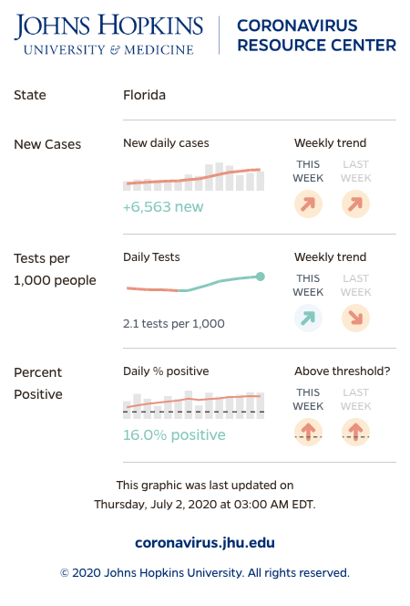
When we build exploratory visualizations with many displays and filters, we don’t want users struggling to share the exact view they’re looking at. So we build a robust routing system into our projects: a user copies the URL from the browser, sends it along, and whoever opens it lands on the same view. In our work with the Johns Hopkins Resource Center, our *Impact of Opening and Closing Decisions by State* visualization has over a thousand distinct routable views.
That routing pays off a second time when it comes to print. Because every view is already a URL, we can hand any one of those thousand-plus views to a headless browser and render it exactly as the user configured it.
We run the same app under Puppeteer, navigate to the shareable URL, and wait for the visualization to signal that it’s finished rendering before we capture. The page ships a print-specific layer — a @media printstylesheet (or a flag the app reads off the URL) that trades interactive chrome for a static, paper-friendly layout: legends expanded, tooltip content baked into labels, colors tuned for ink, page breaks placed on purpose. Then page.pdf() produces a clean, branded export.
const browser = await puppeteer.launch();
const page = await browser.newPage();
await page.goto(shareUrl, { waitUntil: "networkidle0" });
await page.waitForSelector(".viz-rendered"); // the viz tells us when it's done
const pdf = await page.pdf({ format: "Letter", printBackground: true });
await browser.close();
The reason this matters: the same routing that lets a user share a link with a colleague lets us turn that link into a report. One system, two payoffs — interactive sharing and pixel-accurate print — with no separate “export” code path to maintain.
Christopher Lanoue is a Creative Technologist/Data Visualization Engineer who is currently a Sr. Principal Front-end Engineer at Mission Lane and the former Director of Engineering and Innovation at Graphicacy.
메타데이터
- post_id
- d9cb327dd655
- slug
- bespoke-data-visualizations-from-graphicacy-d9cb327dd655
- url
- https://medium.com/@calanoue/bespoke-data-visualizations-from-graphicacy-d9cb327dd655
- canonical_url
- https://medium.com/@calanoue/bespoke-data-visualizations-from-graphicacy-d9cb327dd655
- author_url
- https://medium.com/@calanoue
- status
- ok
- fetched_at
- 2026-06-16 19:09:56