How I Built My UX Portfolio in Framer (As a Beginner Who Overthought Everything)
When I decided to build my UX portfolio, I thought the hardest part would be the design.
How I Built My UX Portfolio in Framer (As a Beginner Who Overthought Everything)
When I decided to build my UX portfolio, I thought the hardest part would be the design.
It wasn’t.
The hardest part was deciding: What actually deserves to be shown — and how.
Like most beginners, I started with a lot of confusion.
Should I use a template? Should I code it? Should I just use Behance?
Eventually, I chose Framer — mainly because it gave me flexibility without needing to code, and I could treat my portfolio like a product, not just a static page.
But what I didn’t expect was this:
Building a portfolio feels a lot like doing a UX project on yourself.
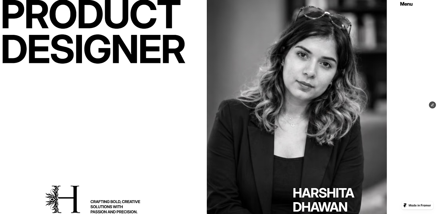
Harshita Dhawan — Portfolio — Framer Link
Step 1: Starting with the wrong focus
In the beginning, I focused too much on visuals.
I wanted: — Clean layouts — Smooth animations — Modern UI
And Framer made this part easy.
Within a few days, I had something that looked… good.
But when I looked at it again, something felt off.
It looked like a portfolio.
But it didn’t feel like mine.

Step 2: Realizing the real problem
The issue wasn’t the design.
It was the lack of clarity.
If someone landed on my portfolio, it wasn’t clear: — Who I am as a designer — What kind of problems I solve — How I think
I had focused on “presentation” before “positioning.”
So I stepped back.
Step 3: Structuring the content before designing
Instead of jumping back into Framer, I opened a blank doc.
I started writing:
– What do I want someone to understand about me in 10 seconds? — Which projects actually represent my thinking? — What story does my portfolio tell?
This changed everything.
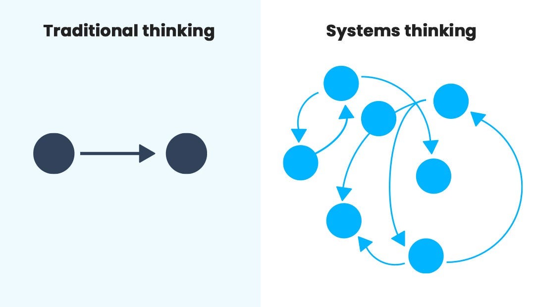
Now, when I went back to Framer, I wasn’t just designing screens.
I was designing communication.
Step 4: Building in Framer (the right way this time)
This time, my approach was different:
– I used simple layouts instead of complex ones — Focused on readability over visual noise — Used clear sections and hierarchy — Kept interactions minimal and intentional
Framer became a tool — not the focus.
Step 5: Treating the portfolio like a product
One shift that really helped me:
I stopped thinking of my portfolio as a “website.”
And started thinking of it as a user experience.
The user = recruiter / hiring manager
So I asked: — What do they want to know quickly? — What will make them stay longer? — Where might they get confused?
This made my decisions much more intentional.

What I learned from building it
1. A good-looking portfolio is not enough Clarity matters more than visuals.
2. Writing is as important as design If you can’t explain your work, it loses value.
3. Tools don’t make the portfolio strong Your thinking does.

Where I am now
My portfolio still isn’t perfect.
But it feels more aligned with how I think as a designer.
And more importantly — it communicates something real.
메타데이터
- post_id
- da6fd1ef798b
- slug
- how-i-built-my-ux-portfolio-in-framer-as-a-beginner-who-overthought-everything-da6fd1ef798b
- url
- https://medium.com/design-bootcamp/how-i-built-my-ux-portfolio-in-framer-as-a-beginner-who-overthought-everything-da6fd1ef798b
- canonical_url
- https://medium.com/design-bootcamp/how-i-built-my-ux-portfolio-in-framer-as-a-beginner-who-overthought-everything-da6fd1ef798b
- author_url
- https://medium.com/@harshi.dhawan
- status
- ok
- fetched_at
- 2026-06-09 15:37:30






