Google Stitch: From Idea to App in Seconds
Yesterday, the new release of Google Stitch was launched; you can see the original tweet here:
Google Stitch: From Idea to App in Seconds
Yesterday, the new release of Google Stitch was launched; you can see the original tweet here:
[embed]
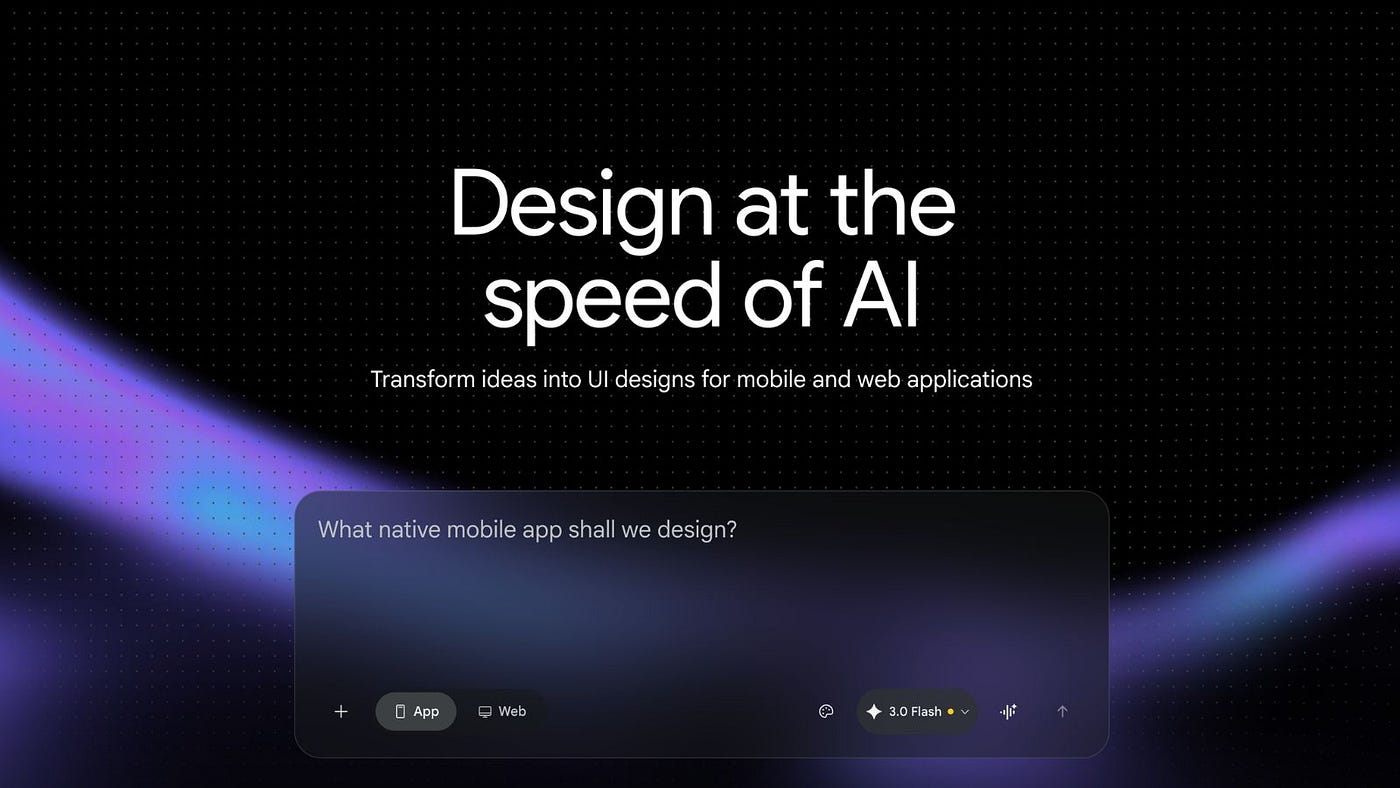
You can access it directly at https://stitch.withgoogle.com/, and upon entering, you will see an interface like this:

Stitch (stitch.withgoogle.com) is the new experimental tool from Google Labs that aims to close the gap between “I have an idea” and “I have an app on my screen” as much as possible. Powered by models from the Gemini family, it converts text or sketches into functional user interfaces for web and mobile.
Stitch allows you to write a description in natural language (“a minimalist food delivery app in green tones”) and automatically generates the interface design: this is what they call “Text-to-UI.” If you prefer to start analog, you can also upload a photo of a drawing on paper or a whiteboard, and the AI translates it into a structured digital UI (“Sketch-to-UI”). In other words, you can work with prompts, upload reference images, or even videos. If the prompts are good, it is the best option.
There are thousands of free prompt libraries out there — don’t trust the “prompt-sellers”; in fact, you can also ask your favorite AI to generate a prompt. Still lost? You can use:
- If you are working from an image, a mood board, something exported from Figma, a screenshot, etc., you can use this Replit I built: https://image-prompt-craft--fernandocomet.replit.app/
- You can also use https://promptbook.co.in/
- You can find many prompts here as well: https://www.claudecodehq.com/playbooks
The workspace is no longer just a list of screens, but an infinite canvas where you can paste screens, ideas, references, and alternative states of the same view. An interesting concept appears on this canvas: “Vibe Design.” Instead of starting with a rigid wireframe structure, you first define the “vibe” or feel of the app (more serious, more playful, more minimal, more editorial), and the AI proposes designs aligned with that aesthetic.
You can export frontend code (HTML, CSS, Tailwind, JSX/React) and continue working directly in your usual stack. Additionally, it allows you to copy and paste designs into Figma with editable layers to integrate it into a more traditional design workflow, and “stitch” several screens together to assemble small navigable prototypes.
For example, here was the workflow:
- I looked for inspiration on Variant and found this design.
- I ran it through my Replit, the CometPrompt Generator, and obtained the following prompt (yes, a long one!):
Act as a senior engineer. Prioritize accuracy over creativity. Do not introduce ideas that aren't in the reference.

## 0) Overall Screen / Artboard
- **Canvas size (reference image):** 768 × 1740 (portrait).
- **Background:** solid dark slate/indigo gray.
- **Primary layout:** single centered column of content (hero + stacked project cards), then a **2-column** footer/contact row of two smaller cards.
- **Card style:** large rounded rectangles, flat fills (no gradients), subtle/no visible shadows, consistent corner radius across all cards.
- **Right-side annotations:** small “Designed in variant” badges appear in the reference image; treat as **non-product artifacts** (do not implement).

---

## 1) Typography
> Font family cannot be confirmed from the image alone; implement with a modern neo-grotesk (e.g., `Inter, ui-sans-serif, system-ui`) and tune sizes/weights to match.

### Type Scale (approx. from visual proportions)
- **Site/Name (top-left):**
  - Size: 12–13px
  - Weight: 500
  - Line-height: 16px
  - Letter-spacing: 0 to 0.2px
  - Color: near-white, slightly muted
- **Hero headline (“Orchestrating logic into emotion.”):**
  - Size: ~48–56px
  - Weight: 500 (not ultra-bold; appears medium)
  - Line-height: ~1.05–1.12
  - Letter-spacing: -0.5px to -1px (slight tightening)
  - Color: off-white
- **Hero subtext (“Selected works in creative coding…”):**
  - Size: 12–14px
  - Weight: 400
  - Line-height: 18–20px
  - Color: muted gray
- **Card category label (e.g., “SPATIAL AUDIO”, “WEBGL”):**
  - Size: 9–10px
  - Weight: 600
  - Transform: uppercase
  - Letter-spacing: 0.8–1.2px
  - Color: near-black with opacity (on bright cards)
- **Card title (e.g., “Echoes”, “Flux”, “Light”, “Neural”):**
  - Size: ~40–44px
  - Weight: 500
  - Line-height: ~1.0–1.1
  - Letter-spacing: -0.5px
  - Color: near-black
- **Card footer left descriptor (e.g., “VR Sound Design”):**
  - Size: 10–11px
  - Weight: 500
  - Line-height: 14–16px
  - Color: near-black with reduced opacity
- **Card footer right year (e.g., “2024”):**
  - Size: 10–11px
  - Weight: 600
  - Line-height: 14–16px
  - Color: near-black with reduced opacity
- **Bottom small cards:**
  - “STATUS” / “CONTACT” labels: same as category label style (uppercase, small, tracked).
  - “Open” / “Talk”:
    - Size: ~28–32px
    - Weight: 500
    - Line-height: ~1.1
    - Color: near-black on light card; near-white on dark card
  - Supporting line (“Currently accepting freelance”, email):
    - Size: 10–12px
    - Weight: 400–500
    - Line-height: 14–16px
    - Color: muted

---

## 2) Color Palette (hex targets)
> Exact hex values can’t be perfectly guaranteed from a compressed screenshot; use these tightly matched approximations.

### Core
- **Page background:** `#3C3A4D` (dark slate/indigo)
- **Primary text on background (hero/title):** `#F2F3F6`
- **Muted text on background (hero subtitle):** `#B7BAC6`

### Top segmented control (Work / Playground)
- **Pill background (inactive):** `#2E2D3A`
- **Pill background (active “Work”):** `#5BAA63` (green)
- **Pill text (inactive):** `#C9CBD6`
- **Pill text (active):** `#101114`
- **Pill border:** none visible (flat)

### Project cards (flat fills)
- **Echoes card fill (purple):** `#8B74E8`
- **Flux card fill (orange):** `#E27D63`
- **Light card fill (yellow):** `#E7DB62`
- **Neural card fill (green):** `#63BE74`

### Bottom row cards
- **Status card fill (light gray):** `#A2A7A8`
- **Contact card fill (near-black):** `#171717`

### On-card text/icons
- **Primary on bright cards (titles/labels):** `#111114`
- **Secondary on bright cards:** `rgba(17,17,20,0.65)`
- **Primary on dark card:** `#F2F3F6`
- **Secondary on dark card:** `rgba(242,243,246,0.65)`

### Icon buttons
- **Ellipsis button background (on bright cards):** `#151515` (dark circle)
- **Ellipsis dots:** `#F2F3F6`
- **Plus button (contact card):**
  - Circle fill: `#E27D63` (matches orange accent seen)
  - Plus glyph: `#111114`

---

## 3) Layout Structure (grid, widths, spacing)
### Global container
- **Max content width:** visually ~480–520px within a 768px canvas. Implement as:
  - `max-width: 520px;`
  - `margin: 0 auto;`
  - **Side padding:** `24px` (so content never touches edges)
- **Vertical rhythm:**
  - Header to hero: ~48–64px top spacing
  - Hero headline to subtitle: ~16px
  - Subtitle to first card: ~28–36px
  - Card-to-card spacing: ~18–22px
  - Last large card to bottom row: ~18–22px

### Card sizing
- **Large project cards:** full container width.
- **Large card height:** tall, roughly ~320–360px each in this viewport.
- **Corner radius (all cards):** ~18–20px.
- **Internal padding (large cards):** ~22–24px.
- **Bottom row (two cards):**
  - **2-column grid** with gap ~14–16px
  - Each card height: ~150–170px
  - Same radius as large cards

---

## 4) Sections / Components (structure + styling)

### 4.1 Header row
**Left:** “J. Doe — CT”
**Right:** segmented control with “Work” active and “Playground” inactive.
- Layout: `display:flex; justify-content:space-between; align-items:center;`
- Top padding: ~18–24px from top.
- Segmented control:
  - Container: rounded pill, background `#2E2D3A`, padding `3–4px`.
  - Each segment: rounded pill, padding `6px 10px`, font 12px.
  - Active segment fill green; inactive transparent.
  - No visible divider line.

### 4.2 Hero
- **Headline:** two-line wrap as shown:
  - Line1: “Orchestrating logic”
  - Line2: “into emotion.”
- **Subtitle:** single paragraph under headline, left-aligned, narrow width (do not span full container; appears ~60–70%).
  - Implement `max-width: 340px;`

### 4.3 Project Card (reusable)
Each large card contains:
- Top-left: **Category label** (uppercase).
- Below it: **Large title**.
- Top-right: **Ellipsis icon button** (small circular).
- Bottom-left: **Descriptor** (e.g., “VR Sound Design”).
- Bottom-right: **Year**.

**Structure:**
```txt
Card (position: relative)
  Header area (top-left stack)
    Category (uppercase)
    Title
  Action (top-right) -> circular icon button with "..."
  Footer (absolute bottom, full width)
    Left descriptor
    Right year
Styling:
border-radius: 20px;padding: 24px;- Footer pinned to bottom:
position:absolute; left:24px; right:24px; bottom:18px; display:flex; justify-content:space-between; - Ellipsis button:
- size: 28–30px square
- radius: 999px
- background:
#151515 - aligned to card padding top/right
- dots centered (3 small circles or “…” glyph)
Card instances (content exactly as shown):
- Purple card
- Category: “SPATIAL AUDIO”
- Title: “Echoes”
- Footer left: “VR Sound Design”
- Footer right: “2024”
- Orange card
- Category: “WEBGL”
- Title: “Flux”
- Footer left: “Interactive Fluid Sim”
- Footer right: “2023”
- Yellow card
- Category: “INSTALLATION”
- Title: “Light”
- Footer left: “Projection Mapping”
- Footer right: “2023”
- Green card
- Category: “MACHINE LEARNING”
- Title: “Neural”
- Footer left: “GAN Image Generation Model”
- Footer right: “2024”
4.4 Bottom row: Status + Contact cards
Two cards in a row.
Status card (left)
- Fill:
#A2A7A8 - Top-left: a toggle switch (small, iOS-like).
- Track: light/near-white
- Thumb: dark/near-black
- Position appears left/off in the screenshot.
- Below: label “STATUS” (uppercase)
- Big text: “Open”
- Small supporting text: “Currently accepting freelance”
Layout: left aligned, padding ~18–20px.
Contact card (right)
- Fill:
#171717 - Top-right: small circular plus action button
- Diameter: ~26–28px
- Fill:
#E27D63 - Plus glyph centered, dark
#111114
- Left area content:
- Label: “CONTACT” (uppercase, muted)
- Big text: “Talk” (white)
- Small text: “hello@jdoe.tech” (muted white)
5) Navigation / Header behavior
- Header remains at top of content flow (not shown sticky). Do not add sticky behavior unless required; nothing indicates it.
- Segmented control toggles between “Work” and “Playground” states (visual only in reference).
6) Interactive Elements (states)
Segmented control
- Default state: “Work” active.
- Hover (desktop): slightly increase brightness of hovered segment background (by ~4–6%); keep within same palette.
- Active/pressed: reduce brightness briefly.
Project card ellipsis button
- Hover: background lightens slightly (
#1F1F1F). - Focus: 2px outline using a subtle light ring (e.g.,
rgba(242,243,246,0.25))—keep minimal.
Status toggle
- Click toggles state (off ↔ on).
- On state should invert thumb position to right; track possibly darker—however the reference only shows off. Keep styling restrained.
Contact plus button
- Hover: brighten orange slightly; pressed: darken slightly.
No other inputs/forms are visible.
7) Animations / Transitions (only if implied)
No explicit animations are visible. If implementing transitions, keep subtle:
transition: background-color 120ms ease, transform 120ms ease;for buttons/toggles.- Avoid card hover-lift/shadows unless explicitly required (not visible).
8) Responsive Behavior
- Desktop/tablet: keep centered column with
max-width: 520px. - Small screens (≤480px):
- Reduce side padding to
16px. - Hero title scales down (e.g.,
clamp(32px, 7vw, 56px)). - Large cards remain full width; height can become
autowith amin-heightto preserve look. - Bottom row switches from 2 columns to 1 column stacked:
grid-template-columns: 1fr;- vertical gap same as card spacing (~16px).
- Reduce side padding to
9) Performance Considerations
- Use pure CSS for rounded rectangles and icons (SVG or simple glyphs).
- Avoid heavy shadows/filters.
- Use
prefers-reduced-motionto disable transitions if user requests. - Ensure text rendering is crisp (no unnecessary transforms on large text blocks).
10) Component Structure (recommended)
PageHeaderBrandLabelSegmentedControl(Segment)
HeroHeroTitleHeroSubtitle
ProjectCardListProjectCard(x4)CategoryLabelTitleIconButton(ellipsis)CardFooter(descriptor + year)
BottomGridStatusCardToggleLabelValueTitleHelperText
ContactCardLabelValueTitleHelperTextIconButton(plus)
If you want, I can translate this into a concrete CSS variables sheet + exact spacing tokens (8px grid) and a DOM skeleton that matches the structure above.
Then I took it to Stitch, and it did quite well; I even moved it to Figma. The jump to Figma works great; it generates with Auto Layout. We can say that from an image, it works very well; from scratch, it is more complicated.

It remains in Beta within Google Labs, and that shows in how they position the product. On one hand, they are using Stitch as a testing ground for models like **Gemini 2.5 Flash** (fast mode) and **Gemini 2.5 Pro** (experimental mode, deeper and multimodal). On the other hand, they need to better understand how it fits into the real workflows of designers and developers, as there are still cases where the generated design can be inconsistent or require significant manual adjustment.
Currently, **Stitch is free but with limits**. It operates on a monthly credit system: in standard mode, you have a high volume of fast generations, and in experimental/Pro mode, the number decreases, but with more detailed results and advanced image support. There is no official pricing announcement, but **it is most likely to end up integrated into Google Workspace, Antigravity, Gemini Advanced, or Google AI Studio**, following the pattern of the rest of the ecosystem.
The big leap arrived in 2026, when Stitch evolved from being a “screen generator” to **behaving more like a complete design platform.** It now understands the context of the entire project, combines text, images, and code in the same space, and generates clickable prototypes from simple descriptions. Google is positioning it for both professional designers and people without a design or coding background who want to launch an MVP in a matter of minutes.
Ultimately, **Stitch is Google’s move to compete in the territory of Figma, v0.dev, and company,** but with a very specific angle: maximum speed to go from a loose idea to a functional prototype supported by generative AI. It is one more piece of the **“from idea to app”** narrative, but now with a truly AI-native canvas at the center.
There is a very interesting post comparing Stitch with Claude and a human:
[embed]
For now, humans win… perhaps not for long…
Want to go deeper? I do! Let’s go to their **documentation**, it is at [https://stitch.withgoogle.com/docs](https://stitch.withgoogle.com/docs)
Here’s the breakdown of what actually matters:
**The North Star: `design.md`** If you take one thing away from the docs, let it be this: `**design.md`** is the brain of your project. It’s not just a text file; it’s the "Source of Truth" for the AI.
- **Semantic Systems:** Instead of rigid hex codes, you describe your UI’s identity (colors, spacing, “vibe”) in Natural Language.
- **Context & Portability:** The AI reads this file to ensure every new screen it generates is consistent. Plus, you can carry this Markdown file over to dev tools like Cursor or VS Code so your IDE “understands” your design language.
**Key Concepts You Need to Know:**
1. **Vibe Design:** Forget starting with gray wireframes. You can feed Stitch an image, a voice memo, or a mood board, and it generates high-fidelity UIs based on that “vibe.”
2. **Infinite Canvas:** Unlike Figma’s artboards, Stitch uses a boundless workspace. The AI “sees” everything on the canvas — screenshots, prompts, and code blocks — to maintain global context.
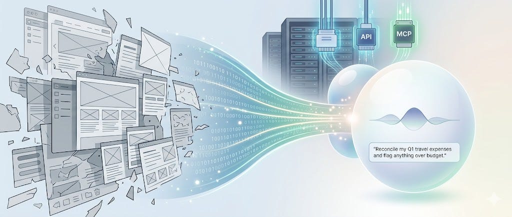
3. **MCP Integration:** For the power users, Stitch supports the **Model Context Protocol (MCP)**. This allows external AI coding agents to “read” your design docs and turn them into functional code instantly.
**The Bottom Line:** Stitch is moving us away from “drawing boxes” and toward **Document-Driven Design**. By mastering the `design.md` structure, you’re not just prompting; you’re architecting a portable design system that an AI can actually execute.
**Check out the full docs here:** [stitch.withgoogle.com/docs](https://stitch.withgoogle.com/docs)메타데이터
- post_id
- dacec1b8a6dd
- slug
- google-stitch-from-idea-to-app-in-seconds-dacec1b8a6dd
- url
- https://medium.com/design-bootcamp/google-stitch-from-idea-to-app-in-seconds-dacec1b8a6dd
- canonical_url
- https://medium.com/design-bootcamp/google-stitch-from-idea-to-app-in-seconds-dacec1b8a6dd
- author_url
- https://medium.com/@fernandocomet
- status
- ok
- fetched_at
- 2026-07-11 21:00:18