Challenge 03 — Rebuild from negative experience
If you’d like to see it in presentation mode, check out the link below!
Challenge 03 — No to Not Yet
Reflection from this and previous challenge, I explained too much upfront. This caused reading my solution became heavy and harder to follow. For this post, I reworked several parts from my initial submission to make it easier to follow.
You can see the first version on this link below!
During this challenge, I revisited the existing flow to find out what missing or could be improved. I introduced a checklist page to bring awareness earlier without setting high expectations, refined the copy, improved the help content.
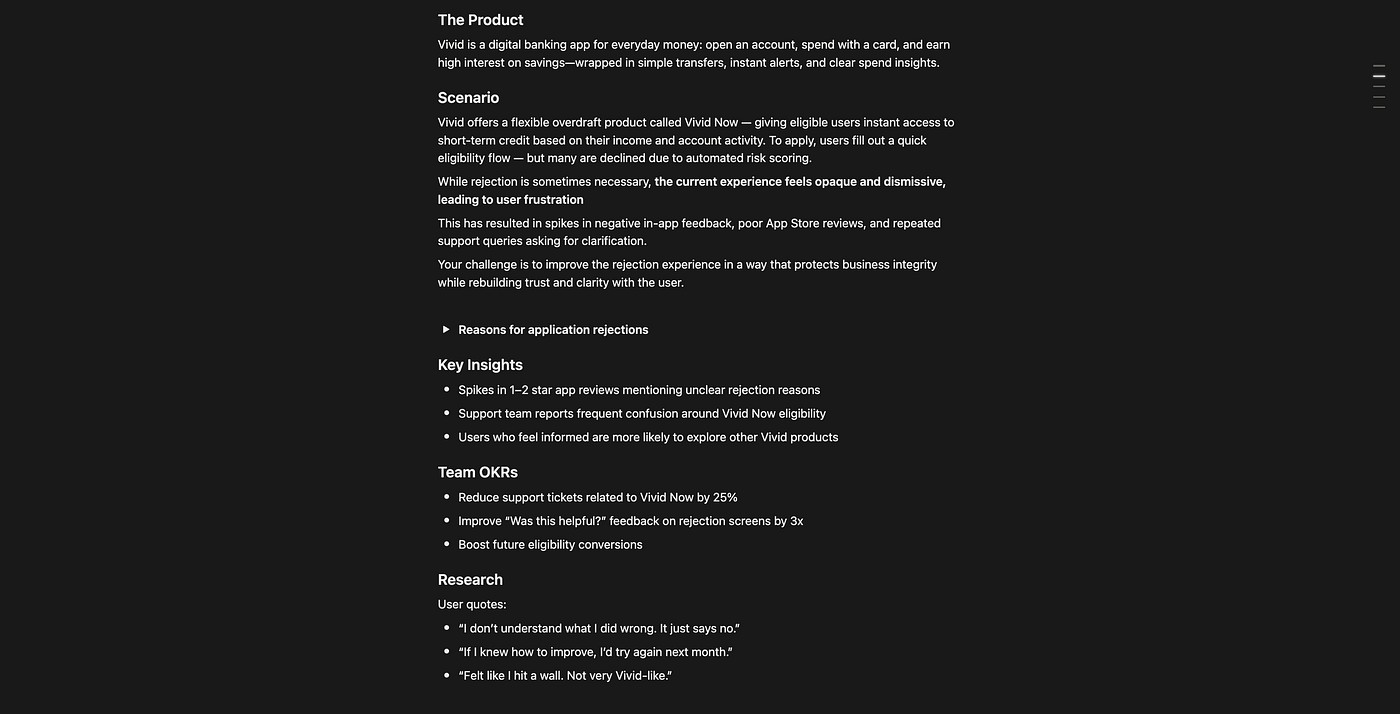
Brief for challenge #3
Outline
Vivid is a digital banking app for everyday money management. One of their product is Vivid Now, gives eligible users instant access to short-term credit based on their income and account activity.
To apply, users fill out a quick eligibility flow. However, this experience spikes in negative in-app feedback, poor App Store reviews, and repeated support queries asking for clarification.
Goal for this challenge is to reduce support tickets related this product by 25%, improve “Was this helpful?” feedback on rejection screens by 3x and boost future eligibility conversions.
Design Direction & Impact
By acknowledging user frustration and providing clear, emphatic guidance, we rebuild trust and reduces confusion around rejection outcomes.
Expected impact
- Acknowledging user frustration, clear, guidance : Transparent reasons and clear recovery path to lower and prevent unnecessary user inquiry (~ reduce support ticket (-25%).
- Clear, emphatic guidance : Improve “Was this helpful?” feedback (3x) by bring empathetic tone and actionable messages.
- Rebuild trust : Users who have regain confidence in recovery process are more likely to reapply successfully in the future.
Breaking down the process
Core Intent
Many users applying for Vivid Now are declined by automated risk checks, but the rejection flow feels unclear and impersonal, leaving them frustrated and confused and resulting in negative feedback, poor reviews, and repeated support queries.
- “Felt like I hit a wall. Not very Vivid-like.”
- “I don’t understand what I did wrong. It just says no.”
- “If I knew how to improve, I’d try again next month.”
How might we improve the rejection experience while protecting business integrity without revealing sensitive rules, so users leave with clarity, trust, and motivation to return?
How others fin-app handle this
Apps like Revolut introduce early prevention mechanisms that build awareness and provide clearer instruction while users reach rejections.

Issue Handling Comparison
Behind the design
- Empathy first : Acknowledge the user’s disappointment honestly
- Transparency within limits : Share what can be disclosed, without overpromising.
- Guided recovery : Provide a clear path to regain eligibility
- Tone of partnership : Position Vivid as “on your side”
- Encourage re-engagement : Frame rejection as a temporary pause, not a permanent stop
Design Evolution
Pre-Eligibility Check
Turns potential rejection into preparation by building readiness. Before applying, users do a lightweight self-check based on income, deposit frequency, and payment history.
* It would be great for the user experience if the eligibility check can be done automatically, but due uncertainty of the regulation. The current check is provided as guide.

Pre-Eligibility Check
Transparent Rejection Messaging & Recovery Path
Based on the brief, three rejection reason uncovered along with its regulation.
Acknowledge emotion → Explain reason (as allowed) → Offer next step
- If recoverable “Here’s how you can bounce back.”
- Goal : Turn confusion into clarity of next steps and a sense of control.
- Design insight: Soft tone, provide specific, empathetic recovery guidance.
- Business benefit: Encourages continued use and improve the customer’s financial footprint and retention.

Rejection message and help center
If unclear “We can’t tell you everything, but here’s your next step.”
- Goal : Empower users to see rejection as a temporary pause, not a closed door.
- Design insight: Since the exact rule can’t be disclosed, we should focus on guiding behavior indirectly.
- Business benefit: Builds trust while reducing drop-offs or negative app reviews.

If unclear “We can’t tell you everything, but here’s your next step.”
If permanent “You’re valued and here’s how you can continue with Vivid.”
- Goal: Preserve brand goodwill even in a “no” moment.
- Design insight: Even if they can’t reapply now, redirect their attention to alternative Vivid products
- Business benefit: Keeps non-eligible users active and reduces churn.

If permanent “You’re valued and here’s how you can continue with Vivid.”
Outcome Alignment & Validation Plan
OKR Alignment with Design Decision
- Pre-Eligibility Check → Fewer support tickets (expected -25%)
- Tailored rejection states → Better “Helpful” feedback
- Recovery path guidance → Boosts future eligibility conversions
Usability Testing Goals
- Do users understand why they were rejected?
- Can users identify what to do next without contacting support?
- Does the pre-check step reduce rejection attempts from ineligible users?
Success Metrics
- Decrease support queries around Vivid Now eligibility (–25%).
- Increase in “Was this helpful?” positive ratings (×3).
- Increase in successful reapplications (future eligibility conversions).
메타데이터
- post_id
- dba5374e4e23
- slug
- challenge-03-rebuild-from-negative-experience-dba5374e4e23
- url
- https://medium.com/@annishafirdausyrafi/challenge-03-rebuild-from-negative-experience-dba5374e4e23
- canonical_url
- https://medium.com/@annishafirdausyrafi/challenge-03-rebuild-from-negative-experience-dba5374e4e23
- author_url
- https://medium.com/@annishafirdausyrafi
- status
- ok
- fetched_at
- 2026-07-15 12:19:42