Solving a wicked UX/UI problem
A lot of young people that visit museums feel like the experience isn’t relevant to them and believe museums do not take them into…
Solving a wicked UX/UI problem
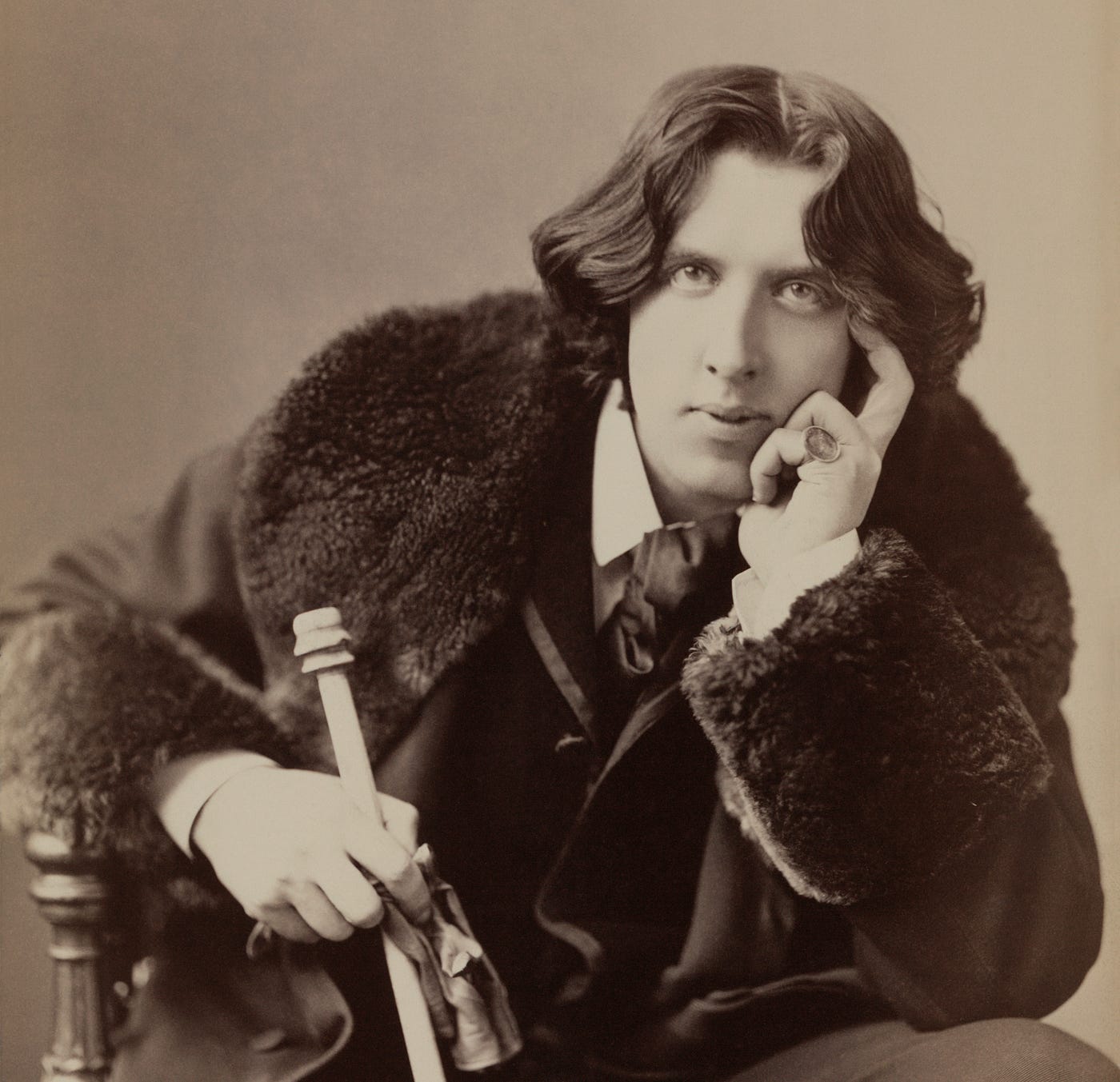
A lot of young people that visit museums feel like the experience isn’t relevant to them and believe museums do not take them into consideration as an important audience. While museums are increasingly looking to create new educational opportunities, make the information available online, enhance visitors’ mobile engagement and create quality cross-platform experiences, the audience often feel like they are ignoring a desire to relax and destress away from screens.

Hero Image
Team & Brief
So with this, a question was given to us: How might we help museums and other public institutions bring people closer and fulfill their mission to preserve and activate cultural heritage in the 21st century?
But who are we? We are a team of UX/UI students from different countries, formed by Minhee, Théo, Dídac and me (Cristina). This was our first challenge from the Ironhack bootcamp and we are glad to present you our results.
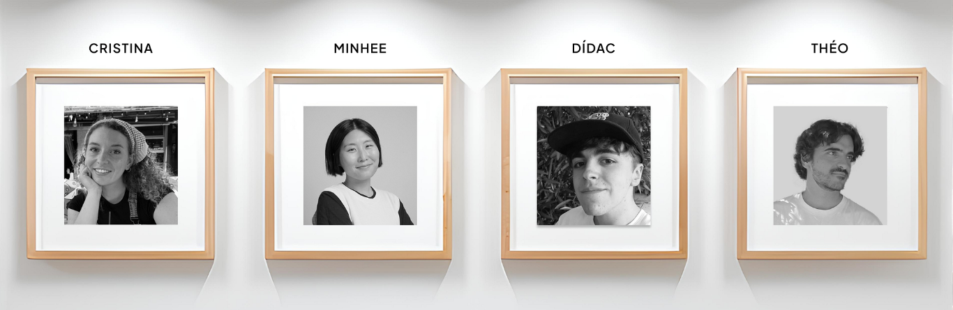
Meet the team
Secondary Research & User Interviews
With a team and a challenge, we set up a goal for our project: to design meaningful and accessible experiences that make cultural heritage more interactive and memorable for diverse audiences.
To achieve this goal, we conducted a secondary research which data was sorted out in a CSD matrix:
- Certainties: museums are constantly working on creating digital experiences to engage museum visitors
- Suppositions: visitors seek more active and meaningful ways to engage with museums.
- Doubts: how can accessibility, storytelling, and digital tools make museums more engaging and collective experiences?
After completing the research, we had to dig in to discover what the users thought. For this purpose, we conducted 5 interviews with 5 different users within our target group. These interviews gave us some valuable insights.
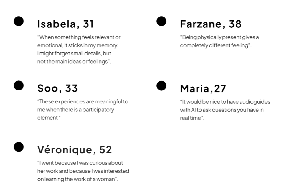
Insights from our user interviews
Affinity Diagram
Once we had the interviews we gathered all the data in an affinity diagram (step 1). For this, we collected the most important insights from each interview and sorted them out in different groups. We tried the Figma AI sorting tool, which gave us the following groups:
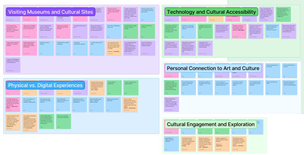
AI groups
This was helpful to get some ideas, but we felt it was too generic and not what we were looking for, so finally we decided to sort them into groups with subgroups (step 2). Finally, we did dot voting for choosing the most relevamt insight from each category and synthesised the information in the Super Groups(step 3). This was the process:
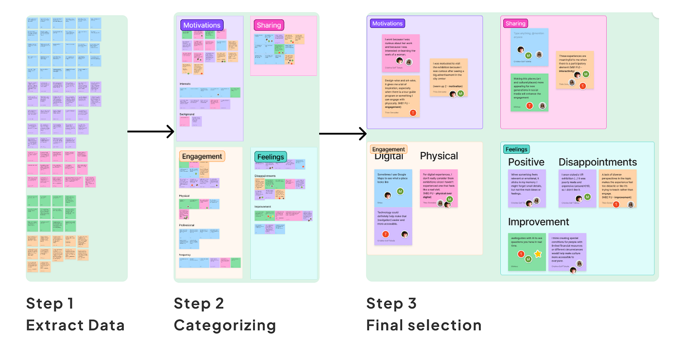
Final steps of our Affinity Diagram
User Persona and User Journey Map
With the information synthesised we were ready to move on and create a user persona and a user journey map. These were definitely one of my favorite parts of the project, I loved imagining a user that was going to user our service. We decided to base the user in Paris (FR), mostly because a lot of our users were based there and we felt it’s a city with a lot of cultural offers.
Laura is 27-year-old architect who loves art and seeks inspiration and refuge on it. She loves visiting museums, going to cafés and basically romantising her life through social media. She’s charismatic, creative, social, curious, independant and a long-life learner. Some of her goals are: sharing cultural experiences, getting inspired for her job, engaging with culture in a meaningful way and finding exhibitions and events in the city that suit her tastes. On the other hand, her frustrations are: finding it hard to remember what she learned once the visit is over, finding exhibitions that match her interests is difficult and she seeks for a participative experience.
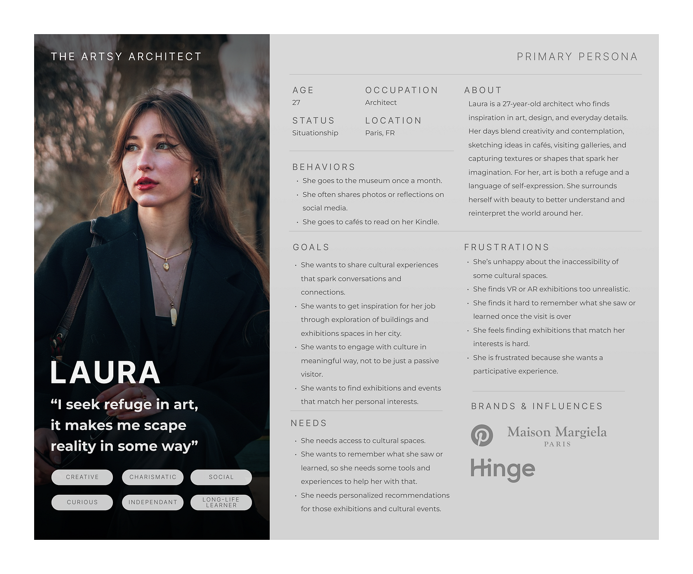
User persona
Laura’s journey starts from the moment she sees an advertisement on the metro and looks for it on Instagram to find out more about it. She buys her tickets and checks the information on the website, but she feels a bit lost because the website is really confusing. At this moment she says:
“OMG, this website it a mess, I can’t find any of the information I’m looking for… This is so frustrating!”
When she goes to the exhibition, she has to face a long queue and she gets an audioguide, although she doesn’t like audioguides, it is the only way to get information about the content. She also feels lost and doesn’t really know where to start. She thinks:
“I don’t know why I keep getting these audioguides, I don’t really like them… There’s always too much information. Where should I start? I’m so confused and overwhelmed.”
She visits all the rooms and finds some interactive features and a VR experience which is not very good and feels unreal. Although she liked the art and buys a book at the shop, once she goes home, she goes to the cinema with her friend and ends up forgetting her experience, because it was not meaningul for her. She says:
“I am proud and happy about having visited the museum, but I felt kind of disconnected and couldn’t engage too much. Such a shame.”
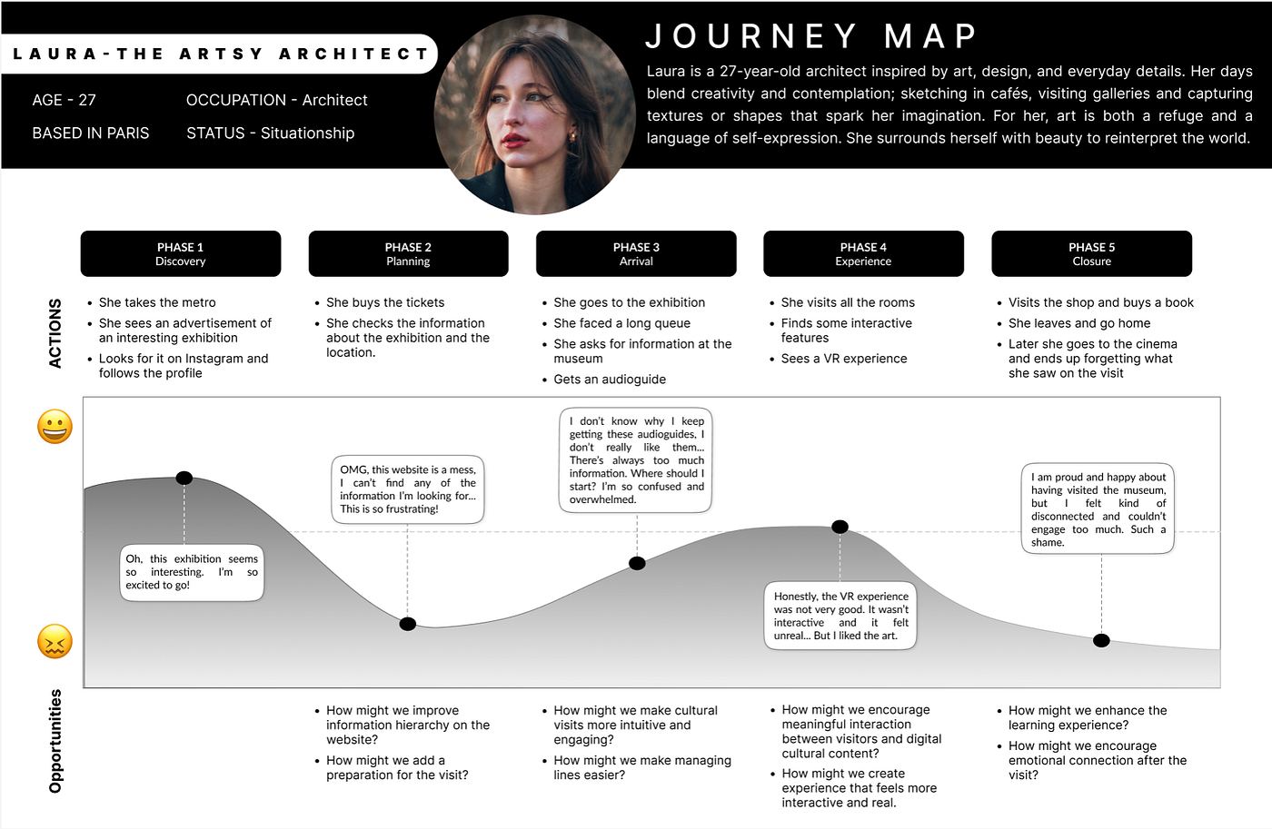
User Journey Map
HMW Questions & Problem Statement
Before ideating solutions, we had to ask ourselves some How Might We questions to discover the design opportunities we had regarding the project. The most relevant ones where the following:
- HMW encourage meaningful interaction between visitors and digital cultural content?
- HMW enhance the learning experience?
- HMW create experience that feels more personal and memorable?
- HMW encourage emotional connection after the visit?
Taking into consideration all these valuable insights from the interviews, the user persona and user journey and our HMW questions, we redacted a problem statement:
“Visitors of museums and art lovers in Paris need to find a way to engage with culture in a more meaningful and personalised way because currently, they tend to feel disconnected and somewhat disappointed with their experiences going to exhibitions.”
Ideation: Crazy 8’s and User Flow
Before creating a user flow, we did some brainstorming with the Crazy 8’s technique. This constists of folding a paper into 8 parts and write one screen in one minute. Every team member did the same and afte having all our ideas together, we voted on the ones we really would like to include in our app.
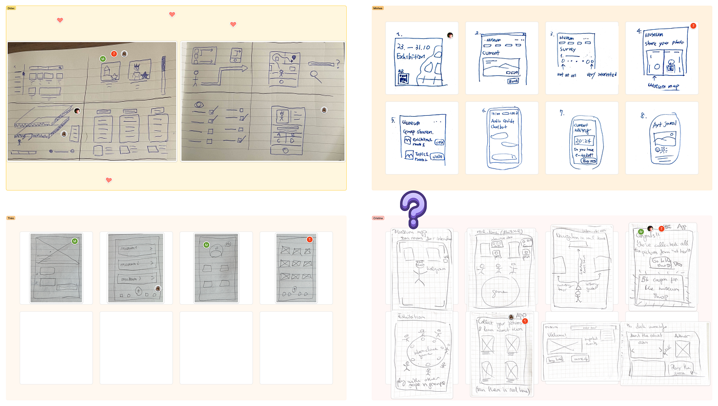
Our crazy 8's
After that, and with the problem statement in mind, we created a user flow that described mainly a happy path. It started from the moment the user sees the advertisement and scans the QR code to download the app until the user finishes the visit to the museum having used the app to dynamize their visit.
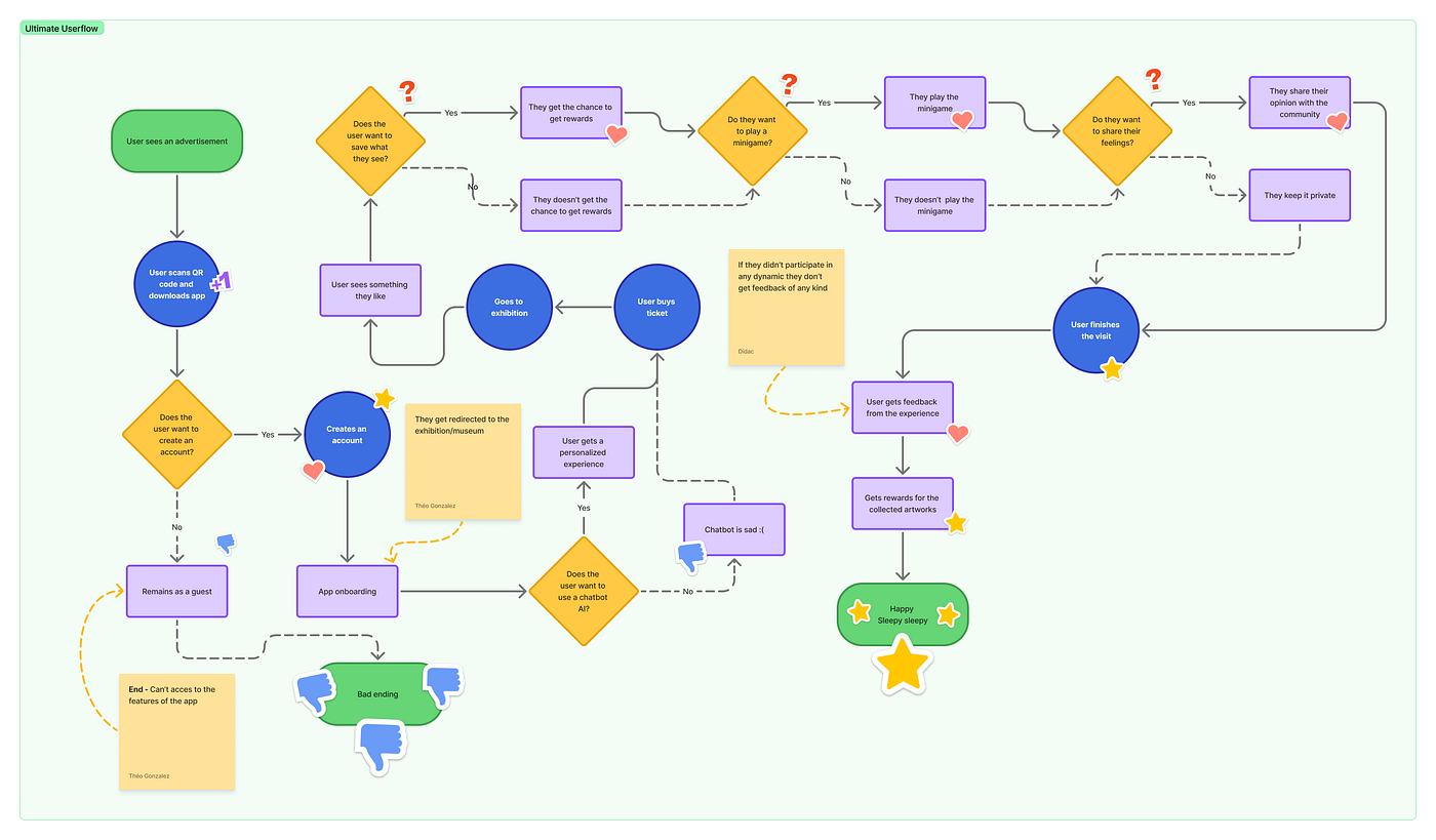
User flow map
Low-Fidelity & Prototyping
After having a clear idea of what we wanted our app to look like, we began creating screens. We ended up with 19 screens and our MVP included:
- A welcome page and create an account
- Onboarding with a chatbot feature included
- A page to buy tickets of all the different musems in Paris in one app
- Different apps to use while visiting the museum:
- One for taking photos and having more information about the artworks.
- A quizz game
- A search function with an interactive 3D map
- A live chat with the people that are visiting at the same time as you
- And a rewards page and feedback feature if you complete all the experience
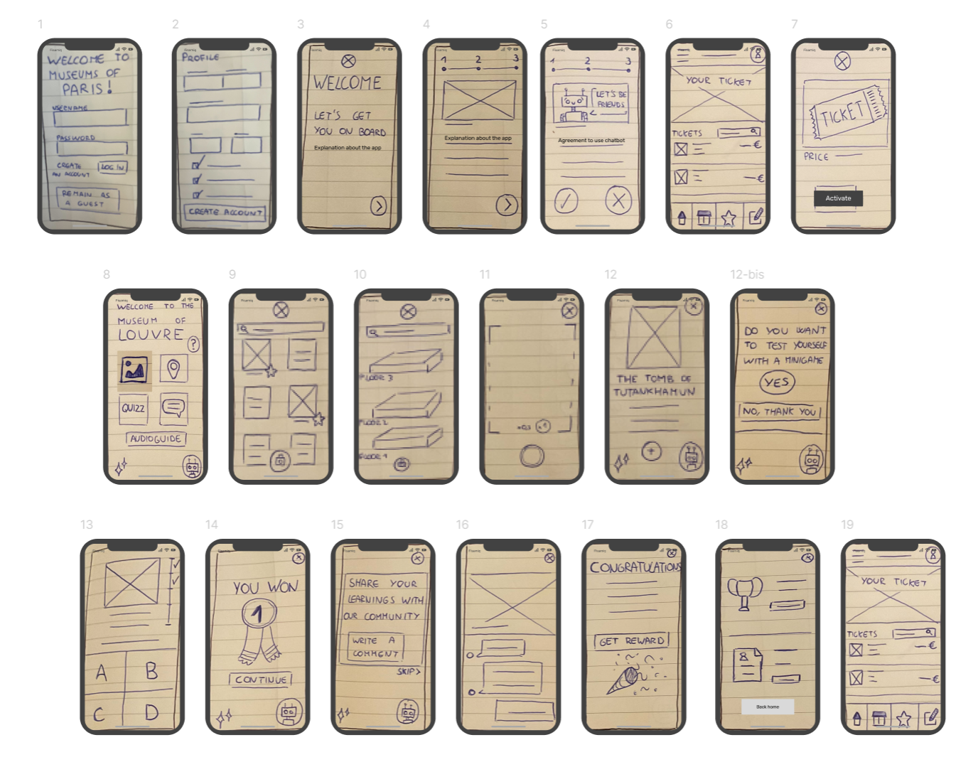
Screens of the MVP in low-fi
After this it was time for creating a prototype and testing it. It was very satisfying to see our product together and being able to show it and it made us learn a lot about what worked and what didn’t. You can see the prototype here or in the GIF below.
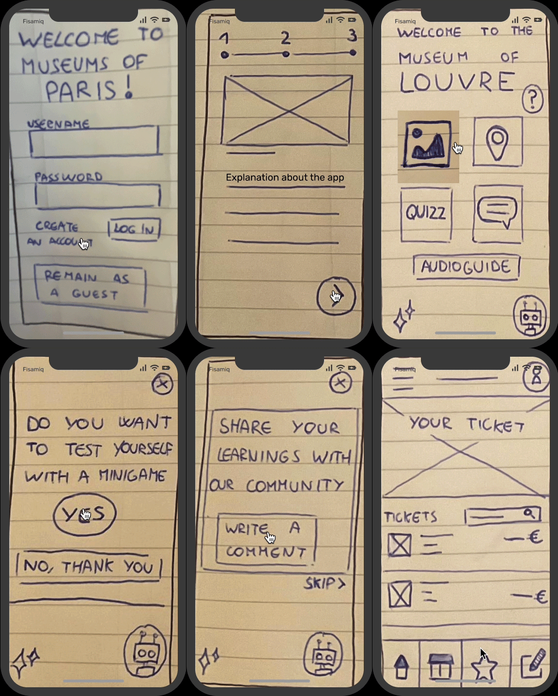
Low Fidelity prototype GIF
Concept Testing & Next steps
We did concept testing of the app with 3 different users and their feedback was very insightful.
- 1 user expected to see information about the museum/exhibition in the welcome screen.
- 2 users liked the 3 step onboarding process.
- 1 user was worried about the amount of artworks available in the art collection.
- 2 users liked the 3D interactive map.
- 1 user found the possibility of adding art to their collection confusing.
- 1 user found that gamification was a good idea for going with kids.
- 2 users found the possibility of getting rewards for engaging with the experience very nice.
With this feedback, we’ve established what our next steps would be if we continued with this project. These were our ideas:
- Clarify purpose: make it clear the app supports real museum visits, not digital exhibitions.
- Enhance experience: reduce confusion by guiding users clearly from selection to confirmation.
- Improve navigation: Refine hierarchy and labels for a smoother browsing experience.
- Balance Play: Let users snooze gamification during visits and re-engage later to extend the experience beyond the museum.
- Full journey design: Support users before, during, and after their museum visit.
Creating this first project has reinforced my thoughts of how important it is to create a good user experience for any activity. It taught me a very interesting lesson on how to allign business needs with user needs in a creative and interactive way. I can’t wait to apply this knowledge in my future projects!
메타데이터
- post_id
- dbbdb1cee5eb
- slug
- solving-a-wicked-ux-ui-problem-dbbdb1cee5eb
- url
- https://medium.com/@cristinagolftoledo/solving-a-wicked-ux-ui-problem-dbbdb1cee5eb
- canonical_url
- https://medium.com/@cristinagolftoledo/solving-a-wicked-ux-ui-problem-dbbdb1cee5eb
- author_url
- https://medium.com/@cristinagolftoledo
- status
- ok
- fetched_at
- 2026-06-22 17:31:34