Launching Motel6.com
Hi People, welcome back to the blog. I hope all of you are doing great.
Launching Motel6.com
Hi People, welcome back to the blog. I hope all of you are doing great.
I’ve been meaning to write about one of the major projects I worked on during my time at Prism (formerly OYO) as a Product Management Intern. I was involved in launching both the Motel6 (My6) app and the Motel6 website. For today’s post, let’s talk about the Motel6 website. More bookings meant more conversions, which also meant more risks, more responsibility, and yes, more fun.
What is Migration? Motel6.com was one of the migration projects I worked on. When I first joined, I kept hearing the word migration but honestly had no idea what it meant. I never asked anyone directly, but slowly picked it up by observing and listening.
In tech, website migration means making significant changes to a website’s setup, platform, structure, content, design, or hosting while ensuring:
- minimal downtime,
- no data loss,
- preserved SEO/search rankings.
Now comes the major question: Why was there a need for migration? Did the PM suddenly decide one day that we should migrate the website to the global stack? Obviously not.
This was a call taken by senior leadership. And if you think about it from a founder’s perspective, it makes sense. If you own multiple companies, having all of them on a global stack means engineers can easily understand the codebase across brands, making work smoother and scalable.
How does a PM approach migration?
Once the decision was made, the next step was execution. At OYO, PMs typically work with designers first before going to the tech team. Wireframes weren’t something PMs created themselves instead, we connected directly with designers to discuss the flow. (Interestingly, the same approach was followed in other companies I’ve been at, like Milkbasket and TBO.com).
But it wasn’t just about migration. New app features were also being built at the same time. So, we had to ensure parity between app and web. That meant any new feature on the app also had to be live on the website. As PMs, every decision required us to balance design, data, and stakeholder inputs.
Homepage Decisions — Thinking Like a PM
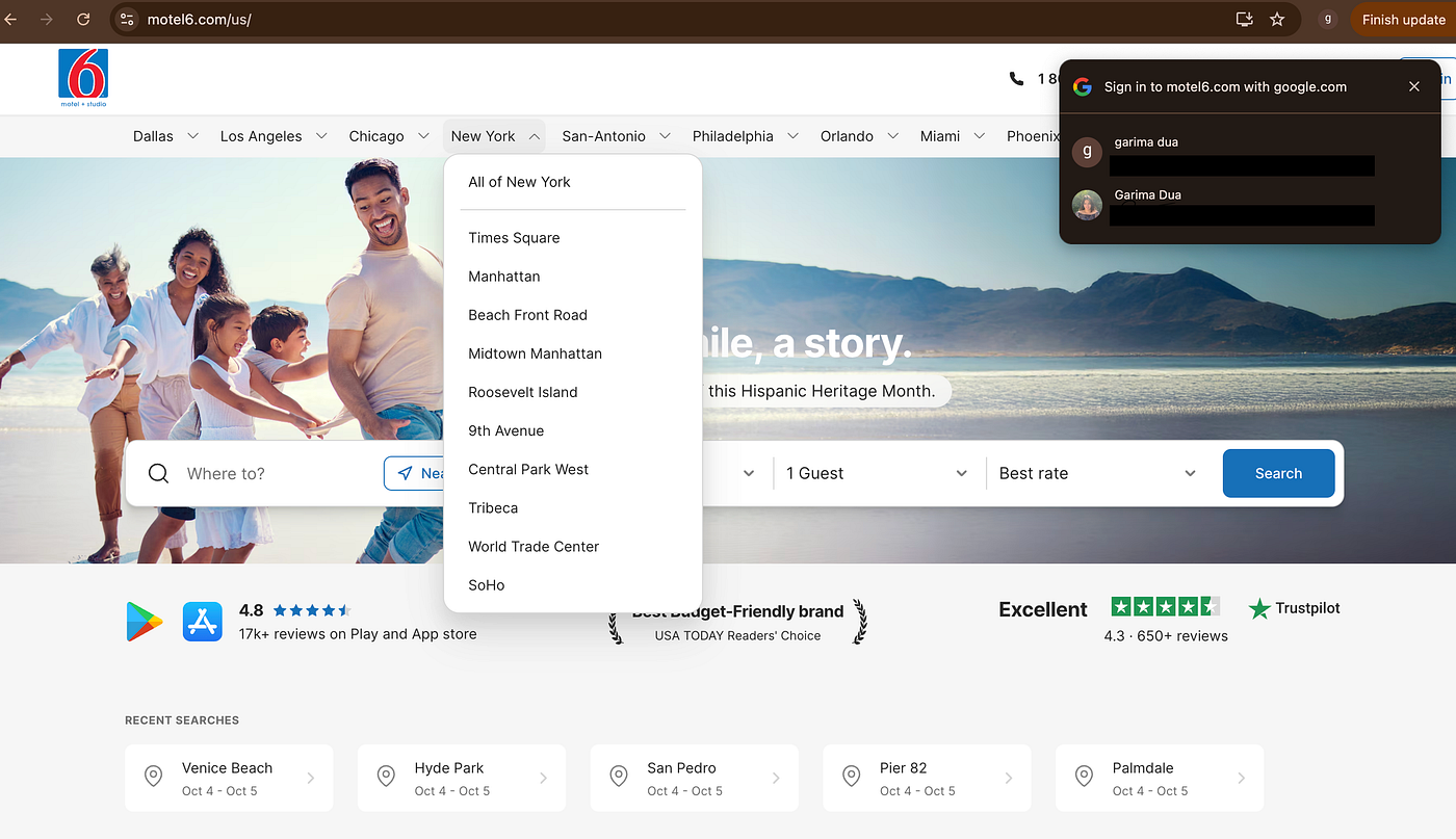
1. Google YOLO
When I first heard “YOLO,” I thought it meant the deep learning algorithm. But here it stood for You Only Login Once.
Now, how do you break this down into user stories? Some of the ones I worked on were:
- How many accounts should be shown on the landing page?
- On which pages should the login popup reappear?
- For how long should the popup remain visible?
- Should it disappear only when the user clicks the cross, or also when they click anywhere outside?
If you were the PM, what would your answers be?
2. City Selector
You must have noticed the city selector — for example, Dallas and Los Angeles. The first thought you might have is: Why did we put this here at all?
The answer lies in migration. When moving to a global stack, certain design patterns need to be consistent across brands. If you explore OYO businesses like Belvilla or OYO India, you’ll find similarities.
Now, why these cities specifically? To decide that, I asked the analyst for the top 10 cities based on frequency of searches and bookings. But here’s another question to think about: How much past data should you actually consider? Three months? Six months? A year?
3. Search
Why is the search bar center-aligned here, instead of at the top like Amazon? Because when you migrate, you often need to follow certain rules — you can’t just place elements wherever you like.
Another common question: why are we using rate codes instead of coupons? The answer is simple — Motel6 customers have been using rate codes for years, and they understand them. Just because coupons work in India doesn’t mean they’ll work here.
So here’s something to think about: if you were migrating this feature, would you retain the customer’s existing behavior, or try to change it?
4. Recent Searches Widget
The recent searches widget shows users their last searched details along with dates. Why was it added? Because data showed that CTR (Click-Through Rate) for this widget was higher.
But as a PM, you don’t stop at that. You ask:
- Why did we place this widget in this specific order?
- Why not something else here?
- Why these particular items under this widget?
The same line of questioning applies to every widget on the homepage.
Beyond the Homepage
The same kind of thinking applies to other pages too — the lister page, hotel detail page, and payments page.
One of the major USP features we prioritized was the Guest Checkout Flow. This allowed users to book without logging in — just entering basic details like name and number. Why was this important? Because data showed most users preferred guest checkout. My manager even shared a *blog* post about it on our Teams channel that validated this insight.
The PM Lens
This project taught me that product management is about constantly asking the right questions:
- What should the copy be for an error message?
- How should a 404 page look?
- How do we maintain parity between mobile web and desktop web?
- How do we balance design consistency with data insights and technical constraints?
Every detail counts.
Final Thoughts
Working on the Motel6 migration was a thrilling experience. It gave me ownership of a high-impact project and the opportunity to collaborate with some of the best people. A special thanks to my manager, Megha Dhammi, for trusting me with such responsibility.
If you’d like to discuss more about product management in general, feel free to reach out to me on LinkedIn.
Thanks for reading!
메타데이터
- post_id
- dbdae9e22ca7
- slug
- launching-motel6-com-dbdae9e22ca7
- url
- https://medium.com/@garimadua/launching-motel6-com-dbdae9e22ca7
- canonical_url
- https://medium.com/@garimadua/launching-motel6-com-dbdae9e22ca7
- author_url
- https://medium.com/@garimadua
- status
- ok
- fetched_at
- 2026-06-13 07:35:29