Redesigning the mobile banking app login experience.
When a member of our team informed us that they were looking to switch banks because Ulster Bank was leaving the market, we proceeded to…
Redesigning the mobile banking app login experience.
When a member of our team informed us that they were looking to switch banks because Ulster Bank was leaving the market, we proceeded to have a very insightful conversation about how poor the incumbent banking apps are.
Initially, we looked at redesigning the PTSB mobile banking app. Two of our team members were familiar with the PTSB app and also voiced similar damning comments about the Bank of Ireland and AIB apps.
From a positive perspective, we were also aware of some of the great features that banks like Ulster bank and Revolut had adopted and how well they’ve been received by their customers.
Approach
As a team, we adopted the Design Thinking methodology and immediately looked at applying the Double Diamond framework.
There are multiple versions of Design Thinking and their interpretation of what the Double Diamond consists of. We decided to follow the version first launched by the Design Council in 2004.
***Framework for Innovation: Design Council’s evolved Double Diamond***
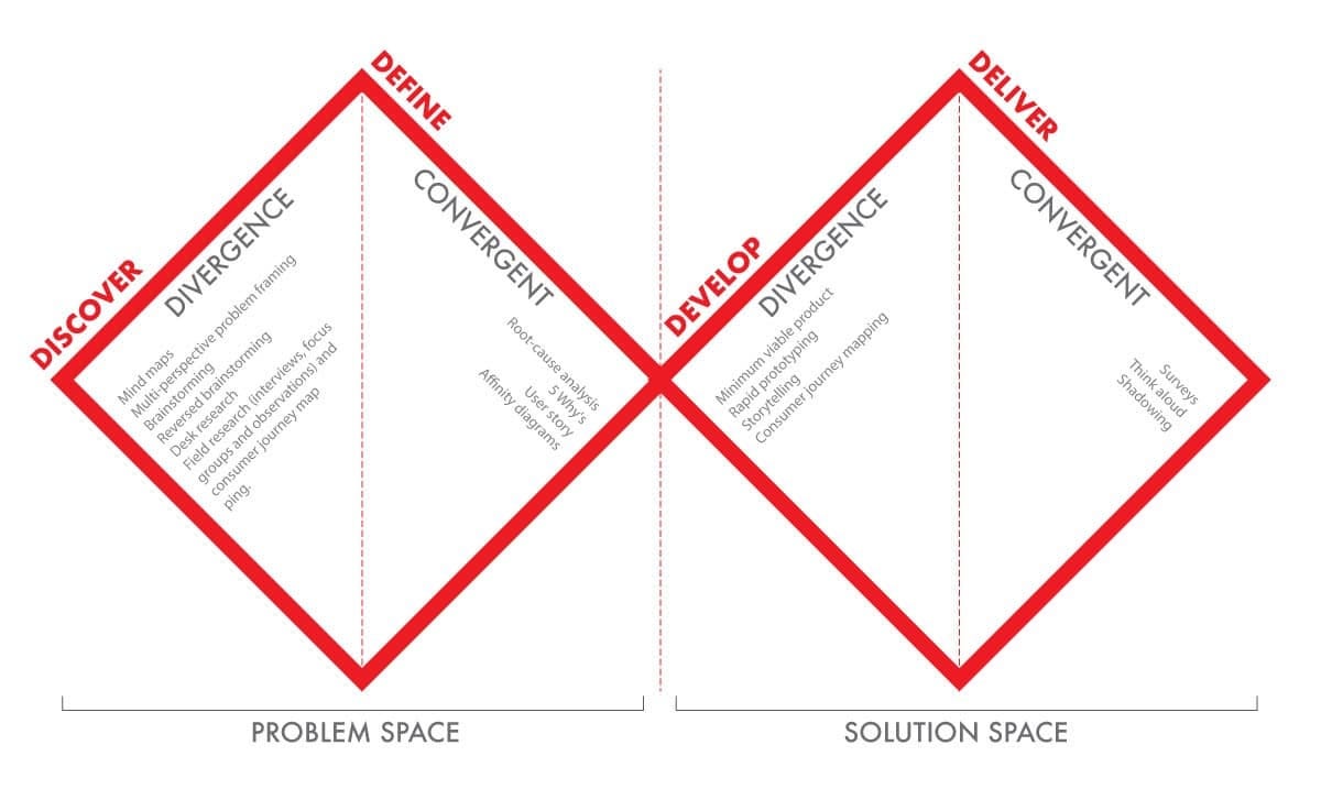
The Double Diamond design thinking process (Adopted from the Design Council).
I think you can use the Double Diamond to tell all sorts of design stories in really helpful ways. Part of its beauty is its simplicity.
Jonathan Ball
Design Council’s Double Diamond consists of four phases, Discover, Define, Develop and Deliver.
Discover Phase
In this phase, we focused on understanding what the problem is that customers are experiencing. Some of the team conducted Primary Research through surveys which resulted in gathering Quantitative Research.
*What’s the difference between qualitative and quantitative research?*
We also conducted some Competitor and Customer Research on the banks, by carrying out a Heuristic Evaluation as well as capturing various reviews shared on Google Play.
Heuristic Evaluation
We performed a Heuristic Evaluation (Nielsen and Molich, 1990; Nielsen 1994) on the PTSB banking app to better understand the usability problems by applying a set of evaluators to examine the interface and judge its compliance with recognized usability principles (Nielsen, 1992).
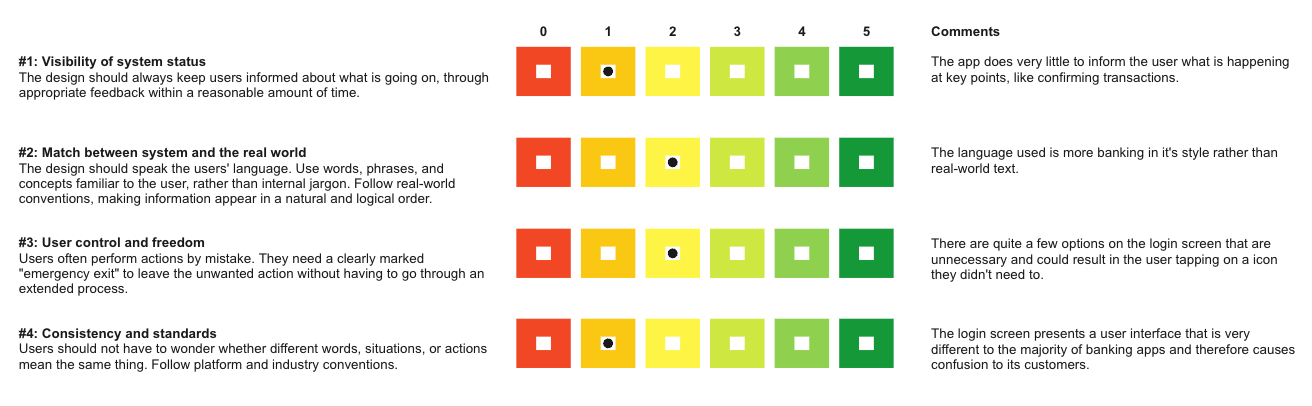
Heuristic Evaluation
Competitor Research
By gathering positive and negative reviews of the competitors, via Google Play Reviews, we are able to inform ourselves about what our customers' needs are. Identifying what customers found frustrating and what caused them joy, was key to advising the team on what the optimum customer experience should look like.
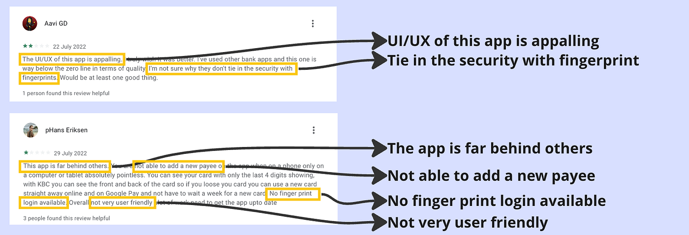
These early insights confirmed to the team that the login journey, a flow that we all experienced on a daily basis is the source of great frustration for many customers.
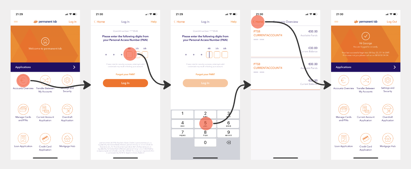
Current PTSB login flow
**Competitor Research Findings**
By applying Neilson's 10 Usability Heuristics we were able to identify the following. Both PTSB and BoI are guilty of #8 Aesthetic and Minimalist design. Their interfaces are cluttered with information that is irrelevant. #7 Flexibility and Efficiency of use are not being applied by these apps as they fail to adopt the latest tech features available to them to improve the users experience.
Empathy
Capturing the reviews shared online was insightful research. Now we needed to get personal with the user’s so that we can better *understand their experiences, motivations, and problems.*
“If you want to build a product that’s relevant to people, you need to put yourself in their shoes.”
— Jack Dorsey, Programmer, entrepreneur, co-founder of Twitter & founder of Square
To understand more about our users we created two **Proto-personas* so the team could [quickly align our assumptions about the users, but it's not based on new research.](https://www.nngroup.com/articles/persona-types/)*
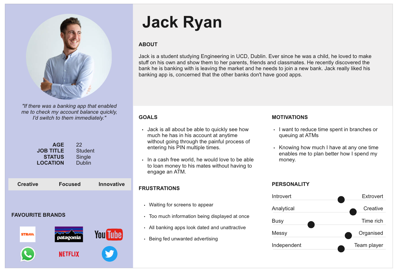
Proto-Persona
With two Proto-personas to work with were we able to progress further by doing some Empathy Mapping. This would aid us visualising what we know of our particular users. What this will achieve is a shared understanding of the user needs that will aid the team's decision-making.
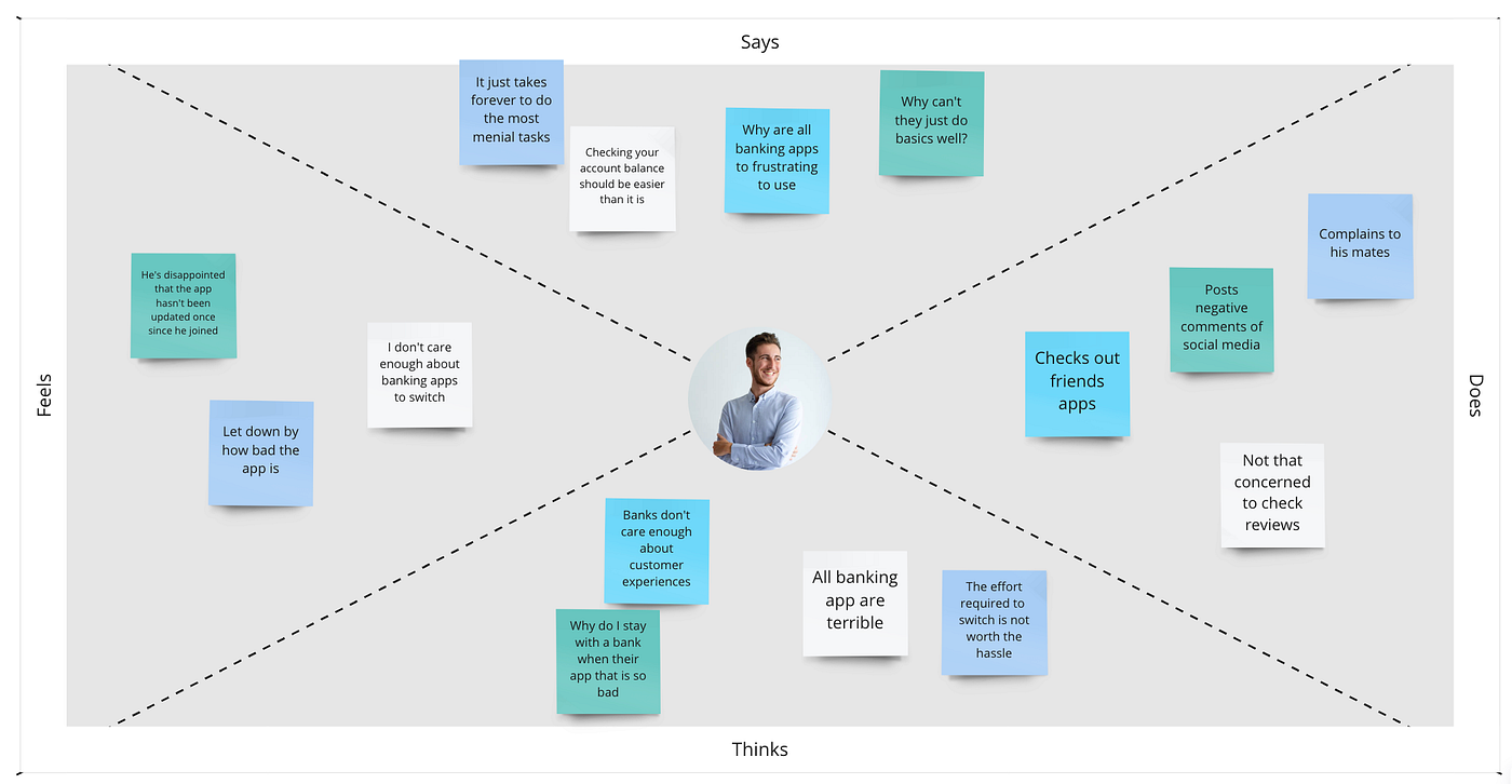
Empathy Mapping
The team then looked at creating a **Scenario** that would tell a story of a person and their attempt to complete a simple task. We focused on our persona, Jack when creating the Scenario by answering the following questions:
- Who’s the actor?
- What’s their motivation?
- What’s their intention or intent?
- What’s their action?
- What’s their resolution?
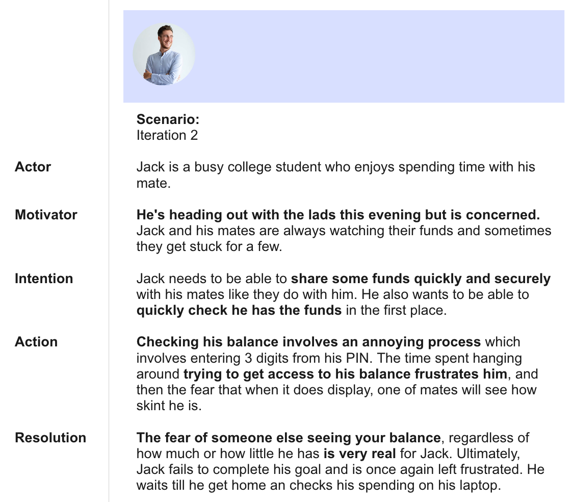
Scenario — Iteration 2
**Proto-Personas and Scenario Findings**
The creation of two proto-personas enabled us to better understand the user's needs from contrasting perspectives. Empathising with the personas, we assigned goals, motivations, and frustrations as well as additional personality traits, so that we could build a relatable persona.
Focusing on Jack, the 22-year-old student, we looked at creating a scenario that highlighted the issue he is currently experiencing and how he hopes to resolve it.
Define
In this phase, we aimed at making sense of our findings by understanding how the user needs and the problem align. As a result, we needed to create a **Problem Statement** which clearly defines these challenges based on our findings.
“If I had an hour to solve a problem, I’d spend 55 minutes thinking about the problem and 5 minutes thinking about solutions.”
— Albert Einstein
I took a few iterations to finally frame a Problem Statement that has a broad enough scope to allow the team to be creative and narrow enough to be practicable, while also being human-centered and action-oriented.
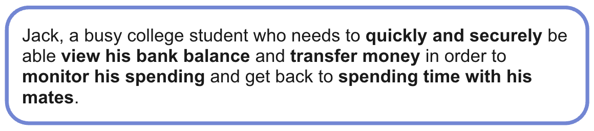
Problem Statement
Using Nielson Norman group’s guide to *identify and frame the Problem Statement*, we attempted to answer the 5 W’s.
- Who is affected by the problem?
- What is the problem?
- Where does this problem occur?
- When does the problem occur?
- Why does the problem occur? Why is the problem important?
The team all had an understanding of what our Problem Statement was in the Discovery Phase. However, it wasn’t until the Define Phase that we worked on framing it succinctly to ensure answered the 5 W’s. With the Statement defined, we used it as a constant reference to keep the team focused when ideating solutions.
With valuable insights gathered in the Discovery Phase, we looked to synthesise our findings. Using Card Sorting the team was able to identify common themes.
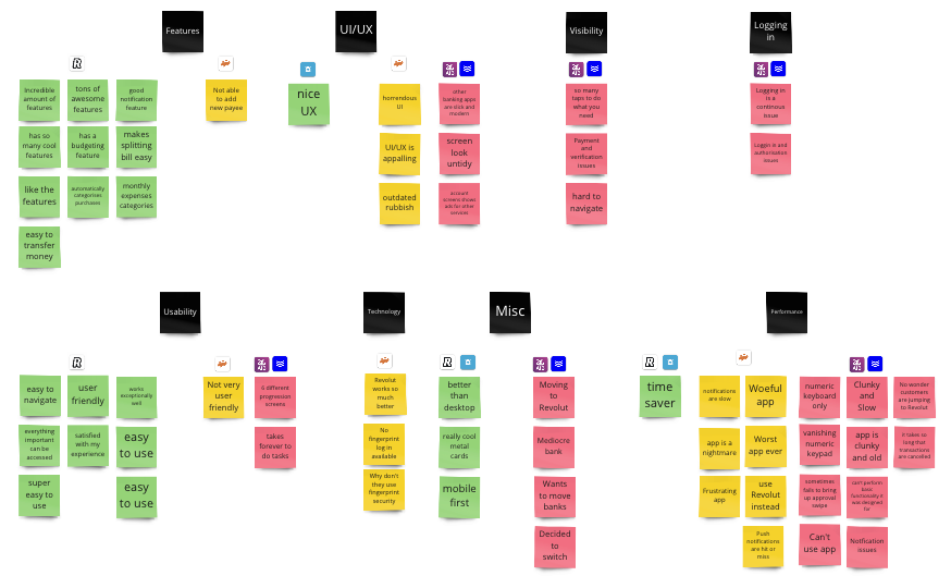
Card Sorting
The key insights gathered were identified for each app and using Card Sorting we were able to uncover the user's pain points and the positives of their experiences.
The results uncovered that apps like Revolut and Ulster Bank scored well in Usability and Features, while PTSB, AIB, and BoI all struggled in UI/UX, Visibility, Performance, and Logging in.
Customer Journey Mapping
In addition to Card Sorting, the team used a common UX tool in the form of Customer Journey Maps to visualise the process a person goes through to accomplish a goal.
We fleshed out the four key stages the customer will experience, documenting their interaction/touchpoints, thoughts, feelings, and opportunities in order to create a narrative.
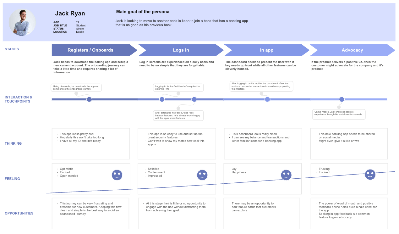
Customer Journey Mapping
Customer Journey Mapping Findings
By visualising the customer's journey we were able to gain a greater understanding of the person's feelings and emotions as they progress through a very common journey. Our aim was to look at it from a perspective that sees the user follow a happy path from Registration / Onboarding all the way through to the banking apps dashboard.
Develop
In the third phase of the process, we looked to take all of our findings and commence our first round of low-fidelity Paper Prototypes.
We each focused on the same customer login journey, and how best to meet the customer's needs while attempting to apply a succinct and intuitive flow.
First Iteration
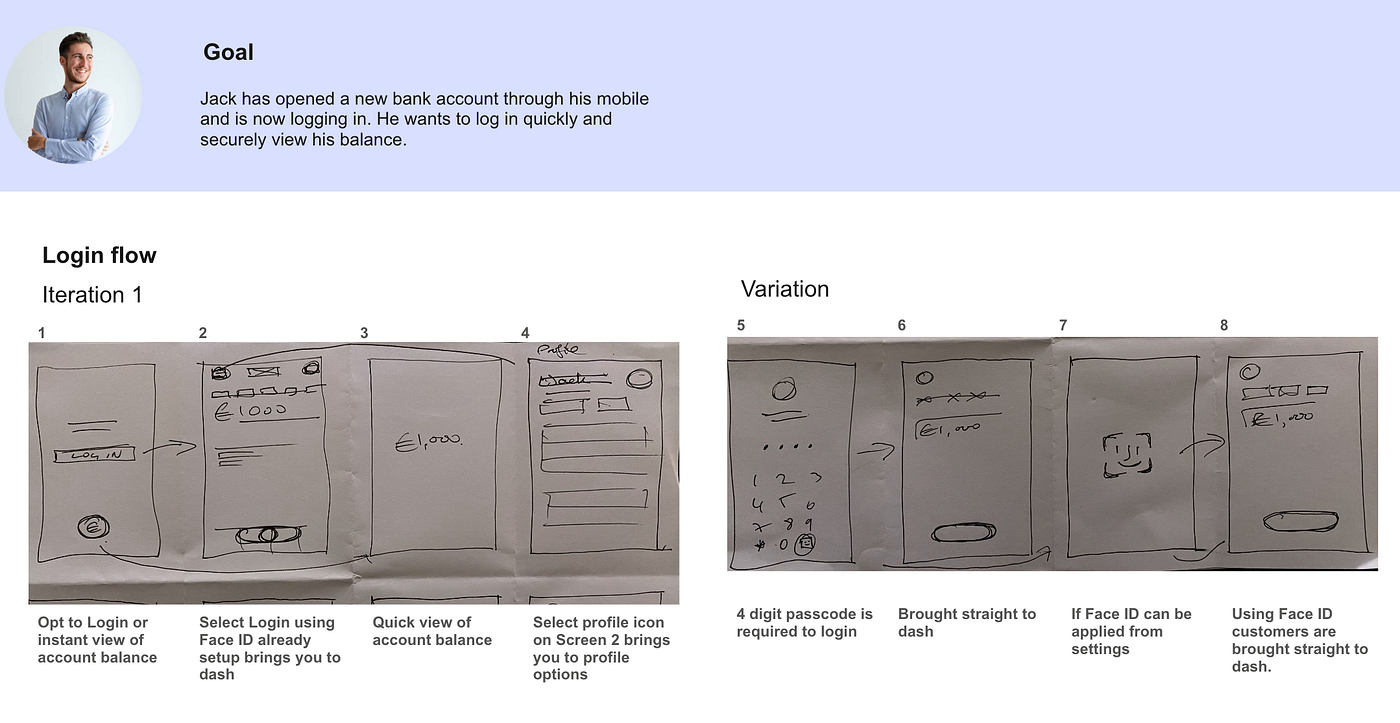
First Iteration
We used Crazy 8’s to quickly mock up the login screens which followed a minimalistic design style. The team was in favour of imitating a design that was clean and clutter-free. We were also influenced by the work of Dieter Ram who developed the 10 Principles of Good Design also referred to as the 10 Commandments.
Second Iteration
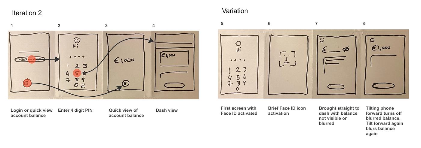
Second Iteration
Focusing on designing screens that incorporated the latest tech features that meet the customer's needs by enabling customers to login quickly while also keeping their balance details secure. Additionally, we also wanted to make the transfer of funds a more intuitive experience.
Third Iteration
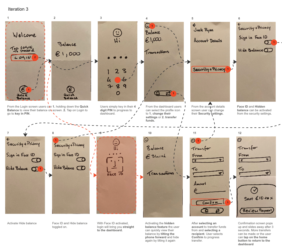
Third Iteration
The third iteration captured all three customer goals while maintaining a content-light interface. The customer goals were met by adding a Face ID and Hidden balance activation toggles in the Security Settings. The ability to make a simple transfer to friends was also factored into the new design of the dashboard.
User Testing
The Third Iteration of the paper prototype was photographed and uploaded to an app called Marvel. The Marvel app is perfect for rapid prototyping as it contains features that allow designers to link screens together so they can perform User Testing with ease.
With the screens, all linked up and the respondents all agreeing to sign the **Consent Forms**, they were asked to complete two tasks.
Tasks
- Login to the banking app and try to turn on your Face ID and Hidden balance features.
- Once logged in try to perform a transfer.
User Testing Video
[embed]User Testing Video
User Testing Findings
From our User Testing, we were able to see firsthand how users interacted with the prototype. As they attempted to complete their goals it was evident that they were seamlessly able to complete the first task. However, the second task proved more challenging as the user struggled to identify the transfer icon and got momentarily confused and flustered.
Conclusion
Our research confirmed that numerous banking app users suffer various pain points when they carry out basic and daily tasks. We also identified that there are apps out there whose features create that wow factor for the users.
Simple features were identified in two of the apps researched and we were able to combine them into a new fictional banking app that also embraced a very minimalist user interface design.
The final iteration that we user-tested was extremely simplistic to enable the user to navigate the screens without experiencing content overload.
Unfortunately, the overly minimalist approach was not realistic. The addition of multiple options for users to explore would’ve presented the team with a more convincing and plausible version of what users would expect from their banking app.
References
Nielsen, J. (1994). 10 Usability Heuristics for User Interface Design. Nielsen Norman Group. https://www.nngroup.com/articles/ten-usability-heuristics/
Nielson Norman Group. (2019, October 4). Heuristic Evaluation of User Interfaces [Video]. YouTube. https://www.youtube.com/watch?v=6Bw0n6Jvwxk
Nielson Norman Group. (2019, August 23). Scenario Mapping for Design Exploration [Video]. YouTube. https://www.youtube.com/watch?v=dmlFRCZI9gQ&t=13s
Nielson Norman Group. (2018, September 21). Creating Personas Is Like Sorting Rocks [Video]. YouTube. Creating Personas Is Like Sorting Rocks
Rosala, M. (2021). Problem Statements in UX Discovery. Nielsen Norman Group. https://www.nngroup.com/articles/problem-statements/
Gibbons, S. (2018). Empathy Mapping: The First Step in Design Thinking. Nielsen Norman Group. https://www.nngroup.com/articles/empathy-mapping/
Nielsen Norman group. (2019, February 8). How to Empathy Map [Video]. YouTube. https://www.youtube.com/watch?v=9HwpR3Njq00
Gibbons, S. (2018). Nielsen Norman Group. Journey Mapping 101. https://www.nngroup.com/articles/journey-mapping-101/
Kaplan, K. (2017). Nielsen Norman Group. The 5 Steps to Customer Journey Mapping. https://www.nngroup.com/videos/customer-journey-mapping-steps/
Interaction Design Foundation — IxDF. (2017, September 17). What is Paper Prototyping? [Video]. YouTube. https://www.youtube.com/watch?v=4ZRzJTczMCE
Nielsen Norman Group. (2021, November 19). Paper Prototyping: How to Create & Usability-Test Simple UI Prototypes (40 min tutorial) [Video]. YouTube. https://www.youtube.com/watch?v=OlbdIXLunt4
메타데이터
- post_id
- dcb486ae0ff3
- slug
- redesigning-the-mobile-banking-app-login-experience-dcb486ae0ff3
- url
- https://medium.com/@georgegalbraith/redesigning-the-mobile-banking-app-login-experience-dcb486ae0ff3
- canonical_url
- https://medium.com/@georgegalbraith/redesigning-the-mobile-banking-app-login-experience-dcb486ae0ff3
- author_url
- https://medium.com/@georgegalbraith
- status
- ok
- fetched_at
- 2026-07-26 12:13:33