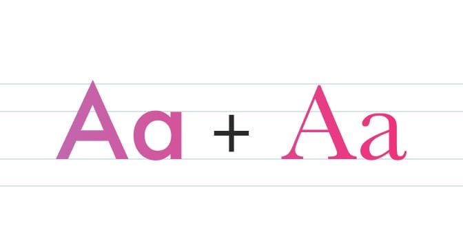
Fleyt. Type System
How Two ESA Reports Inspired the Creation of Fleyt
Fleyt. Type System
How Two ESA Reports Inspired the Creation of Fleyt
Most typefaces are inspired from different moments, sometimes derived from other typefaces.
Fleyt, however, has a very different origin.
As a lifelong lover of books, I often spend time browsing second-hand bookshops. A few months ago, I came across two publications from the European Space Agency (ESA), two reports that immediately caught my attention. Not because I am an aerospace engineer, but because of their visual language.
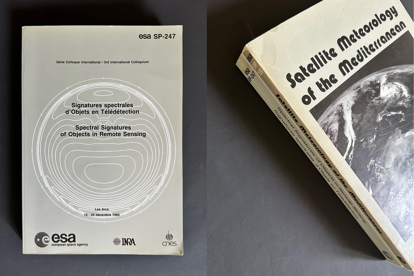
ESA. Documents: SP-247, 1985 / SP-159, 1980
These documents embodied a particular vision of the future. Not the glamorous, cinematic future often portrayed in science fiction, but something quieter and more pragmatic. Their pages were filled with diagrams, tables, measurements, engineering constraints, and carefully structured information. Everything felt rigorous in its research and discourse.
Yet, in their typography and layout, there was something far less controlled. Something almost chaotic. And still, undeniably beautiful.

Example of layout in SP-247

Beautiful Pixel font. SP-247
What fascinated me most was the tension between technical precision and the inconsistencies of their production. Some pages were carefully typeset, others appeared to be scans. Some were reproduced at astonishing resolution, while others showed the limitations of the technology available at the time. There were even traces of human intervention: handwritten notes, annotations, and corrections scattered throughout the documents.
Together, these elements created a rich visual texture. They revealed not only the final reports, but also the people, processes, and imperfections behind them.

Human annotations

Textures of iconography
I began collecting references from these publications. Not individual letters or specific typographic details, but broader impressions: proportions, rhythms, the relationship between text and space, and the feeling of a complex system held together with intention.

First sketch where Serif and Sans are mixed. Serifs are in research of their forms.

Also the wish to produce a system who share same weight, width and vertical metrics is borning
The first drawings that would eventually become Fleyt were never intended as a direct reinterpretation of a historical typeface. Instead, they were an attempt to capture the atmosphere of these ESA reports: a sense of movement, precision, and forward-thinking design.

First layout with Fleyt Sans and Fleyt Serif (Narrow and Extended. Based on a page of the report SP-247
As the project progressed, the influence became less literal and more conceptual. The goal was no longer to recreate the appearance of the reports, but to translate their spirit into a contemporary type family.

Mock up. Contemporary use of Fleyt Beta
That is why Fleyt is shaped by ideas of exploration, systems thinking, and technical elegance. The very qualities that made those reports so captivating in the first place.

Uppercases in development of Fleyt Serif Normal Regular.

Lowercase of Fleyt Serif Normal Regular + Fleyt Sans Narrow Normal. In looking at the serifs I keep the most simple froms like on the ‘a’.

The whole Fleyt System
Looking back, I find it fascinating that a typeface can emerge from such an unexpected source. Inspiration rarely appears where we expect it. Sometimes it comes from typography itself. Sometimes it comes from architecture, industrial design, or photography.
And sometimes, it comes from two engineering reports produced by a space agency.
Fleyt is the result of that encounter.

For all the reader I offer Fleyt PX-89, an exclusive pixel version of Fleyt Serif Narrow Regular + Bold in susbcribing to the newsletter of PizzaTypefaces where the font has been published. Typefaces Newsletter
The fonts download will be right in your inbox!

Thanks for reading!

typefaces.pizza
메타데이터
- post_id
- dd2adbf6352b
- slug
- fleyt-type-system-dd2adbf6352b
- url
- https://medium.com/@pizzatypefaces/fleyt-type-system-dd2adbf6352b
- canonical_url
- https://medium.com/@pizzatypefaces/fleyt-type-system-dd2adbf6352b
- author_url
- https://medium.com/@pizzatypefaces
- status
- ok
- fetched_at
- 2026-06-26 03:39:16