Indicators “Masters of Risk” — Game of “Skipping Stones”. Part 2
More than four years have passed since the publication of the first article, “Indicators “Masters of Risk” — a new look at financial…
Indicators “Masters of Risk” — Game of “Skipping Stones”. Part 2
More than four years have passed since the publication of the first article, **“Indicators “Masters of Risk” — a new look at financial markets. Part 1". During this time, force majeure circumstances occurred in the homeland of my friend, mentor, and business partner. I had to take over the business and the development of indicators for the “Masters of Risk”** trading system. During these years, I had to refine the concept of the indicators, as well as create new ones that would help our students more easily perceive the material being taught. During my teaching, I realized that the postulates that are understandable to us are not so easy for our students to understand. I completely changed the presentation of the materials and managed to find a way to get closer to them. It was a difficult and long process, but I am pleased with what I have achieved. I hope that in this and other articles I will try to be close to people who want to learn and develop in the field of financial markets. “Trading”, as a profession, should be practiced with pleasure and carry the same passion as when you first encountered the material.
I will start this article with the changes related to the indicators for “Reversal Patterns” and “POC levels”, as well as some unclear points related to them. Then I will try to associate and explain “Trend trading” like the board game “Skipping Stones” on water. “Trend trading” is a well-known concept, but also complex enough to understand and apply in practice when trading in the financial markets. I would like to clarify that the examples shown in the articles are from screenshots that do not show the names of the financial instruments. This is because the information shown in the articles is from various financial instruments (currency pairs, indices, metals, oil, and cryptocurrencies). The examples are universal and can be seen on all financial instruments, as well as on all time frames (fractal structure of the markets).
Some time ago, I had the pleasure of talking to a professor in the field of university education, and I was able to get him to think and look at his problems from a different perspective. I will paraphrase what I said as follows:
“If you can explain your complex activity to a stranger (a gardener, garbage collector, or construction worker), and he or she understands you and starts discussing your problems, then you have managed to clarify the concept of what you do and have begun to inspire the people around you to think and develop.”
When I wrote the first part of the article “Indicators “Masters of Risk” — a new look at financial markets”, the indicators I presented there were in their first version. In the years since, many improvements have been made. The versions of the indicators “MR Reversal Patterns” and “MR Volume POC Levels” are now in their fourth. You can find the indicators **here**.
Let’s quickly recall what they looked like then and see what the changes are today.
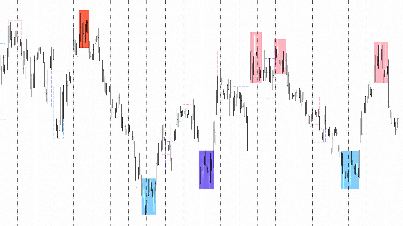
This is a screenshot of the version of the “MR Reversal Patterns” indicator from the first part of the article.

And this is a screenshot of the current version of the indicator…
You can see that “Structural Levels” (shown with “lines”) have been added to the reversal patterns, which show exactly where the structure of the patterns is violated by price movement, as well as the locations of the “Stop Losses” (shown with the “x” symbol).

In the options of the new version of the indicator, the ability to visualize the “Zig-Zag” line on the basis of which the “Reversal Patterns” are built has been added. We decided to open this option because our students have a major problem with the scale for determining the places where the “Reversal Patterns” are built. Let me remind you that in the indicator settings, you select a time frame from which the reversal patterns are built and visualized.

Also added is the option for a classic view of the “Reversal Patterns”…
When you select this option, the “Stop Loss” positions are moved (visualized) above the extreme of the “Reversal Pattern” of sellers or below the extreme of the “Reversal Pattern” of buyers. The bodies of the patterns are removed (they are not enclosed in a rectangle and are not filled with a colored background), and only the “Structural Levels” are left. In combination with the “Zig-Zag” line, novice students begin to skillfully recognize the structure and patterns of the “Reversal Patterns”. This option is also useful for traders who prefer a clean look for their charts.
The next point I want to pay attention to is what happens at the “Structural Levels”, which show exactly where the structure of the patterns is violated by the price movement. The logic for building these lines proceeds in two phases:
Phase 1.
The new pattern is visualized by the indicator upon a breakout of the “Structural Level” line through an impulse formed along the “Zig-Zag” line. This is a kind of “preliminary” view of the pattern, but its formation is not yet complete. In this case, we have a pattern and a “Structural Level” line, but we do not have a test (correction, pullback) of the price movement relative to the pattern. In the settings of the “MR Reversal Patterns” indicator, the “Alert” option for the appearance of a new pattern is activated in this phase. The idea is to have enough time until the completion of “Phase 2” to check your analysis and decide whether to open a position in the direction you need.
Phase 2.
Only after a test (correction, pullback) of the price movement against the pattern can we say that the “Reversal Pattern” is complete. Until then, the “Structural Level” line is continued with each subsequent newly formed candle (bar). When the first test of the price movement is completed, the “Structural Level” line is finally visualized and we can say that the formation of the pattern is complete. Only then can we say that there is a potential entry into a trade.
Why do I make these dilutions?
On the charts of the financial markets, one can see four types of situations regarding the reaction of price movement to newly formed patterns. This is related to the volumes that have accumulated in these places and the intentions of the major players for the scenarios of market movements. The first two types of reactions are repeated in 95% of cases when new patterns are formed. The third type of reaction is called “Stop Loss Hunting”, with a repeatability of about 4% of all cases. The fourth type of reaction is the closing of the “Reversal Pattern” even before it has been completely formed. Fortunately for us, the fourth type of reaction is not traded, since the indicator shows the pattern as closed (with a dotted line on the rectangle), but I must note that this situation also carries its own information about the intentions of the major players in the markets.
Let’s look at these types of situations involving price movement reactions to newly formed patterns.
1. A situation where the test (correction, pullback) of the price movement does not reach the “Structural Level” line.

In the screenshot, with the help of the “Zig-Zag” line, it is visible when “Phase 1” occurs — we have a pattern, we have a line at the “Structural Level”, and we have a place designated for a “Stop Loss”.

Here, in the screenshot, we also see when “Phase 2” occurs. The test (correction, pullback) of the price movement does not reach the “Structural Level” line. The important thing here is to remember that the rule for the maximum size of the stop loss must be followed — not to exceed 60–70 pips from the entry to the stop loss location for patterns of the multi-time frame H1 (the rules are described in the first part of the articles).
There is a variant of this situation that we do not trade!

The screenshot shows the formation of a “Reversal Pattern” when a large “price gap” occurs. Please note that the pattern is not formed after the “price gap” occurs, and the “price gap” is located at the breakout of the “Structural Level” line. This is a very risky situation. From the rules of technical analysis, we know that when a gap occurs, the price movement tends to close it over time. We do not know how far the price movement will extend — it can close 50%, 100% of the gap, or more. In the presence of a “price gap” at the breakout of the “Structural Level” line, the meaning of the “Reversal Pattern” is lost, and it is best to wait for the situation to develop.

This screenshot shows that the situation is developing in the classic way with the onset of “Phase 2”, but the gap remains open. With such a development of events, we have no justified entry into the market. We continue to wait and monitor the situation.

Finally, it can be seen that waiting for the price movement saves us from making the wrong decision to enter a trade. The price movement closes the “price gap”, but it also closes the “Reversal Pattern”.
2. A situation where the test (correction, pullback) of the price movement reaches the “Structural Level” line but does not reach the place designated for the “Stop Loss”.

In the screenshot, with the help of the “Zig-Zag” line, you can see when “Phase 1” occurs — we have a pattern, we have a “Structural Level” line, and we have a place designated for a “Stop Loss”.

Then it is seen when “Phase 2” occurs. The test (correction, pullback) of the price movement has crossed the “Structural Level” line but does not reach the place designated for the “Stop Loss”. This is the clearest and easiest situation to trade. The entry is always after the completion of “Phase 2”.
3. A situation where the test (correction, pullback) of the price movement reaches the “Structural Level” line but exceeds the place designated for the “Stop Loss”.
In this situation, we say that there is “Stop Loss Hunting”. The candles (bars) in the composition of the test price movement do not close above the upper boundary of the “Reversal Pattern” of the sellers or below the lower boundary of the “Reversal Pattern” of the buyers.

In the screenshot, using the “Zig-Zag” line, you can see when “Phase 1” occurs — we have a pattern, a “Structural Level” line, and a designated place for a “Stop Loss”. In this case, the wick of one of the candles has reached the place designated for the stop loss. Notice that the body of the candle itself remains within the boundaries of the pattern. This situation is called “Stop Loss Hunting” or “Stop Hunting”. The general explanation for “Stop Loss Hunting” is as follows:
“Stop loss hunting occurs when institutional traders drive the price of a financial instrument to levels where many retail traders have placed stop loss orders. The goal is to trigger these orders, creating a surge in order pressure that allows larger players to acquire the financial instrument at a better price or to accumulate a position.”
If the “Close” price of the candle is above the boundaries of the sellers’ pattern and the price movement continues in this direction, we say that the “Stop Losses” have provided liquidity for the price movement. If the “Close” price of the candle is below the boundaries of the pattern and the price movement does not continue in this direction, we say that the “Stop Losses” have provided a position gain for a large player in the market. The good thing is that this event occurred during the formation of the “Reversal Pattern”, but the logic for placing the “Stop Loss” has changed. The “Stop Loss” location indicated by the indicator is no longer relevant.

This screenshot shows how the situation develops during the formation of “Phase 2”. In this example, we have a position being built by a large market player at the expense of stop losses (we are not talking about our stop loss here, but about the total stop losses placed at that location). The entry is always after the completion of “Phase 2”, and the next justified step is to move the “Stop Loss” location above the extreme of this candle, according to the rules described in the first part of the articles (5 pips + spread).
4. A situation where the candles (bars) in the composition of the test price movement close above the upper boundary of the “Reversal Pattern” of the sellers or below the lower boundary of the “Reversal Pattern” of the buyers.

Or…

On the screenshots, you see specific cases of forming “Reversal patterns”. In these situations, we do not have justified entries, nor places to set stop losses. Of course, these patterns also have their significance and information. When such patterns appear, it means that either the market has not finished its price movement or major players have not finished building (forming) their positions.
When presenting these situations, I was talking about justified entries and places for placing stop losses. In the first part of the article “Indicators “Masters of Risk” — a new look at financial markets”, I did not talk anywhere about entries from a single pattern. The reason for this is that confirmation (additional weight) of these entries is needed through “Trading models” or through “Interaction models”. Please remember that “Reversal Patterns” without confirmation (from another pattern or from another indicator) are not traded on their own!
The “MR Volume POC Levels” indicator now looks like this.

I must remind you that the “Point of Control” of volumes shows a price line where the largest number of transactions has occurred. The indicator shows how many transactions were recorded on this price line, but it does not show how many of these trades were closed and how many remained open. In the “Masters of Risk” trading system, we have assumed that there is an area (level, zone) around this volume price line (POC), and therefore the indicator provides the possibility of expanding or contracting this area. When the price movement reaches these areas, we see reactions on the charts in the form of corrections. These reactions are a result of the transfer of volume from trades (opening and closing positions or providing liquidity) between buyers and sellers of financial instruments. We do not know what the magnitude of these reactions will be. Therefore, we work on the charts only based on facts — there is a POC level, and there is a reaction upon reaching it.
Another thing I should point out is that Forex markets are decentralized systems and the volumes you see there are provided by your broker. Different brokers provide different volume data to their end clients. Please don’t forget this when you ask why your chart looks different from the charts I show you. For example, one broker may provide higher volumes in the European session and another broker in the North American session. Then, in the terminal of the first broker, the POC level for a one-day (D1) time frame will be shown in the European session, while in the terminal of the second broker for the same day, it will be shown in the North American session.
In addition to all the improvements in the indicator’s performance, “Dynamic POC” points have been added, which come from the “MR Dynamic POC” indicator. “MR Dynamic POC” was created based on a model we used in NinjaTrader 8. The “MR Dynamic POC” indicator itself is distributed freely for MetaTrader 4 and 5 versions.
For MetaTrader 4 — “MR Dynamic POC 4”
For MetaTrader 5 — “MR Dynamic POC 5”
The visualization of the last “Dynamic POC” point (enclosed in a rectangle) is for information. In its place, subsequently, the “MR Volume POC Levels” indicator will decide whether the POC level will be active or will be closed at the very beginning. The methodology for which POC levels are closed and which remain active is described in the first part of the articles.
For lovers of clean graphics, the option to visualize only the “Dynamic POC” points is also available.

In combination with the clean look of the “MR Reversal Patterns” indicator, I think we will fully satisfy the demands of this circle of traders.

With this, I conclude the reference to the first part of the articles “Indicators “Masters of Risk” — a new look at financial markets. Part 1". Of course, there is much more to be said about these two indicators, but that is not the goal of the current article.
The other thing I should mention is that some of the indicators for the “Masters of Risk” trading system are listed separately from the main set of indicators and are distributed in my name. This became necessary due to force majeure circumstances in the homeland of my mentor and friend. We define the separate part of the indicators as auxiliary indicators for the trading system. They are universal and can be combined with other trading systems. The idea is for these indicators to help traders navigate the market situation. Many of my acquaintances and students have problems with justified entry points, holding open positions for a long enough time, and realizing when they are in a range from a higher time frame. When trading in a range, even experienced traders lose significant sums. Regarding all these problems, in this and subsequent articles, I will try to clarify the logic in a way that is accessible to the majority of readers. My mission is to show that understanding the nature of markets does not have to be complex and incomprehensible. The knowledge we have accumulated must remain for the people who come after us, and I will be happy if one day someone manages to improve upon what we have worked on…
Lately, I have been increasingly encountering beginner and intermediate traders who reject the use of classic technical indicators. These people become fanatical followers of new trading systems and dismiss all simpler explanations that could help them solve their problems. I feel like we are talking about different things, rather than trading in the financial markets. In this regard, I would like to express my appeal to them:
I beg you! Have respect for the people who, more than 50 years ago, took the trouble to think and create the indicators that we use today. Remember that not all indicator authors were financiers. The problem is not the people who created these indicators, but the people who use them without understanding their logic, just because that’s what’s written in thick textbooks. If you cannot adapt these indicators to your “modern” trading logic, then the problem is indeed yours!
In this part and in parts of the following articles, I will try to show you that the use of classic technical indicators is not a problem in explaining the nature of the markets. I will show how these indicators can be adapted to modern trading and how they can correspond with our or other trading systems. In this article, I will offer you a new perspective on using the classic technical indicator “Moving average”.
My experience with “Moving averages” dates back to 2009. At that time, I was reading a lot of literature related to trading. I watched, tried, and studied all the classic technical indicators. Later, I also studied the “Elliott Wave Theory”. Everything was new and interesting to me. In the years that followed, I realized that these indicators and theories did not work in my favor the way I wanted or as they were described in the thick textbooks. I always wondered why this didn’t work for me the way it was described in those books. I understood the formulas, the readings, and the information from them, but something still wasn’t clicking for me (I didn’t become a millionaire in 2 years — ha, ha, ha…). After that, I decided to make these indicators work for me through analytical research and testing various strategies. After many, many tests, I managed in 2011, 2012, and 2013 to make the combination of “Moving averages”, “Parabolic SAR”, and “Commodity Channel Index” work for me and my investor. Oh, at the beginning of 2013, you couldn’t “talk” to me — life had become wonderful, I reviewed profits every day, and I was making plans to expand the business. Then came mid-2013, and everything turned upside down. We were losing money, conducting tests, checking past results, and getting nothing. Finally, we reached the initial investment and stopped trading. We ran tests and optimizations again, and still nothing. Then my investor (a person with a lot of experience in real life and in trading) told me the following:
“My boy, we were just lucky for two and a half years. The markets have changed, and we have to accept it…”
Shock and horror for me. I, the “great” trader, have been working on luck for two and a half years!!!
Eventually, I had to come to terms with the situation and promised myself not to make the same mistake twice. Then, I sat down and started programming my own indicators and expert advisors from scratch. I hated math, I hated formulas, but there was nothing else to do. I bought textbooks for programming in C and C++, watched videos on YouTube, and after a year or a year and a half, the magic happened. I could already write basic indicators and not depend on other programmers. In the years following my “great” trade, the nightmare of “luck” still haunted me. From time to time, I tried one strategy or another with moving averages and continued to not understand how everything had been “luck”.
Around 2015, I rediscovered multi-time frame “Moving averages”. I no longer had to open 2–3 screens for a single financial instrument. I started looking for options that would be suitable for me. For a period of time, I even believed that a standard moving average from the D1 time frame could be observed on the M5 or M1 time frames by increasing the period of the moving average according to the minutes of the lower time frames. For example, to observe a moving average with a period of 7 days on a one-minute time frame, it must be multiplied by 1440 minutes (*7 days 1440 minutes on the M1 TF = a 10 080 period for the moving average on the M1 TF). At the time, that made sense to me. I still believed everything written in articles or said in video courses. Later, I came across indicators that used the technical term “interpolation”**. Simply put, this is the distribution of the moving average values between two candles (bars) from a higher time frame to the number of candles (bars) from a lower time frame.
Oh, how difficult it was for me to understand then…
One day, something unexpected happened to me. On three screens of a single currency pair, I placed a standard moving average with a 7-day period on a one-day time frame, and on the other two screens, I decided to compare the moving average on a 5-minute time frame using two calculation methods to choose which one to work with. And of course, a surprise!!!
On the screen with the moving average calculated via interpolation, the data on the zero candle (bar) matched the data from the standard moving average from the D1 time frame, while the data from the first calculation method (*7 days (1440 minutes / 5 minutes) = 2016 periods for the moving average on the M5 TF) showed a deviation. Yet the lecturer was teaching so confidently that this was the correct way to view a moving average from the D1 time frame on lower time frames that he had even created a trading system based on these calculations. And here we go again, another problem…**

“Simple Moving Average” (SMA) on a 1-day time frame.

“Simple moving averages” from a 1-day time frame, calculated by the two methods.
Where did this difference come from, and how well everything worked!!!
And how complex the formula for data interpolation was…
Finally, I was forced to find a statistics teacher at a university branch in the city where I was staying. To my luck, this man was also a programmer. I went to him with my problems (indicators) and showed them to him. When I showed him the first way of calculating (7 days * 1440 minutes on the M1 TF = 10 080 periods for the moving average on the M1 TF*), he confidently said that this was indeed the normal way to calculate. I looked at this statistics teacher and secretly gloated over the surprise I had prepared for him. After listening to his assurances about the first way of calculating, I proudly loaded the second indicator, which calculated the moving average using the interpolation method. Then I “cleverly”*** asked him the question:
Why is there such a difference?
After a few minutes of silence (15–20 minutes) and examining the program code, the teacher stated that this could not be happening. Both calculation methods were correct, but he did not know where the difference came from. I, naturally, acted “cleverly” again and proudly told him that, to me, this was a statistical error from data accumulation and rounding after the decimal point. I explained and showed him that the closer we are to the chosen time frame of D1, the fewer deviations there are in the result; conversely, the further we move away from the chosen D1 time frame, the larger the differences become. He looked at me in surprise, said that it was entirely possible, but that he had never seen these differences from data accumulation and rounding after the decimal point in real-world conditions. I told him that on the charts of financial instruments, everything is very simple and clear — you have data, you calculate it, and you get a result. The man thought about it and told me he would call in the following days. That never happened, and I once again tossed my favorite “Moving averages” to rest in my archives for an indefinite period.
Later, I became Sergey’s student and studied the “Masters of Risk” trading system. I had to forget everything I had learned up to that point about technical analysis, swallow all my “successes” and failures, and devote myself to new knowledge, logic, and explanations. From time to time, I bothered Sergey with questions based on my old knowledge, asking him to explain what works, what doesn’t, and why. He patiently explained and showed me everything I was interested in, and over time, he became my mentor and friend.
My experience with “Statistics” continued for some time. In my post-communist homeland (Bulgaria), they finally translated a textbook that is part of the literature for the “CMT LEVEL 1” exams — “Technical Analysis: The Complete Resource for Financial Market Technicians” (Kirkpatrick, Charles D. and Dahlquist, Julie). After carefully studying this thick textbook, in its section “PART IX: APPENDICES, A — BASIC STATISTICS”, there were very well-explained basics of statistics and some advanced methods that I could not understand very well. This time, I decided to go to a professor at the oldest and largest university in my country and ask him to explain these points from the textbook that I didn’t understand. The professor was elderly, erudite, trustworthy, and, above all, well-meaning. I asked him where I could read more about the statistical methods described in the textbook. I showed him the book and told him that the material in it was explained very well. I told him that during my university education, I had studied the subject of “Statistics” for one semester, but there was nothing in the native textbooks about what interested me. The professor started laughing and was very happy to see me. He told me that in my country, statistics related to sociological surveys are studied, while the statistics I didn’t understand from the textbook are related to “Rocket Engineering”, and there are still no teachers on this topic. Nevertheless, the professor invited me into his office, took out some old textbooks from the time I was born (1974), explained the material to me, and even created a formula for me to calculate in an Excel spreadsheet. He sent me off very pleased that someone interested in such statistical methods had appeared, while I left very sad because I realized that I had to rely solely on my own knowledge and logical thinking. This was also the day I promised myself two things:
1. Always seek alternative ways to verify what is written in thick textbooks, internet articles, or video courses.
2. When I don’t find a solution to a problem, always think logically, postpone the decision for later, and think logically again until I solve that problem.
Naturally, this created more problems for my mentor and friend Sergey. Everything he taught me passed through my “sieve” of logic again. I even managed to catch a few mistakes, which we subsequently corrected. Then we decided to build the entire system into an expert advisor. But it was not to be…
To create an Expert Advisor, indicators must be prepared to a point where they can be easily described as logic within that Expert Advisor. And as they say in my homeland, “Enthusiasm knows no fatigue! “, after one year, we already had a working advisor. The problem was that we used four time frames simultaneously. I was programming for MetaTrader 4, and in the tester, you cannot test custom indicators from four different time frames at once. We had to test on demo accounts, and later on real accounts. The expert performed more than well in trending movements. The risk-to-reward ratio was 1:8 — for a $50 loss, we gained about $400. Naturally, we used “Moving averages” as a roadmap for the trend, but if we entered a range of one to four weeks, the entire profit would melt away. The problem was how to describe a range from a high time frame (1–4 weeks or more) and what the expert should do during that time…
Around that time, we moved our indicators to the MetaQuotes market. I decided to write an article about our experience working with these indicators. Describing one’s experience in an article turned out to be a more difficult and slower task than I expected. Of course, writing the article also had its benefits for my growth. When you try to explain your knowledge, observations, and experience to strangers, you have to structure the content in a clear, easy-to-understand, and clean way.
Sometime after the article was published, a person contacted me who wanted me to explain the points of the article in detail. I explained the article to him, but the practical application of knowledge in trading was a problem. To me, everything was crystal clear, but in the beginning, it was not that way for him. I had to find an alternative approach for explaining the material. In my attempts to explain everything to him in an elementary and clear way, I returned once again to my “nightmare” moving averages. For me, using a classic technical indicator was like a universal language between two people who had studied the basics of technical analysis. At roughly the same time, I also came up with the idea for the indicator that is currently distributed under the name “Impulses and Corrections”. With the combination of moving averages and the ideas embedded in the “Impulses and Corrections” indicator, we were finally able to understand each other. To my pride, the man managed to build upon the knowledge I tried to give him and even started his own firm for training traders on his own trading system and trading in the financial markets.
In my approach to the “universal language” of moving averages, I had to choose settings that were also universal and logically indisputable. Therefore, I suggested using moving averages from a 1-hour time frame (H1). In one day, we have three trading sessions of 8 hours each. Thus, it is logical to consider price movement in ratios of these three trading sessions. I used moving averages with periods of 8, 16, and 24 hours. If the fast moving average with a period of 8 hours is above the medium 16-hour average and the medium 16-hour moving average is above the slow 24-hour average, then we have an upward price movement. If the fast moving average with a period of 8 hours is below the medium 16-hour average and the medium 16-hour moving average is below the slow 24-hour average, then we have a downward price movement.

“Simple Moving Averages” (SMA) looked good, but there was too much “noise” in the signals they provided.

From my previous experience, I liked “Exponential Moving Averages” (EMA) more. They cleared the “noise” in the signals.

After that, I told him to imagine that the price movement described by these three moving averages looks like a “River flow” that carries the price movement along.

I showed him that the price movement described by these three moving averages coincides with the ideas of impulse from the “Impulses and Corrections” indicator. At that time, the indicator looked different, but in the article, I will use its latest version for greater clarity.

Finally, we went down to a 15-minute time frame (M15) and loaded the “MR Reversal Patterns” indicator. I showed him the potential entry points following the price movement (trend), and everything looked very good. The man understood what I wanted to explain to him.

I, naturally, had to explain this even more extravagantly to make it memorable, and I told him it was like watching a swimmer doing the “Butterfly” stroke or a “Frog” jumping along the river current, with the entry points being where it lands in the water. The screenshot now looks to me like it came out of a children’s book about trading, but back then, it had its own logic…
Subsequently, I thought that a trend (price movement) from a 1-hour time frame (H1) was a “small” trend. For larger movements, I had to choose higher time frames. Without thinking much about it, for a 1-day time frame (D1), I boldly chose settings of 7, 14, and 21 days. This had remained in my mind from studying technical analysis.

These moving averages were very close in settings to my 8, 16, and 24 hours.
Compared to the daily moving averages (7, 14, 21 bars), the hourly moving averages (8, 16, 24 bars) look a bit smoother.
Only one small problem remains…
What should the settings be for time frames of 1 month, 1 week, 4 hours, 30 minutes, 15 minutes, 5 minutes, or 1 minute?
After I could not find a logical explanation for the settings on a 4-hour time frame, I simply set the moving averages with settings for a 1-day time frame (7, 14, 21 EMA). Everything looked good, but then I changed them to the settings for a 1-hour time frame (8, 16, 24 EMA) and again everything looked good!
There were minimal differences. The EMAs with periods of 7, 14, and 21 provided earlier signals, but it seemed to me that a slight “noise” appeared in the signals. The EMAs with periods of 8, 16, and 24 provided later signals, but the “noise” from the signals decreased. Ultimately, I chose to use the 7, 14, and 21 EMA to describe the trend movement from the H4 time frame, since the 4-hour time frame is higher than the 1-hour time frame and should be classified as a medium-sized trend movement.
What about the weekly moving averages?
If for a 1-hour time frame I used hourly periods (8, 16, 24 hours) and for a 1-day time frame I used daily periods (7, 14, 21 days), then to construct weekly moving averages I should use weekly periods. I thought about it and initially decided that there are 4 weeks in a month and, therefore, the other moving averages should have periods of 8 weeks and 16 weeks. Then I considered that, based on my trading knowledge, the important periods are 1 month (4 weeks), 3 months (12 weeks), and 6 months (24 weeks). It was logical, but the moving averages on the charts did not look good.

The 4-, 8-, and 16-week moving averages were too fast and had too much “noise” in the signals provided.

The same was true for the 4-, 12-, and 24-week periods.
Something was not right, and since moving averages were not important in my trading, I let them “rest” in the archives again.
In 2023, we published an indicator named “MR Trend Correction”, which combined three “Moving averages”, modified “Fibonacci Levels”, and a “Zig-Zag”.

It turned out to be a difficult indicator for traders to understand. Perhaps the concept behind it was not fully refined, or its description in the market was not well-written. Overall, there was not much demand.
However, I kept thinking about the “Frogs” that jump along the river (trend). In my homeland (Bulgaria, EU), “Frogs that jump on the water” is identified with a children’s game in which a stone is thrown across the water and it skips several times. I took the trouble to look for the English name of this children’s game on the internet and found the following definitions:
-
North America: “Skipping stones” or “Skipping rocks”.
-
Britain: “Stone skimming” or “Ducks and drakes”.
-
French: “making ricochets” (faire des ricochets)
-
Spanish: “making white-caps” (hacer cabrillas); “making little frogs” (hacer ranitas); “making ducklings” (hacer patitos)
-
Portuguese: “water shearing” (capar a água); “making tiny hats” (fazer chapeletas).
-
German: “stone skipping” (Steinehüpfen); “flitting” (flitschen, old synonym of schwirren, “whirring”).
-
Bulgarian: “frogs” (жабки).
-
Russian: “pancakes” (блинчики [Blinchiki]); “frogs” (лягушки [Lyagushki]).
-
Chinese: “da shui piao” (打水漂).
-
Japanese: “cutting water” (「水切り」[mizu kiri]).
The game has many other names, and information about it can be found here.
I got curious and looked for more. I looked at pictures on the internet and was amazed at how much they resembled my jumping “Frogs” in the graphics.

And it really is so…

It turns out that I have been thinking about the same thing, but I have been showing it in a different way…
About a year ago, Sergey and I decided to separate some of the indicators distributed in his name. We agreed that the indicators created after the onset of the force majeure circumstances in his homeland would be distributed and developed by me, as he did not have the opportunity to familiarize himself with their functionality and usefulness. I had to make this assessment and decide what to remove, what to keep, and what to change. This process involved refining the concepts for these indicators. I decided to split the “MR Trend Corrections” indicator into two parts. One part of the indicator was transformed into the “Impulses and Corrections” indicator — “Zig-Zag” and modified “Fibonacci levels”. The other part (moving averages) was transformed into the “Trend Acceleration” indicator. I already had an idea for its functionality from my previous experience working with moving averages. After much research and investigation, I decided to use moving averages with settings of 8, 16, and 24 bars for the 1-hour and 4-hour time frames. For the other time frames, I left it up to the users to decide which settings to use.
Clever, isn’t it?
Let the others figure it out…
I also added a visualization of “Moving Average Acceleration” — a concept I have been working on for many years but had not yet managed to complete. In my initial ideas, I thought about describing trend “acceleration” through oscillators, but my attempts were not very successful, and the charts became cluttered. Later, the idea emerged to find dependencies within the set of moving averages that show where price movement accelerates and where it slows down. By then, I had enough experience as an indicator programmer and sat down to experiment. Finally, I managed to describe five different types of dependencies between moving averages — some were more restrictive, while others allowed more freedom. In the end, I kept two dependencies that provided the necessary restrictions and ensured good signals for holding positions.
What is the “Moving Average Acceleration” concept?
“Moving Average Acceleration” is the result of an analysis of the relationships between moving averages. This analysis shows the “Acceleration” of price movements of financial instruments, as well as the points where price movement slows down. Visually, the “Acceleration” of price movement is represented in the form of “dots” between the “Fast” (8-bar) and “Medium” (16-bar) moving averages. “Moving Average Acceleration” is equivalent to the term “Trend Acceleration” because it is derived from the signals obtained from moving averages.
The filters that I left for visualizing the “Acceleration” of moving averages are the following:
Filter 1 — Shows the dependencies between the “Medium” (16 bars) and the “Slow” (24 bars) moving averages. This filter analyzes the expansion and contraction of the “Medium” and “Slow” moving averages.
Filter 2 — Uses updates of new “Highest Highs” or new “Lowest Lows” based on the “Fast” (8 bars) moving average. This filter is quite simple but visualizes well where corrections or ranges occur in the price movement along the trend.

Here you can see the dots that indicate the “Acceleration” of the trend, located between the “Fast” (8-bar) moving average and the “Medium” (16-bar) moving average.

Even the concept of “Trend Acceleration” coincided with my perception of the trend as a “river” in which there were stronger and weaker currents.
However, two problems remained:
-
What happened to my clever idea, “Let the others figure it out…”?
-
How to show the “Frogs” or “Stones” that were jumping along the trend in a way that is easy to perceive and explain?
I undertook the reworking of the “Impulses and Corrections” indicator, which worked with “Zig-Zag” and modified “Fibonacci levels”. Since in its first version, it worked in combination with my moving averages, I began to check the impulse price movements with them on different time frames. Honestly, I was too lazy to constantly change the moving average settings on the different time frames and simply left them with the default settings of 8, 16, and 24 bars (candles). It turned out that this combination worked well as long as I respected the proportions between the two indicators — “Impulses and Corrections” from a higher time frame coincided well enough with the beginning and end of the trend price movement described by the moving averages from a lower time frame.

I wondered why, without changing the moving average settings, everything worked well?
And then I realized that all the limitations were in my head!
I didn’t need different moving average settings. Coincidentally or not, I had found settings that worked well for me. These settings (8, 16, 24 bars) coincided with the signals that the other indicator gave, which worked on a completely different logic. I realized that I had intuitively been looking for moving average settings that described movements that could be traded — neither with faster signals and “noise” nor with lagging signals that would reduce profits. This decision also coincided with my promises to myself:
1. Always seek alternative ways to verify what is written in thick textbooks, internet articles, or video courses.
Regarding the first point, I found an alternative way to verify my ideas about moving averages through another indicator!
2. When I don’t find a solution to a problem, always think logically, postpone the decision for later, and think logically again until I solve that problem.
Regarding the second point, it took a long time to find the logical solution, but I still succeeded. The problem with my “clever” idea “Let the others figure it out…” was solved!
Now I could argue and show that the choice of moving average settings is justified and works well. I had a “road map” of trend movements for all time frames, as well as a “compass” to show me the direction whenever I got confused.
I still have the second problem:
- How to show the “Frogs” or “Stones” that were jumping along the trend in a way that is easy to perceive and explain?
My moving averages (8, 16, 24 bars) were multi-time frame — the lower I went from the selected period for their construction, the larger and clearer the movements (trajectories) of my skipping stones (frogs) along the trend became. I only had to describe these movements in a reasonable and visually easy-to-understand way…
I remembered that in 2012, we used the “Parabolic SAR” indicator for entry and exit based on price movements. I knew this indicator well…
I knew his strengths and weaknesses well, but I still decided to check what would happen with my new moving averages. I loaded moving averages on a 4-hour (H4) time frame, removed the visualization (color None) of the “Trend Acceleration”, set the “Parabolic SAR” indicator with default settings, and started browsing through the time frames.

On a 4-hour time frame, the chart looked good and the “Parabolic SAR” indicator signals matched the “Skipping stones” idea.

When I moved down to a 1-hour time frame, I began to encounter the problems that the “Parabolic SAR” indicator had created in the past. Due to the fractal structure of the markets, the indicator reflected market movements in more detail, which created additional “noise” in the entry and exit signals. Of course, I was aware of this issue when working with this indicator, and I didn’t feel like rewriting it into a multi-time frame version. Still, I decided to check how the chart would look on a 15-minute time frame as well.

Yes, everything worked in the old, familiar way.
If you decide to work with the “Parabolic SAR” indicator, you must choose a suitable time period and then upgrade your strategy and the settings of your other indicators accordingly. This did not satisfy me, and I once again stopped dealing with my moving averages…
After some time, I searched through my archives of old indicators. I had an indicator that drew histograms between two moving averages. It looked interesting and was eye-catching. It only worked for MetaTrader 4, but I had no problem with that. I use both MetaTrader 4 and MetaTrader 5 terminals, and for me, it is not a problem to convert an indicator from one platform to the other.

It really looks interesting and catches the eye.

Next, I decided to add the “Parabolic SAR” indicator. The old indicator, which drew histograms between two moving averages, did a better job of showing the price movements along the trend and somehow smoothed out the readings from the “Parabolic SAR” indicator. Interesting…
After a few more weeks, I returned to this chart again. Until then, I was only occasionally observing the readings of the two indicators. I began to like what I saw more and more. The jumping “Frogs” returned as an idea in my head. But these “frogs” sounded too childish to me, and I once again searched the internet for a description of the children’s game “Skipping Stones” on the water. I recalled part of my childhood, looked at photos of the game, and finally came across several articles with explanations of this game. It turned out that there are even competitions for throwing stones on the water…
One article made a particular impression on me. You can see it here.
The article was simply seared into my mind. My jumping “Frogs” transformed into “Skipping Stones”…
The idea appealed to me so much that I downloaded several pictures from the Internet and saved them in a folder. Over time, I had an increasing desire to create an indicator that would show the movements (trajectories) of these stones along the trend — after all, I had an indicator that resembled a river with its currents, bends, and narrowings. Half of my idea was already realized.
I sat down again to work with my moving averages. I tried, researched, and searched until I finally realized that everything was right in front of me. I took the indicator that drew histograms between two moving averages and, based on the principle of working with the “Parabolic SAR” indicator, made the necessary settings — I had to add and adjust the other indicators to it…
I already had settings for moving averages and decided to use them. However, the histogram indicator used two moving averages, while my “Trend Acceleration” indicator used three. In the end, I settled on the version with two moving averages with periods of 8 and 24 bars. Then I played with the moving average type settings and chose “Smoothed Moving Averages”. In my experience, I didn’t like this type of calculation much, but in this case, it worked well. After that, I placed the indicator on a 15-minute time frame (the time frame I trade on) and started experimenting with the “Trend Acceleration” indicator by adding it to the other indicator. I wanted to see the limit of the “Trend Acceleration” indicator’s time period where trend movement corrections touch its moving averages.

Here you see the two “smoothed” moving averages with periods of 8 and 24 bars and the histograms between them.

I added the “Trend Acceleration” indicator from the 1-hour (H1) time frame. The trend moving averages were “merging” with the other moving averages. This did not look good to me, and I continued with my attempts.

Then, I changed the settings of the “Trend Acceleration” indicator for a 4-hour (H4) time frame. The trend moving averages moved away from the other moving averages. Visually, everything looked very good.

Then I changed the settings of the “Trend Acceleration” indicator for a 1-day (D1) time frame. The trend moving averages moved even further away from the other moving averages. This did not look good.
In the end, I settled on the version with a trend from the 4-hour (H4) time frame.

This version of the combination between the two indicators seems best to me, with the exception of the high volatility over the last few weeks.

It looks nice and covers the concepts of the river and the jumping “Frogs” or the “Skipping Stones”.
After much more work, I was able to discover and create the settings for the ratio between trend moving averages and moving averages with histograms describing the structure of the price movement.
The setups are as follows:
-
If you choose a monthly (MN1) time frame to display the trend moving averages, then to see the structure of the price movement, you must do so on a 1-day (D1) time frame.
-
If you choose a weekly (W1) time frame to display the trend moving averages, then to see the structure of the price movement, you must do so on a 4-hour (H4) time frame.
-
If you choose a daily (D1) time frame to display the trend moving averages, then to see the structure of the price movement, you must do so on a 1-hour (H1) time frame.
-
If you choose a 4-hour (H4) time frame to display the trend moving averages, then to see the structure of the price movement, you must do so on a 15-minute (M15) time frame.
-
If you choose a one-hour (H1) time frame to display the trend moving averages, then to see the structure of the price movement, you must do so on a 5-minute (M5) time frame.
-
Finally, if you choose a 15-minute (M15) time frame to display the trend moving averages, then to see the structure of the price movement, you must do so on a 1-minute (M1) time frame.
-
The 30-minute (M30) time frame is not included in the default settings because it does not correspond to the proportions of trend moving averages for observing the structure of price movement. For this time frame, you can experiment with an 8- or 12-hour time frame in the MetaTrader 5 terminal.
Finally, I have created an indicator in which these setups are set by default. You simply need to choose a time frame to display the trend moving averages. Then you need to go to the time frame suitable for observing trend bounces, and they will be visualized there in the form of moving averages with histograms between them. By default, a 4-hour time frame is set for displaying trend moving averages, and on a 15-minute time frame or lower, you can work with trend bounces.
I called the indicator “Pullbacks on Trend” because the name I wanted to give it, “Skipping Stones”, is a registered trademark. I chose “pullbacks” instead of “bounces” along the trend because I want to direct attention to the points of potential entries along the trend, rather than to the “trajectories” (description) of small movements along the trend.
By “pullback” we mean:
“A temporary correction in the trending price movement of financial instruments, often seen by traders as an opportunity to enter at a discount before the price continues its trend movement.”
You can find the indicator here.
For МетаТрейдър 4 — “Pullbacks on Trend 4”
For МетаТрейдър 5 — “Pullbacks on Trend 5”
So…
Now that the “Pullbacks on Trend” indicator is ready, I need to explain the concept of “Trend trading” as a game of “Skipping Stones”.
Let’s recall our childhood and then move on to the serious explanations.

In the photo, we see a father showing his children how to skip a stone on the water.
When this image is associated with trading, there are three main points:
-
There is an area of water for the stone to skip on.
-
There is an adult throwing the stone from the shore.
-
There are young people observing what the adult will do.
But isn’t “Trend trading” just like that life situation from our childhood?
-
In trading, the water surface consists of chart screens with “time” on the horizontal axis and “price” on the vertical axis.
-
The adults are the institutional participants (big players — Banks, various types of Funds, Market Makers) who determine market movements.
-
And the young people are the retail traders (small players) with more or less experience, who try to catch market movements.
It’s simple…
Retail traders learn from the “statistics” of the trading of institutional market participants. They try to get involved in the actions of institutional participants, and the better they do, the more they like trading (the game)!
Now let’s see exactly what the big players do?

This is one of the photos in the article I wrote to you about earlier.
In it, we see a professional player who throws a stone across the water. He chooses the stone and the strength with which to throw it. Depending on his decisions and experience, we also see the results — 5+ or 2–3 successful bounces on the water, as well as 1 unsuccessful stone throw.
When we project the actions of this professional “Skipping (Skimming) Stones” player onto the charts of financial instruments, the following occurs:

In the markets, we have professional big players (institutional participants) who make decisions about the start of a price trend movement, how long it will be, what its strength will be, and how many bounces it will have. They view the markets as places where they can enter or exit positions according to pre-set plans (Banks and Market Makers). They, and only they, can move the price in one direction or another!
You can read about the plans and actions of the central banks here.
You can see the ECB’s plans here.
And what can the small players do?

There are many non-professional and professional small players (retail traders) in the markets who observe and analyze the number of bounces along a trend movement. They view the markets as places with movements in a certain direction that they can join to earn income, because they do not know when the trend movement will start or how long it will last. Small players cannot move the price in one direction or another!
Understand that we, as small players (retail traders), can only work based on facts!
We do not know the intentions of the big players (institutional participants); therefore, we can only observe them. If you realize this, many of your problems will disappear, and “Trading” as a profession will turn into pleasure and success…
With the help of the “Pullbacks on Trend” indicator, we now have the opportunity to observe the actions of the big players and follow them in their intentions. In combination with the “MR Reversal Patterns” indicator and depending on the time frame, we can observe where a trend movement of the price begins and where it would eventually end. Also, we can observe the places where big players fix their positions, add new positions, or supplement them.
First, we will examine the analysis opportunities provided by the combination of the two indicators on a higher time frame — how the trend begins, develops, and ends. Next, we will look at potential entry points along the trend, where to place our stop losses, and how to move them to protect our entries. We will also see how much of our capital we can allocate for entries and how and where we can add to already open positions. Additionally, we will see where we can lock in our profits as retail traders.
Let’s get started…
I trade 7 currency pairs (EURUSD, USDJPY, GBPUSD, USDCAD, AUDUSD, NZDUSD, and USDCHF) and monitor several other financial instruments. I do this to have options. I choose currency pairs where I feel comfortable and that have a low cost for opening positions (you will understand why later). I do not trade all currency pairs simultaneously, but only those that provide me with that comfort at any given moment. I am already at an age where physical strain does not affect me well.
The first thing I start my analysis with is to go and examine the currency pairs on a 1-hour time frame.

I am a day trader with a tendency toward swing trading. On a 1-hour time frame, I look for medium-term trends from a 4-hour time frame. Sometimes I need to go to a 4-hour time frame, but that is only to look at the overall picture from a further distance.
To trade, I choose currency pairs that have completed a trend movement and have started new movements.
I do not like currency pairs with high volatility and range movement. I am talking about the current situation…

Here, if you don’t know what you’re doing, it’s more than certain that you will lose money!

I also don’t like financial instruments with many gaps, especially during force majeure circumstances, but the principle applies to other financial instruments as well. I advise you to trade gaps that have occurred only against the trend price movement…

Gap against the trend disrupts the plans of the big players, and they strive to close it!
Gap along the trend is a “bonus” to the plans of the big players, and they have no interest in closing it!
What am I loading on the screens?
On a 1-hour time frame, I load the “Pullbacks on Trend” indicator. In the indicator settings, it is set by default to calculate trend moving averages from a 4-hour time frame. This fits my trading style, but you can always change these settings according to your trading style.

For me, it is comfortable to observe medium-term trends (from the 4-hour time frame) on a 1-hour time frame because I can see the picture with enough detail.

Of course, I also look at the 4-hour time frame to get an idea of the big picture.

This is a screenshot of another currency pair. You can see that it is truly comfortable to observe medium-term trends on a 1-hour time frame.
Now, I will explain when we have an upward trend and when we have a downward trend…

From the beginning to the end of the upward trend, the Fast (8-bar) moving average is located above the Slow (24-bar) moving average, and the Medium (16-bar) moving average is located above the Slow (24-bar) moving average. Combinations where the Fast (8-bar) moving average is located below the Medium (16-bar) or below the Slow (24-bar) moving averages, but the Medium (16-bar) and Slow (24-bar) moving averages do not intersect, are called “noise” in the upward trend signals.

From the beginning to the end of the downward trend, the Fast (8-bar) moving average is located below the Slow (24-bar) moving average, and the Medium (16-bar) moving average is located below the Slow (24-bar) moving average. Combinations where the Fast (8-bar) moving average is located above the Medium (16-bar) or above the Slow (24-bar) moving averages, but the Medium (16-bar) and Slow (24-bar) moving averages do not intersect, are called “noise” in the downward trend signals.

“Noise” in the upward trend signal.
Every trend has a beginning and an end, and in its middle part, there are bounces along the trend. Let’s look again at one of the pictures from the “Skipping Stones” game.
There is also a beginning and an end here, and in its middle part, there are skips across the water…
If we divide these events into three phases, we get the following:
In the picture, we can now very clearly distinguish the three phases of the game.

In Phase 1, we have a player who is on the shore, has taken a stone, and has thrown it across the water. The results of this throw can only be two — either a failure on the first throw or success with a result of skips on the water.
In Phase 2, observers record how many (count how many) skips the stone will make on the water.
In Phase 3, the stone already loses its inertia and begins to sink. The stone may sink faster or slower depending on its shape and weight.
Presented this way, there’s nothing complicated about the game “Skipping Stones,” is there?
Let’s see how these phases look on the charts.

If we define these places as “Phase 1” (start of the trend), then the player who throws the stone must be on the shore — that is, he must not be positioned in the trend itself.
How do we find where the person (the big player) who throws the stone is standing?
It’s simple…
We add the “MR Reversal Patterns” indicator!
From the article “Indicators “Masters of Risk” — a new look at financial markets. Part 1", we already know that patterns are places where volumes accumulate and which show us a possible trend reversal. Let’s see what the places we marked with rectangles look like after adding the indicator.

You can already see that before the start of the trends, we have “Reversal Patterns”, which indicate the direction of the price movement and are located immediately before the start of the trend movements.
Is it possible that the intentions of the big players start from there and we can see them?
Yes, it is possible!
Let’s go down to a 15-minute time frame and look at the histograms — where they start and where they end in “Phase 1”.

In the screenshot, we see where the “initiative” for starting the upward trend is. From the “CP” (Change of Priority) pattern, a “bullish histogram” begins (in yellow), which draws the trajectory of the first impulse (the player’s first throw). Then we see a correction (the stone falling toward the water). The correction is indicated by a “bearish histogram” (in a reddish color) and shows the path that the price movement takes to reach the trend moving averages from the 4-hour time frame. After that, “Point 1” is formed, where the “bearish histogram” ends and a new “bullish histogram” begins. At this point, we see that a “VTS” (Violation of Trend Structure) pattern has been created, which further strengthens the significance of “Point 1” for the continuation of the trend movement. From “Point 1”, the first pullback along the trend ends and a new bounce begins, so we can accept it as our first entry along the trend. I will explain how this happens a little later.

In the following screenshot, we can see where the “initiative” for starting the downward trend is. From the “VTC” pattern, a “bearish histogram” begins (in reddish color), which draws the trajectory of the first impulse (the player’s first throw). Then we see a correction (the stone falling toward the water). The correction is indicated by a “bullish histogram” (in yellow) and shows the path that the price movement takes to reach the trend moving averages from the 4-hour time frame. After that, “Point 1” is formed, where the “bullish histogram” ends and the “bearish histogram” begins. At this point, we do not see a pattern that further strengthens the significance of “Point 1”, but it is created a little later (“CP” pattern), and this confirms the significance of “Point 1” for the continuation of the trend movement. From “Point 1”, the first pullback (rise, rally) along the trend ends and a new bounce begins, so we can accept it as our first entry along the trend.
In both cases, we can boldly claim that on the chart, we observe the actions and intentions of the big players for initiating a trend movement!
Remember these two screens…
-
On them, we see the “initiative” (pattern) before the start of the trend movement.
-
Histograms show where this “initiative” starts and draw the trajectory of the first movement (impulse) along the trend.
-
Between the trend moving averages from the 4-hour time frame, we see strong and continuous trend acceleration (acceleration points).
These are the main characteristics for starting a strong and prolonged price movement in a trend!
And what do failed starts of a new trend movement look like?

In the screenshot, you can also see what failures to start a new trend movement look like. The main signs of failure are the absence of or weak signals from the above-listed characteristics for starting a strong and prolonged price movement in a trend. On the left side of the screenshot (Example 1), you see a strong acceleration of the trend (the dots) and a failure in the bounce. And, in the middle-right side of the screenshot (Example 2), you see weak and fragmented trend acceleration (the dots) and a small bounce that cannot be traded.

Of course, there are nuances to “Phase 1”, but I think you can already see the differences from the failures yourself.
The next phase that I will examine is “Phase 3”. It is easy to recognize — the end of “Phase 3” is, in most cases, the beginning of “Phase 1”.
To help you get used to recognizing “Phase 3”, I will begin the explanations on a 1-hour time frame.

In the screenshot, you see many price movements up and down. Our priority is what is happening with the trend moving averages from the 4-hour time frame.

If we remove the “MR Reversal Patterns” indicator and set the candles to be displayed without color (color None), we can now concentrate only on the trend moving averages. We see that instead of continuing to expand, the moving averages begin to contract toward each other. The “dots” that show trend acceleration disappear or almost disappear in “Phase 3” — that is, we can say that “trend acceleration” in “Phase 3” is absent or fading.

Here is another example. As you can see, there are many nuances.

There are also interesting situations in which you can get confused about where “Phase 3” is. In the example, I have shown that there is an update of the previous highest position of the “Fast” (8-bar) moving average…
The question is:
Is the new extremum within “Phase 3” a continuation of the trend or not?
Since we cannot determine “Phase 3” by the first criterion, we then look at the extremes of the candles (bars) in the disputed situation…

Here we see that in the part where the “Fast” (8-bar) moving average renews its previous high, the candles (bars) do not.
In this situation, we can say that we are observing a “Divergence” between the moving averages and the candles!

In this screenshot, you can see another situation. The candles (bars) make a new maximum, but the trend moving averages do not. Here again, we can say that we are observing a “Divergence” between the moving averages and the candles. The example is interesting because it shows the rule of priority for signals from trend moving averages on a 4-hour time frame over signals from price movement described by candle (bar) highs.
Finally, if you are still not sure whether you are in “Phase 3”, you can always go down to a lower time frame and look at the histograms.
Let’s look at the two examples from the perspective of “histograms” drawn on a 15-minute time frame.

In the first example, you see that the “Fast” (8 bars) makes a new maximum, but the “impulse” of the price movement is only one and the “throwing of the stone” is unsuccessful (the stone sinks). Some will say that the “impulse” of the price movement is divided into two parts, but the answer is that the histogram is only in one color (there is no histogram in the opposite direction) — therefore, we have no “bounce” along the trend movement of the price.

In the second example, you see that the “Fast” (8-bar) does not make a new maximum. Where there is an update to the maximum of the candles (bars) of the price movement, you see that the “impulse” from the price movement is only one and the “throwing of the stone” is unsuccessful (the stone sinks). After that, there is a semblance of a trend movement with a “bounce”, but the “trend acceleration” is weak. The “Fast” (8-bar) trend moving average does not make a new maximum, and last but not least, the maximums of these movements do not update the previous highest maximum of the candles (bars).
It will take you some time to learn how to recognize “Phase 3”. Remember that every financial instrument has its own characteristics, but if you follow the principles, you will very quickly begin to navigate the phases of the trend. For “Phase 3,” the important things are:
-
With priority, we observe what is happening with the trend moving averages from the 4-hour time frame.
-
If the situation is unusual, we look for “divergence” between the extremes of the trend moving averages and the extremes of the candles (bars) of the price movement.
-
Finally, we can confirm that we are in “Phase 3” through the “impulses” of the price movement and the failed “bounces” (failed throwing of the stone) on the lower time frames.
We have reached “Phase 2”.
“Phase 2” is easy to identify. It is located between “Phase 1” and “Phase 3”. “Phase 1” ends at “Point 1”, where the price movement reaches the trend moving averages for the first time. We have “histograms” in the direction of the trend price movement and in the direction of the pullback to the trend moving averages. At “Point 1”, in most cases, we have confirmation of the formation of a “reversal” pattern in the direction of the trend price movement. If there is no pattern, then a new histogram begins there in the direction of the trend.

I’m reminding you how “Phase 1” ends.
The duration of “Phase 2” can be within one or two “bounces” along the trend or an indefinite number of “bounces” (more than 2) along the trend!
As retail traders, we do not know how long a trend will last, but we can take advantage of the trend movement specifically in “Phase 2” — with good management of our funds and justified entries along the trend.
Let’s look at the variant with one or two “bounces” along the trend.

In the screenshot, you can see how we determine the three phases of the medium-term trend price movement. Everything follows the rules, but you must realize that in such a situation, you are in a phase (correction or the beginning) of a major trend movement or in a range of a higher time frame.

If we look at the chart on a 1-hour time frame, you can see that it does not look like a correction to the trend moving averages from a 4-hour time frame, but from “Phase 3”, we have entered a range price movement with a duration of 8 days.

Accordingly, if we load trend moving averages from a 1-day time frame, we see that we are rather in “Point 1” of “Phase 1” of a starting daily trend.
Remember:
Every price movement from one time frame is part of a trend movement from a higher time frame or represents a trend for the price movement from a lower time frame!
We choose the proportions (trend from a 4-hour time frame and pullbacks along the trend on a 15-minute time frame) that we will use, and we are not interested in other proportions. If you break this rule, great chaos (great confusion) will arise in your thoughts…
Let’s see the other extreme of the situations.

The screenshot shows a trend movement on the Nasdaq 100 Index (NAS100) chart. You can see how long the medium-term trend movement lasts on the 4-hour time frame. We have a clearly defined “Phase 1” and the subsequent “Phase 2”, which has not yet finished. Here, we can confidently say that the medium-term trend movement of the price coincides (visually) with the trend movement from the higher time frames.

In this screenshot, I am showing you the “market rally” of the price movement of Gold (Spot Gold in USD). On the chart, we see two medium-term trends from the 4-hour time frame, which are formed one after the other. Here, we can also say that the medium-term trend price movement coincides (visually) with the trend movement from the higher time frames.
Above, I wrote a definition for small players (retail traders), and now let’s recall it again:
“In the markets, there are many non-professional and professional small players (retail traders) who observe and analyze the number of bounces along a trend movement. They view markets as places with movements in a certain direction that they can join to earn income because they do not know when a trend movement will start or how long it will last. Small players cannot move the price in one direction or another.”
You have already seen that with a great deal of confidence, the beginning of a trend movement can be determined, but how long it will last, none of us knows.
Remember this fact very well!
The conclusion is that we must trade in “uncertainty” during “Phase 2” of the trend movement of the price of financial instruments.
How is this done?
Back in 2019, we developed models from combinations of “Reversal Patterns” that work in the direction of the trend. I will explain these models in more detail in another article because, right now, I want to make you think logically. In the first part of the article “Indicators “Masters of Risk” — a new look at financial markets”, I presented “Reversal Patterns” with their characteristics — “Trading models” and “Interacting models”. In the last part of the article, I analyzed the chart using “Interacting models” but paid little attention to “Trading models”. We saw that “Interacting models” are found at extremes, followed by a reversal of trend movements.

You should already be able to recognize them…
Then, what works for the trend movement of the price of financial instruments?
Logically — in the trend, we can trade “Trading models”!
These are not “Trading models” for trend reversals, but rather “models” that confirm trend movement.
Let’s quickly review which “models” exist for trend trading…

In the example, you can see a great variety. There are the classic “Trading models” (“2a” and “3”), but this time they are confirming, as well as new models from a single pattern along or against the trend. Every financial instrument has its own characteristics, but the logic is the same — there is a “Trading model” at the end of the correction (pullback), followed by an “impulse” (bounce) and price movement in the direction of the trend. When you combine this logic with the histograms of pullbacks and bounces on a lower time frame, you cannot go wrong. There are also confirming trend models involving more than two patterns, which we say form a small range or a “balance of patterns”. I will examine all of this in detail in the next article, where I will show how to use the “Volumes and Sentiments” indicator in trend trading.
So, we have reached the interesting part:
How do you apply what you have learned so far to your trading?
The answer at first glance is very simple — we open the first position at “Point 1” of “Phase 1” of the trend movement, and then we add to and hold the positions until we enter “Phase 3” (the end) of the trend. Great, but it’s not that simple!
Now I will explain why it’s not that simple…
Earlier in the article, I wrote to you that I trade 7 currency pairs. From these currency pairs, I choose those with which I feel comfortable. However, I didn’t tell you how many of these currency pairs I can open positions on at the same time and how many of these positions I can add to. Of course, it’s not that simple…
Back in 2012, I had to create a streamlined system for managing the funds available in my trading account. I went through a lot of searching on the internet, reading textbooks, and real-life trial and error. I met many “gurus” who had various ideas, and I later realized that they didn’t work. Finally, based on my own experience and logic, I created my own money management system that has been working for me for many years. I do not claim to have made any stunning insights, and here I will explain the logic I have reached. This works for me, and I hope it works for you too.
Personal funds in trading accounts are confidential information for each of us. This is something private, and besides the investors, I have no desire to share it with other people. I assume it is the same for you. In the example I will show, I will reduce the amount to $1,000.00 in the trading account to be as close as possible to most non-professional (small) market participants. The example is for the MetaTrader 4 terminal, but it also applies to all other trading terminals in the financial markets.
When you deposit funds into your trading accounts, even at the opening of these accounts, your broker offers you “leverage” so that you can trade financial instruments. With different brokers, the “leverage” is different — from 1:50 to 1:500. What the brokers do not tell you in the beginning is that there are “Margin Call” and “Stop Out” levels on your newly opened accounts. A small detail with major consequences for the funds in your trading accounts.
“Margin Call” is the level set by your broker at which you cannot open new orders once reached.
“Stop Out” is the level set by your broker at which your open orders are automatically closed once reached.
Unfortunately, this information is not present in the currency pair specifications.

On the screen, you see the specifications of EURUSD, set as information in the MetaTrader 4 terminal.

It is the same in the MetaTrader 5 terminal.
Ultimately, I wrote my own script for MetaTrader 4 to provide additional information about the financial instrument I am interested in. The script is called “Market Status Info” and is published on the MQL5 website. You can download it from here:
For MetaTrader 4 — “Market Status Info”

You can see that the information the script extracts from the broker for the financial instrument you are interested in is quite different from the standard. Here we see the account “leverage”, “Margin Call” and “Stop Out” levels, the cost of the financial instrument for the minimum allowable lot (0.01), as well as the value of the instrument when the price moves by 1 pip (10 points). This is very useful information that we must organize so that it works in our favor.
I created a table in Excel that automatically calculates margin levels according to the lots with which I want to open orders and the stop losses.
You can find the table here: “Margin Levels Calculations”

You can see what the table looks like. It is consistent with the examples I want to explain — a deposit of $1,000.00 and the financial instruments I used.
-
In the gray fields, enter the data from the “Market Status Info” script, and in column “F”, enter the size of the stop loss you are willing to bear — in this case, 50 pips are recorded conditionally. In cells “F2” and “H2”, you must also manually enter the data extracted from the script. These are your control values for the “Margin Call” and “Stop Out” levels, below which you must not fall.
-
In column “G”, the table automatically calculates the potential stop loss for the financial instrument according to the lots with which you open a new position, the stop loss relative to those lots, and the cost for a price movement of 1 pip (for the minimum amount of allowed lots). You can see the formula for how the table calculates them in the cells of the column itself.
-
In column “H”, the table calculates how much of your funds will be needed to open a position, according to the lots you have selected.
-
In cell “E2”, the “Free Margin” is calculated as a percentage ratio between “Equity” and “Margin” (used margin). These calculated data should be compared with the manually entered control values for the “Margin Call” level.
-
In cell “G2”, “Free Margin — SL” is calculated as a percentage ratio between “Equity — Stop Losses” (cell G12) and “Margin” (used margin). You should compare these calculated data with the manually entered control values for the “Stop Out” level. You can also compare it with the “Margin Call” level because the total amount of losses is included in this calculation.
In the Excel spreadsheet, you can see that there are three tables, one after another. They simulate a scenario (“Apocalypse Day”) where, after your initial entries, your positions were closed by stop losses. For example, you opened positions within a few hours but missed news such as a “President Speaks” or a “Press Conference”, and as a result, market movements hit your stop losses. The second table takes the size of the stop losses from the first table and deducts them from the deposit. Thus, you start the second table with less money in your deposit. A third table follows, which works on the same principle. The idea is to see how your deposit and your “Free Margin” decrease. Ultimately, with poor money management, you will reach a point where you can no longer open new positions, and trading ends for you until you refill your deposit. I personally went through this during my first year of trading, and I can say it was not pleasant…
But how do we use the table to determine what style of trading and deposit management we can apply in trend trading?
As I wrote above, we open the first position at “Point 1” of “Phase 1” of the trend movement, and then we add to and hold the positions until we enter “Phase 3” (the end) of the trend. Yes, but for seven currency pairs, a deposit of $1,000.00 is only enough to open the first positions on the currency pairs, and there are not many free funds left to add positions to them afterward. I also wrote that I choose currency pairs that have a low cost for opening positions. In the table, you can see that USDCHF (among the currency pairs) has the highest cost for a minimum lot (0.01), and if I decided to open positions on NASDAQ or Gold, I would have already passed the “Margin Call” level and my broker would not have allowed me to do that. Now you understand why I choose currency pairs with low costs, and here you have to make a difficult decision — to trade a smaller number of currency pairs and be able to add positions after the first ones are opened, or to trade a larger number of currency pairs and not be able to add new positions along the trend. The good thing about the table is that you can play out your “Apocalypse Day” for your trading until you find the optimal solutions for you…
Let me explain what the options for trading and deposit management are:
— Aggressive style of trading and deposit management. This style of trading and management is only for advanced traders who know what they are doing and have well-calculated the lots for their entries and losses. In relation to “trend trading”, this means that in “Point 1” of “Phase 1” of the trend movement, we open our first position. When “Point 2” or “Point 3” (or subsequent points) of “Phase 2” appears, we supplement our first position with an additional number of lots. When we open the additional positions, we move our previous stop losses above the old open positions (Break Even), while on the last open position, we are ready to take the full stop loss. The remaining stop losses (on the old positions) stay far from the placement of the last stop loss. Thus, we can give ourselves the opportunity and time for subsequent analysis of the market situation and for decision-making. In a favorable development of the situation, we finally close all open positions in “Phase 3” — the end of the trend movement. With this style of deposit management, we can afford to open our positions with an even or odd number of lots, in accordance with “Margin Call” and “Stop Out” levels.

-
We have “Entry 1” and “Stop Loss 1”. We always open the position upon the final formation of the “Structural Level” of the pattern we are using.
-
We have “Entry 2” and “Stop Loss 2”.
-
After “Entry 2”, we move “Stop Loss 1” to the “Break Even 1” position. In this way, “Entry 1” is no longer at risk but continues to use “Margin” for the open position.
-
We have “Entry 3” and “Stop Loss 3”. This entry setup along the trend is one of the new ones — we have a pattern against the trend price movement, which is then closed by the price movement following the trend. This setup clearly shows the intentions of the big players to continue the development of the trend.
-
After “Entry 3”, we move “Stop Loss 1” and “Stop Loss 2” to the “Break Even 2” position. In this way, “Entry 1” is already in profit, and “Entry 2” is no longer at risk. The two open positions continue to use “Margin” from our free funds.
-
We have “Entry 4” and “Stop Loss 4”. In the aggressive trading style, we use every provided opportunity. The specific thing about “Entry 4” is that its pattern reaches the stop losses of the previous pattern next to it (in the direction of the trend) but does not close it. In this situation, we have a “Stop Loss Hunting”, which clearly shows us the intentions of the big players. Additionally, we have a trading model in the direction of the trend. The “Margin” continues to increase, and the free funds continue to decrease.
-
After “Entry 4”, there is a small correction in the trend movement, but then we have a movement in the direction of the trend again. Since the week is ending, we move “Stop Loss 1”, “Stop Loss 2”, and “Stop Loss 3” to the “Break Even 3” position. In this way, “Entry 1” and “Entry 2” are already in profit, and “Entry 3” is no longer at risk. For “Entry 4”, we take the full risk of loss through “Stop Loss 4”.
You can see that this style of trading is extremely aggressive. Although we protect some of our positions during the trading process, this cannot continue for long in terms of free margin management. As open positions accumulate, we get closer and closer to the “Margin Call” level, and eventually, your broker will limit the ability to open new positions. Upon reaching the “Margin Call” level, you could close a profitable position, but you would lose potential gains. The other option is to continue with the open positions using “Break Even” or “Trailing Stops”. This style of trading and deposit management is very risky regarding the deposit, but also very profitable.
— Moderately aggressive trading style and deposit management. This style of trading and management is for intermediate traders who know what they are doing and have well-calculated entry lots and losses. Relative to “trend trading”, this means that we open our first position at “Point 1” of “Phase 1” of the trend movement. Before “Point 2” of “Phase 2” appears, we reduce our first position (Partial Close) by 50% of the number of lots with which we opened the position. This occurs when reaching 75% or more of the stop loss size set when opening the first position. In this way, funds are released from the “Margin” (funds used to open a position), and the psychological stress in our trading is reduced. When “Point 2” appears, we supplement our reduced first position with an additional number of lots, which we hold until “Phase 3” occurs. When we open the additional second position, we move our previous stop loss above the old open position. Then, when new entry points appear, we move our previous stop losses above the old entry points (Break Even). In a favorable development of the situation, we finally close all open positions in “Phase 3” — the end of the trend movement. With this style of deposit management, we can afford to open our positions with an even or odd number of lots, in accordance with the “Margin Call” and “Stop Out” levels. It is mandatory to open the first position with an even number of lots, which can subsequently be reduced by 50%.

Here, the sequence of actions is as follows:
-
We have “Entry 1” and “Stop Loss 1”. We always open the position upon the final formation of the “Structural Level” of the pattern we are using.
-
Upon reaching 75% or more of the size of “Stop Loss 1”, we reduce our first position (Partial Close) by 50% of the number of lots with which we opened it. In this way, we release part of the “Margin”, increase our account funds, and reduce “Stop Loss 1” (fewer lots, smaller stop loss).
-
We have “Entry 2” and “Stop Loss 2”.
-
After “Entry 2”, we move the remaining (in lots) “Stop Loss 1” to the position of “Break Even 1”. In this way, “Entry 1” is no longer risky and is at a small profit, but it continues to use “Margin” for the open positions of “Entry 1” and “Entry 2”.
-
When other potential entries appear, we do not open positions. Instead, we move the stop losses based on the “Break Even” principle.
You can see that this trading style is moderately aggressive. In the trading process, we protect the first position (“Entry 1”), and from the second position, we want to extract maximum profit. Our money management is moderately conservative — we have free funds for trading other financial instruments. Reaching the “Margin Call” level is far off, which gives us a greater choice for trading. This style of trading and deposit management is less risky regarding the deposit and brings average profitability.
— Safe trading style and deposit management. This style of trading and management is suitable for beginners (unconfident) or intermediate traders. It is mandatory for these traders to have calculated their entry lots and losses well. In relation to “trend trading”, this means that at “Point 1” of “Phase 1” of the trend movement, we open our first position with an even number of lots. Before the appearance of “Point 2” of “Phase 2”, we reduce our first position by 50% of the number of lots with which we opened the position. This should happen upon reaching 75% or more of the stop loss size set when opening the first position, but for beginner traders, this percentage may be smaller. This way, funds are released from the “Margin” (funds used to open a position) and psychological stress is reduced (the stop loss decreases). Upon the appearance of “Point 2”, we supplement our reduced first position with an additional number of even lots. Before the appearance of “Point 3” of “Phase 2”, we reduce our second position by 50% of the number of lots with which we opened the position. After that, we move our stop losses from the two open positions to a small profit (according to the rule of 5–10 pips + spread size) above the second open position. Upon the appearance of “Point 3” of “Phase 2”, we set our stop losses to work as “Trailing Stops” with a size equal to 1/2 or 1/3 of the distance between the opening of position 2 and the fixing of the 50 percent (Partial Close) of that position. Thus, the total positions can only be closed by price movement against the “Trailing Stops”. With this style of deposit management, we can afford to open our positions only with an even number of lots, in accordance with the “Margin Call” and “Stop Out” levels.

Finally, here the sequence of actions is as follows:
-
We have “Entry 1” and “Stop Loss 1”. We always open the position upon the final formation of the “Structural Level” of the pattern we are using.
-
Upon reaching 50%, 75%, or more of the size of “Stop Loss 1”, we reduce our first position (Partial Close) by 50% of the number of lots with which we opened it. In this way, we release part of the “Margin”, increase our account funds, and reduce “Stop Loss 1” (fewer lots, smaller stop loss).
-
After reducing our first position (Partial Close), we move the remaining “Stop Loss 1” (in lots) to the “Break Even 1” level. In this way, “Entry 1” is no longer risky and is at a small profit, but it continues to use “Margin” for the open position at “Entry 1”.
-
We have “Entry 2” and “Stop Loss 2”.
-
Upon reaching 75% or more of the size of “Stop Loss 2”, we reduce our second position (Partial Close) by 50% of the number of lots with which we opened it. In this way, we release part of the “Margin”, increase our account funds, and reduce “Stop Loss 2” (fewer lots, smaller stop loss).
-
After reducing our second position (Partial Close), we move the remaining “Stop Loss 1” and “Stop Loss 2” (in lots) to the “Break Even 2” level. In this way, “Entry 2” is no longer risky and is at a small profit. Both entries continue to use “Margin” for the open positions.
-
After the “Break Even 2” level, we calculate the size of the distance between the opening of position 2 and the fixing of 50% of that position. Then, we set our stop losses to work as “Trailing Stops” with a size equal to 1/2 or 1/3 of the calculated distance.
-
After we have enabled the “Trailing Stops” option, we only observe and do not readjust anything further.
You can see that this trading style is very safe and easy on the trader’s psyche. In the process of trading, we protect the first and second positions. Our fund management is very conservative — we have more free funds for trading other financial instruments. Reaching the “Margin Call” level is very far off, which gives us a greater choice for trading. Last but not least, this style of trading and deposit management builds more confidence in beginner traders — it teaches them reasoned entries, and losses do not hurt as much. This style of trading and deposit management is the least risky regarding the deposit and brings low profitability, but also great confidence in the decisions of beginner traders.
Of course, the example considered for different trading styles and deposit management can be called “Ideal”. Due to the complex market situation in the currency markets at the time of writing this article, I had to choose a financial instrument that would present different situations on one screen. The example is based on the NASDAQ chart and the “market rally” of the trend movement, which has lasted for more than a month. If you play out the table on the “Apocalypse Day” for this financial instrument, you will best understand the different styles of trading and deposit management.

In the screenshot, you can see what the “Aggressive style” of trading and deposit management looks like. The minimum number of lots to open a position is 0.10. If we decide to make four entries along the trend movement, we will eventually reach the maximum possible 0.60 lots for trading. You can see that we reach the “Margin Call” level very quickly, and the idea of entries with an even number of lots does not work. Therefore, we must also work with an odd number of lots: “Entry 1” with 0.20 lots, “Entry 2” with 0.20 lots, and “Entry 3” and “Entry 4” can be opened with 0.10 lots each.

In the screenshot, you can see what the “Moderate-aggressive style” of trading and deposit management looks like. The minimum number of lots to open a position is 0.10. We want to make 2 entries following the trend movement. If we decide to use an even number of lots for both positions of 0.20 lots each, then in “Entry 1” we open the trade with them. After that, we close 50% of the lots upon opening “Entry 1” and remain with 0.10 lots. The lots in “Entry 2” are 0.20, and we hold them until the end. The sum of the lots for the two entries is ultimately 0.30 lots. In the table, you can see that the “Free Margin” is far enough from the “Margin Call” level, and we have options for entries in other financial instruments or to play out another scenario for the number of lots in “Entry 2”.

In the screenshot, you can see what the “Safe Style” of trading and deposit management looks like. The minimum number of lots to open a position is 0.10. We want to make two entries in the trend direction. If we decide to use an even number of lots for the two positions of 0.20 lots each, then in “Entry 1” we open the trade with them. After that, we close 50% of the lots upon opening “Entry 1” and are left with 0.10 lots. The lots in “Entry 2” are again 0.20. Then, we again close 50% of the lots upon opening “Entry 2” and are left with 0.10 lots. The sum of the lots for the two entries is ultimately 0.20 lots. In the table, you can see that the “Free Margin” is quite far from the “Margin Call” level, and we have options for entries in other financial instruments. This also gives beginner traders “confidence” in trend trading.
As you can see, using the table, you can try different combinations for managing your deposit. The only thing you need to do is put in a little effort to research financial instruments and play out your “Apocalypse Day” scenarios.
It is good to remember, however, that there are always “catches”, “exceptions to the rules”, or “unforeseen situations” in the markets!
From my personal experience, I can say that the riskiest trade is the first position opened in the direction of the trend. This is because we assume that we are opening a position according to the trend, but market movements are determined by the big players, and our assumptions may not coincide with their plans. We accept this fact and decide to open our first position. The good thing is that, in most cases, we will have made the right decisions.
What are the problems when opening the first position in the direction of the trend?
We can identify several important problems:
- Desire to open the first position during news.

No, there is no potential entry at “Point 1” from “Phase 1” on the screenshot. Do not guess…
“Phase 1” has not ended yet. The fact that you see different histograms in the direction of the price movement and against it does not mean that you can predict the logic of the market movement. It is absolutely forbidden to open a position during news.
We work only based on facts, not intuition!
2. The opening of the first position should occur deep at the beginning (the first bounce) of “Phase 2”.

In the screenshot, you see a potential entry at “Point 1” from “Phase 1”. The problem here is that the formation of the pattern we chose for entry is very stretched in terms of the price scale. The entry is almost at the end of the impulse (bounce). The size of the stop loss is larger than the maximum allowed for patterns from the 1-hour time frame. I do not recommend trading such patterns at the moment. There are ways to reduce the size of the stop loss, but we will look at those in another article.
3. The opening of the first position should occur at the end of the work week, and at the beginning of the new week, a gap should open against the trend, closing our position.

In the screenshot, you can see an entry at “Point 1” from “Phase 1”. We opened the position according to all the rules, but at the beginning of the new week, a gap opened against the trend movement of the price. The gap closed our position with an even larger loss than the stop loss we set. Yes, this can happen! We accept the fact and move forward…
For beginner traders, I do not recommend trading gaps. For more advanced traders, I can note that this is a gap against the trend and can be traded with increased attention and good analysis.

In the screenshot, you see a similar situation. The difference here is that the gap itself does not close our position, but this happens in the subsequent price movement. Here it can be said that we are observing “Stop Loss Hunting” after a gap occurs. We accept the fact and move forward again…
For more advanced traders, I can note again that this is a gap against the trend and after it, we have “Stop Loss Hunting”. This is a clear indication of the intentions of the big players, and you can easily follow them.
Regarding “Phase 2” of the price trend movement, problems may arise in the number and size of bounces and pullbacks in this phase.
Remember, we work only on facts, not guesswork!
I would suggest that beginner traders modify the standard “Fibonacci Retracement” tool to determine where they can reduce their positions (Partial Close) by 50% of the number of lots they opened.
The idea is simple:
- In the settings of the “Fibonacci Retracement” tool, in the “Levels” tab, change the standard settings to settings of 0, 25, 50, 75, and 100 percent. Add new levels of 125, 150, 175, and 200 percent.

In this way…

And accordingly so…
Then place the tool from the stop loss of the pattern (0%) to the entry of the open position (100%), and you can see where you could reduce your positions (175% or more).

You can see what the percentages look like in the example of the NASDAQ chart.

Similarly, on the EURUSD chart as well.
Regarding “Phase 3” of the trend movement of the price, problems can arise in the speed of formation of this phase. If “Phase 3” ends smoothly and for a long enough time, then most of you will understand it. If, however, “Phase 3” ends quickly and in a short time, the only thing you can do is close your positions when the trend movement of the price changes (the positioning of the trend moving averages is changed) or the price movement itself will do this via your stop losses.
In the screenshot, we can recall how “Phase 3” of the trend ends.
Finally, for cryptocurrency lovers, I will share two screenshots.

This is the “Bitcoin” chart.

And this is the “Ether” chart.
I hope these two screenshots answer your questions about whether the material discussed in the article works for cryptocurrencies…
This concludes the article…
I showed you how long it can take to create an elementary indicator that is justified and easy to perceive. I also showed you how “Trend trading” can be “fun” when associated with a children’s game. We examined the stages of trend price movement, as well as how important personal deposit management is for choosing different trading styles. I hope I have once again given you a different perspective on familiar things from a trader’s daily life and managed to inspire you to think outside the box, to continue learning, and to always verify what you have learned.
Have fun like a child and don’t stop moving forward…
“Trend trading” — it’s simply a game of “Skipping Stones”!!!
In the next article, we will look at how the “Volumes and Sentiments” indicator will help deepen our knowledge of “Trend trading”. We will learn how to reduce stop losses and increase profits. We will also understand the significance of 10–15 minutes for decision-making or, figuratively speaking — will the rooster’s crow wake us up before the sun has risen?
Thank you for your attention!
메타데이터
- post_id
- dd602f692d33
- slug
- indicators-masters-of-risk-game-of-skipping-stones-part-2-dd602f692d33
- url
- https://medium.com/@svetoslavboyadzhiev/indicators-masters-of-risk-game-of-skipping-stones-part-2-dd602f692d33
- canonical_url
- https://medium.com/@svetoslavboyadzhiev/indicators-masters-of-risk-game-of-skipping-stones-part-2-dd602f692d33
- author_url
- https://medium.com/@svetoslavboyadzhiev
- status
- ok
- fetched_at
- 2026-06-23 03:48:11