AEM Granite UI Components: Dialog Fields Samples & Indexes (Part 1)
Welcome back all, In my last blog, we explored the basics of Adobe Experience Manager (AEM) and how Sling Models simplify component…
AEM Granite UI Components: Dialog Fields Samples & Indexes (Part 1)
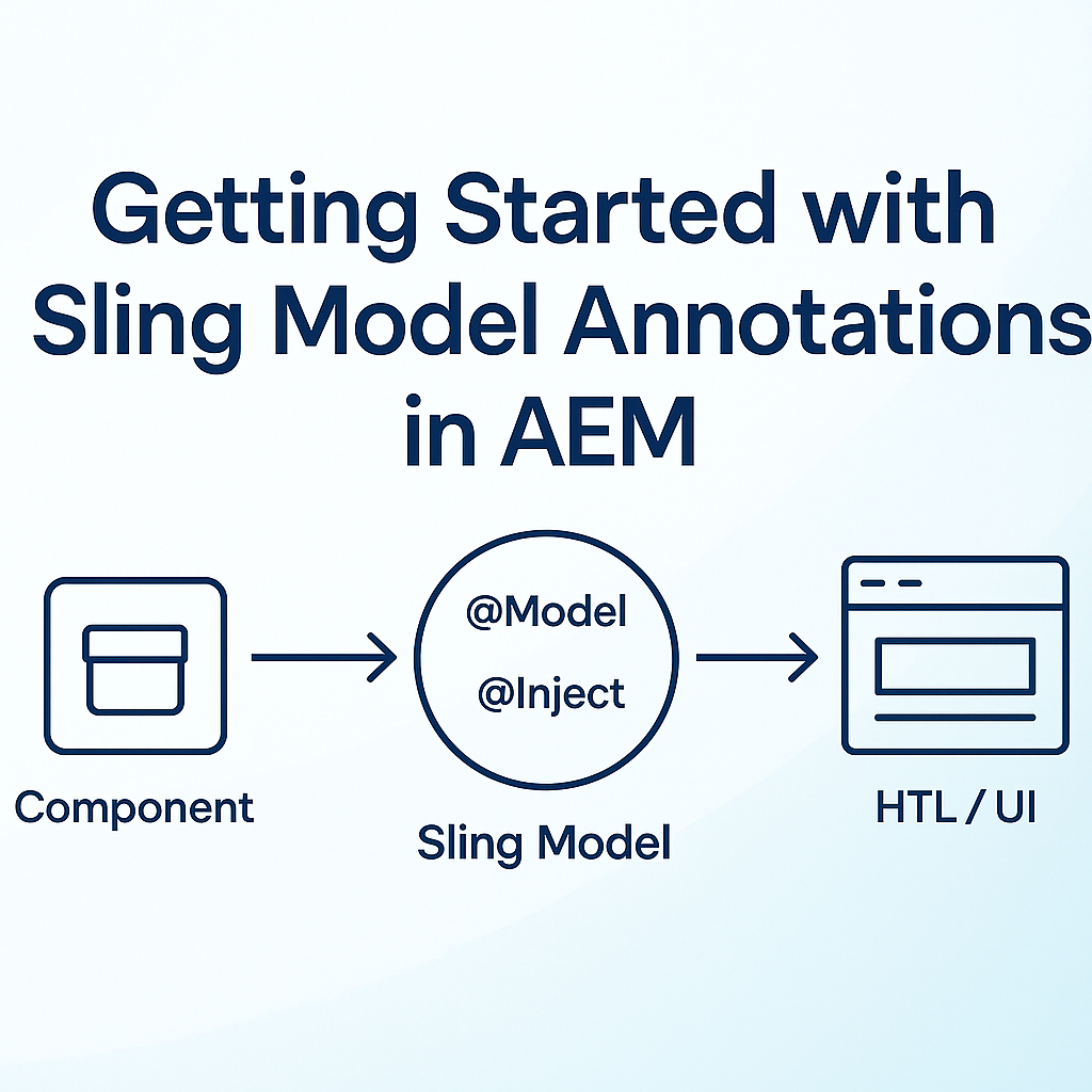
Welcome back all, In my last blog, we explored the basics of Adobe Experience Manager (AEM) and how Sling Models simplify component development by mapping JCR content to Java objects. Building on that foundation, this post dives deeper into Sling Model annotations, highlighting their practical use and benefits. Whether you’re new to AEM or looking to enhance your code quality, understanding these annotations is essential for creating robust, maintainable components.
In Adobe Experience Manager (AEM), a dialog serves as a key interface for content authors to configure and input data for webpage components. Dialogs function as forms or pop-up windows, enabling authors to enter text, upload images or files, select options using dropdowns, checkboxes, or radio buttons, and adjust component-specific settings such as styles, layouts, and behaviors. This streamlined interface ensures efficient and accurate content management.
Introduction
Adobe Experience Manager (AEM) is a powerful content management solution for building digital experiences. One of its core strengths is the ability to create custom components with rich authoring dialogs. Granite UI is the foundation for modern dialog creation in AEM, enabling developers to build intuitive and flexible interfaces for content authors. This blog provides a comprehensive overview of Granite UI, explains dialog creation, and offers a detailed index of dialog field samples to accelerate your AEM development.
What is Granite UI?
Granite UI is the user interface framework used by AEM for building Touch UI dialogs and consoles. It is based on a component-driven architecture, allowing developers to define dialog fields using XML or JSON. Granite UI provides a wide range of ready-to-use widgets (fields) such as text fields, dropdowns, multifields, and more, making it easy to create complex and user-friendly dialogs for AEM components.
Key Features:
- Declarative dialog definition using XML
- Rich set of field types and widgets
- Extensible and customizable
- Seamless integration with AEM’s authoring environment
Understanding Dialogs in AEM Components
Dialogs in AEM are the primary way for authors to input and configure content for components. There are two main dialog types:
• Classic UI Dialogs: Legacy dialogs, now largely replaced.
• Touch UI (Granite UI) Dialogs: Modern dialogs built with Granite UI, offering a responsive and user-friendly experience.
Each AEM component can have its own dialog, defined under /apps/<project>/components/<component>/cq:dialog. These dialogs determine what fields authors see and interact with when editing a component.
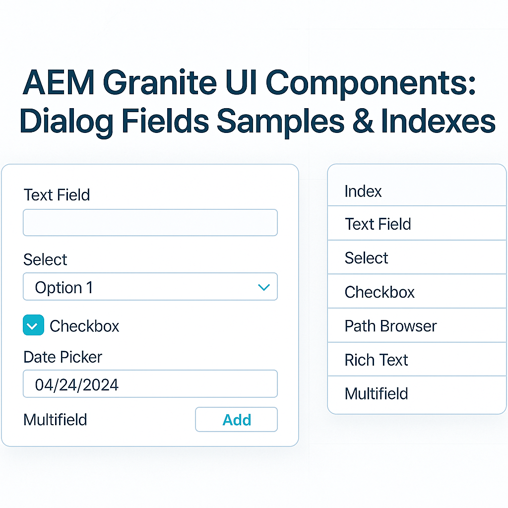
Granite UI Dialog Field Types Overview with Sample Index & Explanation
Granite UI offers a variety of field types. Here’s an index of the most commonly used ones, with explanations and sample XML snippets:
- Textfield : This textfield allows authors to input the full name of a state. It is a required field, ensuring that the component always captures this information. The field label and description provide clear guidance to users, improving the authoring experience and data consistency.
<stateName
  jcr:primaryType="nt:unstructured"
  sling:resourceType="granite/ui/components/coral/foundation/form/textfield"
  fieldLabel="State Name"
  fieldDescription="Please enter the full name of the state."
  emptyText="State Name"
  name="./stateName"
required="{Boolean}true"/>- Textarea : This textarea allows authors to specify a custom constraint message for form validation. The message will be shown as a tooltip if the submitted value does not match the selected type. It helps guide users to provide correct input by displaying clear validation feedback.
<validationNote
    jcr:primaryType="nt:unstructured"
    sling:resourceType="granite/ui/components/coral/foundation/form/textarea"
    fieldLabel="Validation Note"
    fieldDescription="Enter the message to display as a tooltip when the submitted value does not meet the required criteria."
name="./validationNote"/>- Multifield : The Multifield component in Granite UI allows authors to add multiple values for a single property, such as a list of items or entries. It is especially useful for dynamic lists where the number of inputs is not fixed. Each entry can be a simple field or a composite set of fields, providing flexibility in dialog design.
<cityList
    jcr:primaryType="nt:unstructured"
    sling:resourceType="granite/ui/components/coral/foundation/form/multifield"
    fieldDescription="Click 'Add field' to add a new city to the list."
    fieldLabel="City List">
    <field
        jcr:primaryType="nt:unstructured"
        sling:resourceType="granite/ui/components/foundation/form/textfield"
        required="{Boolean}true"
        name="./cityList"/>
</cityList>- Checkbox : The Checkbox component in Granite UI allows authors to toggle a boolean value, such as enabling or disabling a feature. It is ideal for simple on/off or true/false options in component dialogs, providing a clear and intuitive interface for content authors.
<displaySummary
  jcr:primaryType="nt:unstructured"
  sling:resourceType="granite/ui/components/coral/foundation/form/checkbox"
  fieldDescription="Enable this option to display the summary for each item."
  name="./displaySummary"
  text="Display Summary"
  checked="{Boolean}true"
  uncheckedValue="{Boolean}false"
value="{Boolean}true"/>- Richtext : The Richtext component in Granite UI provides authors with a WYSIWYG editor for entering and formatting rich content, such as styled text, links, and lists. It supports a variety of formatting options and plugins, allowing for flexible content creation directly within the dialog. This component is ideal for fields where enhanced text editing and presentation are required.
<richtext
jcr:primaryType="nt:unstructured"
sling:resourceType="cq/gui/components/authoring/dialog/richtext"
name="./text"
useFixedInlineToolbar="{Boolean}true">
<rtePlugins jcr:primaryType="nt:unstructured">
<format
jcr:primaryType="nt:unstructured"
features="bold,italic"/>
<justify
jcr:primaryType="nt:unstructured"
features="-"/>
<links
jcr:primaryType="nt:unstructured"
features="modifylink,unlink"/>
<lists
jcr:primaryType="nt:unstructured"
features="*"/>
<misctools jcr:primaryType="nt:unstructured">
<specialCharsConfig jcr:primaryType="nt:unstructured">
<chars jcr:primaryType="nt:unstructured">
<default_copyright
jcr:primaryType="nt:unstructured"
entity="&copy;"
name="copyright"/>
<default_euro
jcr:primaryType="nt:unstructured"
entity="&euro;"
name="euro"/>
<default_registered
jcr:primaryType="nt:unstructured"
entity="&reg;"
name="registered"/>
<default_trademark
jcr:primaryType="nt:unstructured"
entity="&trade;"
name="trademark"/>
</chars>
</specialCharsConfig>
</misctools>
<paraformat
jcr:primaryType="nt:unstructured"
features="*">
<formats jcr:primaryType="nt:unstructured">
<default_p
jcr:primaryType="nt:unstructured"
description="Paragraph"
tag="p"/>
<default_h1
jcr:primaryType="nt:unstructured"
description="Heading 1"
tag="h1"/>
<default_h2
jcr:primaryType="nt:unstructured"
description="Heading 2"
tag="h2"/>
<default_h3
jcr:primaryType="nt:unstructured"
description="Heading 3"
tag="h3"/>
<default_h4
jcr:primaryType="nt:unstructured"
description="Heading 4"
tag="h4"/>
<default_h5
jcr:primaryType="nt:unstructured"
description="Heading 5"
tag="h5"/>
<default_h6
jcr:primaryType="nt:unstructured"
description="Heading 6"
tag="h6"/>
<default_blockquote
jcr:primaryType="nt:unstructured"
description="Quote"
tag="blockquote"/>
<default_pre
jcr:primaryType="nt:unstructured"
description="Preformatted"
tag="pre"/>
</formats>
</paraformat>
<table
jcr:primaryType="nt:unstructured"
features="-">
<hiddenHeaderConfig
jcr:primaryType="nt:unstructured"
hiddenHeaderClassName="cq-wcm-foundation-aria-visuallyhidden"
hiddenHeaderEditingCSS="cq-RichText-hiddenHeader--editing"/>
</table>
<tracklinks
jcr:primaryType="nt:unstructured"
features="*"/>
</rtePlugins>
<uiSettings jcr:primaryType="nt:unstructured">
<cui jcr:primaryType="nt:unstructured">
<inline
jcr:primaryType="nt:unstructured"
toolbar="[format#bold,format#italic,format#underline,#justify,#lists,links#modifylink,links#unlink,#paraformat]">
<popovers jcr:primaryType="nt:unstructured">
<justify
jcr:primaryType="nt:unstructured"
items="[justify#justifyleft,justify#justifycenter,justify#justifyright,justify#justifyjustify]"
ref="justify"/>
<lists
jcr:primaryType="nt:unstructured"
items="[lists#unordered,lists#ordered,lists#outdent,lists#indent]"
ref="lists"/>
<paraformat
jcr:primaryType="nt:unstructured"
items="paraformat:getFormats:paraformat-pulldown"
ref="paraformat"/>
</popovers>
</inline>
<tableEditOptions
jcr:primaryType="nt:unstructured"
toolbar="[table#insertcolumn-before,table#insertcolumn-after,table#removecolumn,-,table#insertrow-before,table#insertrow-after,table#removerow,-,table#mergecells-right,table#mergecells-down,table#mergecells,table#splitcell-horizontal,table#splitcell-vertical,-,table#selectrow,table#selectcolumn,-,table#ensureparagraph,-,table#modifytableandcell,table#removetable,-,undo#undo,undo#redo,-,table#exitTableEditing,-]"/>
</cui>
</uiSettings>
</richtext>- Select : The Select component in Granite UI provides a dropdown menu, allowing authors to choose a single value from a predefined list of options. It is ideal for fields where only one selection is allowed, such as choosing a display mode or category. This ensures data consistency and simplifies the authoring experience.
<displayMode
  jcr:primaryType="nt:unstructured"
  sling:resourceType="granite/ui/components/coral/foundation/form/select"
  fieldLabel="Display Mode"
  name="./displayMode">
  <items jcr:primaryType="nt:unstructured">
      <fullScreen
          jcr:primaryType="nt:unstructured"
          text="Full Screen"
          value="FULL_SCREEN"/>
      <container
          jcr:primaryType="nt:unstructured"
          text="Container"
          value="CONTAINER"/>
      <inlineOption
          jcr:primaryType="nt:unstructured"
          text="Inline"
          value="INLINE"/>
  </items>
</displayMode>- Radiogroup : The Radiogroup component in Granite UI allows authors to select a single option from a set of predefined choices, displayed as radio buttons. It is ideal for mutually exclusive selections, such as choosing a size or a display style. The vertical layout option improves readability when there are multiple choices.
<fontWeight
  jcr:primaryType="nt:unstructured"
  sling:resourceType="granite/ui/components/coral/foundation/form/radiogroup"
  name="./fontWeight"
  vertical="{Boolean}true">
  <items jcr:primaryType="nt:unstructured">
      <light
          jcr:primaryType="nt:unstructured"
          checked="{Boolean}true"
          text="Light"
          value="light"/>
      <regular
          jcr:primaryType="nt:unstructured"
          text="Regular"
          value="regular"/>
      <bold
          jcr:primaryType="nt:unstructured"
          text="Bold"
          value="bold"/>
  </items>
</fontWeight>- Numberfield : The Numberfield component in Granite UI provides a numeric input field, allowing authors to enter or select a number within a specified range. It supports attributes like minimum, maximum, step, and default value, making it ideal for settings that require numeric constraints, such as counts, limits, or measurements.
<itemLimit
    jcr:primaryType="nt:unstructured"
    sling:resourceType="granite/ui/components/coral/foundation/form/numberfield"
    fieldDescription="Set the maximum number of items to display in the list."
    fieldLabel="Item Display Limit"
    defaultValue="10"
    max="50"
    min="1"
    name="./itemLimit"
    step="1"/>
Tips & Best Practices
- Use Meaningful Field Names: Use clear, descriptive names for fields to make dialogs intuitive.
- Group Related Fields: Use tabs or fieldsets to organize complex dialogs.
- Validation: Leverage Granite UI’s validation options to ensure data integrity.
- Reuse Field Definitions: Use include or resourceType to reuse common field sets.
- Performance: Avoid unnecessary fields to keep dialogs responsive.
- Documentation: Comment your dialog XML for maintainability.
Conclusion
Granite UI is a cornerstone of modern AEM component development, enabling the creation of powerful, user-friendly dialogs. By understanding the available field types and their configurations, developers can build flexible and maintainable components that enhance the authoring experience. Use the provided samples and best practices as a foundation for your own projects, and continue exploring Granite UI’s capabilities to deliver exceptional digital experiences.
Resources & References
메타데이터
- post_id
- dd9684e6f874
- slug
- aem-granite-ui-components-dialog-fields-samples-indexes-part-1-dd9684e6f874
- url
- https://medium.com/@punitsharma6019/aem-granite-ui-components-dialog-fields-samples-indexes-part-1-dd9684e6f874
- canonical_url
- https://medium.com/@punitsharma6019/aem-granite-ui-components-dialog-fields-samples-indexes-part-1-dd9684e6f874
- author_url
- https://medium.com/@punitsharma6019
- status
- ok
- fetched_at
- 2026-08-05 02:20:04