Creating a JavaScript Step Line Chart: 10 Years of U.S. Federal Funds Rate
Learn how to build a step line chart using JavaScript, turning 10 years of the Fed rate data (2016–2026) into an interactive visualization.
Creating a JavaScript Step Line Chart: 10 Years of U.S. Federal Funds Rate

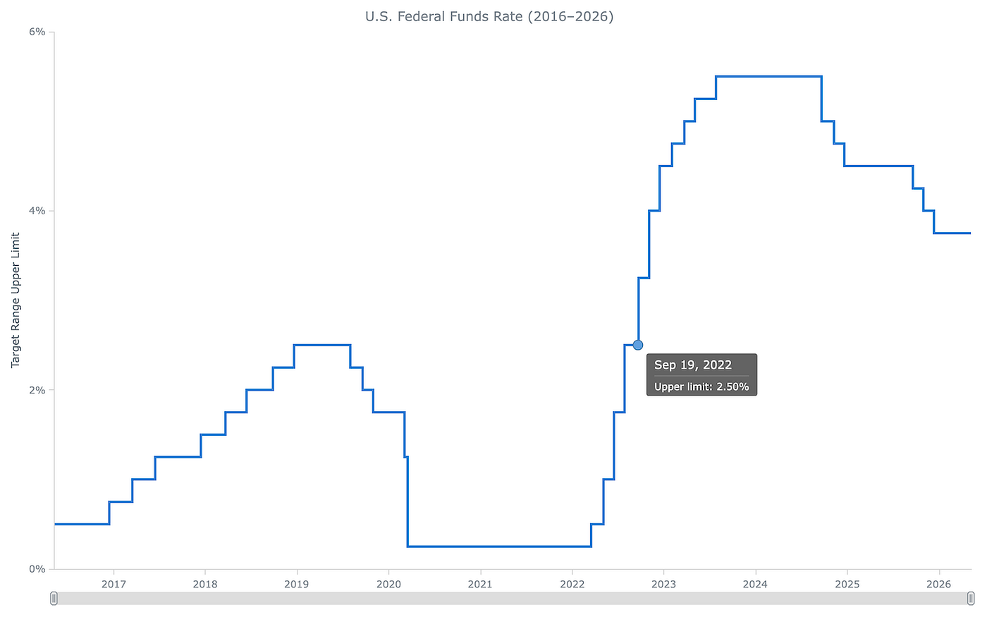
A step line chart displays data as a continuous staircase, making it ideal for visualizing values that change at specific moments and hold constant in between. This tutorial walks through building one with JavaScript using ten years of U.S. Federal Funds Rate data, from a blank HTML page to a fully interactive step line chart ready to embed in any web page or application.
Here’s what the final chart will look like:
What Is a Step Line Chart?
A step line chart (also called a stepped line chart) is a chart type where data points are connected by horizontal segments and vertical transitions rather than diagonal lines, creating a staircase-shaped series. Each horizontal segment represents a value held constant over time; each vertical line marks the exact moment and magnitude of a change.
Step line charts are the right choice for data that shifts at specific decision points and stays flat in between: interest rate targets, price tiers, software version numbers, configuration values. Both the timing and the direction of each change are immediately readable from the staircase shape. The closest alternative is a jump line chart, which leaves a visible gap between segments instead of connecting them, emphasizing the discrete nature of each value over the transition path.
Building a JavaScript Step Line Chart
Building an interactive JavaScript-based step line chart involves four steps: creating the HTML page, loading the necessary JS files, preparing the data, and writing the chart code.
1. Create an HTML Page
The chart needs a home, so let’s begin with a minimal HTML file with a <div> that it will render into. The #container div fills the full browser window here, giving the ten-year timeline enough horizontal space. For a partial-page embed, replace the values with whatever percentage or pixel dimensions suit your layout.
<!DOCTYPE html>
<html lang="en">
<head>
  <meta charset="UTF-8">
  <meta name="viewport" content="width=device-width, initial-scale=1.0">
  <title>JavaScript Step Line Chart</title>
  <style>
    /* make the page and container fill the full browser window */
    html, body, #container {
      width: 100%;
      height: 100%;
      margin: 0;
      padding: 0;
    }
  </style>
</head>
<body>
  <!-- the chart will render inside this div -->
  <div id="container"></div>
</body>
</html>
With the page set up, let’s load the necessary files.
2. Include the JavaScript Files
This tutorial uses AnyChart’s JavaScript charting library. The step line chart is part of the anychart-base.min.js module, which covers all basic Cartesian chart types. In addition, the data will be loaded from a CSV file, so anychart-data-adapter.min.js is also needed - it handles loading external data files.
Add both using the <script> tags in the <head> section, then add an empty <script> block in the <body> where the chart code will go.
<head>
  ...
  <!-- load the AnyChart base module, which includes the step line chart -->
  <script src="https://cdn.anychart.com/releases/8.14.1/js/anychart-base.min.js"></script>
  <!-- load the data adapter module, which enables loading external CSV files -->
  <script src="https://cdn.anychart.com/releases/8.14.1/js/anychart-data-adapter.min.js"></script>
</head>
<body>
  <div id="container"></div>
  <!-- chart code goes here -->
  <script>
  </script>
</body>
The scripts are in place — now for the data.
3. Prepare the Data
The data visualized in this tutorial comes from FRED, Federal Reserve Bank of St. Louis and covers ten years of the Federal Funds Rate, from May 2016 to May 2026. The Fed doesn’t set a single rate; it sets a target range. When headlines say “the Fed raised rates to 5.5%”, that’s the upper end — 5.25%-5.50% in that case. This chart tracks exactly that number, the upper limit of the target range.
The data is available for download as a CSV directly from the FRED series page. The file has two columns: observation_date (an ISO date string) and DFEDTARU (the upper target rate as a decimal), with one row per calendar day — 3,653 observations in total in our case. The first few rows look like this:
observation_date,DFEDTARU
2016-05-06,0.5
2016-05-07,0.5
2016-05-08,0.5
2016-05-09,0.5
With the file hosted and accessible, the AnyChart data adapter can load it directly — no manual parsing or data transformation needed.
4. Write the JS Code for the Chart
The entire chart script goes inside anychart.onDocumentReady(), which fires only after the page has fully loaded and the #container div is in the DOM. This is also where the data loading kicks off.
anychart.onDocumentReady(function () {
  // ... all the following JS chart code goes here
});
4.1. Load and Parse the CSV
The chart code can’t run until the file has arrived, so everything goes inside the callback that anychart.data.loadCsvFile() fires when it does. The callback receives the raw CSV text — anychart.data.set() turns it into a structured data set (ignoreFirstRow: true drops the header row), and mapAs() tells AnyChart which column maps to which field: column 0 (observation_date) becomes the x value, column 1 (DFEDTARU) becomes the series value.
anychart.data.loadCsvFile(
  "https://raw.githubusercontent.com/andreykh1985/anychart-data/main/DFEDTARU.csv",
  function (data) {

    // parse the CSV; ignoreFirstRow skips the "observation_date,DFEDTARU" header
    var dataSet = anychart.data.set(data, {ignoreFirstRow: true});

    // map column 0 (observation_date) to x, column 1 (DFEDTARU) to value
    var mapping = dataSet.mapAs({x: 0, value: 1});

    // ... chart code goes here

  }
);
4.2. Create the Chart and Series
With the data mapped, creating the chart takes three lines: a step line chart instance, a date-time x-scale to position each day at its correct location on the time axis, and a series bound to the loaded data.
var chart = anychart.stepLine();
chart.xScale(anychart.scales.dateTime());
const series = chart.stepLine(mapping);
4.3.Finish and Render
Set a descriptive title, assign the container, and call draw() to render the resulting step line chart. The chart doesn't appear on the page until that last call runs.
chart.title("U.S. Federal Funds Rate (2016–2026)");
chart.container("container");
chart.draw();
Full Code and Result
Here is the complete, runnable HTML with all the pieces assembled.
<!DOCTYPE html>
<html lang="en">
<head>
  <meta charset="UTF-8">
  <meta name="viewport" content="width=device-width, initial-scale=1.0">
  <title>JavaScript Step Line Chart</title>
  <style>
    html, body, #container {
      width: 100%;
      height: 100%;
      margin: 0;
      padding: 0;
    }
  </style>
  <script src="https://cdn.anychart.com/releases/8.14.1/js/anychart-base.min.js"></script>
  <script src="https://cdn.anychart.com/releases/8.14.1/js/anychart-data-adapter.min.js"></script>
</head>
<body>
  <div id="container"></div>
  <script>
    anychart.onDocumentReady(function () {
      anychart.data.loadCsvFile(
        "https://raw.githubusercontent.com/andreykh1985/anychart-data/main/DFEDTARU.csv",
        function (data) {
          var dataSet = anychart.data.set(data, {ignoreFirstRow: true});
          var mapping = dataSet.mapAs({x: 0, value: 1});
          var chart = anychart.stepLine();
          chart.xScale(anychart.scales.dateTime());
          const series = chart.stepLine(mapping);
          chart.title("U.S. Federal Funds Rate (2016–2026)");
          chart.container("container");
          chart.draw();
        }
      );
    });
  </script>
</body>
</html>
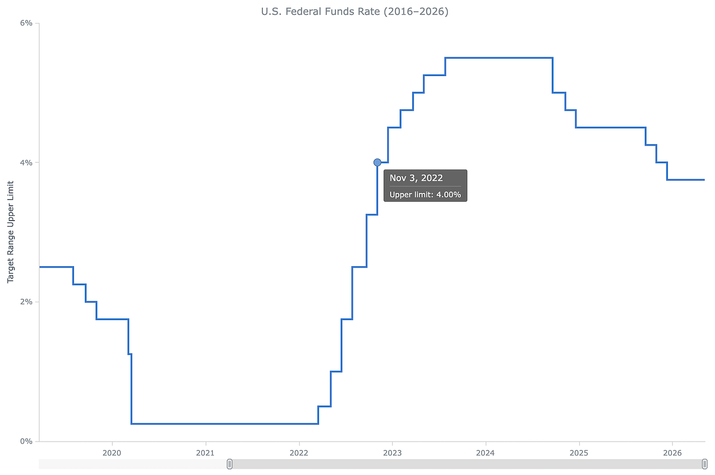
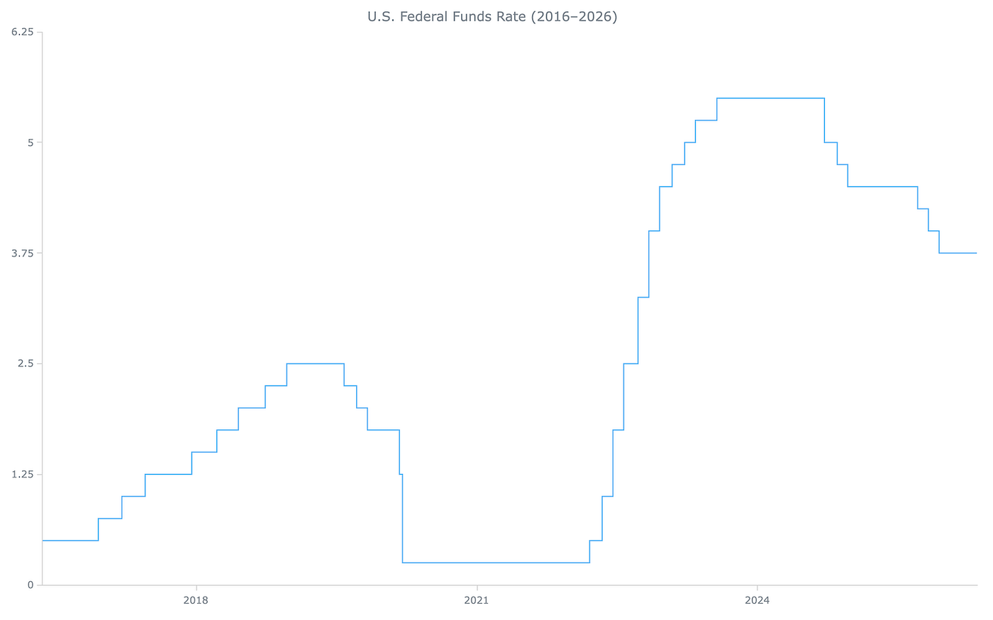
That’s it! A basic JavaScript step line chart is ready. The long flat segment at 0.25% represents the two years the rate was held at near-zero following the March 2020 emergency cut. The eleven consecutive hikes from 2022 to 2023 form a steep ascending staircase up to 5.50%. The subsequent cuts in 2024 and 2025 descend in steps on the right side of the chart.
See it embedded below and open it on AnyChart Playground to explore and play with the full code.
How to Customize a JavaScript Step Line Chart
The basic chart shows the rate history, but a few targeted changes can make it significantly more readable. The four customizations below address the line visibility, tooltip content, axis labeling, and navigation across the full ten-year range.
A. Style the Series Stroke
The default stroke is thin and uses AnyChart’s automatic palette color. A heavier line with a specific color will make the staircase stand out more clearly.
series.stroke("#1976d2", 3);B. Format the Tooltip
By default, the tooltip title shows the date in a format like “2023 Apr 16”, and the body shows “Series 0: 5.25” — a generic series name and a bare number with no unit. Let’s replace both: the title gets a cleaner date format, and the body gets an explicit label with a percentage sign.
chart.tooltip().titleFormat(function () {
  return anychart.format.dateTime(this.x, "MMM d, yyyy");
});
chart.tooltip().format(function () {
  return "Upper limit: " + this.value + "%";
});
The titleFormat() and format() methods each accept a callback; inside them, this.x is the timestamp of the hovered point and this.value is the rate.
C. Format the Axes
Axis customization often makes a bigger difference than it may seem.
The date-time scale auto-picks a tick interval based on available width — with ten years of data, it defaults to every three years. Setting the interval to 1 forces one tick per year:
chart.xScale().ticks().interval(1);The y-axis also needs attention — bare numbers like “1.75” carry no unit on their own. Adding a “%” suffix and an axis title makes the scale immediately readable:
chart.yAxis().labels().format("{%Value}%");
chart.yAxis().title("Target Range Upper Limit");
By default, the y-scale sets its range automatically based on the data in view. That works fine in many cases, but you can override it whenever a specific baseline or ceiling makes more sense. Here, locking the range between 0 and 6% gives the rate history a consistent frame. And it will pay off in the next step too: once the scroller is in place, zooming in won’t cause the axis to jump.
chart.yScale().minimum(0);
chart.yScale().maximum(6);
D. Add a Scroller
Ten years of daily data in a single view makes individual FOMC decisions hard to isolate. Let’s add a scroller so readers can zoom into any period they want to examine — the eleven consecutive hikes from 2022 to 2023, the emergency cuts of March 2020, the slow normalization through 2016–2018 — without losing sight of the full ten-year range. Enable it with xScroller(); it adds a narrow strip below the chart with draggable range handles:
chart.xScroller().enabled(true);Final Result
Below is the complete interactive JavaScript step line chart with all customizations applied — custom stroke, formatted tooltip, year-by-year axis labels, and a scroller. Check it out and open it on AnyChart Playground where you can play with the code, add your own data, and so on.
Conclusion
This tutorial covered building an interactive JavaScript step line chart from scratch using ten years of real Federal Reserve rate data loaded directly from a CSV file. Along the way, the chart received a date-time scale to represent duration correctly, stroke styling with interactive states, a formatted tooltip, year-by-year axis labels, and a scroller for timeline navigation.
For further exploration, see the step line chart documentation. For related chart types, check out the line chart tutorial and browse the line chart examples in the gallery.
Have questions or ran into something unexpected? Leave a comment or reach out to the AnyChart Support Team.
Originally published at https://www.anychart.com on May 19, 2026.
메타데이터
- post_id
- decd4172d206
- slug
- step-line-chart-js-decd4172d206
- url
- https://medium.com/@anychart/step-line-chart-js-decd4172d206
- canonical_url
- https://medium.com/@anychart/step-line-chart-js-decd4172d206
- author_url
- https://medium.com/@anychart
- status
- ok
- fetched_at
- 2026-06-17 08:20:12