Designing a Corporate Parking Dashboard with AI Tools
How I Used Figma Make and AI Tools to Solve Overcrowding, Violations, Grace Period Chaos and Shift Swaps
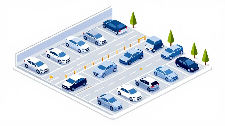
isometric parking illustration
Designing a Corporate Parking Dashboard with AI Tools
How I Used Figma Make and AI Tools to Solve Overcrowding, Violations, Grace Period Chaos and Shift Swaps
By a product designer working under real operational pressure.
Every morning, the same complaints arrived.
“There’s nowhere to park.” “Executives are angry.” “Employees are getting violations.”
But the numbers didn’t add up.
The campus had 850 parking spaces, yet people insisted parking was impossible. That contradiction is what led me to design an AI-powered corporate parking dashboard.
Why We Started Building This
This problem didn’t appear in isolation.
Our team works on a suite of fleet and mobility tools that support companies managing vehicles, employees, and shared transportation infrastructure. Across multiple client conversations, one operational pain point kept appearing again and again:
Parking management.
Different companies described the problem differently:
“Executives can’t find their reserved spaces.”
“Employees park in EV spots.”
“Visitors don’t know where to go.”
“Shift workers arrive before others leave.”
But underneath those complaints was the same operational reality.
Parking systems were being managed with static rules inside dynamic workplaces.
Most campuses were relying on a mix of:
- static allocation lists
- manual enforcement
- spreadsheets
- disconnected booking tools
None of them accounted for real-time behavioural patterns. That’s where we saw an opportunity.
Instead of treating parking as a standalone tool, we decided to design an admin layer for parking management that could integrate into our broader mobility platform.
The goal was simple. Turn parking from a reactive enforcement problem into a real-time operational system.
Every complex dashboard starts with frustration.

dashboard image generated by AI
In this case:
“There are never enough spaces. Executives are frustrated. Employees park illegally. Visitors complain.”
The campus had:
- 1,200 employees
- 850 parking spaces
- 14% daily overflow
- 60+ weekly violations
- reserved executive spaces
- EV allocations
- visitor booking
- rotating shift workers
At first glance, it looked like a simple capacity issue. It wasn’t. It was a dynamic allocation problem inside a static rule system. And two hidden variables made it worse; grace periods and shift swaps.
That’s where AI helped me think beyond surface metrics.
Stage 1 — The Hidden Complexity
When I started mapping the system, the KPIs looked straightforward:
- occupancy %
- violations per zone
- reserved utilisation
- peak hours
Then operations added:
“We allow a 15-minute grace period before issuing violations.”
And HR added:
“Shift workers often swap shifts informally.”
Now the system wasn’t just spatial. It was temporal and behavioural.
The Grace Period Problem

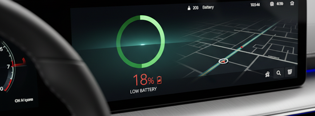
electrical vehicle grace period
Grace periods are meant to reduce friction. But they introduce ambiguity.
Example
- Parking capacity: 300 (General Zone A)
- Occupied: 300
- 18 vehicles technically overstaying
- 12 of them within the 15-minute grace window
The dashboard shows:
- 100% occupancy
- 18 violations pending
But in reality:
- only 6 true violations
Without clarity, leadership thinks enforcement is failing. The real issue it turns out was timing thresholds.
Designing Grace Period Visibility
Instead of counting violations blindly, I introduced layered states.
Parking Status Categories
- ✅ Valid
- ⏳ In Grace Window
- ⚠️ Confirmed Violation
- 🔄 Awaiting Validation (sensor uncertainty)
This changed the map logic.
Instead of orange = violation, I split it into:
- light orange = grace
- dark orange = confirmed violation
This small design decision reduced perceived enforcement errors.
Prompt I Used for Grace Period Logic
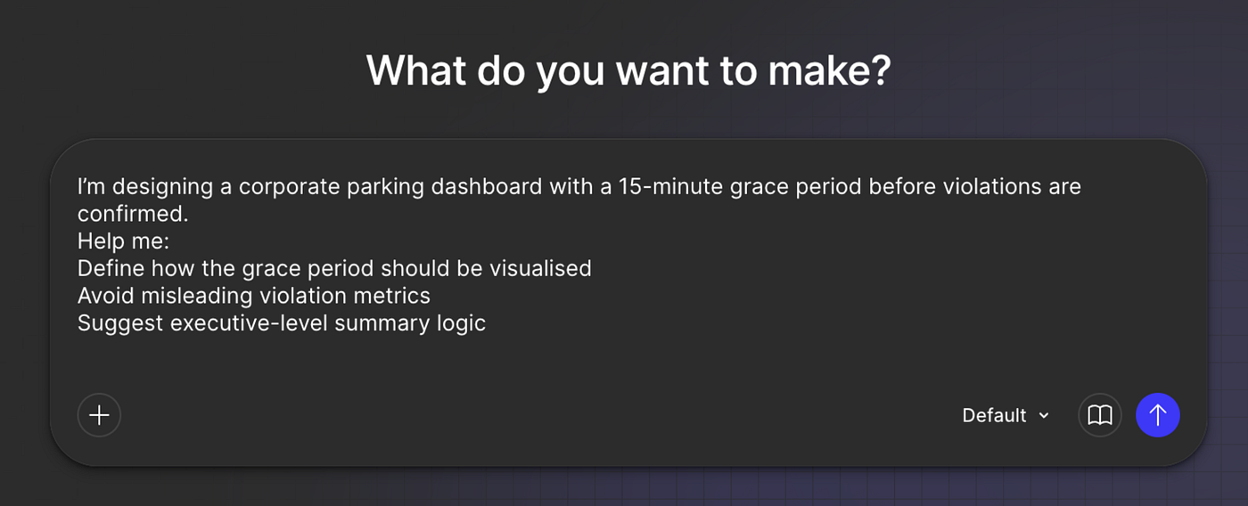
Figma Make prompt example
I’m designing a corporate parking dashboard with a 15-minute grace period before violations are confirmed. Help me:
- Define how the grace period should be visualised
- Avoid misleading violation metrics
- Suggest executive-level summary logic
AI helped clarify:
- separate “Violation Risk” from “Confirmed Violations”
- show grace volume as an operational pressure indicator
- add countdown timer logic in the space-level view
That became a powerful behavioural signal. Instead of punishing users, we warned them.
The Shift Swap Chaos
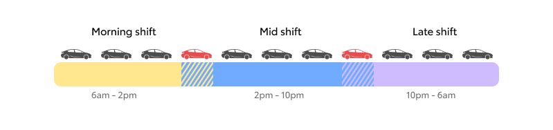
This was even more subtle, the corporate campus had:
- Morning shift: 6:00–2:00
- Mid shift: 2:00–10:00
- Late shift: 10:00–6:00
On paper, it was balanced. In reality employees swapped shifts informally.
So between 2:00–2:30 PM:
- morning shift still parked
- late shift already arriving
Result was, temporary micro-overflow spikes.
These were often misinterpreted as permanent capacity failures.
Data Snapshot During Shift Overlap
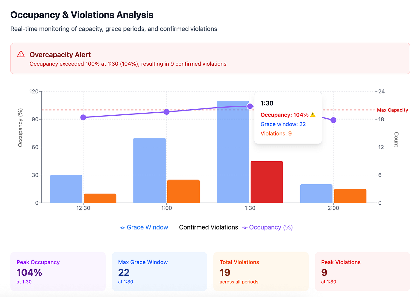
UI example made in Figma Make
At 1:30 PM, it looked catastrophic. But it self-corrected. This insight reshaped the dashboard logic.
Parking demand during shift swaps
Instead of static occupancy charts, I introduced:
1️⃣ Overlap Risk Indicator
A timeline bar showing:
- scheduled shift changes
- predicted overlap density
- risk level (Low / Moderate / High)
2️⃣ Temporary Capacity Buffer Visualisation
On the interactive map, during overlap windows:
- zones get a soft red pulse
- label: “Shift Overlap in Progress”
This reframes overflow as temporary.
3️⃣ Grace + Shift Interaction Layer
The biggest insight.
Grace periods + shift overlap amplify perceived violations.
AI helped me think this through.
Prompt Used for Scenario Simulation
Simulate a parking system with:
a 15-minute grace period
3 overlapping shift windows
10% shift-swap unpredictability
What temporary anomalies appear in violation data?
Key insights returned:
- artificial spike in grace-window occupancy
- false positive violation trends
- increased repeat offender appearance
- executive complaints during overlap
This allowed me to:
- add a “Shift Window Filter” toggle
- show violation trends excluding grace
- provide contextual messaging
Interactive Map Evolution
The final map included four layers.
1️⃣ Live Occupancy
Colour-coded by real capacity.
2️⃣ Grace Countdown View
Each at-risk vehicle showed:
- 14:32 remaining
- a subtle animated timer ring
3️⃣ Shift Density Overlay
Soft gradient showing:
- arrival wave
- departure wave
4️⃣ Violation Confirmation State
Separate from grace. This transformed the map from a static visualisation into a living system.
Leadership Layer — Avoiding Misinterpretation
Executives don’t want raw complexity.
They want clarity, so the summary included:
- confirmed violations (not grace)
- active grace vehicles
- shift overlap status
- reclaimable reserved spaces
- peak forecast
Most importantly, a new KPI:
True Capacity Stress Index
The formula combined:
- occupancy
- grace %
- shift overlap multiplier
- reserved inefficiency
This prevented overreaction during temporary spikes.
Using AI to Accelerate the MVP
This project also became a real experiment in AI-assisted product design under pressure. The timeline was tight. Leadership wanted a demo-ready concept in under a week.
Instead of starting from blank canvases and long documentation cycles, I used AI tools — especially ChatGPT — to accelerate several parts of the process.
Not to design the product for me. But to stress-test the system logic.
I used prompts to:
- simulate parking scenarios
- identify edge cases
- clarify metric definitions
- structure dashboard logic
- clean up ambiguous assumptions
A typical workflow looked like this:
- Write rough operational assumptions
- Use AI to challenge them
- Refine the logic
- Translate it directly into interface structures
Example prompt I used early on:
“Simulate a parking system with:
a 15-minute grace period
3 overlapping shift windows
10% shift-swap unpredictability
What temporary anomalies appear in violation data?”
The responses helped surface patterns that were easy to overlook:
- temporary capacity spikes
- false violation signals
- misleading occupancy percentages
- enforcement appearing inconsistent
These insights informed the data model before I even opened Figma.
AI + Figma Make for Rapid Prototyping

chatGPT + Figma Make image
Once the logic was clearer, the next step was moving quickly from system thinking to visual structure. AI helped here too.
Instead of manually building every UI variation, I used prompt-driven design workflows to generate rapid layout explorations and component structures, which I then refined in Figma using Figma Make.
Typical workflow:
1️⃣ Define system states in ChatGPT 2️⃣ Generate structured UI descriptions 3️⃣ Convert them into layout scaffolds 4️⃣ Push them into Figma for refinement 5️⃣ Iterate interaction logic and hierarchy
This approach accelerated:
- dashboard information architecture
- map layer logic
- status state definitions
- edge-case handling
- demo storytelling
Instead of spending days exploring structure, I could test multiple system interpretations within hours.
AI didn’t replace product thinking. But it significantly reduced the time between:
idea → scenario test → interface structure → prototype
And under real operational pressure, that speed matters.
Reflection
Corporate parking isn’t just about spaces.
It’s about time.
- arrival waves
- behavioural grace windows
- informal shift swaps
- human unpredictability
If we ignore temporal complexity, we design misleading dashboards.
AI helped me zoom out. It helped me design not just for space allocation — but for time-based system behaviour.
And when 40 employees arrive early for swapped shifts while 30 others are still in a grace period, you don’t need more asphalt.
You need smarter visibility. That’s what intelligent dashboard design — amplified by AI — made possible.
Final Thought
Corporate parking isn’t just a facilities problem.
It’s a systems problem.
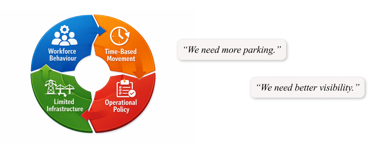
It sits at the intersection of:
- workforce behaviour
- time-based movement
- limited infrastructure
- operational policy
When those dynamics are invisible, frustration grows quickly. But when they’re visualised properly, something interesting happens:
The problem stops being “we need more parking.”
It becomes “we need better visibility.”
That’s the kind of operational clarity we’re working towards.
If you’re interested in how companies can manage parking, fleets, and employee mobility more intelligently, take a look at what we’re building at **Kinto Join — where we’re designing tools to make workplace transportation systems simpler, smarter, and more connected.**
메타데이터
- post_id
- df2d5f4d2b5f
- slug
- designing-a-corporate-parking-dashboard-with-ai-tools-df2d5f4d2b5f
- url
- https://medium.com/the-design-loop/designing-a-corporate-parking-dashboard-with-ai-tools-df2d5f4d2b5f
- canonical_url
- https://medium.com/the-design-loop/designing-a-corporate-parking-dashboard-with-ai-tools-df2d5f4d2b5f
- author_url
- https://medium.com/@renata.waskiewiczux
- status
- ok
- fetched_at
- 2026-06-13 07:35:29